Column Chart in Excel
A column chart in Excel is a chart that is used to represent data in vertical columns. The height of the column represents the value for the specific data series in a chart. The column chart represents the comparison in the form of the column from left to right. If there is a single data series, it is easy to see the comparison.
For example, we need to know the sales of three top food products in country A for a survey. Then, we can insert the output into a column chart, a graphical representation in vertical bars or columns along a two-axis plotted with the values indicating the measure of the particular food product category in country A, and complete a concise survey.
Types of a Column Chart in Excel
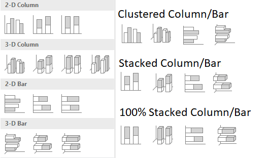
We have different types of column/bar charts available in Microsoft Excel, which are:
- Clustered Column Chart: A clustered chart in Excel presents more than one data series in clustered vertical columns. Each data series shares the same axis labels, so vertical bars are grouped by category. The clustered columns can make a direct comparison of multiple series and can show change over time. But they become visually complex after adding more series. Therefore, they work best in situations where data points are limited.
- Stacked Column Chart: This type of chart helps represent the total (sum) because it visually aggregates all categories in a group. The negative point about this chart is that it becomes difficult to compare the sizes of the individual classes. Stacking enables us to show a part of the whole relationship.
- 100% Stacked Column Chart: This is a chart type helpful to show the relative percentage of multiple data series in stacked columns, where the total (cumulative) of stacked columns always equals 100%.
How to Make Column Charts in Excel? (with Examples)
Example #1
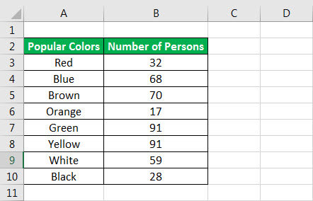
To make a column chart in Excel, first, we need to have data in table format. For example, suppose we have data related to the popularity of the colors.
- To make the chart, we first need to select the whole data and then press the shortcut key (Alt+F1) to place the default chart type in the same sheet where the data is or F11 to place the chart in a separate new sheet.

- Else, we could use the long method to click on the Insert tab -> Under Charts group -> Insert Column or Bar Chart.

We have a lot of different types of column charts to select. However, according to the data in the table and the nature of the data in the table, we should go for the clustered column. So, for which type of column chart should we go? We can find this below by reading the usefulness of various column charts.
- We must press Alt+F1 for the chart on the same sheet.

- For the chart in the separate sheet, we can press F11.

- Here, in Excel 2016, we have a ‘+’ sign on the right side of the chart where we have checkboxes to display the different chart elements.

As we can see, the chart looks like the one below by activating the “Axes,” “Axes Titles,” “Chart Title,” “Data Labels,” “Gridlines,” “Legends,” and “Trendline.”
- Different types of elements of the chart are as follows:

We can enlarge the chart area by selecting the outer circle according to our needs. If we right-click on any of the bars, we have various options for formatting the bar and chart.
- If we want to change the formatting of only one bar, we need to click two times on the bar. Then right-click, and we can change the color of the individual bars according to the colors they represent.

We can also change the formatting from the right panel, which is open when selecting any bar.
- By default, the chart is created using the selected data, but we can change the chart’s appearance by using the ‘Filter’ sign on the right side of the chart.

- Two more contextual tabs, “Design” and “Format,” open in the ribbon when a chart is selected.


We can use the “Design” tab to format the entire chart, the color theme, chart type, moving chart, change the data source, the chart’s layout, etc.
In addition, the “Format” tab is for formatting individual chart elements like bars and text.
Example #2
Please find below the column chart to represent the data of Amazon sales product-wise.

As we can see, the chart has become visually complex to analyze, so we will now use the “Stacked Column Chart” as it will also help us find the contribution of the individual product to the overall sale of the month. To do the same, we need to click on the Design tab-> Change Chart Type in the “Type” group.

Finally, the chart will look like the one shown below.

Pros
- A bar or column chart is more popular than another type of complicated chart. It can be understood by a person who is not much more familiar with chart representation but has gone through column charts in magazines or newspapers. Columns or bar charts are self-explanatory.
- We can also use it to see the trend for any product in the market. But, again, make trends easier to highlight than tables do.
- Display relative numbers/proportions of multiple categories in a stacked column chart.
- This chart helps summarize a large amount of data visually and is easily interpretable.
- These chart estimates can be made quickly and accurately—permitting visual guidance on the accuracy and reasonableness of calculations.
- Accessible to a broad audience as easy to understand.
- This chart is used to represent negative values.
- Bar charts can hold data in distinct categories and from one category in different periods.
Cons
- It fails to expose key assumptions, causes, impacts, and causes. That is why it is easy to manipulate to give incorrect impressions, or we can say they do not provide a good overview of the data.
- The user can quickly compare arbitrary data segments on a bar chart but cannot compare two slices that are not neighbors at once.
- The main disadvantage of bar charts is that it is straightforward to make them unreadable or wrong.
- We can easily manipulate a bar graph to give a false impression of a data set.
- Bar graphs are not helpful when displaying changes in speeds, such as acceleration
- Using too many bars in a bar chart looks highly cluttered.
- A line graph in excel is more useful when showing trends over time.
Things to Remember
- The bar and the column chart display data using rectangular bars where the length of the bar is proportional to the data value. But bar charts are useful when we have long category labels.
- We must use various colors for bars to contrast and highlight data in your chart.
- We should use self-explanatory chart titles and axis titles.
- When the data is related to different categories, use this chart. Otherwise, we can use a line chart for another type of data to represent the continuous data type.
- Always start the graph with zero, as it can mislead and confuse while comparing.
- Do not use extra formattings like the bold font or both types of gridlines in excel for the plot area so that the main point can be seen and analyzed clearly.
Recommended Articles
This article is a guide to Column Chart in Excel. We discuss how to make column chart in Excel along with Excel examples and downloadable templates. You may also look at these useful functions in Excel: –