Excel Dashboards Are Not Enough: The Future of Financial Data Visualization
Table of Contents
Introduction
Excel dashboards have become a core tool for financial analysis across industries. They help professionals track performance, model scenarios, and make data-driven decisions. However, as financial information grows more complex, dashboards alone are no longer sufficient.
Today’s financial insights must be communicated to diverse stakeholders, many of whom do not have technical or accounting backgrounds. Numbers and charts may be accurate, but they often fail to convey meaning clearly. This gap has led to a broader shift in how financial data is visualized and explained.
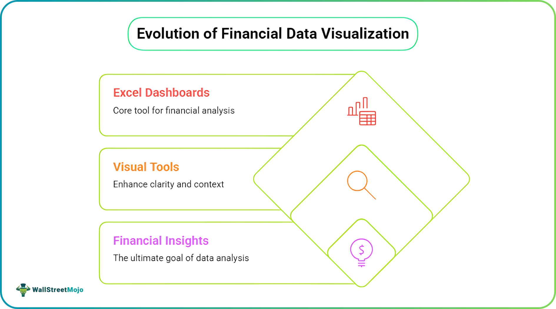
The future of financial visualization is not about replacing Excel dashboards. Instead, it is about complementing them with visual tools that add clarity, context, and narrative.
What Excel Dashboards Do Exceptionally Well
Before exploring what comes next, it is important to recognize the strengths of Excel dashboards. Excel remains one of the most powerful and flexible tools available to finance professionals. Its dominance is not accidental.
Excel dashboards excel at quantitative analysis. They allow users to organize large datasets, apply formulas, and run complex financial models. This makes them indispensable for core finance tasks.
Common strengths of Excel dashboards include:
- Real-time calculations and updates
- Financial modeling and forecasting
- KPI tracking and variance analysis
- Scenario and sensitivity analysis
Excel also offers transparency. Every calculation can be audited, reviewed, and adjusted, which is critical in finance. For analytical accuracy, dashboards remain unmatched.
The Communication Gap in Financial Dashboards
Despite their strengths, Excel dashboards struggle with communication. They are built to analyze data, not to explain it. This limitation becomes clear during presentations and reports.
Dashboards often assume the viewer understands financial logic and terminology. Stakeholders such as executives, investors, or clients may not share this background. As a result, insights can be misunderstood or ignored.
Another challenge is information overload. Dashboards frequently display multiple charts, tables, and metrics at once. Instead of clarifying insights, they can overwhelm the audience.
Why Numbers Alone Rarely Tell the Full Story
Financial decisions are rarely based on numbers alone. They are influenced by context, assumptions, and strategic intent. Dashboards typically show outcomes but not reasoning.
For example, a revenue decline chart shows what happened. It does not explain why it happened or how management plans to respond. This missing layer limits effective decision-making.
Finance professionals are increasingly expected to translate analysis into insight. That translation requires explanation, not just calculation.
The Shift Toward Narrative-Driven Financial Visualization
To address these gaps, financial communication is moving toward narrative-driven visualization. This approach combines data with explanation to guide understanding. The goal is not decoration, but clarity.
Narrative visualization helps audiences follow a logical flow. It connects data points to strategy, risk, and future outcomes. This is especially important in high-stakes financial discussions.
This shift reflects a broader reality. Financial professionals are now communicators as much as analysts.
Why Traditional Visualization Tools Have Limits
Tools like Power BI and Tableau enhance dashboards, but they still focus on chart-based outputs. They are optimized for structured data visualization. Abstract or conceptual explanations remain difficult.
These tools also require time and design effort to customize visuals. Creating process diagrams or strategic frameworks is often inefficient. As a result, many explanations remain verbal rather than visual.
This is where complementary visual approaches, like ai image generators, become necessary. Dashboards show performance, but other visuals explain meaning.
Introducing a Complementary Layer to Dashboards
Modern financial visualization is increasingly layered. Each layer serves a different purpose. Dashboards remain the analytical foundation.
On top of dashboards, explanatory visuals add context. These visuals focus on understanding rather than measurement. Together, they create a more complete communication system.
This layered approach reflects how people actually process information. Data provides evidence, while visuals provide interpretation.
How AI Image Generators Fit Into Financial Visualization
AI image generators have emerged as tools for creating explanatory visuals quickly. They convert text descriptions into custom images. In finance, their value lies in explanation rather than creativity.
An AI image generator can be used to create supporting visuals for Excel dashboards. These visuals help explain relationships, assumptions, and processes that dashboards cannot easily show. The result is improved clarity without changing the underlying data.
Importantly, AI image generators do not replace analytical tools. They act as a communication bridge between data and decision-makers. You can pair these tools with chat AI tools for better explanation of data.
Types of Financial Visuals Dashboards Cannot Easily Create
Dashboards are excellent at charts and tables. They struggle with conceptual representation. This is where AI-generated visuals add value.
Examples of visuals dashboards cannot easily produce include:
- Cash flow cycles and money movement diagrams
- Risk exposure frameworks
- Business model structures
- Forecast assumption illustrations
These visuals explain how systems work rather than how numbers change. They support understanding at a higher level.
Use Case: Board and Executive Presentations
Board members often focus on strategic implications rather than raw data. Dashboards alone may not align with this perspective. Visual explanations help bridge the gap.
AI-generated visuals can illustrate strategy, risk, or long-term impact. They provide context before dashboards are reviewed. This leads to more productive discussions.
In this setting, visuals act as guides. Dashboards then serve as supporting evidence.
Use Case: Investor Pitch Decks
Investor communication relies heavily on storytelling. Financial models are critical, but they must be understood quickly. Dense spreadsheets rarely achieve this goal.
AI-generated visuals can illustrate growth logic, market positioning, or scalability. These visuals help investors grasp the story behind the numbers. Dashboards then validate the claims.
This combination strengthens credibility and clarity. It also reduces reliance on lengthy explanations.
Use Case: Financial Education and Training
Finance education often struggles with abstraction. Concepts like cash flow, leverage, or valuation can be difficult to visualize. Text and tables alone may not suffice.
AI image generators can create visual learning aids. These visuals support textbooks, courses, and internal training materials. They improve comprehension without oversimplifying content.
For students and trainees, visuals accelerate understanding. Dashboards then reinforce learning through practice.
Use Case: Client Reporting and Consulting
Consulting reports must communicate insights clearly and efficiently. Clients may not have deep financial expertise. Dashboards can appear intimidating.
Explanatory visuals help clients understand findings and recommendations. They provide structure and narrative to reports. Dashboards then offer detailed backup.
This approach improves trust and engagement. Clients understand not just the result, but the reasoning.
Best Practices for Combining Dashboards and AI-Generated Visuals
To be effective, visuals must be used intentionally. They should clarify, not distract. Each tool should serve a distinct purpose.
Best practices include:
- Use dashboards for metrics and performance tracking
- Use AI-generated visuals for explanation and context
- Keep visuals simple and accurate
- Align visuals with financial logic
This balance preserves analytical rigor while improving communication.
Avoiding Common Pitfalls in Visual Financial Communication
Visuals can mislead if used carelessly.
- Oversimplification is a common risk. Financial nuance must not be lost.
- Another risk is visual bias. Images can influence perception more strongly than data. This makes validation essential.
Finance professionals remain responsible for accuracy. Visuals should support judgment, not replace it.
Ethical and Practical Considerations
AI-generated visuals must be reviewed carefully. They reflect prompts, not expertise. Human oversight is essential.
Transparency also matters. Stakeholders should understand that visuals are illustrative. They are not substitutes for data.
Used responsibly, AI image generators enhance communication. Used poorly, they can undermine trust.
Conclusion
Excel dashboards remain essential to financial analysis. Their role is secure and irreplaceable. However, their limitations in communication are increasingly apparent. The future of financial data visualization is layered. Dashboards provide data, while explanatory visuals provide meaning.
Together, they create clarity. Finance professionals who adopt this approach will communicate insights more effectively. In a complex financial world, clarity is a competitive advantage.
