Table of Contents
What Is Heatmap?
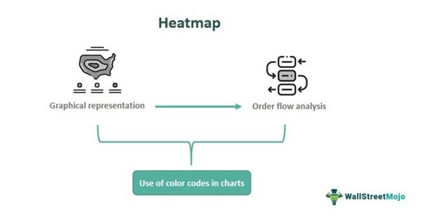
Heatmap is a tool or method to visually represent data with colors, where each color depicts a different value. It is used in various fields like business, weather, real estate, sports, biology, etc. to derive beneficial results. But it is widely used in the financial market.
The color variation often shows how strong, dense, or intense the value is. The map is usually represented using two axes and is divided into grids or cells. This practice of using colored matrices is not new in the statistical and analytical field, even though they provide very limited information about the topic.
Key Takeaways
- Heatmaps are a visual depiction of data in a map that denote the intensity of any value using colors.
- It is frequently used in statistical and analytical studies using limited information.
- It is used in a variety of fields, like weather, sports, medicine, real estate, engineering, marketing, etc. It has gained a lot of importance in the financial market for trading purposes over the years.
- It gives an idea about the situation at a glance, without much analysis, and is, thus, easy to read and understand.
Heatmap In Trading Explained
A heatmap is a tool to visually represent data or information with colors, where each color has its significance, depicting intensity or strength. It has gained importance over the years in various fields of study and is easy to understand and interpret.
It gives a quick result and is quite a time-saving technique for analysis purposes, giving a wholesome and comprehensive view of the overall situation. Data is usually shown using graphs or charts, where each cell has a particular color of its own.
In trading and financial markets, heatmap stocks hold quite a considerable significance. Even though it is not an indicator to identify market trends of entry and exit levels, it gives information about market conditions in general. However, in trading, the horizontal or the x-axis will show the time, and the vertical or y-axis will show the price of the asset in the graph. In the order flow, the financial instruments that are traded more will display hotter colors like red or orange. Traders can also identify support and resistance levels using it. Any color change will denote a change in the order flow.
How To Use?
There is a systematic approach to using a heatmap website that gives a clear insight into the market conditions. The steps for the same are given below.
- Firstly, it is essential to identify a dependable and valuable heatmap tool that can be customized as per the user’s need, provide reliable data, and be user-friendly.
- Next comes the time frame for trading in heatmap stocks. It can be intra-day, medium-term, or for long-term investing, depending on the trading objective.
- The prices are depicted in the vertical axis. The fluctuations in prices will help decide the interval of prices on the y-axis. Small intervals will provide a detailed view, and if intervals are large, they provide a broader overview.
- Next, it is essential to understand the color changes. Hot colors with red and orange will show high order levels, and light colors like blue and green will show that the order activity level is low. Traders will tend to focus more on solid colors because they will show essential price levels and buy or sell pressure. This will help identify the entry and exit levels.
- Next, the trader should put equal preference in understanding how the color patterns are changing. This will signify shifts in market sentiments.
Apart from the above steps, the trader should keep in mind that this process is not a standalone method to trade. Many important indicators should be used in combination with the heat map, which includes oscillators, candlestick patterns, trend lines, etc. Along with the above, the trader should also analyze the financial instrument fundamentally to get a clearer idea about the market. It is possible to refine the skills through experience and repeated use of the concept.
Chart
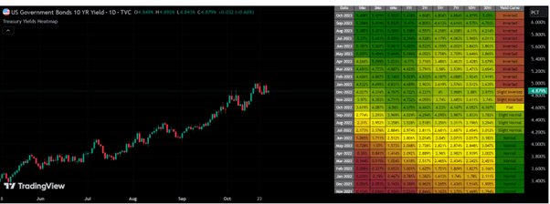
The concept of a heatmap chart can be explained using a chart from TradingView, as given below. In the chart of US Government bonds, a study is made based on 10-year yield. There is a heatmap table that establishes a correlation between the yield and their corresponding dates; in the yield curve column of the heatmap chart, which is the last column, the status of the yield curve is mentioned, which uses Pearson’s linear regression coefficient. Traders will be able to track the bond values and enable the selection of proper bonds that will be profitable investments in the long run.
Examples
Here are some suitable examples that will explain the concept of a heatmap website.
Example #1
Jack is a medium-term investor who wants to invest in ABC Corporation's stock. Along with other indicators, he also refers to heat maps to understand the market sentiments. For this particular stock, he has noticed that the map shows that during the current month, the colors shown are deep red and orange, indicating a high buying and selling taking place. Correspondingly, in the chart, candlesticks show an uptrend with huge volume. Jack decides on an entry point at this level. After holding the stock for six months, he notices that the color of the heat map for the current price has turned green, indicating a turnaround very soon. This is the time he prepares for an exit from the stock.
Example #2
Another example of using the concept is given in this example. Mac has identified several green stocks in the heat map. After doing a fundamental analysis of these stocks, he finds that they are strong ones with sound financials and stable management. These are good stocks for potential investments, and Mac has decided to invest in some of them in sound volume.
Advantages & Disadvantages
This self-explanatory tool is ubiquitous among users who may not be accustomed to reading and interpreting complex data or charts for detailed analysis. Its numerous applications using color schemes have their advantages and disadvantages.
Advantages
- Heatmap analysis is visually attractive and makes it easy to analyze the order flow. The color codes help identify the activity levels clearly.
- Since hot and light colors are used to depict activity levels, traders can understand at what prices higher buy and sell is taking place. This helps to assess the market sentiments and trends.
- Even support and resistance levels are visible from the heat map. This depends on the order density, and traders can note those levels to look for a breakout either upwards or downwards.
- This concept can be used to change strategies and adjust treading techniques based on market movement through the identification of patterns and reversals.
Disadvantages
- This process depends on how accurate data is fed into it. Therefore, if the data is delayed or not reliable, the result may not be effective.
- Heatmap analysis does not take into account other factors that influence market conditions, such as financial news and political and socio-economic factors.
- Market conditions like volatility and liquidity also influence heatmaps. Thus, sometimes, such factors lead to inaccurate results.
- The interpretation of many results is subjective results. The analysis may be biased because interpretation depends on the discretion of the trader.
Therefore, the concept may have many uses. Still, traders should use it with proper understanding and in combination with other studies and technical methods that give more detailed insight into the topic.

