Table of Contents
What Is Renko Chart?
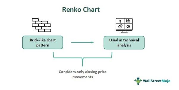
Renco chart is a chart pattern used in technical analysis, which is based on price movements. This chart pattern forms brick-like structures, and the term is derived from the Japanese word “Renga,” meaning bricks.
A series of bricks are created when price movements take place, each placed at an angle of 45 degrees, which may be up or down of the previous brick. They filter out small movements in prices, making it easier for traders to spot any price trend and give the chart a uniform appearance.
Key Takeaways
- Renco chart is a chart pattern used in technical analysis where there are brick-like structures instead of candlesticks.
- It is a Japanese pattern, where each brick is placed at a 45-degree angle, and they do not occur exactly beside one another.
- They filter out any small price movements, and thus, traders are able to identify and analyze trends very quickly.
- The bricks are constructed as per the closing prices, based on the chart’s time frame.
Renko Chart Explained
Renco chart is a chart pattern that is widely used in technical analysis, but it forms bricks instead of candlesticks. It is a Japanese concept where bricks are called “Renga.” Each brick appears either up or down from the previous brick at an angle of 45 degrees. Therefore, they are never beside each other.
The main focus of the structures of the Renko chart strategy is on price movements and not time intervals. The bricks that go up are typically green, and the ones that go down are red. They do not consider small price movements and catch the large and significant ones, allowing traders to identify trends quickly.
The chart's appearance is relatively uniform in comparison to candlesticks. Even though intra-day traders also use it, the concept is more prevalent among position or swing traders. The size of the bricks is an essential consideration for traders in this case.
The bricks in Renko chart patterns are also sometimes called boxes, and the box size is based on the price. The time scale is not the same for all bricks, and therefore, the brick’s formation will depend on the time taken for the price to change. The structures are formed based on closing prices for the selected time frame.
How To Read?
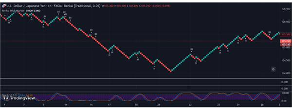
It is possible to understand the concept of Renko chart strategy using a TradingView chart. In the chart given below, the brick-like structures are visible instead of candlesticks. When the price movement is downward, the color is red, and the upward movement is green, quite like candlestick charts. Here, the trader will have to select the size of each brick or box, which will represent the magnitude of the price change.
Since the brick formation is dependent on closing prices, the new brick appears once the price crosses the brick size selected. As clearly visible in the chart, none of the bricks are precisely beside each other. After going up, if the price again drops back to the initially selected size, there will be no new brick. It will have to go below the selected size to get a new brick.
Depending on price fluctuation, there may be many bricks in a day, or one brick may take many days to form, unlike candlesticks, where every time interval will have a new candle.
How To Trade?
This pattern is used for trading when the bricks change the colors from green to red for a downtrend and red to green for an uptrend, signifying trend changes. Therefore, when the color changes from green to red, typically, the trader will have to enter a short position either or sell off their holding because the prices are showing a tendency to go down.
However, in case of a change in color from red to green, the trader will enter the market or buy the financial instrument with the anticipation that the price will go up in the near future.
It is often used to identify support and resistance. This happens when the bricks repeatedly turn higher or lower near a particular price point. This will represent support or resistance. Traders can make trade decisions in such areas, like buying at the support level and shorting at resistances. Traders also look for breakouts to identify the beginning of a new trend.
Examples
Below are some examples of how to understand the concept of Renko chart patterns.
Example #1
James is a long-term investor who is using the Renco chart to analyze the stock of XYZ Pharma and wants to locate an entry point since the stock has good prospects in the pharmaceutical industry. He uses a brick size of $2, and any price move of less than $2 will not be considered. After a brief downtrend marked by red boxes, the stock shoots up, showing green boxes one after another. This is a good entry point for James.
Example #2
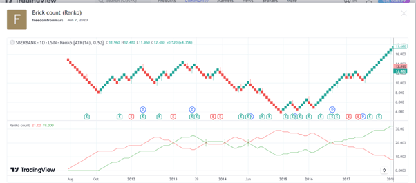
In the chart from TradingView, given below, a trader can understand the role of bricks in estimating the trend in the market in the Renko chart settings for intraday or long term. It is reasonable and correct to assume that if red bricks occur at a stretch and more than green bricks, then there is a downtrend, signaling traders to sell their stocks or go short. The opposite is true in case green bricks occur more continuously than red ones, signaling traders to enter the market.
Advantages And Disadvantages
The concept of Renko chart analysis has certain advantages and disadvantages, as mentioned below.
Advantages
- It is a pattern that can be used to identify and use trends simply and systematically.
- Support and resistance levels are also evident for trading purposes.
- It eliminates too much noise of fluctuations in prices and only takes the strong ones. This reduces confusion and simplifies the chart, which is not possible using candlesticks.
- It allows traders to customize their settings related to brick formation to suit their trading requirements.
- Any timeframe can be used for Renko chart analysis purposes.
- Its accuracy levels are much higher than that of candlesticks, giving more precise buy and sell points.
Disadvantages
- Like any other technical indicator, this pattern is also not a perfect one. It sometimes gives false signals in a choppy market, confusing traders and making them make incorrect decisions.
- Renko chart settings for intraday or long-term eliminate many essential data or information from the charts, which may be helpful for traders because it does not consider small price movements.
- Sometimes, there are many bricks formed just before the close of the trading session, and this leads to a loss of the entry point or a good trading opportunity.
- The setting of brick size is very crucial. Brick size for past data may not suit future price movements or may not work in current market conditions either. Therefore, traders should be experienced enough to understand that.
Renko Chart Vs Candlestick Vs Heiken Ashi
All the above are technical chart patterns that use price movements for trade decisions. But some crucial differences between them are as follows:
| Renko Chart | Candlesticks | Heiken Ashi |
|---|---|---|
| 1) Eliminate small price moves and disturbances. | Accounts for small price moves. | Eliminate small price moves and disturbances. |
| 2) Bricks instead of candlesticks. | Standard candlesticks | Modified candlesticks |
| 3) Suitable for long-term. | Suitable for both short and long term. | Suitable for the short term. |
| 4) Suitable for price reversals. | Good for reversals and trends analysis. | Suitable for identifying trends. |
