Table of Contents
What Is A Correlogram?
A correlogram is the graphical representation of the relationship between each variable pair of a dataset. It elaborates on the auto-correlation between data pairs at different time frames. It is a visualized correlation like a bubble, line or number through a symbol or scatterplot to analyze the relationship.
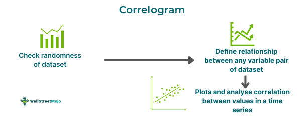
It is also known as a correlation matrix or an autocorrelation function (ACF) plot. It helps in verifying the randomness in a dataset. It is mostly used with an exploratory objective and not an explanatory purpose. The most important aspect of a correlogram is to provide a quick and steady overview of the whole dataset.
Key Takeaways
- Correlograms are graphically plotted explanations of the relationship between each numeric variable pair of a dataset.
- It has a wide scope of applications with Python, R, MATLAB and time series analysis, diagnosing autocorrelation and is also called ACF plot or correlation matrix.
- Random auto-correlations near zero will be present in any time lag separation, but if not random, then one or more autocorrelations will be non-zero.
- At times when the ACF plot doesn’t help, there is a partial autocorrelation function plot, which assists in shorter time lags to identify important correlations to fit in the model.
Correlogram Explained
A correlogram is a statistical tool to measure the randomness of any given dataset. The randomness is gauged by calculating the autocorrelation of data values present in the dataset. In time series analysis, correlograms are called autocorrelation plots used to depict the serial correlation in data that is not constant with time.
Correlations are a major part of descriptive statistics, which allows the researcher to study the relationship between two variables. Still, the problem is that it can be measured between two variables at a time. This limitation makes the entire process time-consuming and tiring, especially with datasets with multiple variables. It is where the correlogram comes into play as it displays the correlation in a matrix and indicates the coefficient of correlations for all possible combinations of two variables in a dataset.
When it comes to checking randomness, the correlogram helps in verifying the data by measuring the correlation values at different time lags. There are mainly two ways the ACF method measures and plots the average correlation between data points with a given time lag and does not account for any effect or influence of other interventions. The partial ACF (PACF) rectifies it by doing the same correlation calculation but controlling the values at shorter lags.
Both correlogram and partial correlogram plots are just one tool used for time series analysis and forecasting. By analyzing the correlation at different time lags, the important lags are identified to fit in a time series model for accurate forecasting.
How To Read?
The correlogram interpretation follows -
With time series data, the correlogram assesses the data’s autocorrelation to identify dependencies and patterns between time lags. The two common tools for this analysis are the autocorrelation function (ACF) and the partial autocorrelation function (PACF).
The ACF represents the correlation between a time series and its lagged version. It assists in seeking the number of lags required for a time series model. For instance, if the autocorrelation function depicts a strong correlation between the time series and has three lag values, then the time series model that comprises these lags would be a suitable fit.
In contrast, the partial autocorrelation function showcases the correlation, including its lagged value, after adjusting for the shorter lag correlations. Hence, it helps in notifying the important lags to include in a time series model along with the seasonal patterns.
To read the ACF and PACF plots, a researcher may look for patterns such as -
- A sharp cutoff in the autocorrelation function plot at a specific time lag indicates a time series model with a similar number of lags as a suitable fit. On the contrary, if the correlogram plot is slowly declining, it signifies a trend in the data.
- Conversely, a slowly declining partial correlogram plot indicates seasonality in data. But if there is a sharp cutoff at a particular time lag, it exhibits seasonal pattern presence in the data.
- In any time lag separation, there will be random auto-correlations present near zero, but if not random, then one or more autocorrelations will be non-zero.
Graph

Graph reference - https://www.statisticshowto.com/correlogram/
The above graph depicts the correlogram in R. The horizontal axis is the time lag, and the vertical axis is the correlation coefficient.
In the first graph, the correlation is dispersed, and hence, no pattern or trend is identified in it, ultimately resulting in so important correlation existence. In contrast, in the second graph. The correlation points at different time lags make an upward trend. It simply defines the existence of high autocorrelation.
Examples
Below are two examples of correlogram -
Example #1
In finance, the correlogram can diagnose and analyze financial data. Suppose Michael is an investor who can use autocorrelation to calculate the level to which two securities move in association with each other and then utilize it for advanced portfolio management. Correlograms can help Michael in elaborating on patterns and data trends to offer insights based on which Michael can understand financial variables and make informed decisions.
Similarly, correlograms help in defining the relationship between each variable data pair in a dataset. So, for instance, it can be used by the water department of any particular city, state or town to predict the repair and replacement of city water pipelines or upgrade water systems.
Example #2
The second example of a correlogram comes from the Global Navigation Satellite System (GNSS), which is used to offer navigation services across autonomous driving vehicles to handheld commercial devices. The problems occur in urban canyons that create a multipath (MP) and non-line of sight (NLOS) reception that induces delay errors in the ranging measurement.
A new grid based maximum likelihood estimation algorithm by using pseudorange measurements to achieve the correlogram on predefined searching space. The correlations are devised directly by comparing the velocity and timing with the incoming pseudo-range. With the growth of GNSS applications, mitigating such errors has become a priority.
