What Is a Venn Diagram?
A Venn Diagram is a type of pictorial representation of various data sets that are related to each other other and is an integral part of the set theory. It is often used in Excel and is a kind of Excel chart used to analyze the relationship between two or more groups through intersecting parts of the circles.
Venn Diagram Examples Excel Template
Download Excel Template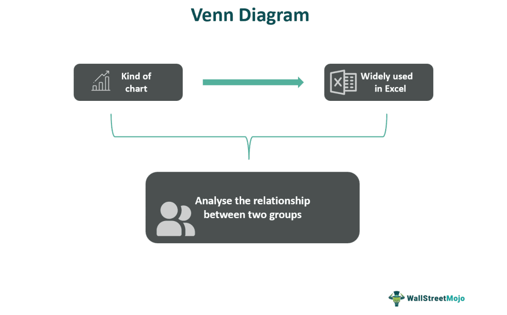
In Excel Venn Diagrams, each group is represented by one circle. It is easy to create, use, and edit the Venn Diagrams as per user requirements. The intersecting circles illustrate the differences, similarities, and relationships among the various groups, categories, ideas, and concepts.
Key Takeaways
- The Venn Diagram is a circular chart typethat represents data in the form of overlapping circles where the overlapped parts are the similarities, and the non-overlapped parts are the difference between the data categories under considerations.
- The different types of Venn diagram display data in different ways, namely,
- Basic Venn – We can use two, three, or four circles to display multiple categories.Stacked Venn – The circular Venn will be stacked one above the other.Radical Venn – The variables don’t overlap, except with the total or the main data.
Venn Diagram Explained
A Venn diagram is a method or a pictorial representation of the relationship between two or more sets of data and is based on the concept of set theory. The overlapping circles in the pictures show the common groups or the differences between these groups.
These diagrams serve as a way in which things can be organized graphically because they help identify how any item is similar to or different from another. They may also be referred to as logic or set diagrams and have a wide range of comprehension uses in the fields of statistics, mathematics, business, computer science, teaching, etc. They are very often taught at the school level itself. The diagrams taught at the school level are usually quite simple and easy to understand their logic. But as the education level increases, this chapter is made complex and involves study and usage in a wide variety of fields. Starting from two, there may be six or sometimes seven topics or data sets that need to be depicted in the Venn diagram symbols and may also be in a 3-D form, which is quite sophisticated. It allows clear and precise visualization of data and is commonly used in Excel for making reports and presentations. Even if there is no data in a set, a Venn diagram can still be used to depict it.
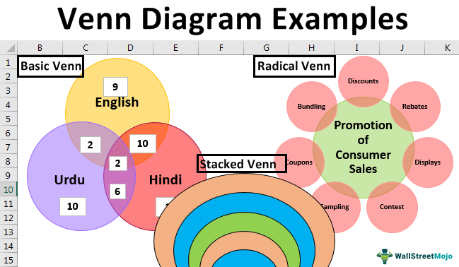
For example, in the image below, we see three generated Venn Diagrams, i.e., Languages, Consumer Sales, etc., represented with three different Venn Diagram types, Basic, Radical, and Stacked, respectively. Here, the Non-overlapping parts indicate the differences between the categories, and the overlapping parts illustrate the similarities.
History
Let us learn how this diagrammatic representation of Venn diagram symbols came into existence. This method is named after a British logician named John Venn, because in the year 1880, he wrote a paper named Diagrammatic And Mechanical Representation of Propositions and Reasonings. His work was published in the Journal of Science and also in Philosophical Magazine.
But it is interesting to note that as far as some 600 years back, philosopher Ramon Llull used similar concepts and pictures, as per information provided by writer M.E. Baron in her article published in 1969, in which she also mentioned about similar diagrams being used in late 1600s by philosopher Gottfried Wilhelm von Leibnitz.
However, Venn Diagram can be directly connected to the Euler Diagram the Swiss mathematician Leonard Euler introduced. Since then it can continued to gain importance in different fields and various mathematical experts are working on it to make it more usable and interesting.
Some noteworthy names in this field are A.W.F. Edwards, Henry John Stephen Smith and Branko Grunbaum who have contributed their valuable knowledge to make them simpler.
Examples
We will consider different types of Venn Diagram with specific examples, namely,
- Basic Venn Diagram with two circles.
- Basic Venn Diagram with three circles.
- Stacked Venn Diagram.
- Radical Venn Diagram.
Below are examples of the Venn Diagram in Excel.
Example #1: Basic Venn Diagram with two circles
The steps to create a Basic Venn Diagram with two circles are as follows:
Step 1: Open the Excel workbook.
Step 2: Note down the group of categories that you want to capture in the Venn Diagram.
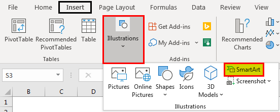
Step 3: Go to the “Insert” tab, and click the “SmartArt” option.
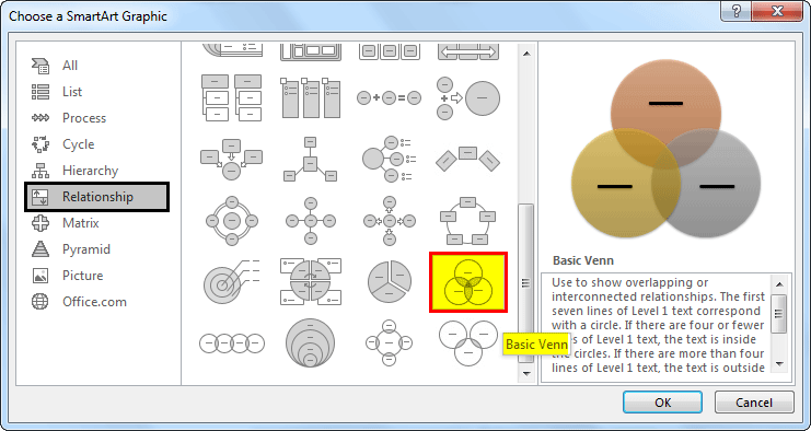
Choose a SmartArt Graphic dialog box that will be opened, as shown in the figure.
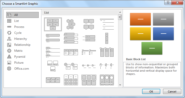
Step 4: Select the “Relationship” category, and choose the “Basic Venn Diagram”.
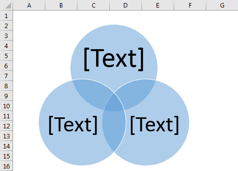
The diagram is inserted, as shown in the figure.
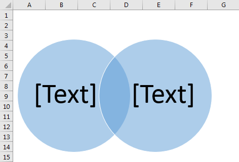
Step 5: We want only two circles. Therefore, click on any circle, and press the “Delete” key. Automatically, one circle is deleted, as shown below.
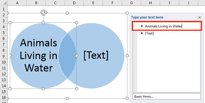
Step 6: Add content to the non-overlapping circles. We can do it in three ways:
- First, click the “Text pane”, and add content next to the bullet points.
- Second, copy content from another place, and directly paste it into the “text pane”.
- Third, click now into the circles, and add content to them.
To add content to the circles, use the “Text” box, as shown in the figure, and apply formatting to the circles to enhance their appearance.

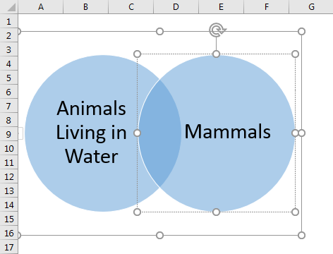
Step 7: Add content to the overlapping part of the circles.

The overlapping part indicates that the whale belongs to both categories, including “Mammals” and “Animals living in the water”.
Example #2: Basic Venn Diagram with three circles
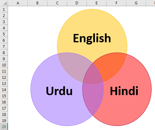
We will create a Venn Diagram with three circles for 40 students of a class who speak different languages.
Note: 10 students speak only English and Hindi but not Urdu. In addition, 6 students speak only Hindi and Urdu but not English, 2 students speak English and Urdu but not Hindi, 2 students speak all three languages, 1 student speaks only Hindi, 9 students speak only English, and 10 students speak only Urdu.
The steps to create aBasic Venn Diagram with two circlesare as follows:
- Open the Excel workbook.
- Note down the group of categories that you want to capture into the Venn Diagram.
- Go to the “Insert” tab, and click the “SmartArt” option. Next, select the “Relationship” category and the “Basic” Venn Diagram.

- Enter the three languages, Hindi, English, and Urdu, in the non-overlapping circlesin a 3 circle Venn diagram.

- Add content to the overlapping and non-overlapping portions to understand the relationship among the three circles.

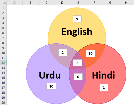
The following equation establishes the relationship among the students speaking different languages in a 3 circle Venn diagram.
Total students (40) = 10+1+9+10+2+2+6
Example #3: Stacked Venn Diagram
We will create the stacked Venn diagram in Excel to represent the overlapped relationships.
The steps to create a Stacked Venn Diagram are as follows:
Step 1: Open the Excel workbook.
Step 2: Note down the group of categories that you want to capture in the Venn Diagram.
Step 3: Go to the “Insert” tab, and click the “SmartArt” option. Select the “Relationship” category, and choose the “Stacked Venn” diagram.
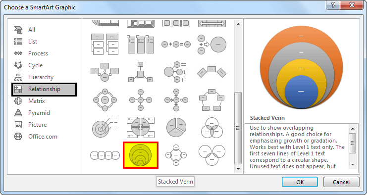
Step 4: The diagram will be displayed in the figure below.
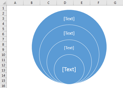
Step 5:
- Select a diagram.
- Click on the “Text pane”.
- Add content next to the bullet points.
- Apply the required formatting to the Venn Diagram.

Step 6: Use the text box to add content to each concentric circle.
Drag the text boxes to the Stacked Venn Diagram, and place it in research philosophy circles. Similarly, do for remaining circles also. The Venn Diagram will be changed, as shown in the screenshot.
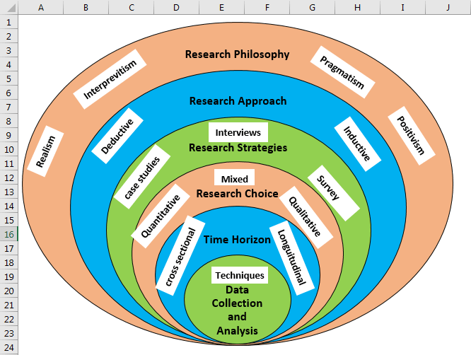
The Onion model research process is clearly described in the above Stacked Venn Diagram. The main purpose of this diagram is to narrow a broad topic of the research process.
Example #4: Radical Venn Diagram
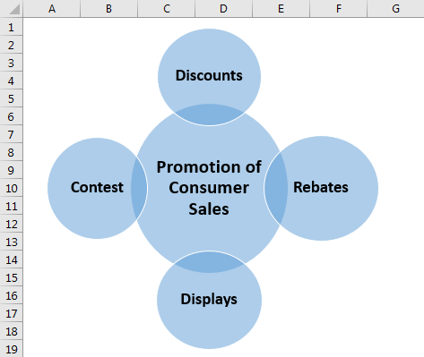
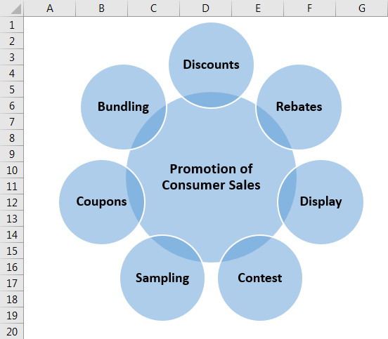
We will create the Radical Venn Diagram in Excel by selecting an example of methods to improve consumer sales.
Step 1: Open the Excel workbook
Step 2: Note down the group of categories that you want to capture in the Venn Diagram.
Step 3: Go to the “Insert” tab and click the “SmartArt” option. Select the Relationship category and choose the “Radical Venn” diagram.
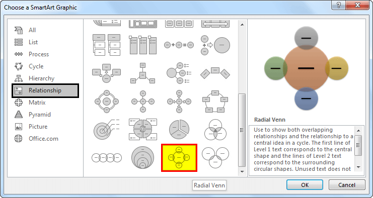
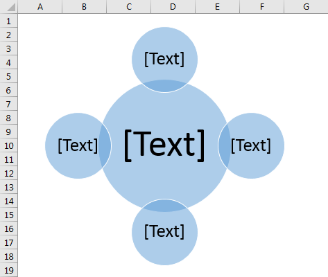
Step 4: The “Radial Venn” diagram will be displayed, as shown below.
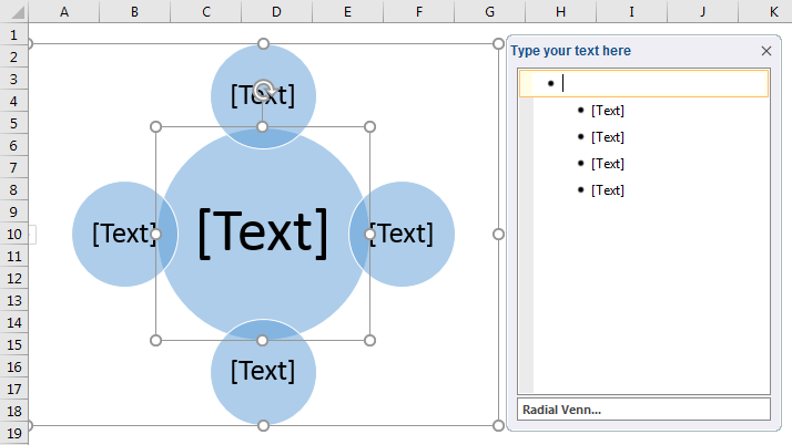
Step 5: Click on the “Text” pane, and add content next to the bullet points.
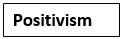
Step 6: Add content to the circles regarding the methods used in consumer sales improvement, as shown in the figure.
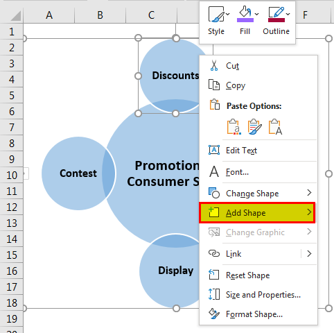
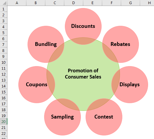
If we want to add an extra circle to the diagram, right-click on the diagram, and select “Add Shape” or press the “ENTER” key in the text pane.
Step 7: Add text to newly added circles, and modify the diagram.
Step 8: Apply different formats, and change the colors of the circles to add more appearance.
From this diagram, it is clear that one must follow the methods mentioned in outer circles to enhance consumer sales.
How To Do?
Creating a Venn Diagram is quite easy and interesting. There are some basic steps that can be followed to create it as given below:
- We need to understand are they data or type of information that we are trying to compare and derive conclusion.
- Next, for Venn diagram in math or any other field, we brainstorm and create a list of ideas or data sets that will be compared. This will allow us to get closer to out goal and understand why we are actually trying to compare them.
- Next, we create the diagram to compare and contrast them and make observations, puttin’ forward our own ideas and decisions.
In case we are drawing Venn diagram probability in an excel, the following steps will help.
- To place the text box properly into the Venn Diagram, drag it to the required place when crossed arrows are displayed.
- To apply the format to the text presented in the text box, use the formatting options shown in the “Font” group on the “Home” tab.
- We must use the “Design” tab to add glow, soft edges, effects, colors, and SmartArt styles.
Venn Diagram Vs Euler Diagram
Both the above illustrations are related to the set theory and show relationship between two or more sets of data. But there are some differences between them as follows:
- The Venn diagram in math or any other field will depict all kinds of logical relationship between sets, but the latter show only those relationships that make sense in the real world.
- Overlapping may exist in both the cases but in case of the former, the overlapping relation, region or information is shown in the shared area. But in case of the latter, there are also nested or common data that may be related to each other, but there is no shared area.
- The Venn diagram probability is designed in such a way so that are possible combinations will be depicted, making it complete. But the latter may not be complete, meaning they may not show all possible combinations.
- The former usually has limited expressions and explanations and can only use union, intersection or differences. But the latter can use shapes to show a larger variety of relations between data sets.
- Complexity increases in case of the former if the data is more than 3 sets because the diagram becomes overcrowded. But this is not the case with latter since there is no shared area. More data range can be represented for interpretation and use.
Thus, the above are some important points of differences between the two types of diagrams.
Frequently Asked Questions (FAQs)
1. Why do we use a Venn Diagram in Excel?
The Venn diagram is a graphical representation of the logical relationship between two or more data variables or categories.
We use it to illustrate the similarities and differences between various groups and concepts, in the form of overlapping circles.
We can insert a Venn diagram from the SmartArt category available in the Insert tab.
2. Name the different types of Venn Diagrams.
The different types of Venn Diagram are,
1. Basic Venn Diagram.
2. Stacked Venn Diagram.
3. Radical Venn Diagram.
3. Where is the Venn Diagram in Excel found?
Open an Excel workbook with the dataset.
First, select the “Insert” tab – go to the “Illustrations” group – click the “Illustrations” option drop-down – select the “SmartArt” option, as shown below.
The “Choose a SmartArt Graphic” window appears.
Next, select the “Relationship” category on the left side, and the required Venn Diagram types from the right side. When we hover around the pictures on the right, the cursor will display the type names, such as Basic, Stacked, or Radical, then we can select the required Venn Diagram, as shown in the images below.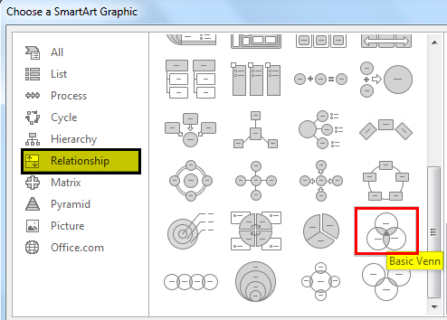

Download Template
This article must help understand Venn Diagram with its formulas and examples. You can download the template here to use it instantly.
Recommended Articles
This article has been a guide to what is a Venn Diagram. We explain it with examples, how to do it, differences with Euler Diagram and history. You can learn more about Excel from the following articles: –