What is a Grouped Bar Chart in Excel?
A grouped bar chart in excel shows the values of multiple categories (or groups) across different time periods. The data of every group is clubbed and presented in the form of a bar chart.
The grouped bar chart is slightly different from the simple bar chart. The former requires data to be arranged in a particular order, whereas no such arrangement is required for the latter.
How to Create a Grouped Bar Chart in Excel? (Step by Step)
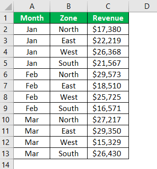
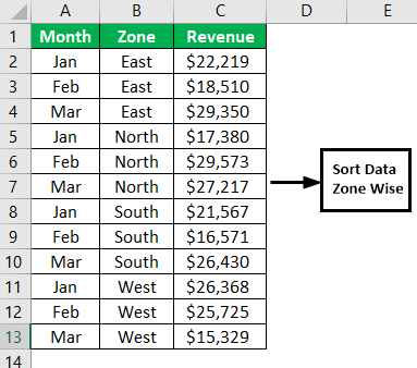
The monthly revenue generated from the different zones has been tabulated. There are three columns–“month,” “zone,” and “revenue.”
We want a chart for these numbers.
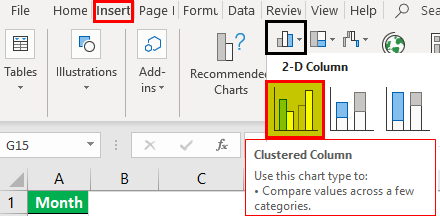
Let us insert a clustered column chart. The steps are mentioned as follows:
- Select the data and insert the clustered column chart (under the Insert tab).

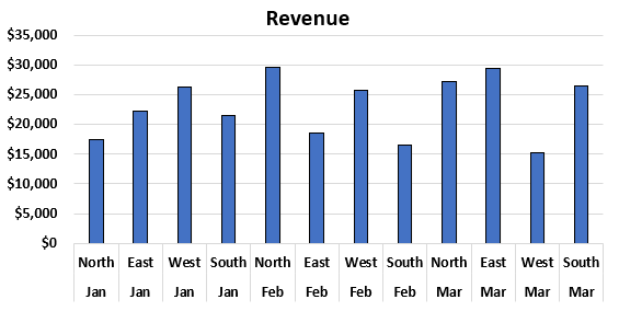
- Click “Ok,” and theclustered bar chartappears, as shown in the following image. The chart shows the revenues of different zones for a particular month.

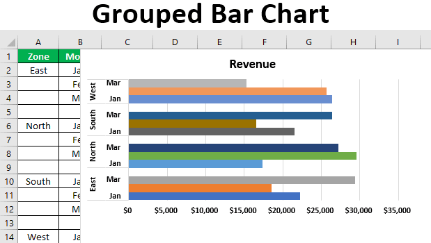
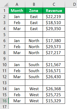
- Since the zonal data for every month is available, we create a zone-wise arrangement.

- The data of every zone are grouped together at one place. Insert a blank row after every zonal group.

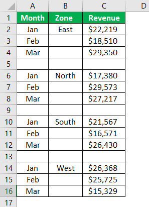
- Retain only one zone name and delete the remaining ones.

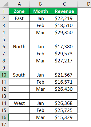
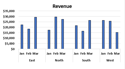
- Interchange the “month” and “zone” columns. Insert the clustered column chart for the data in the succeeding image.

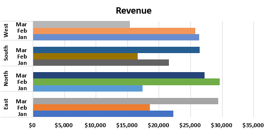
- The chart appears as shown in the following image. On the x-axis of the chart, the different months and zones are displayed.

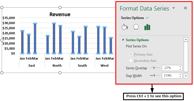
- To format the chart, select it and press “Ctrl+1.” The “format data series” box opens to the right of the chart.

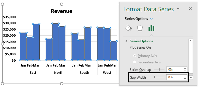
- In the “format data series” box, make the “gap width” 0%. With this, the bars of one category are combined together at one place.

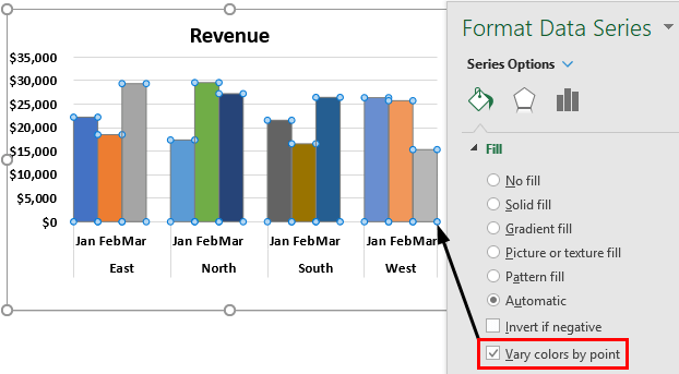
- With the same chart selection, go to the “fill” option in the “format data series” box. Select the check box “vary colors by point.” Every bar of the chart is displayed in a different color.

Conversion From Clustered Column Chart to Clustered Bar Chart
Let us convert the clustered column chart (created in the previous example) to the clustered bar chart. The steps to change the chart type are mentioned as follows:
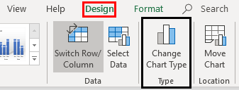
- Step 1: Select the chart. With the selection, the Design and Format tabs appear on the Excel ribbon. In the Design tab, choose “change chart type.”
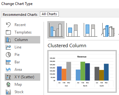
- Step 2: The “change chart type” window opens, as shown in the following image.
- Step 3: In the “all charts” tab, click on “bar.”
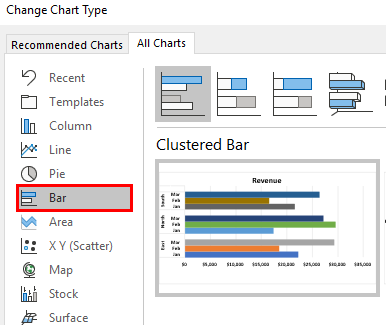
- Step 4: In the “bar” option, there are multiple chart types. Select the “clustered bar.” The preview of the clustered bar chart is shown in the succeeding image.
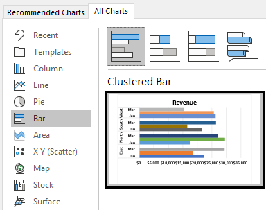
- Step 5: Click “Ok,” and the clustered column chart is converted into the clustered bar chart.
Recommended Articles
This has been a guide to the grouped bar chart. Here we discuss how to create a grouped bar chart in Excel along with a practical example and a downloadable template. You may learn more about Excel from the following articles –