What Is Combo Chart In Excel?
Excel combo chart is the combination of different chart types to show the different or same set of data related to each other. For example, we will have a two-axis with a normal chart, “X-axis” and “Y-axis.” However, this is not the same with combo charts because we will have two Y-axis instead of the traditional Y-axis.
For example, consider the below table showing the previous and current salaries of employees in an organization.

Now, let us create combo charts in Excel.
The steps are:
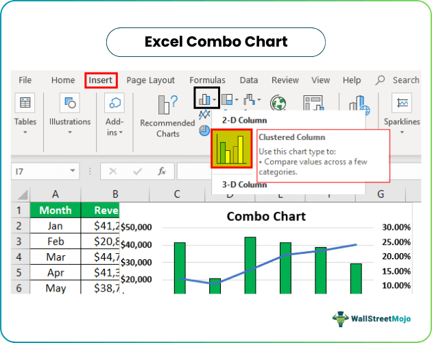
Step 1: To start with, select the entire table and click on Insert > 2D chart.
Step 2: Next, right-click on the chart and click on Change Chart Type.
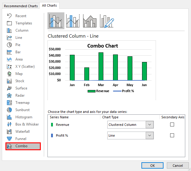
Step 3: The Change Chart Type window appears. Now, click on Combo and select the preferred chart options in Choose the chart type and axis for your data series: section.
Step 4: Click OK.
We can see an Excel combo chart as shown in the below image.

Likewise, we can use Excel Combo option to create combination charts in Excel.
Key Takeaways
- Excel combo chart is a combination of different chart types that display the same or different sets of data related to each other.
- A combo chart is a type of graphical display that presents two Y-axes instead of the standard single axis found in traditional charts.
- In this chart, to add a Y-axis on the right side of a chart, one must check the “Secondary Axis” box.
- You can customize the colors of a combo chart in Excel to suit your preferences.
How To Create Combo Chart In Excel?
Excel Combo chart, in simple terms is the combination chart in Excel. We can easily create combo charts. For example, consider the below table showing marks obtained by Allen in various subjects.
We will show how to create a combo chart with this Excel data.

The steps are:
- To start with, we must select the entire data.
- Next, go to Insert > Charts > Column Chart > Clustered Column Chart in Excel.
- Now, we will see a chart as shown below.

- Therefore, right-click and select “Change Chart Type.”
The window, Change Chart Type appears.

- Now, select the “Combo” option, at the bottom.
- Under “Combo,” we can see the option – Choose the chart type and axis for your data series:
- Click “OK.” We will have a combo chart as shown in the below image.

Likewise, we can create Excel combo charts. In this article, let us look at detailed examples.
Examples
Example #1
If you are in the data team with the management, you may require a lot of analysis. One such analysis is comparing revenue against the profit percentage.
For this example, we have created the below data.

We will show you how to create a combo chart with this Excel data.
Follow the below steps:
- We must select the entire data first.

- Then, go to Insert > Charts > Column Chart > Clustered Column Chart in Excel.

- Now, we will have a chart like the one below.
It is not the combo chart because we have only a column clustered chart here, so we need to change the “Profit %” data to the line chart.

- We first need to right-click and select “Change Chart Type.”
Now, we will see the below window.

- Now, select the “Combo” option, which is there right at the bottom.

- In this “Combo,” we can see a chart preview and various other recommended charts. The chart selects “Line” for the profit and checks the box “Secondary Axis.”

- Click on the “OK.” We will have a combo chart now.
We can see on the right-hand side of the chart that we have one more Y-axis, which represents the line chart numbers.


Now with this chart, we can make some easy interpretations.
- In Feb, we got the lowest revenue, and so did profit percentage.
- But, when we look at the June month, we have the second-lowest revenue, but the profit percentage is very high among all the other months.
- In Jan, even though revenue is 41261, the $ profit percentage is limited to just 12.5% only.
Example #2
Now, we have created slightly different data. Below is the data for this example.

Here, instead of a profit percentage, we have profit numbers, and in addition, we have units sold data as well.
So, here we need to decide which is to show in the secondary axis; this is key here. This time we will create a chart through manual steps.
Step 1: We must firstinsert a blank chart and right-click on the chart, and choose “Select Data.”

Step 2: In the below window, click on “Add.”

Step 3: In the below window, in “Series name,” choose B1 cell, and in “Series values,” select B2 to B7. Click on “OK.”

Step 4: Click on “Add.”

Step 5: In the below window, we need to select “Month” names. Click on “OK.”

Step 6: Repeat the same steps for “Profit%” and “Units Sold” data. As a result, now we will have a chart like the one below.

Step 7: Now, right-click and choose “Change Chart Type.”

Step 8: Select the “Combo” option from the below window. And for the “Units Sold” series name, choose the “Line” chart and check the box “Secondary Axis.”

Step 9: Now, for the “Profit%” series name, choose the “Area” chart but do not select the “Secondary Axis” checkbox.

Step 10: Now, we will have a chart like the one below.

Note: We have changed the series colors.
Important Things To Note
- These are the steps involved in the Excel 2016 version.
- It is necessary to check the box “Secondary Axis” to have the Y-axis on the right side.
- We can change the required colors as per the convenience.
Frequently Asked Questions (FAQs)
What are the benefits of a combo chart in Excel?
Combo charts are an excellent way to compare two different sets of data or to present data in a visually appealing and easy-to-understand manner. One of the main advantages of using a combo chart is that it enables you to demonstrate multiple data sets in a single chart, which can conserve space and simplify the process of comparing data.
How do I create a combo chart in Excel 2023?
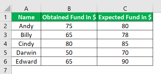
For example, consider the below table showing the funds collected by students in an educational institution.
Now, let us learn how to create combo charts in Excel.
The steps are:
Step 1: To start with, select the entire table and click on Insert > 2D chart.
Step 2: Next, right-click on the chart and click on Change Chart Type.
Step 3: The Change Chart Type window appears in Excel. Now, click on Combo and select the preferred chart options in Choose the chart type and axis for your data series: section.
Step 4: Finally, click OK.
We can see an Excel combo chart as shown in the below image.
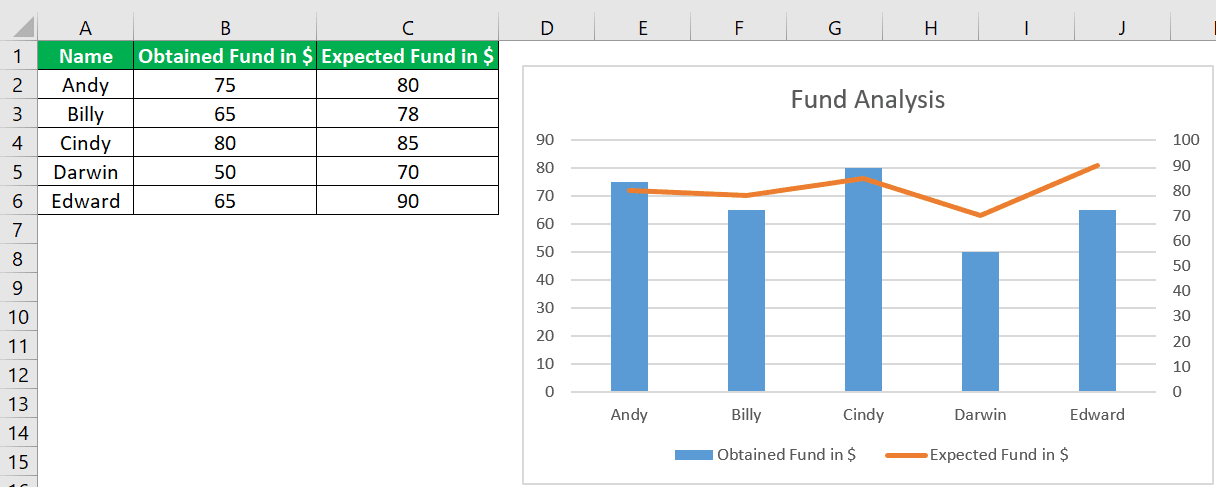
Likewise, we can use Excel Combo option to create useful and presentable combination charts in Excel.
What is a combo chart in Excel best used for?
Combination charts are a widely used type of visual representation that helps to distinguish and compare multiple data sets effectively. These charts are viral in the scientific, marketing, educational, and financial industries, where they enable users to analyze and interpret complex data clearly and concisely quickly. Whether you need to compare sales figures, track progress, or visualize trends, combination charts are an excellent tool for presenting data in an easily understandable format.
Recommended Articles
This article has been a guide to Excel Combo Chart. We discuss creating a combo (combination) chart in Excel, practical examples, and a downloadable Excel template. You may learn more about Excel from the following articles: –