Creating a Dashboard in Power BI
Dashboards can tell the story in a single page view and are also an interactive tool. So, Power BI is best suited to create such kinds of interactive dashboards. So, we will show you how to create an interactive sample sales dashboard in Power BI.
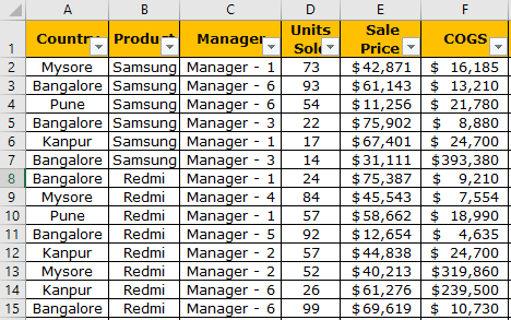
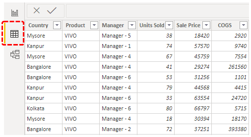
Below is the data we are using to build a dashboard. It is the dummy data of various mobile phones sold in different cities of India. You can download the Excel workbook to create a dashboard in Power BI.
How to Create a Sample Sales Dashboard in Power BI?
Follow the below steps to create a sample sales dashboard in power bi.
Upload Data to Power BI
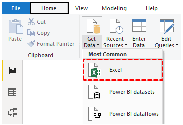
Step 1: Open the Power BI file, and go to the “Home” tab. Click “Get Data” and choose the data source as “Excel.”
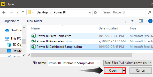
Step 2: Choose the file from the saved location and click “Open.”
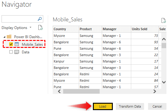
Step 3: Before you upload the file, it will ask you to choose the Data Table, so choose the table name (My table name is “Mobile_Sales”) and click on “Load” to upload the selected table data to Power BI.
It will take some time to upload.
Now, we can see the data in the “Data” view.
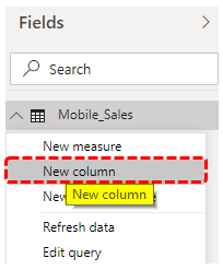
Create New Calculated Column
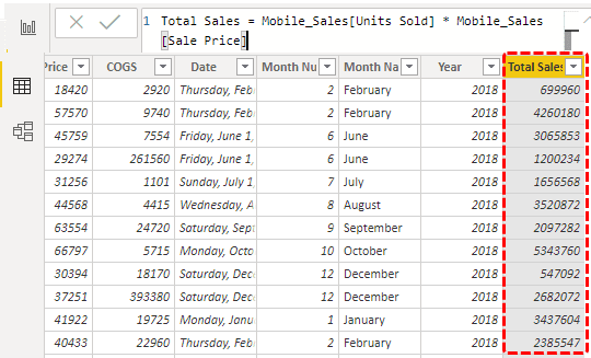
- From the Data Table, we have only “Units Sold” and “Price Per Unit” only, so we need to calculate “Total Sales.” Right-click on the table name and choose “New Column.”
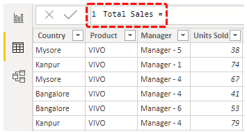
- It will ask you to name the column first, so give it a name as “Total Sales.”
- This column will be calculated by multiplying “Units Sold” by “Sale Price.” So from the table, choose the “Units Sold” and “Sale Price” columns.
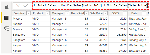
It will create a new column in the table as “Total Sales.”
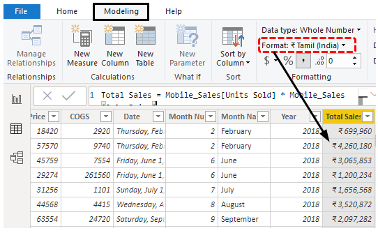
- We need to format this column as “Currency,” so select the column, go to “Modeling,” and choose the format as “Rupee.”
- Come back to the “Report” view now.
In this “Report” view, we will create a dashboard now.
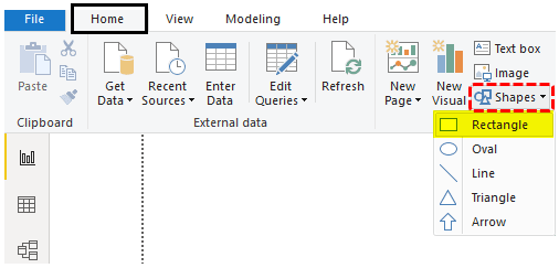
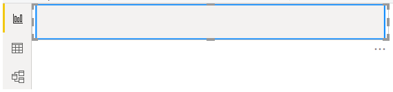
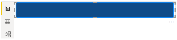
- First, insert the title bar for the dashboard. Next, go to the “Home” tab, click on “Shapes,” and choose the “Rectangle” shape.
- Draw this shape at the top of the page.
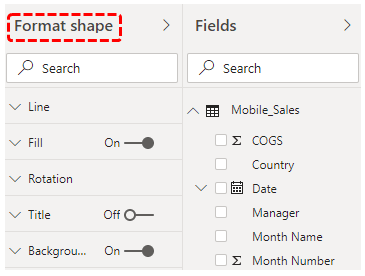
- Change the background color of this shape, and select the shape. It will open up the “Format Shape” option to the right side.
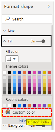
- Click on Fill >>> Fill Color >>> Custom Color.
- Power BI works on HEX color codes so that we can get the color codes from the “color-hex.com” website. So, you can choose the color code (without #) you wish to have and paste it.
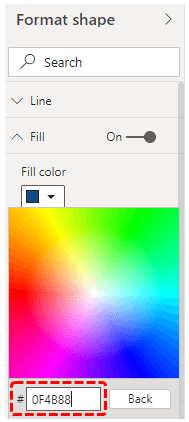
- Now, our shape is filled with a blue color.
- Now, from the “Home” tab, insert the “Text box.”
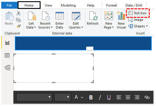
- Type the text as “Sales Dashboard.”
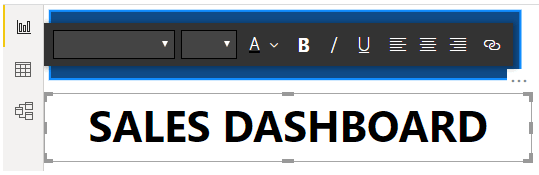
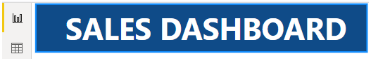
- Place this on the shape, and change the font color to white.
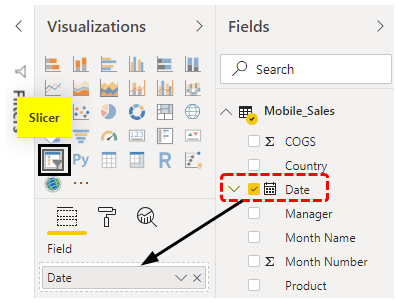
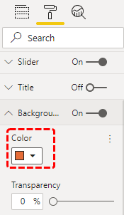
- Now, we need to create slicer visuals. From the Visualization tab, insert a blank slicer, and select the “Date” column from the data table for the slicer “Field.”
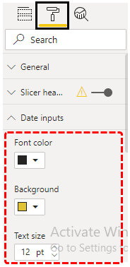
- We need to design this slicer, so choose the slicer and click on the “Format” option. Next, choose “Data inputs” and apply the below changes.
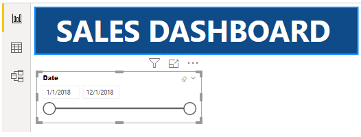
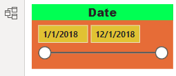
- Now, our start and end dates are formatted like the below.
- Now, change the background color.
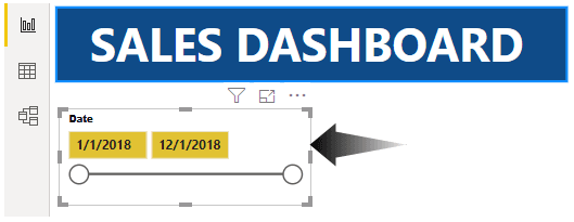
Like this, you can change the border and other things. So, now our “Date” slicer looks like this.
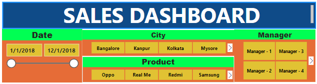
Like this, we need to create four more slicers to have “City,” “Product,” “Manager,” and “Date” columns. Copy and paste the same slice but change the field column and header of the slicer, respectively. We have created similar slicers, and below is the same image.
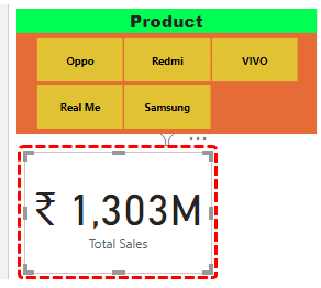
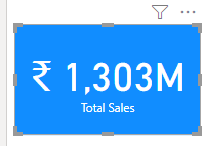
- Let us insert the Card visual to show the “Total Sales” value.
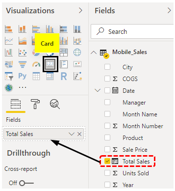
The Card visual shows the total sales value.
- Now, design the card through the formatting section, which looks like this.
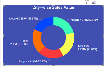
- Insert the “Doughnut” chart to show “City-wise Sales Value.”
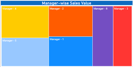
- Insert “TreeMap” to show “Manager-wise Sales Value.”
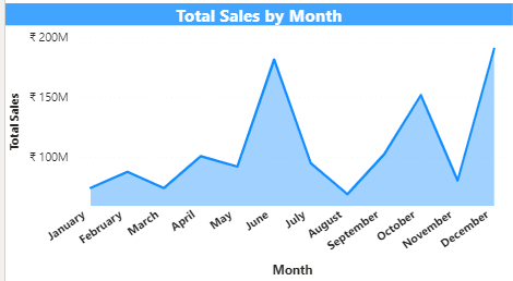
One final visual we will add is the “Date-wise” sales value.
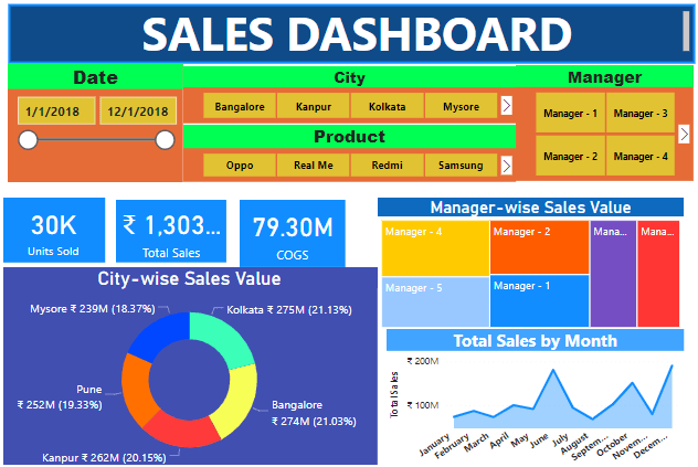
So, finally, our “Sales Dashboard” in Power BI looks like this.
Like this, by using Power BI, we can create interactive dashboards.
Things to Remember
- If the required column is not in the data, we must create it using the DAX function.
- To get attractive colors, search on the web about Hex color codes.
- We must always maintain the dashboard with the most important data.
Recommended Articles
This article has been a guide to Power BI Dashboard. Here, we discuss creating a sample interactive dashboard in Power BI and an example. You can learn more about Power BI from the following articles: –