Dashboard in Power BI Examples
Power BI dashboards are single-paged dashboards that summarize the data. There are various inbuilt samples of dashboards in Power BI that a new user can access and use as per the requirements. However, the home or the expert users create their dashboards for better representations.
The Power BI dashboard is amazing to work with. Dashboards can tell the story of the large data set on a single page. So, by creating dashboards, we try to convey the message to the end-user as briefly as possible with as much information as possible. Creating a dashboard is fun if you know the tool to create it. Otherwise, we must wonder how others have created their dashboard, which rocks in a single page view. While you might have created dashboards using excel, the modern business trend is visualization tools: Power BI. This article will show you how to create dashboards using the Power BI tool with examples.
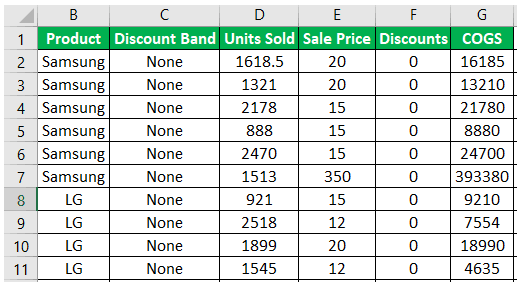
To create examples of a dashboard in Power BI, you need data to work with, so you can download the Excel workbook template from the link below, which is used for this example.
Things to Remember
- If data does not have all the columns to create a dashboard, then we must create those columns by adding calculated columns.
- Do not leave the page empty and increase or decrease visual size based on the visual count.
- To show a map, we should properly enter a visual city or country name.
- Each visual has its formatting, so we must apply custom formatting to make it look beautiful.
How to Create a Dashboard in Power BI? (Step by Step Examples)
Below is how to use the Power BI tool to create a dashboard example.
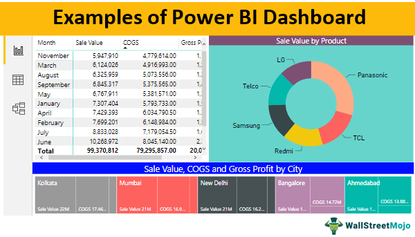
Below is the data we are using to build a dashboard. It is the TV sales data in Indian cities month-wise.
Using these numbers, we will build a beautiful dashboard. Follow the below steps to build the dashboard.
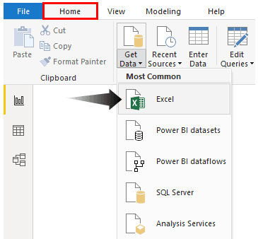
Step 1: Open Power BI software, go to the “HOME” tab >>> Get Data > Excel.
Step 2: From the file chooser window, choose the file from the computer location where you have stored it.
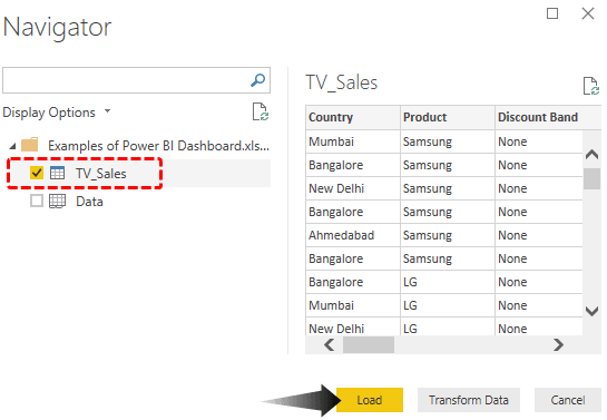
Step 3: You need the required table to be uploaded to Power BI from the below window.
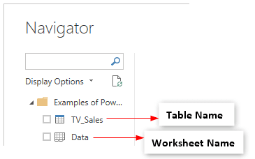
Choose the table and click “Load” to upload the selected table to Power BI.
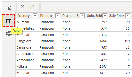
Step 4: Our data is uploaded to Power BI. Under the “Data” section, we shall see the uploaded data table.
Step 5: Now, come back to the “Report.”

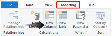
Step 6: We need to rearrange our data to create a dashboard. First, we need to find the sales value using DAX formulas. Then, click on “New Column” under “Modeling.”
Step 7: Now, in the “New column,” first give the name for the column as “Sale Value.”
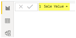
Step 8: The “Sale Value” is calculated using the formula: Units Sold * Sale Price. Type these header names to see the IntelliSense list.
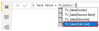
First, you must type the table name followed by a column header name. For example, after selecting the “Units Sold” column, multiply it with “Sale Price.”
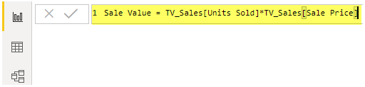
Step 9: After applying the formula, press the “Enter” key, and we shall have a new column named “Sale Value” in the table fields.
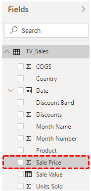
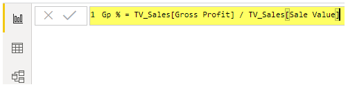
Step 10: Similarly, you need to create one more new column for “Gross Profit,” as shown below.
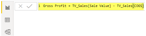
Step 11: Insert one more column and put the below DAX formula to find the Gross Profit percentage.
Now, we are done with all the calculated columns. Next, let us create visuals for these fields.
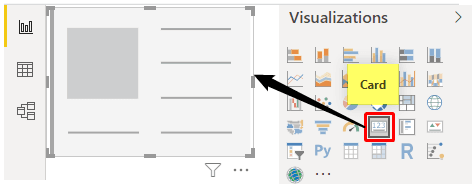
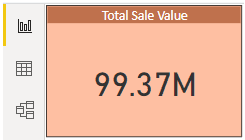
- Create a Card visual for “Sale Value,” “COGS, and “Gross Profit.” Insert card first.
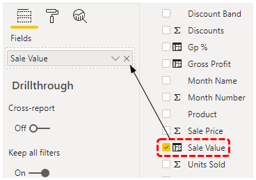
- Drag and drop the “Sale Value” column to “Fields.”
- It shall give us the total “Sales Value” on the card.
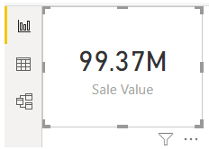
- As you can see above, by default, the card visual applies the number formatting, and the total sale value indicates 99.37 M. We can change the formatting of this card under the “Format” section.
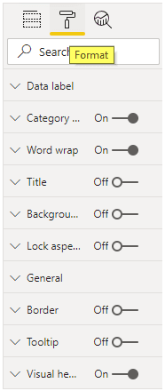
- We have a variety of options. So, you can make use of all these to format your visual. We have formatted the card, as shown below.
We have removed “Category Label,” inserted “Title” and formatted the title, the “Background” color has been changed, and the “Data Label” color has been changed.
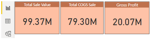
- To show COGS and “Profit Value,” copy and paste the same visual twice and change the fields accordingly.
- Now, for monthly sales, COGS, and Gross Profit, choose the “Matrix” table.
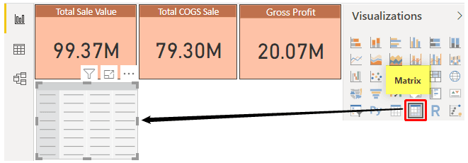
- Drag and drop “Month Number” to the “Rows” field, “Sale Value,” “COGS,” and “Gross Profit” columns to the “Values” field.
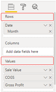
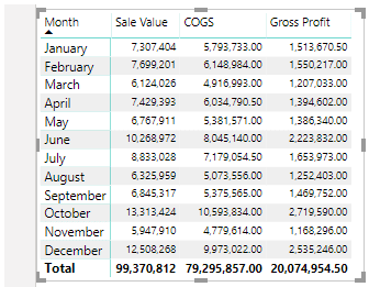
- Now, we have a “Matrix” table like the one below.
- Create one more Matrix table to show monthly gross profit numbers at different discount bands.
- Drag and drop “Month Number” to the “Rows” field and the “Gross Profit” column to the “Values” field. For the “Columns” field, insert “Discount Band.”
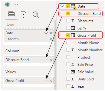
- Now, we have two different matrix tables showing data numbers.
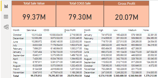
From this table, we can conclude that when the discount was high, the gross profit amount was 6574110. But, when the discount was not there, it reduced the gross profit to 1379212.
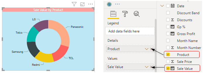
- Insert the “Donut” chart to show the sale value by product amount.
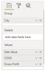
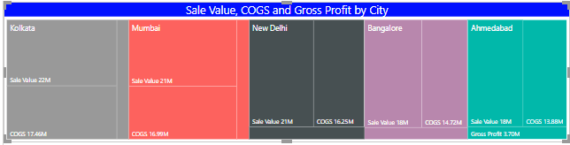
- Now, insert “Treemap” to show city-wise “Sales,” “COGS,” and “Gross Profit” values.
- It will create a treemap like the one below.
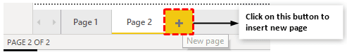
- Now, insert one more new page.
- On this page, choose the “Map” visual.
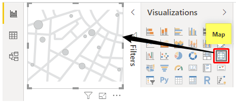
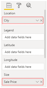
- For this Map visual, insert the “City” column for “Location” and “Sale Price” for “Size.”
- It will create bubbles for each city based on sales amount numbers.
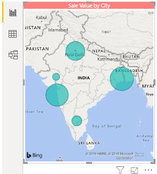
- Increase the map size by dragging the ends of the map.
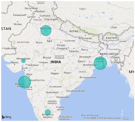
These bubbles show the sales value in each city.
Understanding these principles can significantly impact this approach. This advanced Power BI course is designed to deepen this knowledge and skill set for those eager to build on this foundation.
Recommended Articles
This article has been a guide to Examples of Power BI Dashboard. Here, we discuss examples of creating a Power BI dashboard using DAX formulas to count all unique values and create charts. You can learn more about Power BI from the following articles: –