Part of our Excel Charts guide
What Are Pie Charts In Excel?
A pie chart is a circular representation that reflects the numbers of a single row or single column of Excel. The individual numbers are called data points (or categories) and a list (row or column) of numbers is called a data series. Every pie chart consists of slices (or parts), which when added make a complete pie (or circle).
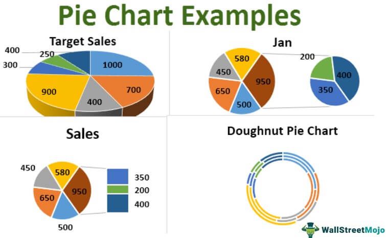
For example, the following image shows some pie charts of Excel. On the top, the 3-D pie chart is to the left and the Pie chart is to the right. At the bottom, the bar of Pie chart is to the left and the Doughnut chart is to the right.

The purpose of making a pie chart in Excel is to visualize data when there are a few data points. Moreover, all the data points should belong to a specific time period. A pie chart is not suitable when there are many data points or the data points pertain to different time periods.
Key Takeaways
- Pie charts in Excel visually represent proportions of a whole, making them useful for comparing parts within a single data series.
- They are most effective when used with few categories, as many slices can clutter the chart.
- Each slice represents a category’s percentage of the total, and adding data labels helps communicate exact values clearly.
- Using variations like Doughnut or Pie of Pie charts can enhance visual impact and focus attention.
How To Make A Pie Chart In Excel?
Excel has different varieties of pie charts. In this article, we will learn to make the following pie charts:
- 2-D pie chart
- 3-D pie chart
- Pie of Pie chart
- Bar of Pie chart
- Doughnut chart
Let us create each Excel pie chart one by one with the help of examples.
Pie Charts In Excel – Explained in Video

2-D Pie Chart
A 2-D (two-dimensional) pie chart is frequently used in Excel. It is a standard pie chart that displays one slice for each data point. The bigger the number (or data point) represented by the slice, the larger the area under it.
Example #1
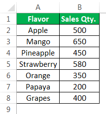
The following image shows the quantities sold (column B) of seven different flavors (column A) of a beverage. All the flavors of this beverage are manufactured by an organization. We want to perform the following tasks:
- Make a 2-D pie chart in Excel by taking into account the given dataset. Interpret the pie chart thus created.
- Add data labels and data callouts to the pie chart.
- Separate a few slices from the pie (or circle) and show how to change their color.
- Rotate the slices and increase the gap between them.
- Change the chart style and show how to apply filters to the pie chart in excel. chart.
Note that the numbers pertain to a specific time period.
The tasks and the corresponding steps to be performed are listed as follows:
Task a: Make a 2-D pie chart and interpret it
Step 1: Select the entire dataset (A1:B8). Next, click the pie chart icon from the “charts” group of the Insert tab. Select a 2-D pie chart.
The selections are shown in the following image.

Step 2: A 2-D pie chart is inserted in Excel. This is shown in the following image.
Notice that the caption (on top) and the legend (at the bottom) are automatically added to the chart. The caption of the chart is the same as the heading of column B. The legend reflects all the flavors of column A.
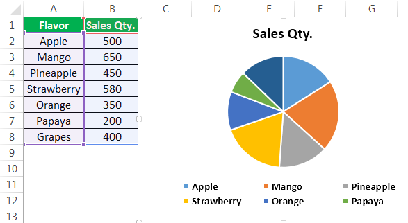
Interpretation of the 2-D pie chart: Each slice of the chart displays the number of beverages sold in a particular time period.
One slice represents one flavor of the beverage.
When all the slices are added, a complete pie is obtained. So, the entire pie represents the total of column B, which is 3130.
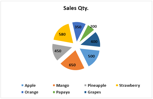
Observe that the slice of mango (orange colored) is the biggest, while that of papaya (green colored) is the smallest. This is because the sales of mango (650) are the maximum and that of papaya (200) are the least. The second highest sales are of the strawberry flavor (580).
Hence, one can interpret that the mango flavor of the beverage has the highest demand. In contrast, the papaya flavor is not much preferred by the customers of the organization.
Task b: Add data labels and data callouts
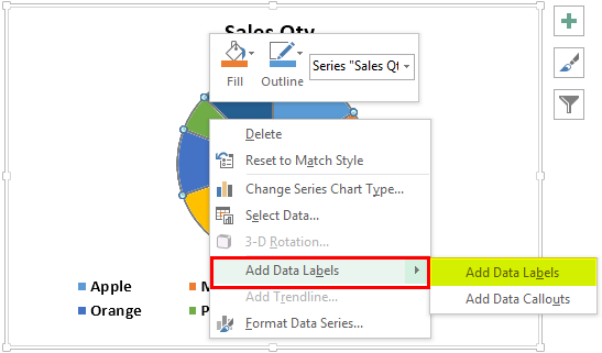
Step 3: Right-click the pie chart and expand the “add data labels” option. Next, choose “add data labels” again, as shown in the following image.
Step 4: The data labels are added to the chart, as shown in the following image. With these labels, the sales quantity of each flavor is displayed on the respective slice. Thus, data labels make it easy to read and interpret an excel pie chart.
Note: Data labels are directly linked to the data points of the source dataset. Therefore, the data labels automatically update with a change in the data points.

Step 5: Right-click the pie chart again. Click the arrow of “add data labels” and select “add data callouts.” The data callouts have been added in the following image.
Notice that each slice shows the name of the flavor along with its share in the entire pie. Since the share is in percentage, a glance at the pie chart can suggest the highly preferred and the less preferred flavors. The total of the pie is 100%.

Task c: Separate the slices from the pie (or circle) and show how to change their color
Step 6: Select the slice to be separated and drag it away from the pie with the help of the mouse pointer. In the following image, the slices having the maximum (orange colored) and the minimum sales (green colored) have been separated from the pie.
Note: To join the slices to the pie again, drag them back to their position. Alternatively, press the undo shortcut “Ctrl+Z.”

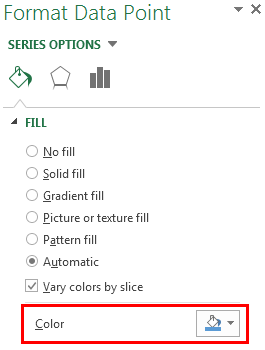
Step 7: Double-click the slice whose color is to be changed. Next, right-click it and select the option “format data point” from the context menu. This option is shown in the following image.

Step 8: The “Format Data Point” pane opens, as shown in the following image. In the “Fill” tab, the “automatic” and “vary colors by slice” options are selected by default.
If the “color” option is visible (shown within the red box), select the desired color from it. If the “color” option is not visible, select “solid fill” and then choose the desired color. Next, close the “format data point” pane.
The selected color will be applied to the slice that was double-clicked in the preceding step.
Note: One can highlight the important slices and assign dull colors to the remaining ones. So, the small and non-relevant slices can be filled with lighter colors. This helps focus on specific data points.
Task d: Rotate the slices and increase the gap between them
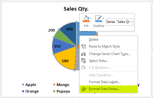
Step 9: Select the pie chart and right-click it. Choose “format data series” from the context menu. This option is shown in the following image.
Step 10: The “format data series” pane opens, as shown in the following image. In the “series options” tab, perform the following actions:
- In “angle of first slice,” enter 96◦ (96 degrees).
- In “pie explosion,” enter 18% (18 percent).
Next, close the “fFormat Data Series” pane.
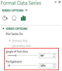
Step 11: The slices of the pie have been rotated. Moreover, the gap between them has increased. This is shown in the following image.
Notice that the entire pie has been rotated. So, the slice that was earlier on the top-right has moved to the bottom-right. However, the colors of the slices have not been impacted.
Task e: Change the chart style and show how to apply filters to the pie chart
Step 12: Click the pie chart. Three icons will appear on the top-right side of the chart. Next, perform the following actions:
- Click the “chart styles” button or the paintbrush icon.
- Select the desired style from the “style” tab.
Notice the changed chart style in the following image.
When the cursor is hovered over the different chart styles, a preview is shown in Excel. So, the preview helps see the way the pie chart would look if the respective style is selected.

Step 13: Click the “Chart Filters” button (or the filter icon) displayed on the top-right side of the chart.
In the “Values” tab (shown in the following image), all the flavors of the beverage are shown under “Categories.” The single column (column B) used to create the Excel pie chart is reflected under “series.”
Select or deselect the categories in order to show or hide them from the chart. Next, click “apply” shown at the bottom-left side of the “Values” tab. The filters will be applied to the pie chart.

As we explore this topic, it’s interesting to note how a deeper understanding can enhance practical skills. For those looking to expand their expertise, consider checking out this Excel All In One Bundle Course that delves into this further.
3-D Pie Chart
A 3-D (three-dimensional) pie chart is usually used for decorative purposes. The features of a 3-D pie chart are similar to that of a 2-D pie chart. However, a 3-D pie chart has an additional feature called 3-D rotation, which is not there in a 2-D pie chart.
It is not recommended to use a 3-D pie chart for data visualization. The reason is that the numbers represented by the chart may look larger than they actually are. So, a 3-D pie chart can be confusing and misleading due to its 3-D effect.
Example #2
Working on the dataset of example #1, we have changed the heading of column B to “Actual sales.” Moreover, the sales numbers targeted by the organization have been added in column C. We want to perform the following tasks:
- Show the outcome when a 3-D pie chart is created by considering the entire dataset. In total, there should be two 3-D pie charts. They should reflect the numbers of both columns (columns B and C) one by one.
- Interpret the 3-D pie excel charts thus created.
The steps to perform the given tasks are listed as follows:
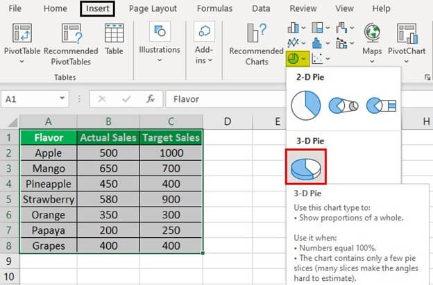
Step 1: Select the entire dataset (A1:C8) including columns B and C. From the Insert tab, click the pie chart icon (in the “charts” group) and choose a 3-D pie chart.
The selections are shown in the following image. Notice that the column headings have also been selected before inserting the excel pie chart. This is because we want the name of the column to be displayed as the title of the chart.
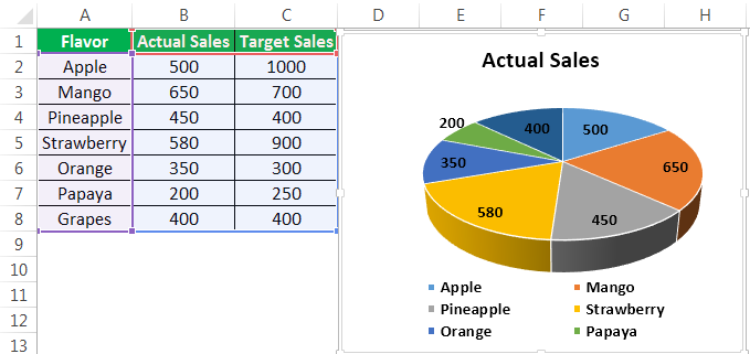
Step 2: A 3-D pie chart has been created, as shown in the following image. The data labels have been added to the pie chart the same way they were added in task “b” of Example #1.
Notice that though we selected the entire dataset (in the preceding step), the pie chart displays only the numbers of column B. The reason is that a pie chart can show only a single series at a time. So, by default, Excel is displaying the first (column B) of the two series (columns B and C).
Step 3: Filter the series of the pie chart to show the numbers of column C. For filtering, perform the listed actions:
- Click the pie chart. Three icons appear on the top-right side of the chart.
- Click the “chart filters” button (or the filter icon), which is the third of the three icons.
- In the “values” tab, the “series” and “categories” are displayed. Select the series “target sales.”
- Click “apply.”
The selection of the series “target sales” is shown in the following image.

Step 4: A 3-D pie chart reflecting the numbers of column C has been created. This is shown in the following image. The data labels have been added by right-clicking the chart and choosing “add data labels.”

Interpretation of the two 3-D pie charts:
The numbers of column B are reflected in the “actual sales” chart (in step 2), while those of column C are reflected in the “target sales” chart (in step 4). There are two charts because a pie chart can display a single data series at one time.
To facilitate comparison, one must place the two pie charts in excel next to each other. On a comparison between the two charts, one can observe that the actual sales of two flavors (pineapple and orange) have exceeded the target sales.
For the grapes flavor, the actual and target sales are the same. However, for all the remaining flavors, the targeted sales volume is more than the actual sales volume. Consequently, the organization must focus on pushing the actual numbers closer to the targeted numbers. Thus, a revision of the marketing plan may be required.
Pie Of Pie Chart
A Pie of Pie chart displays an additional pie along with the main pie.
This additional pie (or secondary pie) shows the breakup of one slice of the main pie. It is used to display smaller slices more clearly.
By default, Excel displays the last three data points of a series on the secondary pie. To avoid this, either of the following actions can be carried out:
- Sort the data series in a descending order. By sorting, the smallest three data points of the series are moved to the secondary pie.
- Choose the data points that will be moved to the secondary pie. For making this choice, the “Format Data Series” panel is used.
A Pie of Pie chart enhances the readability of the main pie by moving the smaller slices to the secondary pie. As a result, the user can focus on the slices of both pies, thereby making the chart easy to interpret and analyze.
Moreover, with the division of slices (of the main pie), a Pie of Pie chart can handle more data points than a regular pie chart.
Note: To know how to use the “Format Data Series” panel in the second bullet point, refer to the following example.
Example #3
Working on the dataset of Example #1, we have changed the heading of column B to “Jan.” So, consider that the figures of this column pertain to the month of January of a certain year. Perform the following tasks:
- Make a pie of Pie chart where the secondary pie displays the last three numbers (or data points) of the dataset. Further, interpret the pie of Pie chart thus created.
- Show how the “format data series” panel is used to decide which data points to be displayed on the secondary pie.
The tasks and the steps to be performed are listed as follows:
Task a: Make a Pie of Pie chart and interpret it
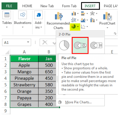
Step 1: Select the entire dataset (A1:B8). From the Insert tab, click the pie icon appearing in the “Charts” group. Choose the Pie of Pie chart from 2-D pie charts.
The selections are shown in the following image.
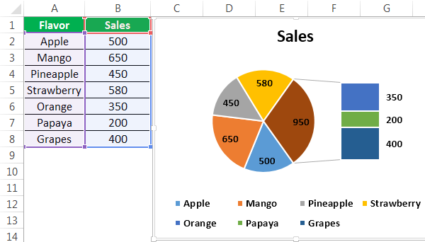
Step 2: The Pie of Pie chart is created, as shown in the following image. Notice that by default, Excel has moved the last three data points (350, 200, and 400) of the series to the secondary pie.

Interpretation of the Pie of Pie chart:
There are 7 numbers in column B of the given dataset.
The main pie shows five slices which consist of the first four data points (500, 650, 450, and 580) and the total of the last three data points (350+200+400=950).
Further, the slice showing the number 950 is the largest part of the main pie. This part is joined to the secondary pie with two grey lines.
Notice that the last three data points moved to the secondary pie are smaller than the other data points.
With this division of data points, one can easily focus on both pies at a given time.
So, the main pie can be studied to improve the demand for the preferred flavors (apple, mango, pineapple, and strawberry). In contrast, the secondary pie can be analyzed to identify the causes of low demand for the unpopular flavors (orange, papaya, and grapes).
Task b: Choose the data points to be displayed on the secondary pie
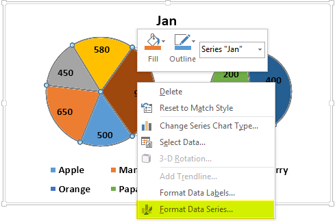
Step 3: Select the Pie of Pie chart and right-click it. Choose the option “format data series” from the context menu. This option is shown in the following image.
Step 4: The “Format Data Series” pane opens, as shown in the following image. By default, the “split series by” drop-down list shows “Position.” The option “Position” tells Excel the number of data points to be moved to the secondary pie.
The “Values in Second Plot” box shows 3. This implies that the last three data points will be moved to the secondary pie. This number (3) can be increased or decreased to add or reduce the number of slices of the secondary pie.
With the default selections (shown in the following image), the Pie of Pie chart looks the same as that of step 2 of this example. However, if we enter 4 in the “Values in Second Plot” box, the slice representing the quantity 580 (fourth last data point) will also move to the secondary pie.
Note: The different options of the “Split Series By” drop-down list are explained as follows:
- “Value” or “percentage value” – These options allow specifying the minimum value or percentage below which the data points will be moved to the secondary pie.
- “Custom” – This option allows selecting a particular slice of the pies manually. Then, one can specify whether this slice should be displayed on the main or secondary pie.

Bar Of Pie Chart
The Bar of Pie chart displays a stacked bar along with the pie. The bar shows the breakup of one of the slices of the pie. Moreover, the bar consists of segments that represent data points and are stacked one over the other.
Similar to the Pie of Pie chart, the last three data points of a series are shown on the bar by default. To move the smallest three data points to the bar, one can sort the series in a descending order.
One can also choose the slices or segments (or data points) to be shown on the pie and bar. The slices to be displayed are chosen with the help of the “format data series” pane. This pane works the same way it did for the Pie of Pie chart.
A Bar of Pie chart improves the readability of the pie and bar, thereby helping the user to focus on all the data points of a series.
Example #4
Working on the dataset of example #1, we have titled column B as “Sales.” Create a Bar of Pie chart and interpret it.
The steps to create a Bar of Pie chart are listed as follows:
Step 1: Select the entire dataset (A1:B8). Click the pie icon from the “Charts” group of the Insert tab. From 2-D pie charts, choose the Bar of Pie chart.
The Bar of Pie chart option is shown within a black box in the following image.

Step 2: The Bar of Pie chart is inserted, as shown in the following image. Notice that by default, the last three data points (350, 200, and 400) have been moved to the bar displayed on the right side of the pie.
Interpretation of the Bar of Pie chart:
The pie represents the first four data points (500, 650, 450, and 580) of the series (of column B) along with the total of the last three data points (350+200+400=950).
The biggest slice of the pie is the brown one. It represents the number 950. This slice is connected to the bar with the help of grey lines.
Notice that the bigger the number, the larger the segment of the bar. In other words, the larger the segment of the bar or the bigger the slice of the pie, the higher the quantity sold of that flavor.
Therefore, the pie shows the highly preferred flavors while the bar shows the less preferred ones.
The green segment (papaya) of the bar is the least preferred as its area is the smallest. So, the organization needs to boost sales of the flavors that are not much preferred by its customers.
Doughnut Chart
A doughnut chart is a variant of the pie chart of Excel. However, the former is different from the latter in the sense that it can contain more than one data series. Moreover, a doughnut chart consists of rings instead of slices. Further, each ring consists of arcs. The innermost ring of the chart represents the first data series.
A doughnut chart is hollow on the inside. It is difficult to read and interpret a doughnut chart compared to a regular excel pie chart. From Excel 2016, sunburst charts have been introduced, which are more preferred than doughnut charts.
Example #5
Working on the dataset of example #1, we have labeled column B as “Jan.” This column shows the sales of January. We have also added the sales of February and March to columns C and D respectively.
In total, there are three series (Jan, Feb, and Mar) in the dataset. Perform the following tasks:
- Create a doughnut chart by considering the entire dataset.
- Title the chart as “Doughnut Pie Chart.”
- Show the doughnut chart with an enlarged hole.
- Interpret the chart thus created.
The steps to perform the given tasks are listed as follows:
Step 1: Select the entire dataset (A1:D8). Click the pie icon from the Insert tab of Excel. Choose “Doughnut” under the doughnut charts.
The selection is shown in the following image.
Note: In Excel 2007, click the “Other charts” drop-down (in the “Charts” group) from the Insert tab. Next, select “Doughnut” under the doughnut charts.

Step 2: A doughnut chart is inserted in Excel, as shown in the following image. The “Chart title” text box may or may not appear (by default) on top of the chart. If the “Chart title” text box does not appear, perform the following actions:
- Click anywhere on the doughnut chart. The “chart tools” menu of the Excel ribbon becomes visible. It consists of the Design and Format tabs.
- Click “Add Chart element” from the Design tab.
- From “Chart Title,” select either “Above Chart” or “Centered Overlay.” A default text box consisting of “chart title” appears.
- Type the desired title within the text box.
- Click outside the text box to fix the new title to the chart.
If the “Chart Title” text box does appear, type “Doughnut Pie Chart” within it. Next, follow the action “e” listed above.
To enlarge the hole of the doughnut chart, perform the following actions:
- Right-click any data series and choose “Format Data Series” from the context menu. The “Format Data Series” pane opens.
- In the “Series Options” tab, there is a slider under “Doughnut Hole Size.” Move this slider to the right to increase the size of the hole. Alternatively, enter a percentage between 10 and 90 in the box. We have entered 75%.
The chart title and the enlarged hole are shown in the following image.
Note: In Excel 2007, the “chart tools” menu shows the Design, Layout, and Format tabs. To add a title to the chart, click the “chart title” drop-down (in “labels” group) from the Layout tab. Next, follow steps “c,” “d,” and “e” listed under the first set of actions.
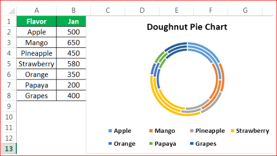
Interpretation of the Doughnut chart: The innermost ring of the chart represents the series “Jan.” The middle and the outer rings represent the series “Feb” and “Mar” respectively.
Each data point is represented by an arc in place of a slice. So, one can say that the bigger the number (or data point), the larger the arc representing it. In each ring, there are seven arcs for the seven flavors.
Notice that the flavor papaya has a small arc (in green) in all the three rings. However, just by looking at the chart, one cannot ascertain the numbers represented by the different arcs. Further, had we added data labels to all the three rings, the chart would have become cluttered. For these reasons, a regular pie chart is preferred over a doughnut chart.
Frequently Asked Questions (FAQs)
Define a pie chart and suggest how to make it in Excel.
A pie chart shows the data points of a single data series. It is a circular chart consisting of slices. One slice represents one data point. The entire pie represents the total of the individual data points. Zeroes and negative values cannot be depicted on a pie chart.
To create a pie chart in Excel, follow the listed steps
- a. Arrange the data series in a single row or single column of Excel
- b. Select the entire dataset including the row and column headings as well as the data series
- c. Click the pie icon from the “charts” group of the Insert tab
- d. Select the required pie chart like a 2-D pie chart, 3-D pie chart, Pie of Pie chart, and so on.
The pie chart selected in step “d” is inserted in Excel.
Note: For more details on the different types of pie charts, refer to the definitions and examples given in this article.
How to make a pie chart showing percentages in Excel?
To create a pie chart showing percentages, follow either of the listed methods:
Method 1 – Enter the numbers (or data points) as percentages in the data series. These percentages will appear as data labels on the pie chart. For adding such data labels, right-click the pie chart and choose “add data labels” from the context menu.
Method 2 – Enter numbers as is in the series and let Excel convert them to percentages. Once converted, the numbers and percentages will appear as data labels on the pie chart. The steps to display such data labels are listed as follows:
- a. Right-click any slice of the pie chart and choose “format data labels” from the context menu. The “format data labels” pane opens
- b. From the “label options” tab, select “value” and “percentage” under “label contains.
- c. Close the “format data labels” pane.
Note: In both methods, the sum of all the data points (or the total value) need not necessarily be 100%. If this sum is not 100%, the outcomes are stated as follows:
- In method 1, each slice of the pie represents a percentage of the total value. The sum of all slices (or data points) of the pie is any value other than 100%.
- In method 2, Excel automatically makes the sum of all slices of the pie 100%. So, the percentage represented by each slice is calculated from the total of 100%.
How to create a pie chart using multiple columns of Excel? Suggest how to resize a pie chart in Excel.
It is not possible to create a pie chart using multiple columns or multiple data series. The reason is that a regular pie chart displays the data points (or categories) of a single data series only. So, only a single row or a single column can be used as the source dataset of a pie chart.
To display the data points of multiple data series, the doughnut chart can be used as a variant of the regular pie chart.
The steps to resize an excel pie chart are listed as follows:
- a. Click anywhere on the pie chart. The “chart tools” menu appears on the Excel ribbon
- b. Click the “format” tab from the “chart tools” menu
- c. Type the required size in the “height” and “width” boxes displayed in the “size” group
- d. Press the “Enter” key.
Note: Alternatively, increase or decrease the size of the pie chart by using the arrows of the “height” and “width” boxes.
Recommended Articles
This has been a guide to making Pie chart in Excel. Here we discuss how to make the top five types of pie charts, namely, 2-D, 3-D, Pie of Pie, Bar of Pie, and Doughnut chart. You may learn more about Excel from the following articles–