Table Of Contents
What is Doughnut Chart Excel?
A doughnut chart is a chart in Excel whose visualization function is similar to pie charts. The categories represented in this chart are parts, and together they express the whole data in the chart. We can only use the data in rows or columns in creating a doughnut chart in Excel. However, it is advised to use this chart when we have less number of categories of data.
Doughnut Chart is a part of a Pie chart in excel. A pie occupies the entire chart, but it will cut out the center of the slices in the doughnut chart, and it will be empty. Moreover, it can contain more than one data series at a time. For example, in the pie chart, we need to create two pie charts for two data series to compare one against the other, but doughnut makes life easy for us by creating more than one data series.
In this article, we will show you creating a doughnut chart. Download the workbook to follow me.
Note: We are using Excel 2013 for this article.
How to Create a Doughnut Chart in Excel?
Below are examples of the doughnut chart in Excel.
Example #1 - Doughnut Chart in Excel with Single Data Series
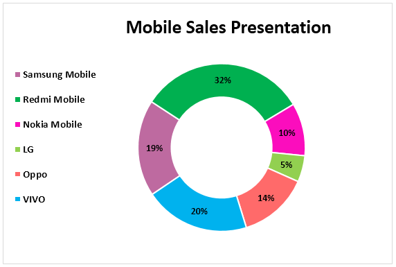
We have simple data that shows the mobile device sales for the year.
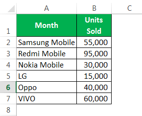
We will show these numbers graphically using a doughnut chart in Excel.
The following are the steps for the creation of a doughnut chart in Excel using single data series:
- We must first select the full data range.
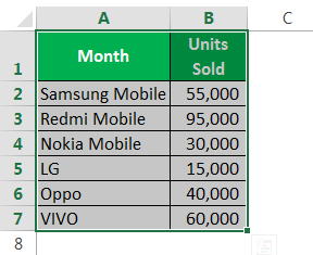
- We need to go to "Insert," "Pie Chart," and select "Doughnut."
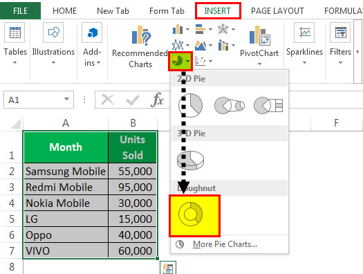
- Now, we have the default doughnut chart ready.

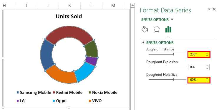
- We need to modify this doughnut chart to make it beautiful. Select all the slices and press "Ctrl + 1." It will show us the "Format Data Series" on the right-hand side.

- Make the "Angle of the first slice" 236 degrees and the "Doughnut Hole Size" 60%.
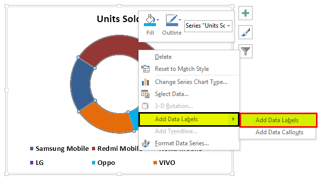
- After that, right-click on the slice and select "Add Data Labels."
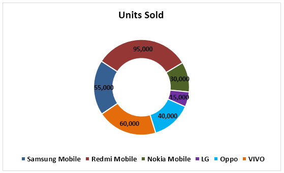
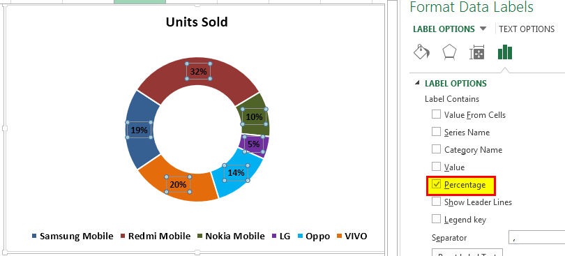
- Now, we must select the newly inserted data labels and press "Ctrl + 1." On the right-hand side, we may see "Format Data Labels." Uncheck everything and choose the only "Percentage."

- Now, change the color of each slice to a nice color. We have changed according to interest, and the chart looks like the one below.
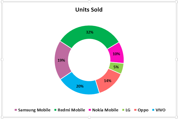
- We must "Add Legends" to the left-hand side and make the "Mobile Sales Presentation" chart title.
Example #2 - Doughnut Chart in Excel with Two Data Series
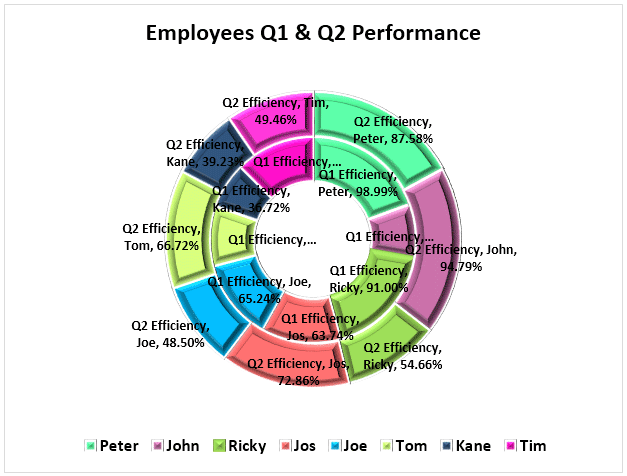
We have seen how cool the Excel doughnut chart is compared to the pie chart. Now, we will see how we create doughnuts for two data series values. First, we have the employee efficiency level for the last two quarters.

Let us show you the first graphical representation in the pie chart.
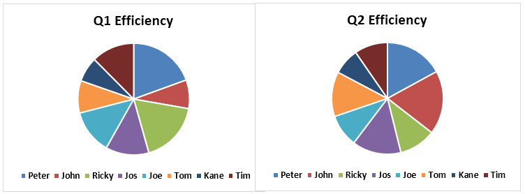
By using a pie chart, I was forced to create two identical pie charts because pie can accept only one data series to its data range. Therefore, if we want to see employee Q1 & Q2 efficiency level percentages, we need to look at two different charts and draw conclusions. It is an arduous task to do so.
We can fit these two data series into an Excel doughnut chart only. Follow the below steps to create a doughnut chart in Excel, including more than one data series.
Step 1: We should not select any data but insert a blank doughnut chart.
Step 2: We need to right-click on the blank chart and choose"Select Data."

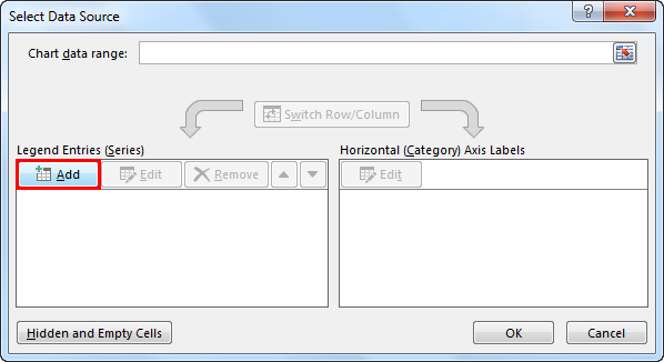
Step 3: Now, click on "Add."
Step 4: Insert "Series name" as "cell B1" and "Series values" as of "Q1 Efficiency" levels..
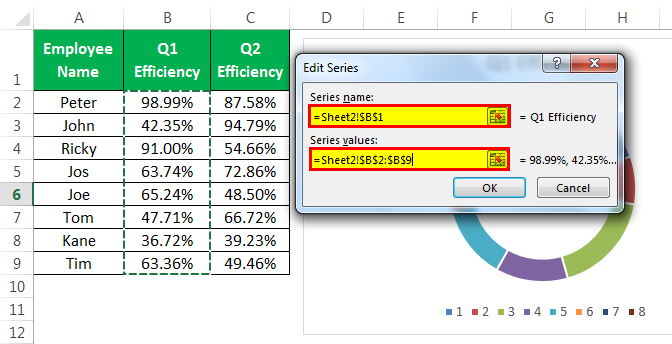
Step 5: Click on "OK" and click "Add."
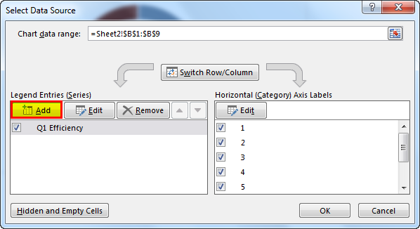
Step 6: Now, we must select second quarter values like we selected Q1 values.
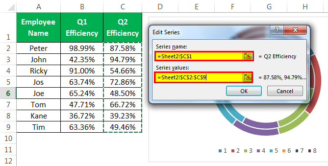
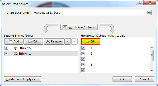
Step 7: After that, click on "OK." On the right-hand side, select "Edit."
Step 8: Here, we must select "Employee Name."
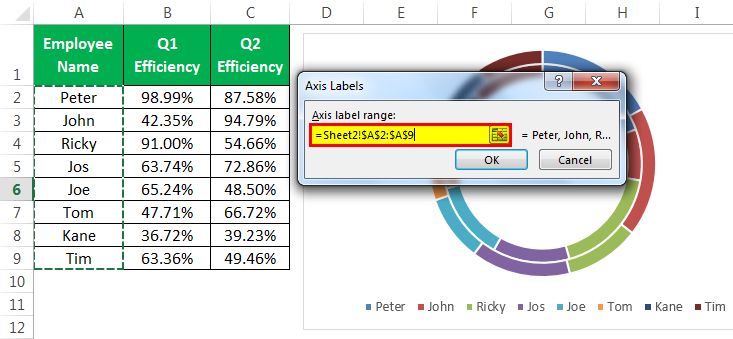
Step 9: Then, click on the "OK." Now, we have our default doughnut chart ready.
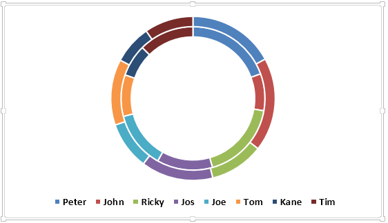
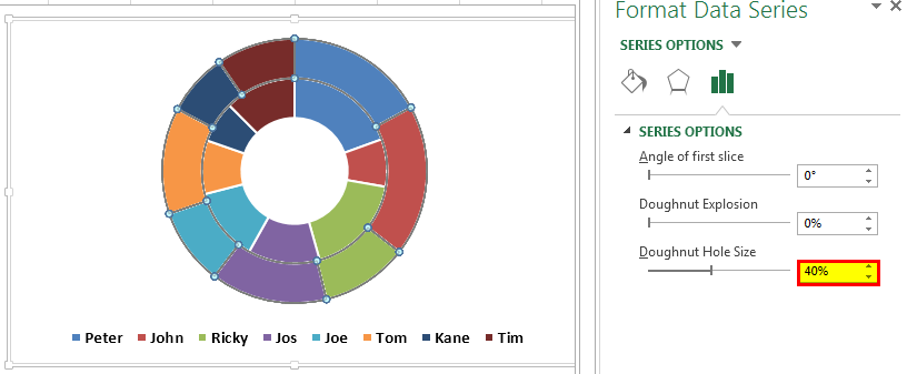
Step 10: Select the slice and make the "Doughnut Hole Size" as 40%. As a result, it will expand the slices.

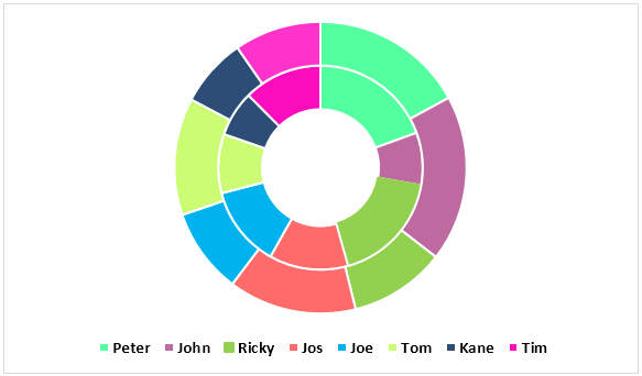
Step 11: We can change each slice's color to a nice color. We need to apply the same color for Q1 & Q2.
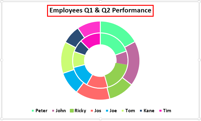
Step 12: Make the chart "Employees Q1 & Q2 Performance."
Step 13: Next, we must right-click and select "Add Data Labels."
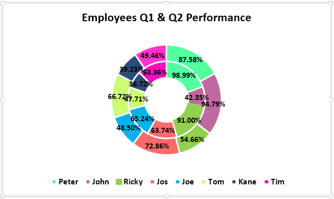
Step 14: Select the "Data Label" and add "Series Name" and "Category Name." Note: adjust the size of the data labels manually to make them appear cleanly.
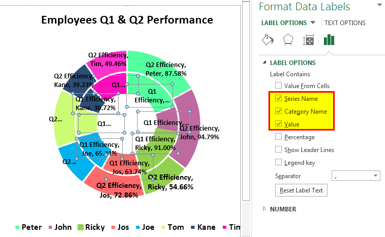
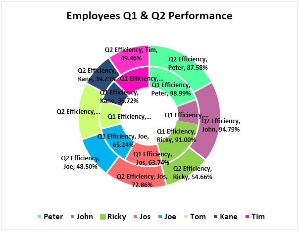
Step 15: Select the slice under "Format" and change the shape of the slice to Bevel > Convex. We need to do this for Q1 & Q2 both.
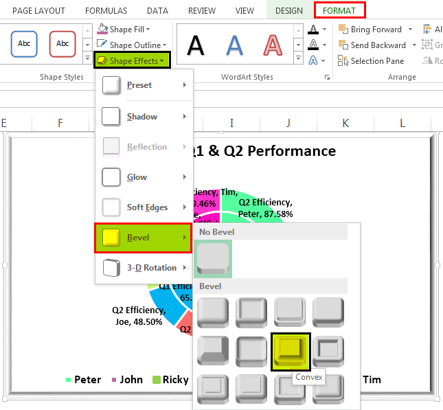
Step 16: We can make changes according to our preferences. Finally, our doughnut chart is ready.
Things to Remember About Doughnut Chart in Excel
- The pie charts can take only one data set; they cannot accept more than one data series.
- We can limit our categories to 5 or 8. Too much is too bad for your chart.
- It is easy to compare one season's performance against another or one to many comparisons in a single chart.
- We must not add any category list. It will mess up our chart's beauty.
- We must always show the data label as a percentage so it can best file within the doughnut slice.
- We can use the empty center space of the doughnut to display many other values or calculations.

