Table Of Contents
What Are Charts In Excel?
Charts in Excel are used to represent the data inserted in the worksheet. It is used to graphically show the data and aid to help users understand the data.
For example, consider the below example showing marks obtained by students in 2 semesters.

Now, we can represent the data using line chart in Excel.
Step 1: Select the cell range which we want to represent the data in line chart.
Step 2: Select Insert > Charts from the charts group.
We can see the data converted into a chart immediately.
Likewise, we can readily convert data into charts in Excel.

Key Takeaways
- Charts in Excel are used to represent the data graphically.
- If we copy a chart from one location to another, the data source will remain the same. However, it means that if we make any changes to the data set, both the charts will change, the primary and the copied.
- For the stock chart, there must be at least two data sets.
- We can only use a pie chart to represent one series of data. They cannot handle two data series.
List Of Top 8 Types Of Charts In MS Excel (With Steps And Examples)
- Column Charts in Excel
- Line Chart in Excel
- Pie Chart in Excel
- Bar Chart in Excel
- Area Chart in Excel
- Scatter Chart in Excel
- Stock Chart in Excel
- Radar Chart in Excel
Let us discuss each of them in detail: –
Chart #1 - Column Chart
In this type of chart, the data is plotted in columns. Therefore, it is called a column chart.
A column chart is a bar-shaped chart that has a bar placed on the X-axis. Such charts are very useful in case we want to make a comparison.
Below are the steps for preparing a column chart in Excel:
- First, select the data and the “Insert” tab, then select the “Column” chart.

- Then, the column chart looks like as given below:

Chart #2 - Line Chart
Line charts show the trend in data. They are used in analysis rather than showing data visually.
In this chart, a line represents the data movement from one point to another.
- Select the data and “Insert” tab, then select the “Line” chart.
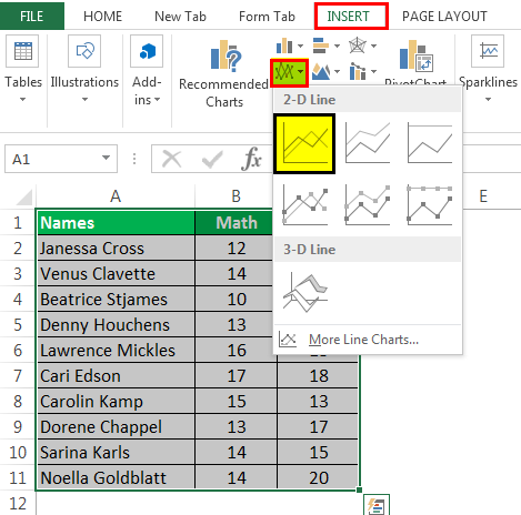
- Then, the line chart looks like as given below:
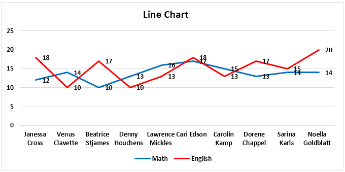
Chart #3 - Pie Chart
A pie chart is a circle-shaped chart capable of representing only one series of data. A pie chart has various variants that are 3-D charts and doughnut charts.
A circle-shaped chart divides itself into various portions to show the quantitative value.
- Select the data, go to the “Insert” tab, and select the “Pie” chart.
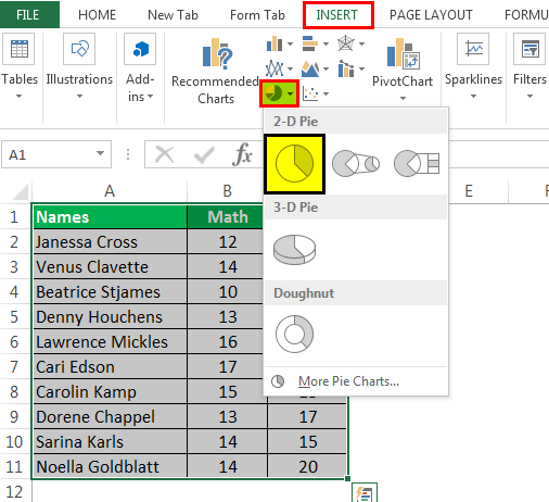
- Then, the pie chart looks like as given below:
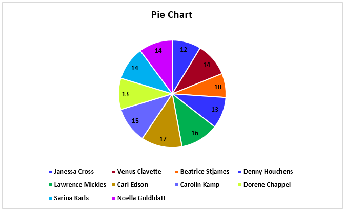
Chart #4 - Bar Chart
In the bar chart, the data is plotted on the Y-axis. Compared to the column chart, these charts use the Y-axis as the primary axis.
This chart is plotted in rows. That is why this is called a row chart.
- Select the data, go to the “Insert” tab, and then select the “Bar” chart.
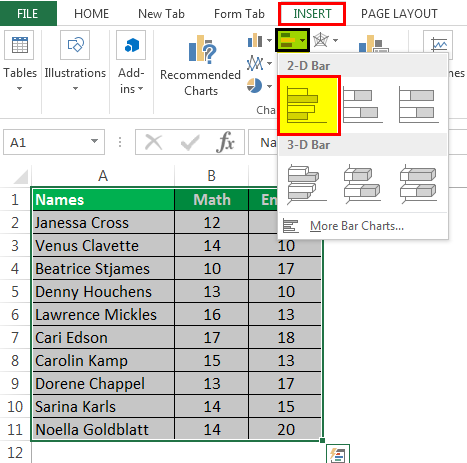
- Then, the bar chart looks like as given below:
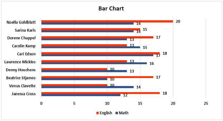
Chart #5 - Area Chart
The area chart and the line charts are the same, but the difference that makes a line chart an area chart is that the space between the axis and the plotted value is colored and is not blank.
Using the stacked area chart, this becomes difficult to understand the data as space is colored with the same color for the magnitude that is the same for various datasets.
- Select the data, go to the “Insert” tab, and select the “Area” chart.
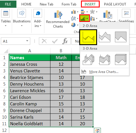
- Then, the area chart looks like as given below:
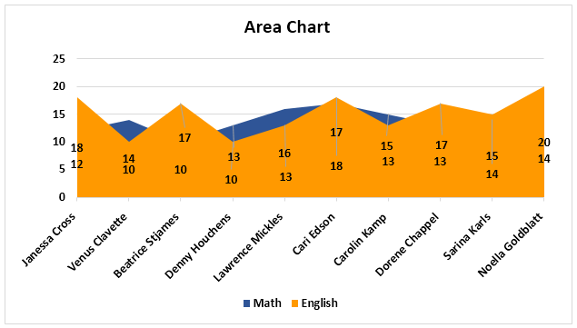
Chart #6 - Scatter Chart
The scatter chart in excel plots the data on the coordinates.
- Select the Data and go to Insert Tab, then select the Scatter Chart.
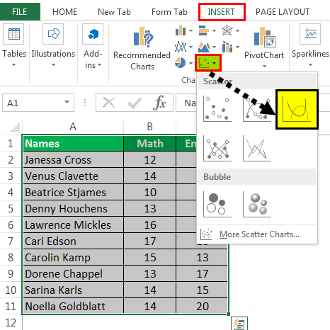
- Then, the scatter chart looks like as given below:
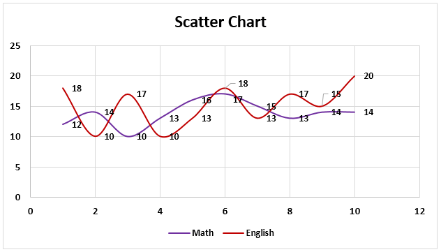
Chart #7 - Stock Chart
Such charts are used in stock exchanges or to represent the change in the price of shares..
- Select the data, go to the “Insert” tab, and then select the “Stock” chart.
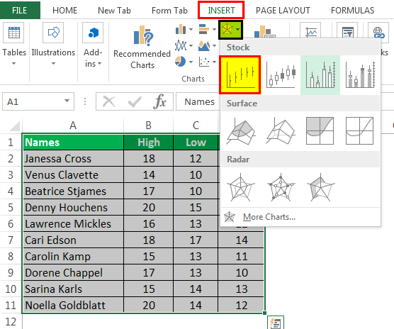
- Then, the stock chart looks like as given below:
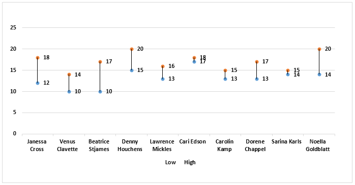
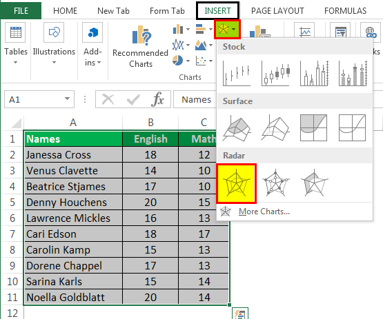
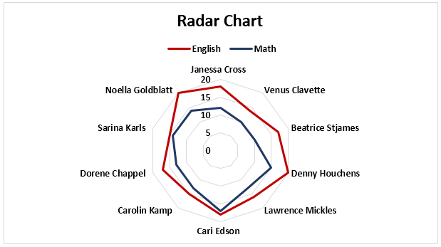
Chart #8 - Radar Chart
The radar chart is similar to the spider web, often called a web chat.
- Select the data and go to “Insert Tab.” Then, under the “Stock” chart, select the “Radar” chart.
- Then, the radar chart looks like as given below:
Important Things To Note
- To keep the chart easy to understand, we should restrict the data series to two or three. Else, the chart will not be understandable.
- We must add data labels if we have decimals values to represent.
- If we do not add them, then we cannot understand the chart with accurate precision.

