What is TimeLine Visual in Power BI?
Power BI timeline is a custom visual we need to download from the web. It is not a default visual available to use. In addition, it is a kind of slicer. We can use it to select multiple ranges of data values and see specific period visuals. However, timeline visuals can accept only “Date” values. Therefore, we cannot apply anything other than date values to this slicer.
How to Import Timeline Visual to Power BI?
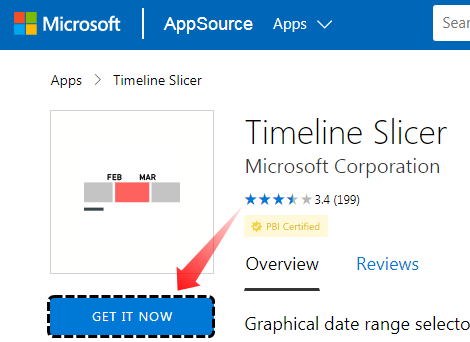
Since timeline visual is not a built-in visual to use, we need to import from the marketplace. Click on the link below first.
Source: Power BI Timeline Slicer
It will take you to the marketplace web page. Click on “GET IT NOW.”
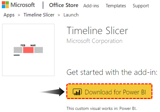
Press the “Continue” button in the next window. It will take you to “Download Page” and click on “Download for Power BI.” This Power BI custom visual file will get downloaded to your computer folder.
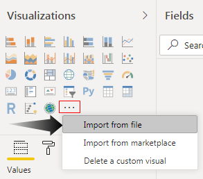
Now, open the Power BI file. Then, under “Visualizations,” click on “Import from file.”
Now, it will ask you to choose the downloaded file from the computer’s hard disk. First, go to the respective file directory and choose the file. After selecting the file, press the “Open” button.
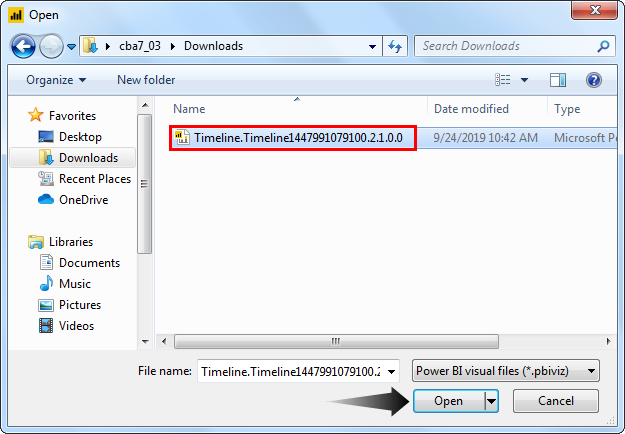
You may see the message: “The visual was successfully imported into this report.” in your Power BI file window.

Now, you should see this visual under the visualizations list.

Create Timeline Slicer in Power BI
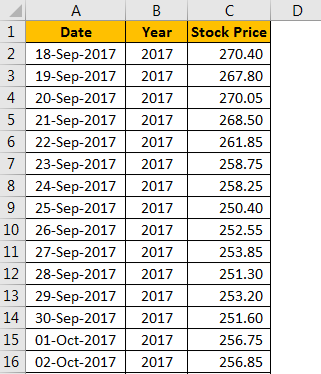
We need “Date” values with associated data to work with the Power BI timeline visual slicer. For example, below is the historical stock price for the past two years of one of the prestigious banks in India.
Copy and paste the data directly to Power BI. Else, you can copy it to an Excel file and then import it to Power BI as an Excel file reference. So, you can download the Excel workbook template from the link below, which is used for this example.
The steps to create a Power BI timeline are as follows.
- We have directly uploaded the data to Power BI.

- Come back to the “Report” view now.

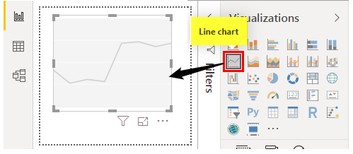
- Insert Power BI “Line chart” from the “Visualizations” field.

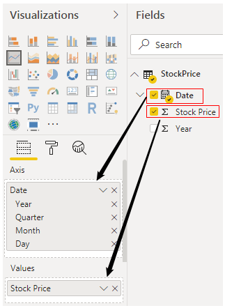
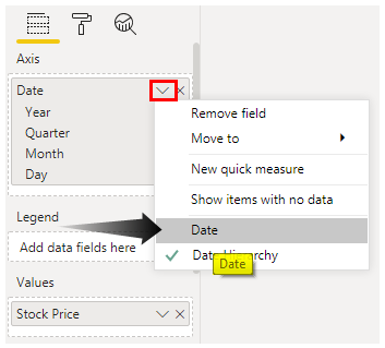
- For this blank Power BI line chart, drag and drop the “Date” column to the “Axis” field and the “Stock Price” column to the “Values” field of the “Line chart.”

- For the date, click on the “Down” arrow and choose “Date” as the option.

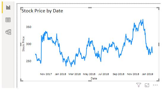
- We can see the Power BI line chart, as shown below.
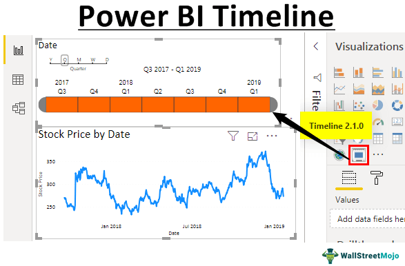
Since the data is too large, we cannot see all the data in the line chart. So, by adding a Power BI timeline slicer, we can configure the chart.

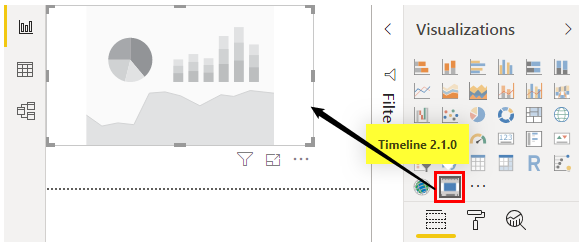
- Deselect the chart and insert Power BI “Timeline” custom visual that we have imported from the file.

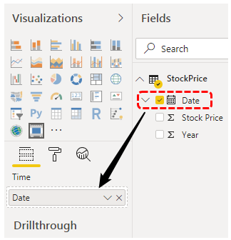
- For this Power BI timeline visual, we need to drag and drop the “Date” column to the “Time” field of this visual.

- Now, please look at the timeline slicer and how it looks.
This timeline slicer can interact with the line chart we created earlier. For example, in the aboveslicer, we can select particular months, and the line chart may show numbers only for selected months.

- We have selected Jan, Feb, and Mar under the year 2018. Now, look at the line chart.

- Power BI timeline slicer by default grouped into Year >> Quarter >> Month. We can change this under grouping in the same slicer only.

- Now, we will choose “Quarter” and see how my timeline slicer looks.
Since the “Quarter” is selected, the timeline slicer is configured accordingly.


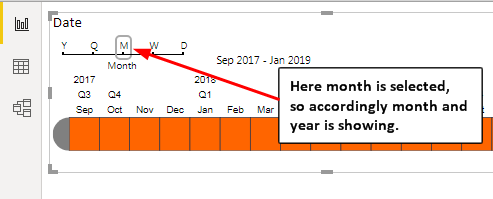

- Like this, we can configure the timeline slicer by “Year,” “Quarter,” “Month,” “Week,” and “Day” wise.

Note: We can also download the Power BI dashboard file from the link below and view the final output.
Things to Remember
- The timeline is a custom visualization that works like a filter or slicer.
- The timeline can accept only date values.
- We can configure the timeline slicer by “Year,” “Month,” “Quarter,” “Week,” and “Day.”
Recommended Articles
This article is a guide to Power BI Timeline. Here, we discuss how to import and create a Power BI timeline slicer to select multiple ranges of data & see specific period visuals and examples. You can learn more about Power BI from the following articles –