Table Of Contents
Power BI Heat Map
The heat map is a custom visualization available with Power BI to show the data numbers through presentation or visual. For example, the heat map will show the highest data density on one specific set of the area through dark heated color, and others will have the same heat as the highest value.
The latest trend is the sports area showing the analysis through a heat map. So, for example, if you take cricket sport, they show the batter's favorite hitting zone. Next, suppose you take bowlers; they show how consistently a bowler places the ball on one specific zone, yielding a wicket. Finally, if you take tennis, they show a player moving consistently in this court section, etc.
Below is the image of the tennis court heat map.
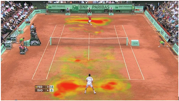
Source: https://www.hawkeyeinnovations.com
Now, we will see how to build a heat map in Power BI visuals.
How to Build Heat Map in Power BI?
We need a certain set of numerical data to build a heat map. For example, below is the sales data in different cities in India.
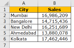
Since this is our first try to build a heat map, let us start with a simple data set only. First, copy and paste the data directly to Power BI, or you can copy the data to an Excel file and then import it to Power BI as an Excel file reference. You can also download the Excel workbook from the link below, which is used for this example.
We have directly uploaded the data to Power BI.
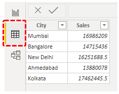
After this, we can build a heat map, but we do not have built-in visualization to use immediately.
Follow the below steps to download the custom visualization:
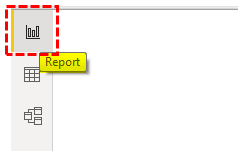
But, first, go to the "Report" view.
Come to the "Visualizations" panel, click on the "Import a custom visual" (three dots at the bottom), and click on "Import from marketplace."
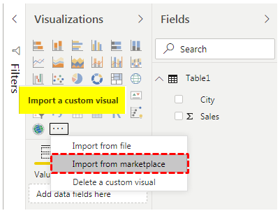
It will take us to the web page of custom visuals if you have already signed into a Power BI account. Else, it will ask you to sign in.
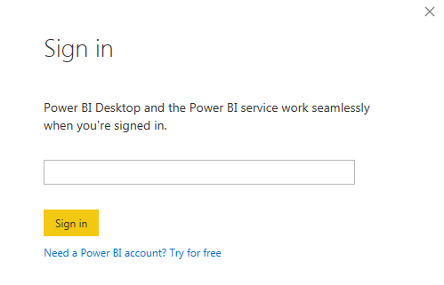
Use your official email id sign. It will take you to the web page.
In the search box, enter "Heat map" and search. You will see related search results.
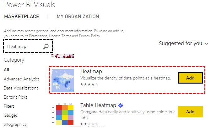
Click on the "Add" button now. We can see this new visual under “Visualizations” visuals.
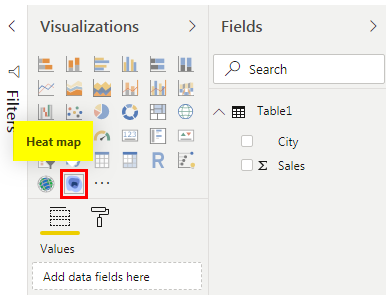
Click on this new visual. We will have a blank "heat map" in place.
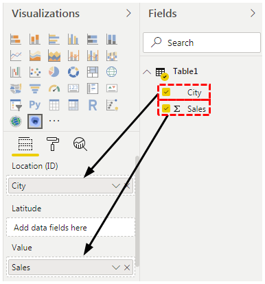
By selecting this visual, drag and drop the "City" column to the "Location (ID)" field and drag and drop the "Sales" column to the "Value" field.
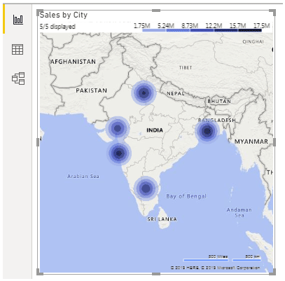
Now, we have our "Heat Map" ready to use.
Now, select the "Format" option by selecting the heat map.
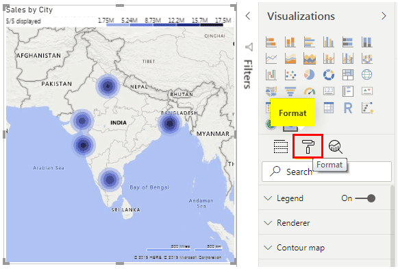
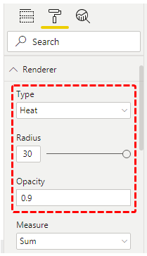
Under "Renderer," select the "Type" as "Heat," "Radius" as "30," "Opacity" as "0.9", and "Measure" as "Sum."
Finally, our heat map looks like this.
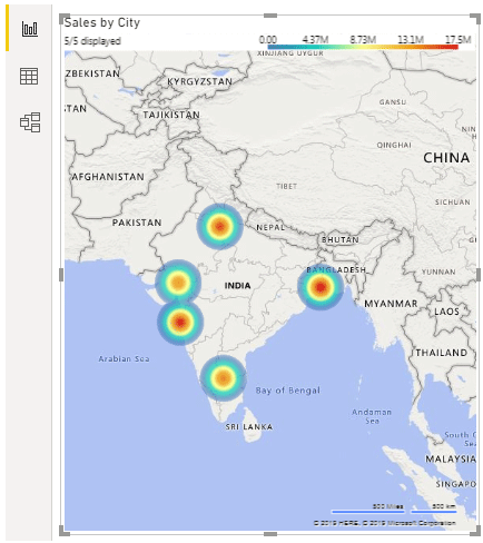
One interesting thing about this heat map is at the top of it, we can see a legend with different colors with different sales numbers for those colors.
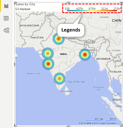
By using these color legends, we can easily read the heat map.
Build Table Heat Map in Power BI
A new addition to the heat map category is building a "Table Heat Map." Unfortunately, this is also not a built-in tool, so you must download it from the web.
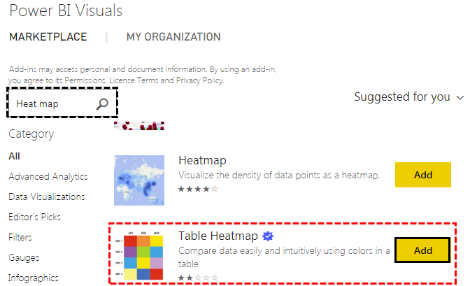
- Click on "Add." It will import it to the Power BI visuals category. We can see this under the "Visualizations" list.
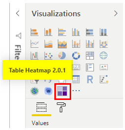
- Insert blank “Table Heat Map.”
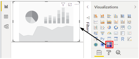
- Now, we need to drag and drop columns to our respective fields. For example, drag and drop "City" to the "Category" field and "Sales" to the "Y" field.

It will give us the table heat map like the one below.
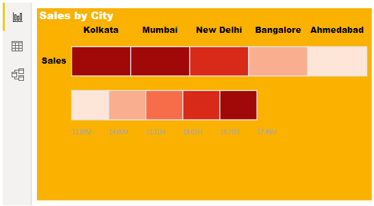
As you can see, each color indicates different numbers on the slab. We have applied format to this table so that you can do the same under the "Formatting" section.
Note: We have done so much formatting to this table. You can download the Power BI heat map file from the below link and apply each formatting technique as applied.
Things to Remember Here
- The heat map is a custom visualization in Power BI, so we must insert it from the marketplace.
- The Power BI heat map builds visualization based on numerical values only.
- From the marketplace, we can download different kinds of heat map visualizations.

