What is the Gantt Chart?
→ Explore all 78 Excel Charts articles
Gantt Chart in Excel is a visual representation of the progress of tasks against the set timeline. So, through this chart, we can oversee each task activity against the set deadline. A Gantt chart in the horizontal line axis represents the total time required to complete the task. We have a Power BI visualization tool to create a beautiful Gantt Chart.
Below are the key parts of the Gantt chart.
- Task Name: It is important to have each task name in detail. The same will be displayed on the chart horizontally against each horizontal axis bar.
- Time Duration: Against each task, what is the time duration to complete the task.
- Date Values: For each task, what is the projected starting date.
- Completion Percentage: Once the deadline crosses for each task, what is the percentage of completion for each task.
You need data to work with to create the Power BI Gantt chart. So, you can download the Excel workbook template from the link below, which is used for this example.
How to Create Gantt Chart in Power BI?
To create a Gantt chart in Power BI, we need a data set with all the above elements of the Gantt chart.
Below is the simple task list to create a Gantt chart in Power BI.
Note: Data source is from Microsoft.

- Copy the above table to the Excel worksheet and then upload the data to Power BI.

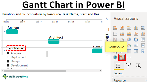
- Unfortunately, “Gantt Chart” is not a built-in chart we can use immediately. So, we need to import from the marketplace to use it.
- Go to the “Visualizations” list and choose “Import from marketplace.”

- Search “Gantt Chart” in Power BI from the marketplace and click on the “Add” button.

- Now, we can see this visual under our visualization list.

- By clicking on this, insert the blank “Gantt Chart.”

- Using the fields of “Gantt Chart,” we will build the “Gantt Chart” for the uploaded data. We first must drag and drop “Task Name” to the “Task” field of the chart.

- We can see how Power BI in Gantt Chart is shaping up.

- The second item we must drag and drop is the “Resource” column to the “Legend” field.

- Drag and drop the “Start Date” column to the “Start” field.

- Drag and drop the “Duration” column to the “Duration” field.

- Drag and drop the “% Completion” column to the “% Completion” field.

- We must add another important thing to drag and drop the “Resource” column to the “Resource” field.

- Now, the “Gantt Chart” in Power BI looks like this.
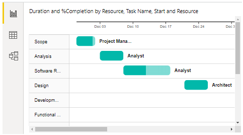
On the left-hand horizontal side, we can see “Task List Names.” On the top horizontal line, we can see “Start Date.” Each bar represents each task completion percentage. If the bar is filled, that is considered 100% completed. Else, we can see the percentage completion percentage.
Since the task list and duration is long, we need to use scroll bars to scroll through each task, which is frustrating. But, by adding a slicer to the task list, we can filter each task and see what is happening.
- Insert slicer and add the file as “Task Name.”

- Now, if you click any specific task set, it will display only those tasks Gantt chart. So, for example, we have chosen three tasks from the slicer and can see only those three tasks in the Gantt chart.

Note: We can also download the Power BI dashboard file from the link below. Finally, we can view the final output.
Things to Remember Here
- The Gantt chart is not a built-in chart. So, we need to import it as a custom visual.
- Try downloading different kinds of custom visuals for the Gantt chart.
- The data should include all the necessary fields, as shown above.
Recommended Articles
This article is a guide to Power BI Gantt Chart. Here, we learn how to create a Power BI Gantt chart to visualize the progress of tasks against the set timeline. You may learn more about Power BI from the following articles: –