What is the Waterfall Chart in Power BI?
The waterfall chart is a kind of column chart showing all the positive and negative variance values against the targeted values. This chart helps us understand how values continue to contribute to overall numbers over time. This chart, we would call “Positive & Negative Variance” values towards set goals. This article will show you how to create a waterfall chart in Power BI.
You need data to work with to create the Power BI waterfall chart. So you can download the Excel workbook template from the link below, which we have used for this example.
How to Create a Waterfall Chart in Power BI?
To create the waterfall chart, we must have actual values and targeted numbers over time. Below is the monthly target vs. actual numbers.
- The above table can create a waterfall chart in Power BI. Copy and paste the above table into the Excel worksheet.

- Save the workbook in one of the folders. Now, open Power BI, click on the “Get Data” option, and choose “Excel” as the data source option. Next, choose the file and upload it. Under the “Data” tab, we should see this table.

- This data is not ready yet to create a waterfall chart in Power BI. First, we need to find “Variance” between “Target” and “Actual” values. Then, under “Modeling,” click on “New Column.”

- It will ask you to name a new column.

- Give the name “Variance” and enter the DAX formula as “Actual – Target.”

- After the formula, press the “Enter” key. It will create a new column for our existing table.

- Using this data, we can create a waterfall chart in Power BI. But, before that, let us see what it looks like under the column chart.
- Return to the “Report” tab and insert a blank column chart.

- Now, drag and drop the “Financial Month” column to the “Axis” field and the “Variance” column to the “Value” field to have the below chart.

- As you can see below, all the negative values are downward bars, and positive variance values are upward bars.

- Selecting the chart from the visualization list, click on the “Waterfall chart.”

- The column chart may automatically convert to the waterfall chart.

- The problem here is this chart automatically sorts the values based on the “Variance” column from highest to lowest, so that is the reason we have all our negative values (red bars) towards the end of the chart. To sort based on the “Month” number by selecting the chart, click on three dots at the top right-hand side of the chart.

- It will open up the below options for the chart.

- Go to “Sort by” and choose “Month.”

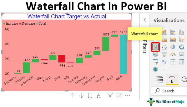
- Our waterfall chart is sorted based on “Month” and looks like this.

- So, if the variance value is positive against the targeted value, we have a column bar color with a “Green” color. If the variance value is negative against the targeted value, we have a column bar color with a “Red” color.
- In the end, we have one more bar saying “Total” this is the overall variance value against the target.”

Formatting of Waterfall Chart in Power BI
- By formatting this Power BI waterfall chart, we can make the chart look more beautiful as well. By selecting the chart, click on the “Format” option.

- The first thing we need to format is to change the default color and font size of “X Axis” values.

- Next, we will do the same for Y Axis as well.
- Under “Data labels,” change color to “Black,” “Display units” to “None,” and “Text size” to “12.”

- Under “Sentiment colors,” we can change the bar colors of “Increase,” “Decrease,” and “Total” value columns.

- Now, fill the background color with “Pink” and make the “Transparency” 20%.

- One final thing we need to add to this chart is “Title.” Under the “Title” formatting category, do the below change.

- Now, we have a waterfall chart that looks like the one below.

As you can see in the months, they did not meet the “May,” “June,” and “July” targets, so we have those column bars in “Red” colors.
Note: We can also download the Power BI dashboard file from the link below and view the final output.
Things to Remember
- It is a built-in chart in Power BI.
- We must use the “Variance” column to create the waterfall chart in Power BI.
- The positive variance is default shown in the “Green” color and the negative variance in the “Red” color.
- Even though we do not have a “Total” column, i.e., the overall variance column, Power BI automatically inserts this column.
Recommended Articles
This article is a guide to Power BI Waterfall Chart. Here, we discuss creating and formatting a waterfall chart on the Power BI Desktop, along with examples and downloadable templates. You can learn more about Power BI from the following articles: –
Recommended Articles
Continue with these closely related articles from the same guide.