What are Power BI Visuals?
Power BI has some built-in visuals and custom visuals for data visualization. Custom visuals are user-defined where the user can use creativity to present data. For example, we can use lines and dots flashing and floating to display the data changes in a certain time period.
Power BI visuals are the type of charts, graphs, tables, cards, etc., available with Power BI to visualize our data.
Power BI visuals are the type of charts, graphs, tables, cards, etc., available with Power BI to visualize our data.
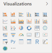
In this Power BI visualization box, we can see “Stacked Bar Chart, Stacked Column Chart, Clustered Column Chart, Clustered Bar Chart, 100% Stacked Bar Chart, 100% Stacked Column Chart, Line Chart, Area Chart, Stacked Area Chart, Line & Stacked Column Chart, Line & Clustered Column Chart, Ribbon Chart, Waterfall Chart, Scatter Chart, Pie Chart, Donut Chart, Treemap, Map, Filled Map, Funnel Chart, Gauge Chart, Card, Multi-row Card, KPI, Slicer, Table, Matrix, etc.
Now, we will see how to use some of these visuals and format the same for better visualization.
You can download the Excel data below to use the same for building visuals. However, it is better if you can download and practice with us as we show them.
How to Create Custom Visuals in Power BI?
We have already uploaded the data from Excel to Power BI, which looks like this.
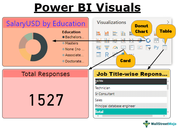
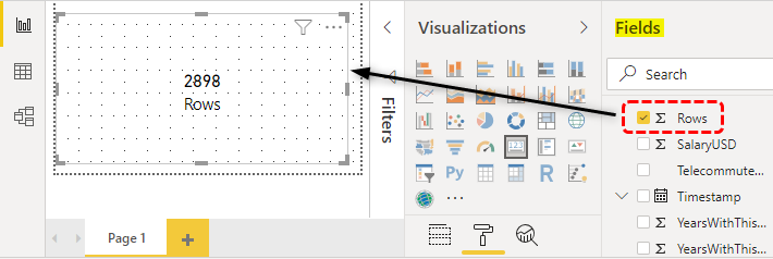
So, the first Power BI visual we will practice is “Cards.”
Visual #1 – Cards
Cards are there to showcase the selected column numbers. Now, we will show how many responses are in this employment survey.
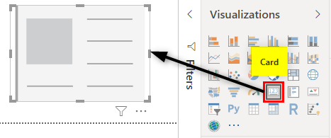
For this, first, choose the “CARD” visual.
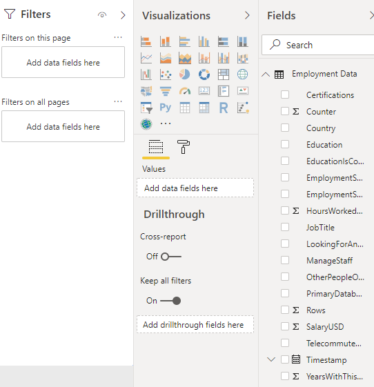
Choose the “Rows” column from the “Fields” to get the total responses.
Since the cards are the current selection, we can easily see the numbers on the card. But the moment you unselect the card, it looks like the one below.

In this, we cannot see a card visual for this, so now we need to design this visualization to improve the presentation.
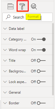
- First, we will add a heading for this card because, as of now, we do not see any heading for this card. Select the card and go to the formatting section.

- Click on “Format” in this section to see all the formatting options.
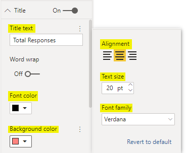
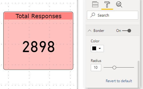
- Since we need to add “Title” to the card, click on the “Title” option. Under this, enter the “Title” of the card as “Total Responses,” font color as “Black,” background-color as “Pink,” alignment as “Center,” “Text size” as “20,” “Font family” as “Verdana.”
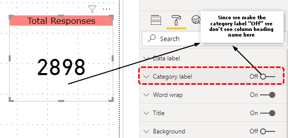
Now, we will have a card heading like the below one.

- Since we have added “Title” to the card, make “Category label” “Off.”
- Now, choose the background option and fill the color identical to the title background color.mak Also, make the transparency 50%.

- Now, apply “Border” to the card, as shown below.
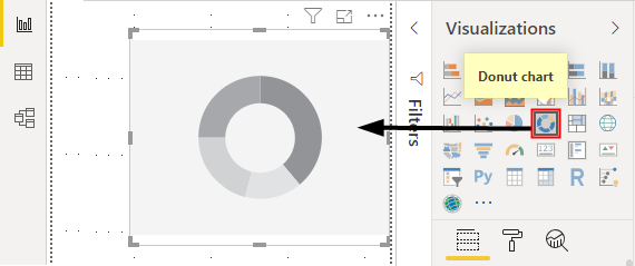
Visual #2 – Donut Chart
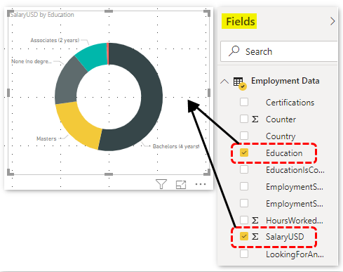
We all know how to create a Donut chart in Excel, but this time in Power BI visuals, you need not break your sweat, so for the data on “Education and their respective salaries,” we will create a “Donut” chart.
- Select the “Donut chart” first.
- Now, click on “Education” and “Salary USD” from the “Fields” column from the “Fields” column to create a donut chart.
Similarly, we must play around with this chart to make it look beautiful.
- Add “Border” to the chart, as shown below.

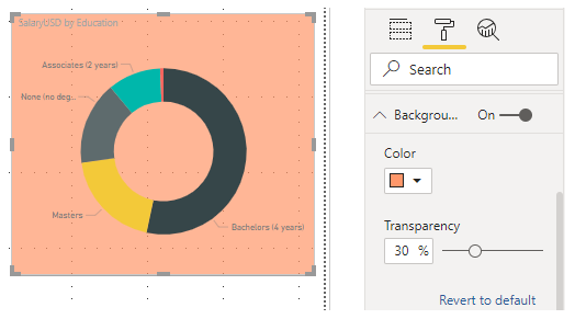
- Now, add background color, as shown below.
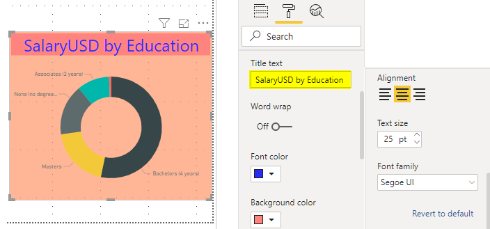
- You can change the “Title” of the chart and make formatting, as shown below.
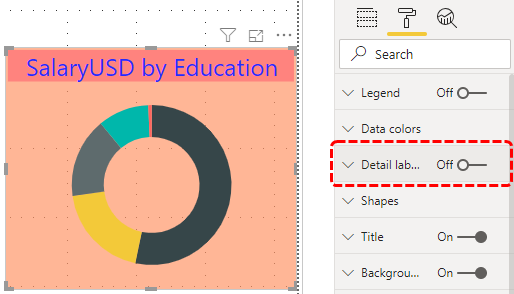
- Switch off “Data labels.”
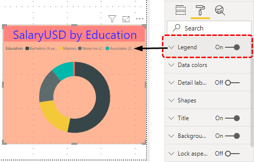
- Add “Legend.”
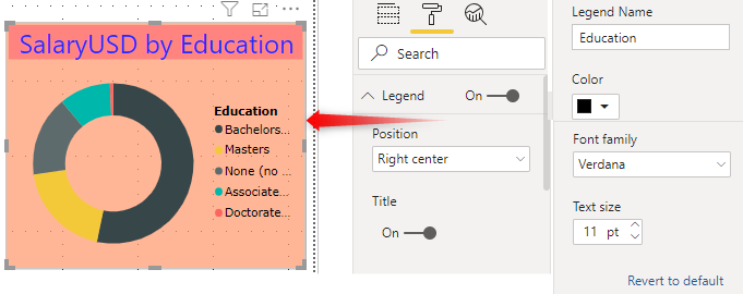
- For “Legend,” do the below formatting to make it look beautiful.
If you wish to play around with the inner circle size of the donut chart, you can do this under “Shapes.”
- The inner circle will look like the “Pie” chart if the inner radius is zero.
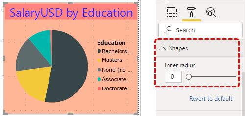
Like this, you can increase or decrease the inner circle size to fit.
Visual #3 – Table
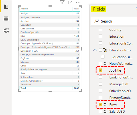
Using Table visual, we can create a summary table. For example, if you want to create a summary of “Job Title,” a wise number of responses, choose “Table” from visuals.

Now, choose “JobTitle” and “Rows” from the “Fields” to create a table like this.
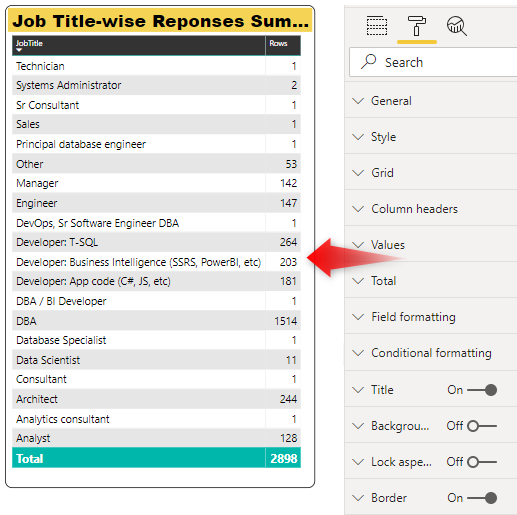
Add “Title” to the chart as “Job Title-wise Responses Summary” and design the heading.
Like this, we can create Power BI visualizations to design the dashboards.
Things to Remember
- Based on the data, we can design the visuals.
- We can insert custom visualization in Power BI as well.
- For all the visuals, formatting is an important technique. We must learn formatting methods to add value to the dashboard.
Recommended Articles
This article is a guide to Power BI Visuals. Here, we learn how to create custom visuals with Microsoft Power BI and examples of cards, donut charts, tables, etc. You can learn more about data visualization from the following articles: –