
Table Of Contents
How to Create a Pivot Table in Excel?
The Pivot Table is created by using the following methods:
Method #1
Pivot Table in excel can be created using the following steps
- Click a cell in the data worksheet.
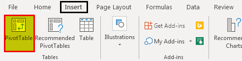
- In the “Tables” section of the “Insert” tab, click “Pivot Table.”
- A “Create Pivot Table” window appears (as shown below).
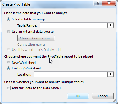
- Now under the option “Choose the data that you want to analyze,” Excel automatically selects the data range.
- The data range is displayed in the “Table/Range” box under the “Select a table or range.”
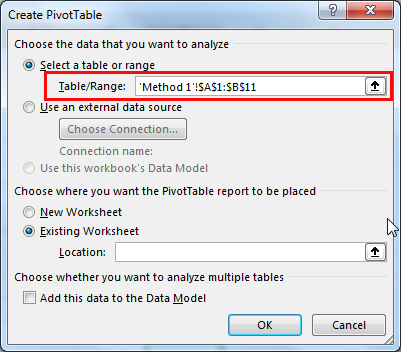
- In the “Table/Range” option, we can verify the selected cell range (shown in the below image).
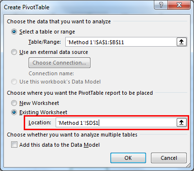
- The next step is to choose the location of the Pivot Table report. The worksheet can either be the existing or a new one.
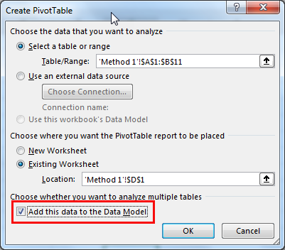
- In this example of Excel Pivot Table, cell D1 is selected. Under the option “Choose where you want the Pivot Table report to be placed,” select “Existing Worksheet” (shown in the below image).
Note: Select “New Worksheet” if we prefer to insert a Pivot Table on the new worksheet (as shown in the below image).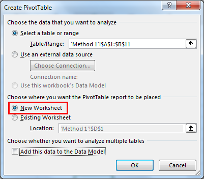
- To analyze multiple tables, go to the option “Choose whether you want to analyze multiple tables” and click the below checkbox “Add this data to the Data Model.”
- Click “OK” to insert the Pivot Table in the worksheet, depending on the location selected.
If we select “New Worksheet,” the “Pivot Table 1” is placed on the new empty worksheet.
The succeeding image shows a column named “Pivot Table Fields” on the right-hand side. This shows a list of fields or columns to be added to the Pivot Table report.
Now, the Pivot Table is created on the Column range A (“Maths”) and Column B (“Science”), respectively. The same is displayed in the “Fields” list (shown in the below image).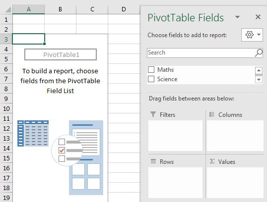
Method #2
- At first, select the data range. It is an input to the Pivot Table.

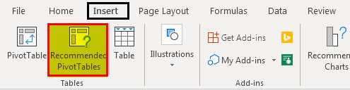
- Go to the “Insert” tab and select “Recommended Pivot Tables.” This option provides the recommended ways of creating Pivot Tables. The user can select and choose one among the given recommendations.
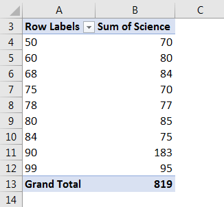
- The below image shows the two recommendations given by Excel. One is the “Sum of Maths by Science,” and the other is “Sum of Science by Maths.”
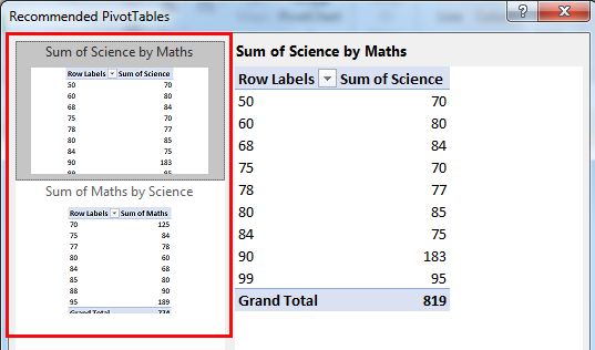
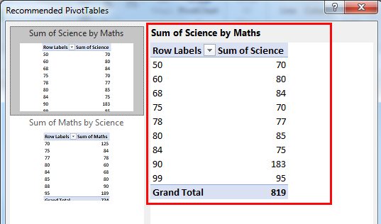
- When you click one of the options, the actual Pivot Table along with the values, opens in the right-hand-side panel.
- Here, the “Group by” option provides the following ways of grouping:
- “Add Science column marks group by Maths column marks”
- “Add Maths column marks group by Science column marks”
- The user can select either of the two ways of grouping. The grouped data is displayed in ascending order (for both the ways of grouping).
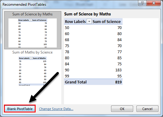
- The other option is “Blank Pivot Table.” To create a new Pivot Table, click “Blank Pivot Table” box. It is displayed at the bottom (left-hand side) of the “Recommended Pivot Tables” window as shown in the succeeding image.
- This step will follow the “Method 1” (mentioned in the previous section) of creating a new Pivot Table.
Pivot Table Uses
Let us understand the uses of the Pivot Table with the help of the below-mentioned case studies:
#1 - “Max” of Science marks by Maths marks
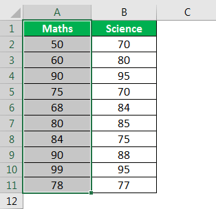
The table below provides the marks of the subjects Maths and Science in Column A and Column B, respectively. The given data is selected to create the Pivot Table in excel.
Now generate the Pivot Table report to find the maximum number which is present in the “Science marks column” by “Maths marks column” values.
Let us follow the steps shown in previous sections - “Method 1” or “Method 2” to generate the Pivot Table.
- Now, drag “Maths” marks to the “Rows” field and “Science” marks to the “Values” field.
- Right-click on the Pivot Table and select “Value Field Settings.”
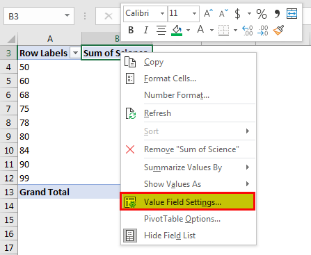
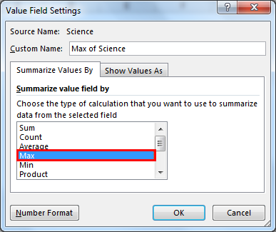
- Now select the “Max” option from the “Summarize value field by” option in the window.
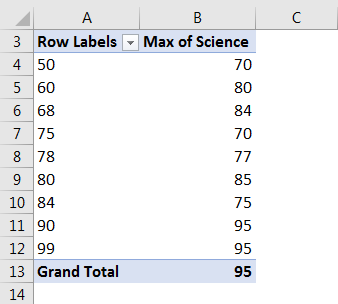
- The “Max” option returns the maximum number present in the Science marks (represented in Column B of the table below).
#2 - Average of Maths Marks Column
A list of Maths and Science marks is provided in Column A and Column B of the table below. Generate the Pivot Table report on the average number of the Maths marks (Column A).
Select the data in Column A (Maths marks) to create the Pivot Table.
Let us follow the below steps to find the “Average” of the Maths marks in Column A.
- Create a Pivot Table and drag “Maths” in the “Rows” field.

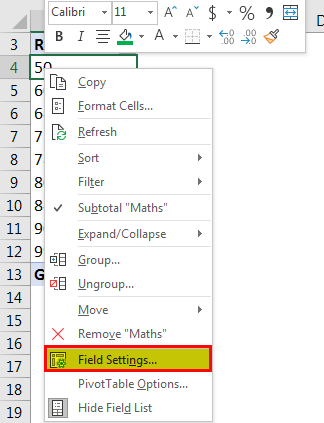
- Right-click on the Pivot Table and select “Field Settings.”
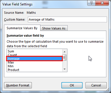
- In the “Field Settings” window, select the “Custom” button under the tab “Subtotals & Filters.”
- Below this tab, choose the “Average” function.

- Now drag “Sum of Maths” in the “Values” field.

- Right-click on the Pivot Table and select “Value Field Settings.”

- In the “Value Field Settings” window, go to the “Summarize value field by” tab. Then select the “Average” option.
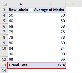
- The Value Field is selected as “Average,” which returns the average value of 77.4 as a result in the Pivot Table Report.
Similarly, other numeric operations can be performed on the given dataset. The dataset can also be filtered to fit the ranges as per the requirement.
