Table Of Contents
What is the Timeline in Excel?
Timeline in Excel is a kind of SmartArt created to display the different timings of a particular process. It is mainly used for filtering the underlying datasets by date. Such datasets are in the form of pivot tables containing the date field.
The timeline was first introduced in the 2013 version of Excel.
How to Create Timelines in Excel? (With Example)
In the following table, there are five columns, namely–Date, Branch, Product Category, Customer Type, and Revenue.
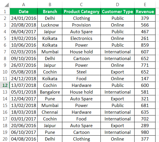
With the help of a pivot table and a pivot chart, let us create a timeline in Excel. The pivot table and pivot chart help summarize and analyze data.
Step #1 - Create table object
Initially, let us convert the data set into a table object with the help of the following steps:
- Click inside the data set, go to the Insert tab, and select “table".

- The “create table” popup appears which displays the data range and a checkbox for table headers. Click “Ok.”

- Once the table object is created, the data appears in a tabulated form, as shown in the succeeding image.

Step #2 - Create a pivot table
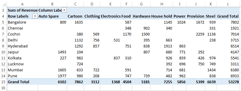
Since we want to summarize the revenue data across different categories of the timeline, we create a pivot table.
The steps to create a pivot table are listed as follows:
- Click on the data set within the table.
- Go to the Insert tab, select “PivotTable,” and click “Ok.”
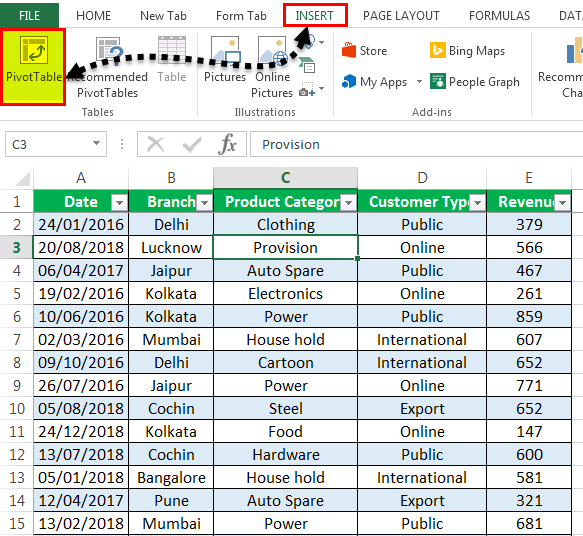
- The “PivotTable Fields” pane appears in another sheet. Name this sheet as “PivotTable_Timeline.”
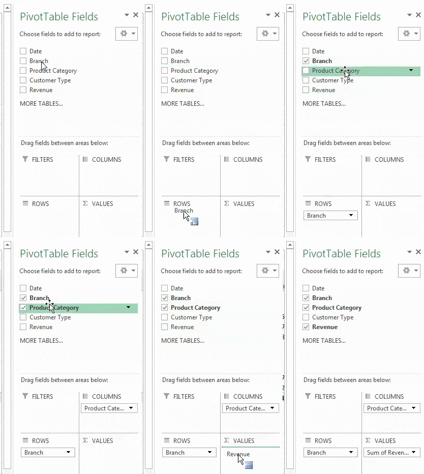
- In the “PivotTable Fields” pane, drag “branch” to the “rows” section, “product category” to the “columns” section, and “revenue” to the “values” section.
Step #3 - Create a pivot chart
We need to base a pivot chart on the pivot table that we have created. The steps to create a pivot chart are stated as follows:
- Copy the previous sheet as “PivotChart_Timeline” or create another sheet with this name.
- Click inside the pivot table on the sheet “PivotChart_Timeline.”
- In the Home tab, go to “Analyze” and select “PivotChart.”

- The “insert chart” popup window appears.
- Select “stacked column chart” and click “Ok.”
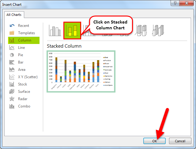
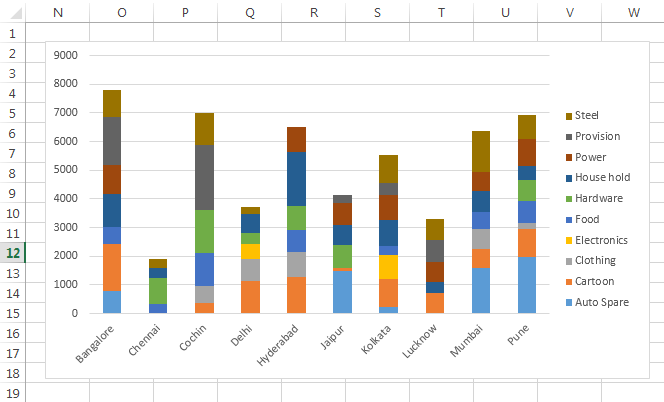
- The pivot chart appears as shown in the following image.
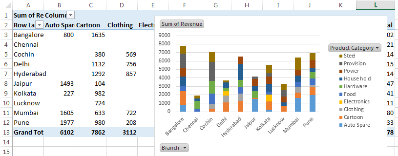
- In the pivot chart, you can hide the “product category,” “branch,” and “sum of revenue.” To do this, right-click and select “hide legend field buttons on chart,” as shown in the succeeding screenshot.
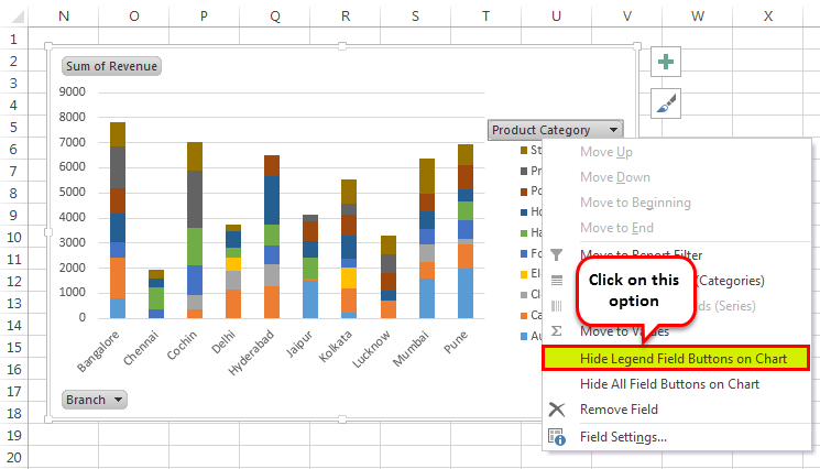
- The pivot chart appears without the legend buttons, as shown in the following image.
Step #4 - Insert a timeline in Excel
The steps to insert a timeline are mentioned as follows:
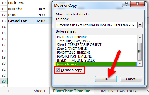
- Copy the “PivotChart_Timeline” to other sheets with the “create a copy” option. The popup window shown in the succeeding image appears.
- Right-click on the sheet name “PivotChart_Timeline” and name the sheet as “Insert_Timeline."
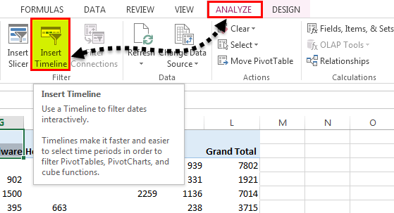
- Click anywhere on the data set of the pivot table. Select the Analyze tab on the Excel ribbon and click on the “Insert Timeline” button in the Filter group.
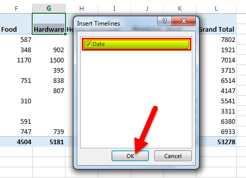
- The “insert timelines” pop-up window appears. It shows a checkbox with the date field. This is the filter of the timeline. Select the checkbox and click “Ok.”
- Now, the timeline appears.
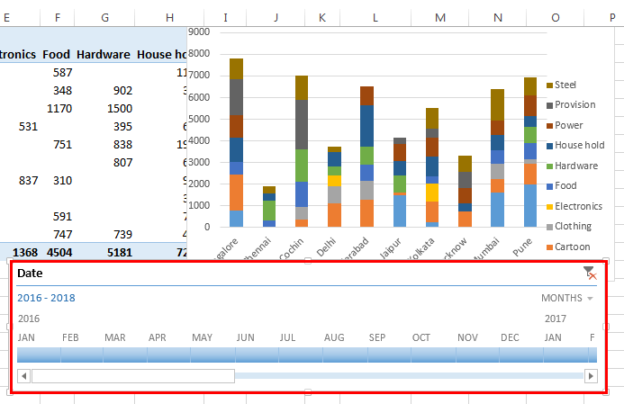
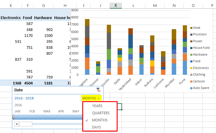
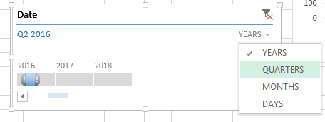
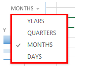
- For the timeline, you can configure or select group dates by years, quarters, months or days with the help of the drop-down list.
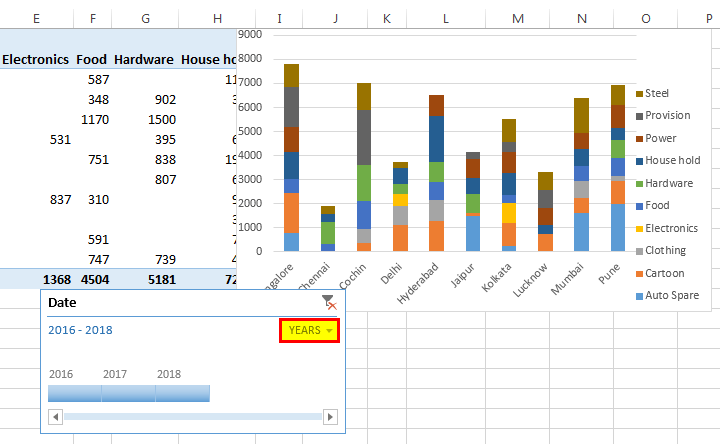
- We have selected “years” as shown in the following image.
How Does the Timeline Filter the Pivot Table?
Let us consider the previous example again.
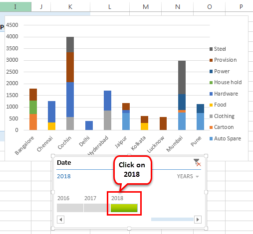
We want the timeline to filter the pivot table with results of the year 2018. To do this, click on “2018” in the timeline slicer.
The revenue for the year 2018 with reference to the branch and product category appears.
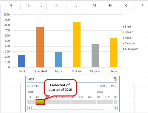
Now, let us select “quarters” from the dropdown list. If quarterly data in the timeline is not visible, drag the blue-colored box towards the end.
Let us select the 2nd quarter of 2016 to observe revenue across the different branches and product categories.
Top Timeline Tools in Excel
Timelines in Excel help filter the dates of the pivot tables. This is done with the help of various tools that assist in the working of the timeline.
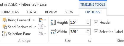
The timeline tools appear to the right and the left of the Options tab, as shown in the following two images.


The major timeline tools are listed as follows:
#1 - Timeline slicer
The timeline slicer allows toggling between years, quarters, months, and days. In the dashboard, there is an option of combining the timeline with the slicer.
In comparison to the normal date filter, the timeline slicer is a more effective visual tool. This is because the latter provides a graphical representation that helps track critical milestones.
#2 - Scroll bar
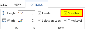
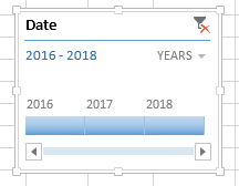
It appears in the Options tab and helps select periods. It also allows scrolling through the years, quarters, months, and days.
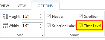
#3 - Time level
This tool allows selecting from four different time levels based on choice. The four-time levels are, namely–years, quarters, months, and days.
#4 - Filter
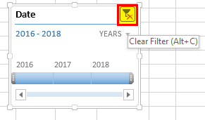
This button helps clear all the “time” options like years, quarters, months or days.
#5 - Timeline header
It displays the heading or the title of the timeline, as shown in the following image.

#6 - Selection label
It displays the date range that is included in the filter.

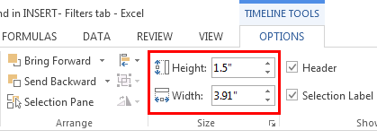
#7 - Timeline window size
The height and width of the PivotTable timeline can be adjusted according to the requirement. It is also possible to resize the timeline window by dragging it from its borders.
#8 - Timeline caption
By default, the caption box shows the column name as the caption. This is the column that was selected while inserting the timeline.

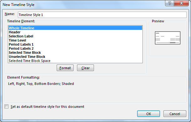
#9 - Timeline style
There are various style options in Excel for the PivotTable timeline. The following screenshot shows 12 types of theme styles.

The style of the timeline can also be customized according to choice.
