Part of our Excel Charts guide
Stacked Column Chart in Excel
A stacked column chart in Excel is a column chart where multiple series of the data representation of various categories are stacked over each other. The stacked series are vertical. The comparison for numerous data series is easy. But, as the number of data series increases, the complexity of representation also increases.

5 Main Parts of Stacked Column Chart
- Title: It describes the information about the stacked column.
- The X-axis (horizontal): It represents an individual entry for which the values are to be presented.
- Bars: The height of a bar represents the total value as the sum of the values of all the legends.
- The Y-axis (vertical): It denotes the intervals spanning the lowest and highest values.
- Legend: It describes the type/category of the dataset that contributes to the column bars.
Types of Stacked Column Chart in Excel
- Stacked Column
- 3-D Stacked Column Chart
- 100% Stacked Column
- 3-D 100% Stacked Column
How to Create a Stacked Column Chart in Excel? (with Examples)
Example #1 – Steps to Create a Basic Excel Stacked Column Chart
Following are the steps to create a basic excel stacked column chart –
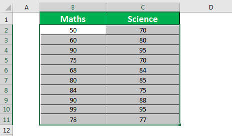
We should first select the range of cells (rows and columns) containing the data to be presented using a stacked column graph. That would be the input data for the chart.

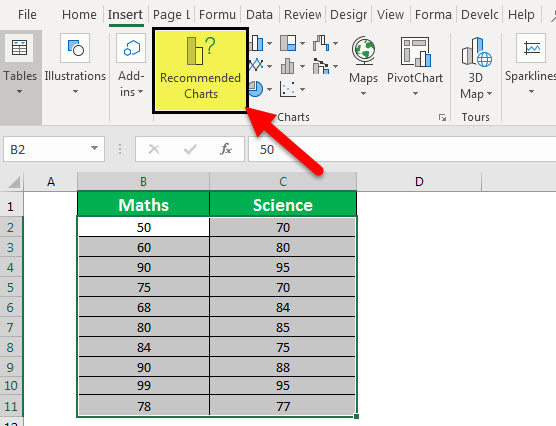
Then, click on “Recommended Charts,” as shown below.

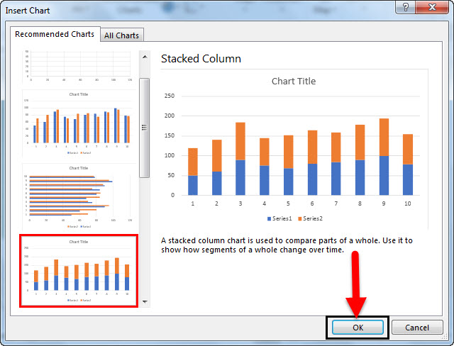
Select Columns-> Stacked Column Chart from the given list -> Click “OK.”


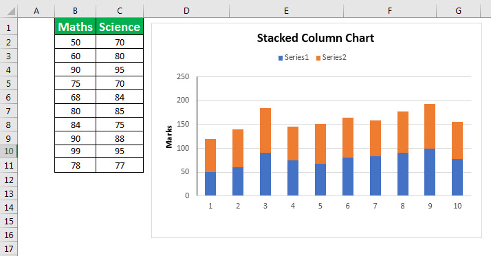
As shown in the above figure, the data consists of two columns, B and C, indicating marks in Maths and Science, respectively.
The chart on the right side is a stacked column graph wherein the X-axis represents the sequence of each entry, such as 1, 2, 3, …, 10. The Y-axis indicates marks. The interval is auto-generated by Excel to 50. Hence, the values are 0, 50, 100, 150, 200, and 250. The height of the bars represents the value. As the chart’s name is “stacked,” the legends are stacked in a single column. As seen in the chart, the blue color indicates column 1, “Maths” marks, and the orange color indicates column 2, “Science” marks.
The maximum value shown by each column bar is the total of each legend’s values. E.g. 50 + 70 = 120 for column 1.
Example #3 – Steps to Create 3-D Stacked Column
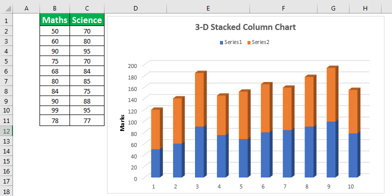
It is different from the default stacked column graph only in representing the column bars. It enables a better view of the column bars if compared to the default one. The rest of the features remain like that of a 100% stacked column.
Example #4 – Steps to Create 100% Stacked Column
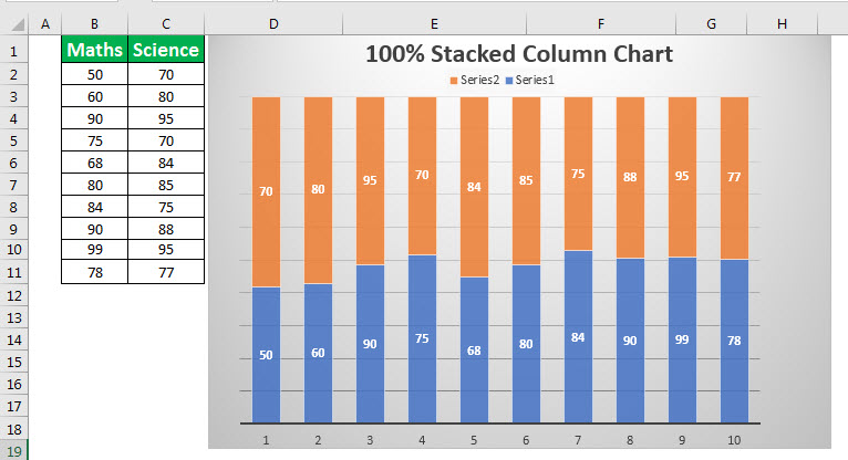
This chart is slightly different from the default stacked column in that the height of every column or bar is 100% by default. Instead, the legends are divided among that 100%. So, the maximum value shown by each column bar will always be 100, unlike the sum of the values of all legends in the default stacked column.
As shown in the above figure, the data consists of two columns, B and C, indicating marks in Maths and Science, respectively. The chart on the right side is a 100% stacked column wherein the X-axis represents the sequence of each entry, such as 1, 2, 3, …, and 10. The Y-axis indicates marks. There is no interval in this type of chart. The height of each legend represents the value ( i.e., marks here) among 100% occupied by the bar.
Like a stacked chart, the legends are stacked in a single column. The “blue” color represents column 1, “Maths” marks, and the “orange” color represents column 2, “Science” marks.
Example #5 – Steps to Create 3-D 100% Stacked Column
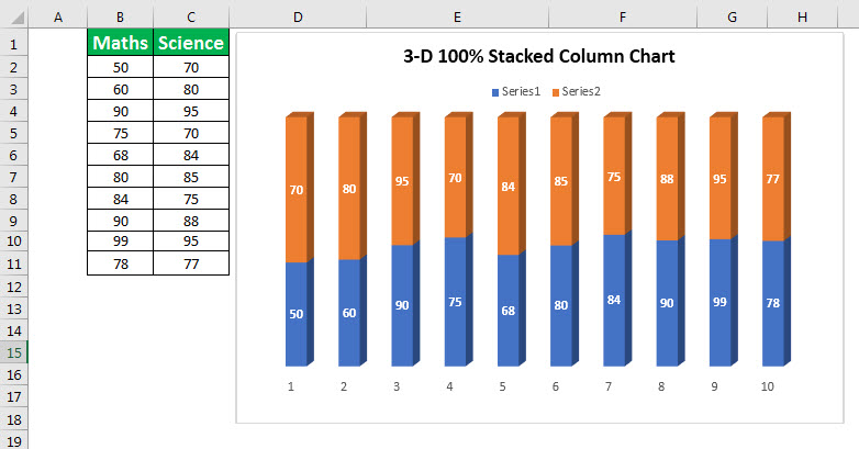
The 3-D 100% stacked column is different from a 100% stacked column, only representing the column bars. It enables a better view of the column bars if compared to the default one. The rest of the features remain like that of a 100% stacked column.
Pros
- Each column bar represents one value. So, the stacked column graph is useful where the entities to be measured are discrete such as “Marks.”
Cons
- A stacked column may not be a good choice if the dataset is too large.
Things to Remember
- The stacked column graph is based on the column bars, which comprise one or multiple legends.
- A column bar is composed of the values of all participating legends.
- A column bar represents one row from the given dataset.
- They represent a discrete dataset wherein one column represents one individual entry (row) in the dataset.
Recommended Articles
This article is a guide to Stacked Column Chart in Excel. Here, we discuss its uses and how to create a stacked column graph along with Excel examples and downloadable templates. You may also look at these useful functions in Excel: –