What Is Frequency Distribution In Excel?
The Frequency Distribution in Excel calculates the data distribution over a period or intervals of time. It lets us analyze how frequently the data values occur in a selected list. To find the Excel Frequency Distribution we must first group or categorize our data into datasets.
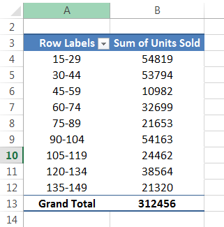
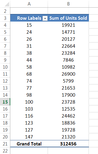
For example, in a dataset of units sold from 15 to 150 products, if we use the PivotTable method to find the Frequency Distribution, then we will get the output, as shown below.
Key Takeaways
- The Frequency Distribution in Excel helps users understand the changes of data in a certain amount of time by placing the data as categories.
- Since the function returns multiple values, we must execute as an array formula i.e., execute the formula using the “Ctrl+Shift+Enter” keys, and not the normal “Ctrl+Enter” keys.
- We can make use of the Histogram method from the Analysis ToolPak to calculate and graphically display the Frequency Distribution data.
- If we do not see the Data Analysis tab, we can always enable it from the “Excel Options” window.
How To Create Frequency Distribution In Excel?
We can calculate or create the Excel Frequency Distribution using two methods, namely:
- Using Excel COUNTIF Formula.
- Using Pivot Table.
In this article, we will calculate the Frequency Distribution in Excel using the two methods with specific examples. However, as an alternative, we can use the “Histogram” tool in the “Data Analysis” tab, to calculate the Frequency Distribution.
Examples
Let us consider examples to calculate Frequency Distribution using COUNTIF and a PivotTable.
Example #1 – Create Frequency Distribution using Excel COUNTIF Formula.
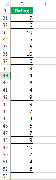
A corporate company conducted a yearly review of 50 employees, and everyone got a rating out of 10.
Below is the rating data for 50 employees.
The steps for creatingFrequency Distributionusing theCOUNTIF functionare,
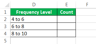
- We need to check how many people got a rating from 4 to 6, 6 to 8, and 8 to 10. We are not applying a Pivot Table. Rather, we willuse the COUNTIF functionto get the total. Before that, we created frequency levels like this.

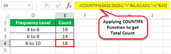
- We are applying the COUNTIF function to get the total count. For example, in cell E2, we mention the COUNTIF function, which counts all the numbers in the range A2 to A52 which are less than or equal to 6.

- In cell E3, we have used the COUNTIFS function, which counts numbers if the number is greater than 6, but less than 8.

- In cell E4, weuse the COUNTIFS function, which counts numbers if the number is greater than 8, but less than 10.
Conclusion:We have results here: 19 employees’ rating is between 4 to 6, 14 employees’ rating is between 6 to 8, and 18 employees’ rating is between 8 to 10.


Examples #2 – Frequency Distribution in Excel using Pivot Table
We have units sold data with the price of the product to calculate the Frequency Distribution In Excel.
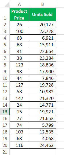
The steps to find the units sold between 15 and 30, 31 to 45, and so on, are,
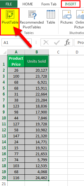
- Step 1: We must first select the data and apply a Pivot Table.
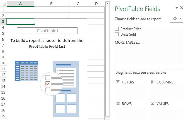
The PivotTable gets generated, as shown below. Now, we will add the required fields.
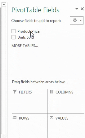
- Step 2: Then, drag and drop the “Product Price” heading to “Rows” and “Units Sold” to “Values”.
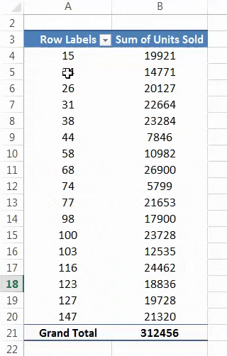
- Step 3: Now, the pivot summary report should be like this.
- Step 4: Right-click the “Product Price” column, and select “Group.”
- Step 5: Once we click on “Group,” it will open up the below dialog box.

- Step 6: In the “Starting at” box, we must mention 15, and “Ending at,” say 147, and “By” mention 15 because we are creating frequency for every 15th value. So, it is our first frequency range.
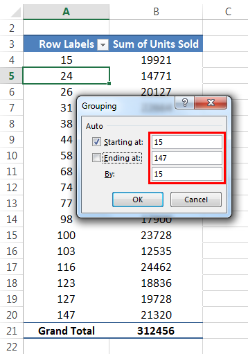
- Step 7: Click on the “OK.” Pivot grouped values like 15 to 30, 31 to 45, 46 to 60, etc.
Conclusion: Now, we can analyze the highest number of units sold when the price is between 15 to 29, i.e., 54819.
When the product price is between 30 to 44 units sold, the quantity is 53794. Similarly, the least number of products sold when the price is between 45 to 59, i.e., 10982.
Example #3 – FD using PivotTable method.
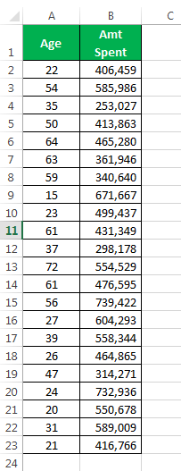
We will calculate the Frequency Distribution In Excel for the following example. A survey on money spent on alcohol based on the age group. We have the data for different age groups and money spent every month. We need to determine which age group is spending more from this data. In this data, the lowest age is 15, and the highest age is 72. So, we need to find out between 15 to 30, 30 to 45, 45 to 60, etc.
Below is the data.
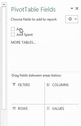
- Step 1: We must apply the PivotTable to this data. For example, in “Rows,” put “Age” and “Amt Spent” for “Values.”
- Step 2: Now, the pivot summary report should be like this.

- Step 3: Right-click on the “Age” in the pivot table and select “Group.” In “Starting at” mention 15 and “Ending at” 72, and “By,” mention 15.
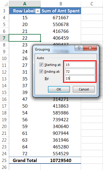
- Step 4: Click “OK.” It will group the age and return the sum for the age group.
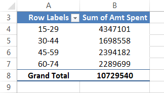
Conclusion: It is clear that the age group between 15 to 29 is spending more money on alcohol consumption, which is not a good sign.
But, the age group 30 to 44 spends less on alcohol. So, maybe they have realized the mistake they made at a young age.
Important Things To Note
- We need to identify the frequency level first before making the Frequency Distribution.
- Using a pivot table for frequency distribution is always dynamic.
- Using the COUNTIF function, we must create frequency levels in Excel manually.
Frequently Asked Questions (FAQs)
1. How to calculate the Frequency Distribution using Histogram from the Data Analysis tab?
The steps to calculate the Frequency Distribution using Histogram from the Data Analysis tab are as follows:
First, if the “Data Analysis Tool” is not found in the Excel ribbon, we must first enable it as follows:
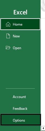
Select the “File” tab – click the “More…” option – select the “Options” option, as shown below.
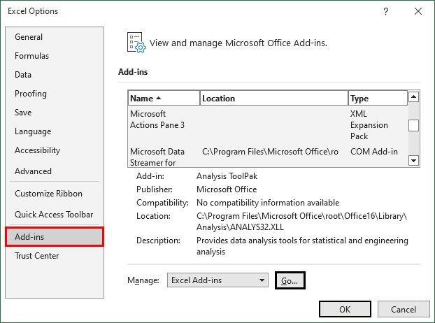
The “Excel Options” window appears. Choose the “Add-ins” option, and click the “Go…” button.
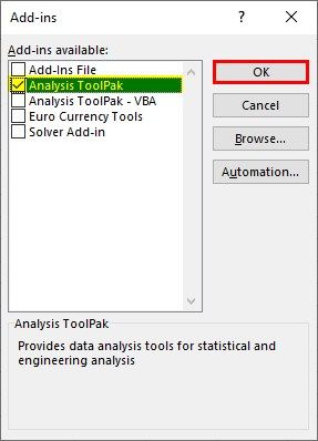
The Add-ins window appears. Here, in the “Add-ins available:” section, check/tick the “Analysis ToolPak” checkbox, and click “OK”.
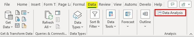
Now, we can see the Data Analysis tool in the “Data” tab, and to use it, go to the “Data” tab – go to the “Analysis” group – click the “Data Analysis” option.
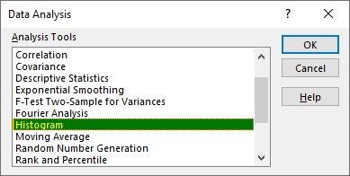
Next, when the “Data Analysis” dialog box appears, select the “Histogram” option from the “Analysis Tools” category, and click “OK”.
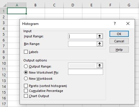
The “Histogram” dialog box appears.
• Enter the Input Range and Bin Range values in their respective fields.
• In the “Output options”, select the “New Worksheet Ply” button.
• Check/tick the “Cumulative Percentage” and “Chart Output” checkboxes.
• Click “OK”.
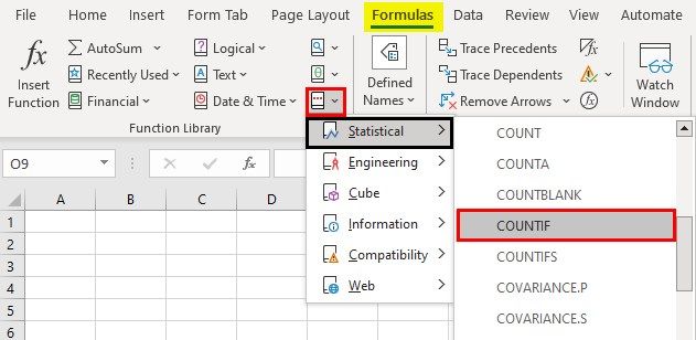
2. Where is the COUNTIF formula found in Excel?
The COUNTIF formula is found in Excel as follows:
First, choose an empty cell – select the “Formulas” tab – go to the “Function Library” group – click the “More Functions” option drop-down – click the “Statistical” option right-arrow – select the “COUNTIF” function, as shown below.
3. Why is the PivotTable of Frequency Distribution not working?
A few reasons the PivotTable of Frequency Distribution might not work are,
• The dataset for which the PivotTable is generated is deleted.
• The dataset is updated and the PivotTable has not got refreshed. Hence not reflecting the updated data.
Recommended Articles
This article is a guide to Frequency Distribution in Excel. Here we find data distribution of period using PivotTable, COUNTIF, examples, downloadable template. You may learn more about Excel from the following articles: –