What is a Linear Regression?
Linear regression is a statistical modeling technique that shows the relationship between one dependent variable and one or more independent variables. It is one of the most common types of predictive analysis. This type of distribution forms in a line called linear regression. This article will take examples of linear regression analysis in Excel.
To do linear regression analysis, first, we need to add excel add-ins by following steps.
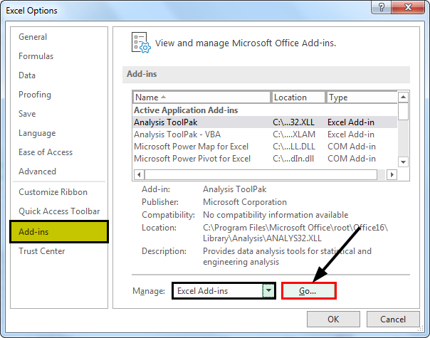
Click on File – Options (This will open an Excel Options pop-up for you).

Click on Add-ins – Select “Excel Add-ins” from the Manage Drop Down in excel, then Click on “Go”.
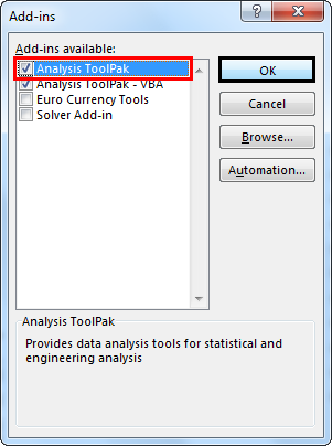
It will open the “Add-ins” pop-up. Select Analysis ToolPak, then click “OK.”
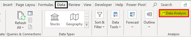
The “Data Analysis” add-in will appear under the “Insert” tab.
Let us understand the below examples of linear regression analysis in excel.
Key Takeaways
- Linear regression is a statistical modeling method that examines the relationship between a dependent variable and one or more independent variables. Establishing a linear equation constructs a best-fit line to represent the data.
- Linear regression is a commonly employed technique for predictive analysis and plays a vital role in statistical modeling.
- When performing linear regression analysis, the focus is on determining the equation of a straight line that effectively represents the average relationship between variables in the dataset.
Linear Regression Analysis Examples
Example #1
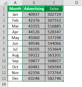
Suppose we have monthly sales and spent on marketing for last year. Now, we need to predict future sales based on last year’s sales and marketing spending.
| Month | Advertising | Sales |
|---|---|---|
| Jan | 40937 | 502729 |
| Feb | 42376 | 507553 |
| Mar | 43355 | 516885 |
| Apr | 44126 | 528347 |
| May | 45060 | 537298 |
| Jun | 49546 | 544066 |
| Jul | 56105 | 553664 |
| Aug | 59322 | 563201 |
| Sep | 59877 | 568657 |
| Oct | 60481 | 569384 |
| Nov | 62356 | 573764 |
| Dec | 63246 | 582746 |
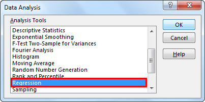
Click “Data Analysis” under the “Data” tab to open the “Data Analysis” pop-up for you.
Select “Regression” from the list and click “OK.”
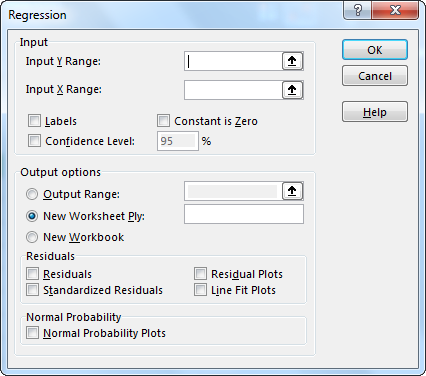
A “Regression” pop-up will open.
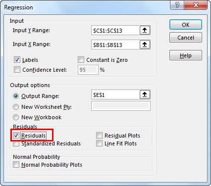
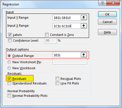
Select the range of sales $C$1:$C$13 in the Y-axis box as the dependent variable, and $B$1:$B$14 in the X-axis as advertising spend is the independent variable.
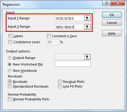
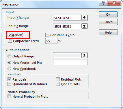
Checkmark the “Labels” box if you have selected headers in the data. Else, it will give you the error.
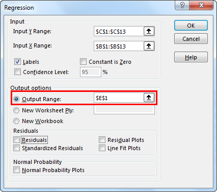
Next, select “Output Range” if you want to get the value on the specific range on the worksheet. Otherwise, select “New Worksheet Ply,” which will add a new worksheet and give you the result.
Then, check the “Residuals” box and click “OK.”
It will add worksheets and give you the following result.
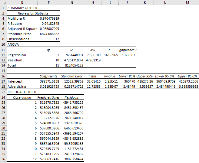
Let us understand the output.
Summary Output
Multiple R: This represents the correlation coefficient. The value 1 shows a positive relationship, and the value 0 shows no relationship.
R Square: R Square represents the coefficient of determination. It tells you the percentage of points that fall on the regression line. 0.49 means that 49% of values fit the model
Adjusted R square: This is adjusted R square, which requires when you have more than one X variable.
Standard Error: This represents an estimate of the standard deviation of error. It is the precision of the regression coefficient that is measured.
Observations: This is the number of observations you have taken in a sample.
ANOVA – Df: Degrees of freedom
SS: Sum of Squares.
MS: we have two MS
- Regression MS is Regression SS/Regression Df.
- Residual MS is the mean squared error (Residual SS / Residual Df).
F: F test for the null hypothesis.
Significance F: P-Values associated with Significance
Coefficient: The coefficient gives you the estimate of the least squares.
T Statistic: T Statistic for null hypothesis vs. the alternate hypothesis.
P-Value: This is the p-value for the hypothesis test.
Lower 95% and Upper 95%: These are the lower boundary and the upper boundary for the confidence interval.
Residuals Output.: We have 12 observations based on the data. The second column represents “Predicted” sales, and the third is “Residuals.” Residuals are the difference in predicted sales from the actual ones.
Example#2
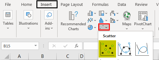
Select the predicted sales and marketing column.
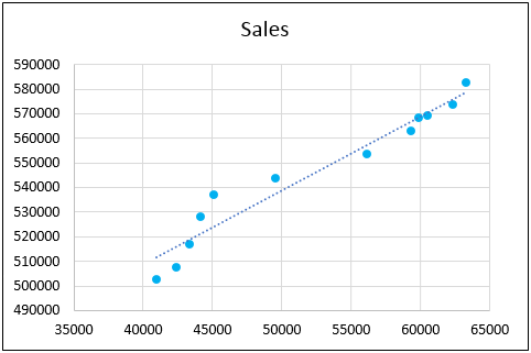
Go to the chart group under the “Insert” tab. Next, select the “Scatter” chart icon.
It will insert the scatter plot in excel. See the image below.

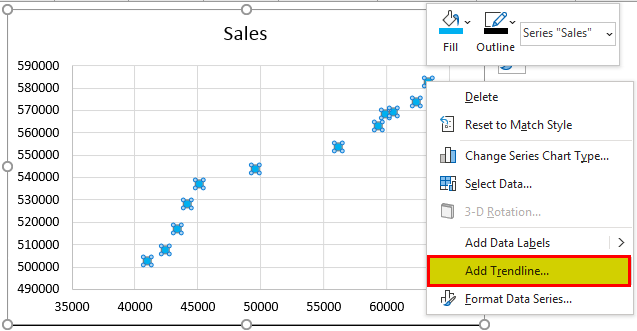
Right-click on any point, then select Add Trendline in excel. It will add a trendline to your chart.
- You can format the trendline by right-clicking anywhere on the trendline and then selecting the format trendline.
- You can make more improvements to the chart. i.e., formatting the trendline, color and changing title, etc.
- You can also show the formula on the graph by checking the formula on the chart and displaying the R-squared value.
Some More Examples of Linear Regression Analysis:
- Predictions of umbrellas sold based on the rain happened in the area.
- Prediction of AC sold based on the temperature in Summer.
- During the exam season, stationery sales, basically exam guide sales, increased.
- Prediction of sales when advertising has done based on high TRP serial where an advertisement is done, the popularity of brand ambassador, and the footfalls at the place of holding where an advertisement is being published.
- Sales of a house based on the locality, area, and price.
Example #3
Suppose we have nine students with their IQ level and the number they scored on Test.
| Student | Test Score | IQ |
|---|---|---|
| Ram | 100 | 145 |
| Shyam | 97 | 140 |
| Kul | 93 | 130 |
| Kappu | 91 | 125 |
| Raju | 89 | 115 |
| Vishal | 86 | 110 |
| Vivek | 82 | 100 |
| Vinay | 78 | 95 |
| Kumar | 75 | 90 |
Step 1: First, find out the dependent and independent variables. Here, the test score is the dependent variable, and IQ is the independent variable, as the test score varies as IQ changes.
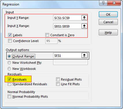
Step 2: Go to Data Tab – Click on Data Analysis – Select regression – click “OK.”
It will open the “Regression” window for you.
Step 3. Input test score range in the “Input Y Range” box and IQ in Input X Range Box. (Check on “Labels” if you have headers in your data range. Select output options, then check on the desired residuals. Click “OK.”)
You will get the summary output shown in the below Image.
Step 4: Analysing the regression by summary output.
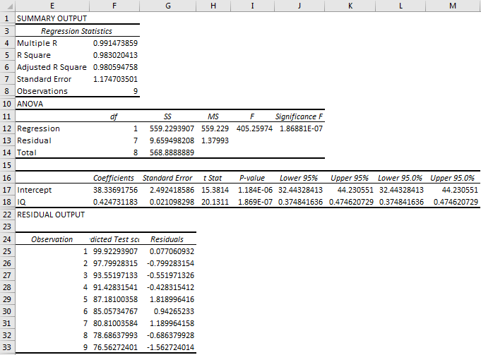
Summary Output
Multiple R: Here, the correlation coefficient is 0.99, which is very near 1, which means the linear relationship is very positive.
R Square: R-Square value is 0.983, which means that 98.3% of values fit the model.
P-value: Here, P-value is 1.86881E-07, which is very less than .1, Which means IQ has significant predictive values.
See the chart below.
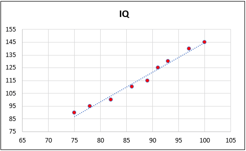
You can see that almost all the points are falling in line or a nearby trendline.
Example #4
We need to predict sales of AC based on the sales and temperature for a different month.
| Month | Temp | Sales |
|---|---|---|
| Jan | 25 | 38893 |
| Feb | 28 | 42254 |
| Mar | 31 | 42845 |
| Apr | 33 | 47917 |
| May | 37 | 51243 |
| Jun | 40 | 69588 |
| Jul | 38 | 56570 |
| Aug | 37 | 50000 |
Follow the below steps to get the regression result.
Step 1: First, find out the dependent and independent variables. Sales are the dependent variable, and temperature is an independent variable as sales vary as Temp changes.
Step 2: Go to the “Data” tab – Click on “Data Analysis” – Select “Regression,” – click “OK.”
It will open the regression window for you.
Step 3. Input sales in the “Input Y Range” box and Temp in the “Input X Range” box. (Check on “Labels” if you have headers in your data range. Select output options, then check on the desired Residuals. Click Ok.
It will give you a summary output as below.
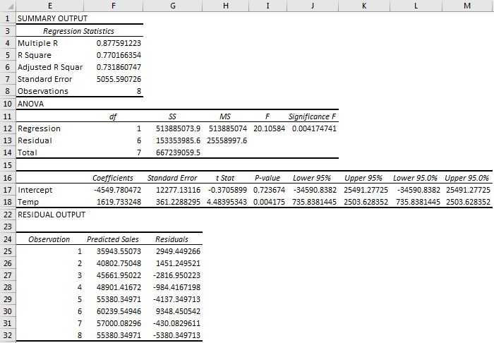
Step 4: Analyse the result.
Multiple R: Here, the correlation coefficient is 0.877, near 1, which means the Linear relationship is positive.
R Square: R-Square value is 0.770, which means that 77% of values fit the model.
P-Value: Here, P-value is 1.86881E-07, which is very less than .1, Which means IQ has significant predictive values.
Example #5
Now, let us do a regression analysis for multiple independent variables:
First, you need to predict the sales of a mobile that will launch next year. Then, you have the price and population of the countries affecting the sales of mobiles.
Follow the below steps to get the regression result.
| Mobile Version | Sales | Quantity | Population |
|---|---|---|---|
| US | 63860 | 858 | 823 |
| UK | 61841 | 877 | 660 |
| KZ | 60876 | 873 | 631 |
| CH | 58188 | 726 | 842 |
| HN | 52728 | 864 | 573 |
| AU | 52388 | 680 | 809 |
| NZ | 51075 | 728 | 661 |
| RU | 49019 | 689 | 778 |
Step 1. First, find out the dependent and independent variables. Here, sales are the dependent variable, as quantity and population. Both are independent variables as sales vary with the country’s quantity and population.
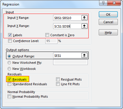
Step 2. Go to the “Data” tab – Click on “Data Analysis” – Select “Regression” – click “OK.”
It will open the regression window for you.
Step 3. Input sales in the “Input Y Range” box and select quantity and population in the “Input X Range” box. (Check on “Labels” if you have headers in your data range. Select output options, then check on the desired residuals. Click “OK.”
Run the regression using data analysis under the “Data” tab. It will give you the below result.
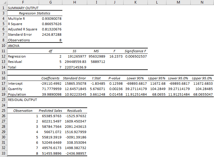
Summary Output
Multiple R: Here, the correlation coefficient is 0.93, which is very near 1, which means the Linear relationship is very positive.
R Square: R-Square value is 0.866, which means that 86.7% of values fit the model.
Significance F: Significance F is less than .1, which means that the regression equation has a significant predictive value.
P-Value: If you look at P-value for quantity and population, you can see that values are less than .1, which means quantity and population have significant predictive values. The fewer P-values mean that a variable has more significant predictive values.
However, quantity and population have significant predictive value. Still, If you look at P-value for quantity and population, you can see that quantity has a lesser P-value in excel than population. It means quantity has a more significant predictive value than population.
Things to Remember
- Whenever one selects data, one must always check the dependent and independent variables.
- Linear regression analysis considers the relationship between the mean of the variables.
- It only models the relationship between the linear variables.
- Sometimes, it is not the best fit for a real-world problem. For example: (age and wages). Most of the time, wages increase as age increases. However, after retirement, age increases but wages decrease.
Frequently Asked Questions (FAQs)
What is the relevance of linear regression?
Linear regression is relevant as it allows us to quantify the relationship between variables and make predictions based on that relationship. It helps in understanding how changes in independent variables affect the dependent variable, making it valuable for forecasting, trend analysis, and decision-making.
What are the applications of linear regression?
Linear regression finds applications in various fields, such as economics (demand forecasting), finance (stock price prediction), social sciences (relationship analysis), and healthcare (patient outcome prediction). It is used whenever there is a need to analyze the relationship between variables and make predictions based on that relationship.
What are the limitations of linear regression?
Linear regression assumes a linear relationship between variables, which may not always hold true in real-world situations. It may not capture complex nonlinear relationships. Linear regression is also sensitive to outliers and assumes independence and homoscedasticity of errors. Additionally, it cannot handle categorical variables without appropriate encoding or transformation.
Recommended Articles
This article has been a guide to Linear Regression and its definition. Here, we discuss how to perform a linear regression analysis in Excel with the help of examples and a downloadable Excel sheet. You can learn more about Excel from the following articles: –