What Is Analysis ToolPak In Excel?
The Data Analysis ToolPak in Excel is an add-in in Excel which allows us to do data analysis and various other important calculations. By default, this add-in is not enabled in Excel. We have to manually enable it from the “File” tab in the options section, and then in the “Add-ins” section, we need to click on “Manage Add-ins” and then check on Analysis ToolPak to use it in Excel.
For example, while working on an Excel worksheet, the included Data Analysis ToolPak will allow you to access various statistical functions, including histograms, correlation, a range of z-test, t-test functions, and a random number of generators. In Excel, one may find this Data Analysis ToolPak by clicking “Data Analysis” in the “Data” tab. It is included in every copy of the Excel.
Key Takeaways
- The Data Analysis ToolPak is an Excel add-in for data analysis and other calculations. It’s not enabled by default.
- To use it, enable it manually by going to “File” – “Options” – “Add-ins” – “Manage Add-ins” and checking the box next to Analysis ToolPak.
- The Analysis ToolPak Excel add-in provides several functions, including ANOVA, Correlation, Rank and Percentile, and Descriptive Statistics.
- Excel’s Data Analysis ToolPak offers statistical functions like histograms, correlation, z-test, t-test, and random number generators. To find it, click “Data” then “Data Analysis”. The ToolPak is available in all Excel versions.
How To Add Analysis Toolpak In Excel?
Below are the steps to load the data Analysis ToolPak add-in:
- First, click on’File.’

- Click on’Options’from the list.

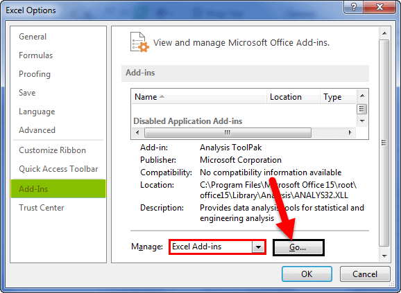
- Click on “Add-Ins” and then choose “Excel Add-Ins” from “Manage.” Finally, click on “Go.”

- The’Excel Add-ins’dialog box will appear with the list of add-ins. Please check for “Analysis ToolPak”u00a0and click on “OK.”

- The command “Data Analysis” will appear under the ‘Data’ tab in Excel at the extreme right of the ribbon, as displayed below.


How To Use Analysis Toolpak In Excel?
Below is the list of available functions in the Analysis ToolPak Excel add-in:
- ANOVA: Single Factor in Excel
- Correlation in Excel
- Rank and Percentile in Excel
- Descriptive Statistics in Excel
Now, let us discuss each of them in detail:
#1 – ANOVA
ANOVA stands for Analysis of Variance. It is the first set of options available in the Analysis ToolPak Excel add-in. In one-way ANOVA, we analyze if there are statistical differences between the means of three or more independent groups. The null hypothesis proposes that no statistical significance exists in given observations. We test this hypothesis by checking the p-value.
Let us understand this by an ANOVA excel example.
Example
Suppose we have the following data from the experiment to check “Can we restore self-control during intoxication?” We categorized 44 males into 4 equal groups comprising 11 males in each group.
- Group A received 0.62mg/kg of alcohol.
- Group AC received alcohol plus caffeine.
- Group AR received alcohol and a monetary reward for performance.
- Group P received a placebo.
Scores on the award stem completion task involving “controlled (effortful) memory processes” were recorded. The result is as follows:
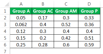
We need to test the null hypothesis, which proposes that all means are equal (there is no significant difference).
How To Run The ANOVA Test?
To run the ANOVA one-way test, we need to perform the following steps:
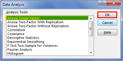
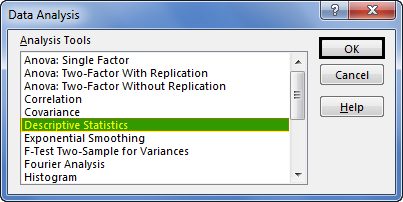
- Step 1: Click on the “Data Analysis” command available in the “Data” tab under “Analysis.”

- Step 2: Select “Anova: Single Factor” from the list and click on “OK.”
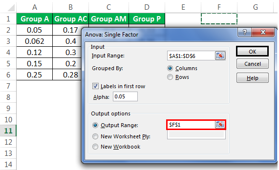
- Step 3: We get the “Anova: Single Factor” dialog box. We need to select “Input Range” as our data with the column heading.
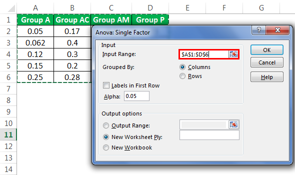
- Step 4: As we have taken column headings in our selection, we need the checkbox for “Labels in the first row.”
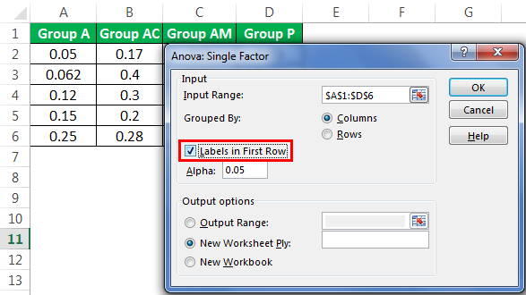
- Step 5: For the output range, we have selected F1. Please click on “OK.”
We now have ANOVA analysis.
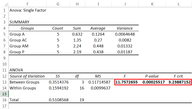
The larger the F-statistic value in Excel, the more likely the groups have different means, rejecting the null hypothesis that all means are equal. An F-statistic greater than the critical value is equivalent to a p-value in excel less than alpha, and both mean that we reject the null hypothesis. Hence, it is concluded that there is a significant difference between groups.
#2 – Correlation In Excel
Correlation is a statistical measure available in the Analysis ToolPak Excel add-in. It shows the extent to which two or more variables fluctuate together. A positive correlation in excel indicates how those variables increase or decrease in parallel. A negative correlation suggests how one variable increases as the other decreases.
Example
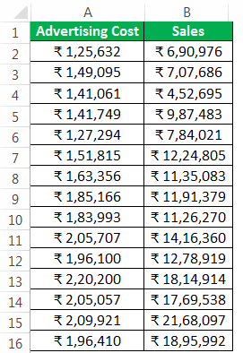
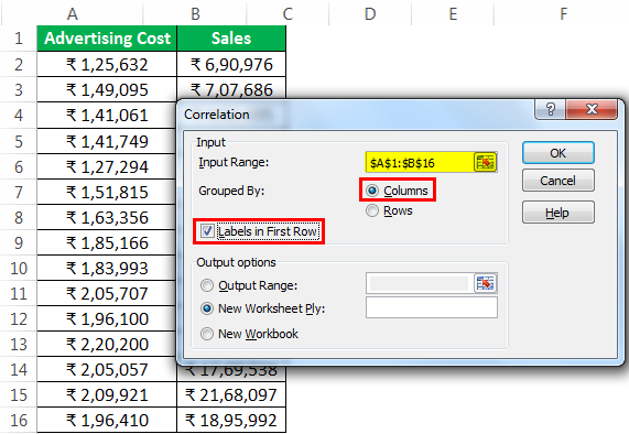
We have the following data related to advertising costs and sales for a company. We want to determine the relationship between both to plan our budget accordingly and expect sales (set target considering other factors).
How To Find Correlation Between Two Sets Of Variables?
To find out the correlation between these two sets of variables, we will follow the below-mentioned steps:
- Step 1: Click on “Data Analysis” under the “Analysis” group available in “Data.”
- Step 2: Choose “Correlation” from the list and click on “OK.”

- Step 3: Choose range “$A$1:$B$16” as the input range and $F$1 as the output range. Please tick the checkbox for “Labels in the first row” as we have column headings in our input range and different heads in a different column. We have chosen “Columns” for “Grouped By.”
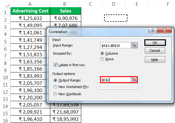
- Step 4: Select the Output range then click on ‘OK.’
- We get the result.
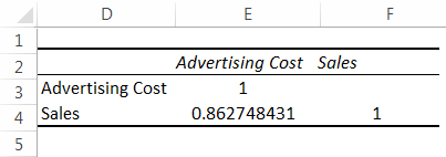
As we can see, the correlation between advertising cost (column head) and sales (row head) is approximately +0.86274, indicating that they have a positive correlation and 86.27% extent. Now, we can accordingly decide on the advertising budget and expected sales.
#3 – Rank And Percentile
Percentile in excel is a number where a certain percentage of scores fall below that number and is available in the Analysis ToolPak Excel add-in. For example, if a particular score is in the 90th percentile, the student has scored better than 90% of people who took the test. Let us understand this with an example.
Example
We have the following data for the scores obtained by a class student.
We want to find out the rank and percentile of every student.
How To Find Rank And Percentile?
The steps would be:
- Step 1: Click on ‘Data Analysis’ under the ‘Analysis’ group available in ‘Data.’
- Step 2: Click on “Rank and Percentile” from the list and click “OK.”
- Step 3: Select ‘$B$1: B$B$17’ as the input range and ‘$D$1’ as the output range.
- Step 4: As we have data field heads in columns, i.e., the data is grouped in columns, we need to select “Columns” for “Grouped By.”
- Step 5: We have selected the column heading in our input range. Next, we need to check for “Labels in the first row” and click on “OK.“
- We got the result like the following image.
#4 – Descriptive Statistics In Excel
Descriptive statistics included in the Analysis ToolPak Excel add-in contain the following information about a sample:
- Central Tendency
- Mean: It is called average.
- Median: This is the mid-point of the distribution.
- Mode: It is the most frequently occurring number.
- Measures of Variability
- Range: This is the difference between the largest and smallest variables.
- Variance: This indicated how far the numbers are spread out.
- Standard Deviation: How much variation exists from the average/mean.
- Skewness: This indicates how symmetrical the distribution of a variable is.
- Kurtosis: This indicates the peakedness or flatness of a distribution.
Example
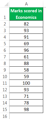
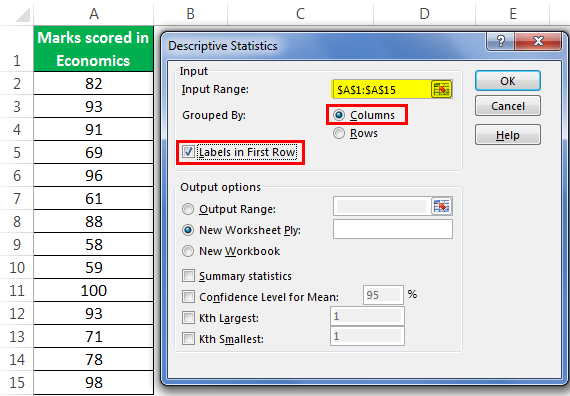
Below we have marks scored by students in Economics. We want to find out descriptive statistics.
To perform the same, the steps are:
- Step 1: Click on the “Data Analysis” command available in the “Analysis” group in “Data.”
- Step 2: Choose “Descriptive Statistics” from the list and click on “OK.”
- Step 3: Choose “$A$1:$A$15” as the input range, choose “Columns” for “Grouped By,” tick for “Labels in the first row,”
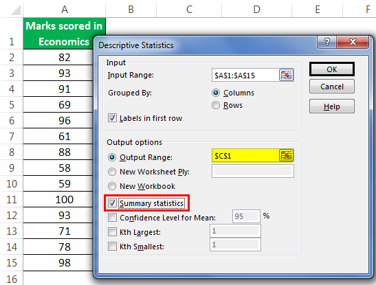
- Step 4: Choose “$C$1” as the output range and make sure that we have checked the box for “Summary Statistics.” Click on “OK.”
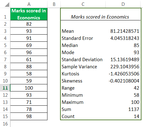
Now, we have our descriptive statistics for the data.
Important Things To Note
- Data Analysis ToolPak in Excel helps users to analyze data analysis and perform important calculations.
- By default, it is not enabled in Excel.
- The list of functions in the Analysis ToolPak Excel add-in are,
- ANOVA: Single Factor in Excel
- Correlation in Excel
- Rank and Percentile in Excel
- Descriptive Statistics in Excel
Frequently Asked Questions (FAQs)
What is the purpose of the Data Analysis ToolPak?
In the event that you are required to undertake intricate statistical or engineering analysis, the Analysis ToolPak can be employed to streamline the process and minimize the time expended.
By furnishing the tool with the pertinent data and parameters for each analysis, the tool utilizes the relevant statistical or engineering macro functions to compute and exhibit the outcomes in an output table. This utility is handy for professionals in the fields of engineering, finance, and the sciences who require precise and rapid analysis of large datasets.
What is the difference between Analysis ToolPak and Analysis ToolPak VBA?
To install Analysis ToolPak in Excel, first select the add/change features option. Then, drill down until you find the Analysis ToolPak option for installation. It is important to note that the Analysis ToolPak VBA is only for use in macros, whereas the Analysis ToolPak is for interactive use.
How to use Excel Analysis ToolPak to conduct a regression analysis?
To perform data analysis in Excel, the following steps should be taken:
- Enter your data into an Excel spreadsheet.
- Install the Data Analysis ToolPak plugin.
- Navigate to the “Data Analysis” option, which will reveal a dialog box.
- Input the variable data that you wish to analyze.
- Select the appropriate output options that meet your needs.
- Analyze the results of your data analysis.
- Create a scatter plot to display your data visually.
- Add a regression trendline to your scatter plot to identify trends and patterns.
- Finally, apply any desired aesthetic touches to your analysis to enhance its presentation.
By following these steps, you will be able to conduct a thorough data analysis in Excel, resulting in a well-organized, insightful, and visually appealing presentation of your findings.
Recommended Articles
This article has been a guide to Data Analysis ToolPak add-in in Excel. Here, we discuss the steps to load data Analysis ToolPak in Excel for tools like 1) Anova, 2) Correlation, 3) Rank and Percentile, 4) Descriptive Statistics, practical examples, and a downloadable Excel template. You may learn more about excel from the following articles: –