What Is The Scatter Plot Chart In Excel?
A Scatter Plot in Excel is a two-dimensional chart representing data, also known as XY charts or Scatter Diagrams in Excel. In addition, the scatter chart has correlated two data sets on the X and Y-axis. It is mostly used in correlation studies and regression studies of data.
The Excel Scatter Plot is an inbuilt chart, so that we can insert it from the Charts groups.
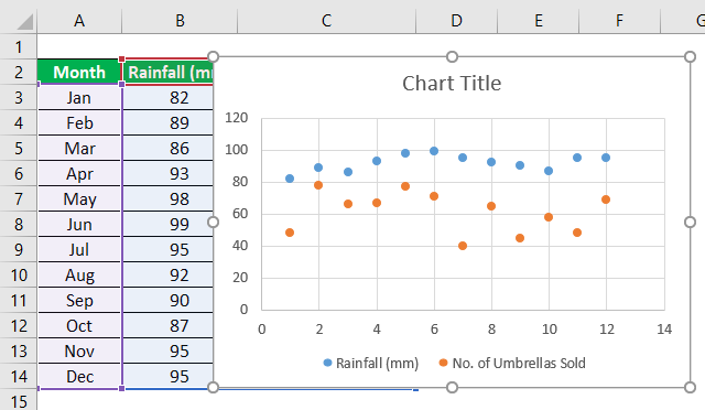
For example, we have a given dataset of school products.

First, select the cells A1:C6, and insert a scatter chart.

We get the generated Scatter Chart as shown above, with the X and Y axis data plotted accordingly.
Key Takeaways
- The Scatter Plot in Excel illustrates the correlation between two interrelated data sets, both X and Y variables. However, we must realize how to utilize and interpret them legitimately.
- We can visualize datasets to identify patterns or trends by using colors or bold lines, which also makes the chart more attractive, and shows clear information.
- The scatter plots are a set of many points on vertical and horizontal axes.
- The scatter charts are very important in insights since they can demonstrate the degree of connection, assuming any, between the estimations of observed quantity or values, which are also called “variables”.
How To Make A Scatter Plot Chart In Excel?
We can create a Scatter Plot Chart In Excel using the inbuilt options provided by Excel. Let us understand the same with an example.
The steps to create anExcel Scatter Chartare as follows:
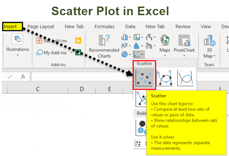
- Select the two segments in the information and incorporate the headers.

- Select the “Insert” tab. In the “Charts” group, click the “Scatter” option, and then select the required chart type which suits the information:

- Click to select the scatter plot chart which you want. After selecting the chart, we will see the chart next to the Excel data table.

- The generated scatter plot chart, after selecting the “Scatter” chart option, is shown below.

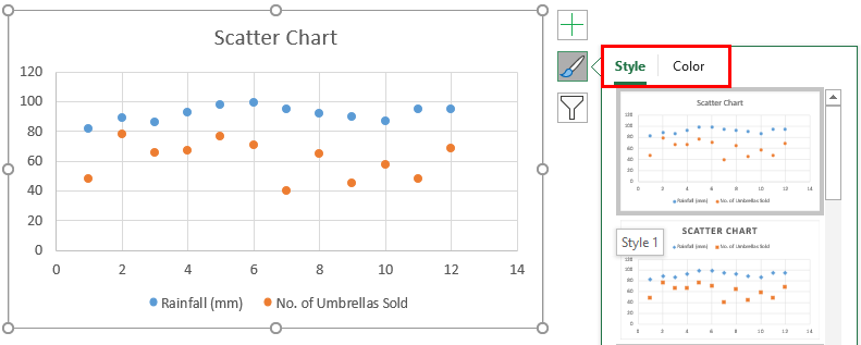
- We can modify or customize the chart as required and fill in the hues and lines of your decision. For instance, we can pick alternate shading and utilize a strong line of a dashed line. In addition, we can customize the graph as we want to customize it.
Next, right-click on the scatter chart, click the “Format Data Point”, select the diagram color, and customize it as required.

- Below is a scatter plot after customizing it as required:

- We can change the chart style/color by clicking right on the chart and clicking on the icon, as shown in the below screenshot.


Types Of Relationships In Scatter Plots In Excel
The three types of relationships in Scatter Plots in Excel are,
#1 – No Correlation: It occurs when there is no direct connection between the factors or variables.
E.g., computers and salaries have no relation between them.
#2 – Positive: It is the point at which the factors move similarly.
E.g., salary and promotion. It means that when the employee gets an upgrade, it is obvious that their salary will increase.
#3 – Negative: It is the point at which the factors move inversely. It means that when one variable is increased, the other variable decreases.
E.g., time spent playing badminton and time spent studying. It means the more time a person plays. Conversely, it leads to a decline in study time.
Advantages Of Excel Scatter Charts
- It helps to obtain the relationship between two or more variables.
- A scatter plot is the best method to show the non-linear pattern.
- Anyone can easily determine the minimum and maximum value of the range of data flow.
- Perception and reading are so clear.
- Plotting the graph is moderately basic.
Disadvantages Of Excel Scatter Charts
- A scatter plot chart does not help determine the variables’ precise relationship.
- A scatter plot chart is not a quantitative measure, which helps to get the result numerically.
- It only gives an estimated idea of the relationship.
- When data is huge, sometimes, it creates a mess on the scatter chart.
Important Things To Note
- We must choose the data carefully to avoid any errors in the analysis. It is best to start practicing with small data to understand the analysis and use of scatter charts on data easily.
- To communicate our data through scattering, it is mandatory to understand the audience’s knowledge on the data. If necessary, use a line on the chart that connects the points.
- Sometimes, alternate shading for the objective information point may be improper. So, we can shade it with indistinguishable shading.
Frequently Asked Questions (FAQs)
Why is the Scatter Plot in Excel not working?
A few reasons the Scatter Plot in Excel may not work are as follows:
• The dataset linked to the chart is deleted.
• The dataset is modified, and the chart is not refreshed.
• There are non-numeric values that hinder us to generate the chart.
Where is the Scatter Plot in Excel found?
The Scatter Chart is found as follows:
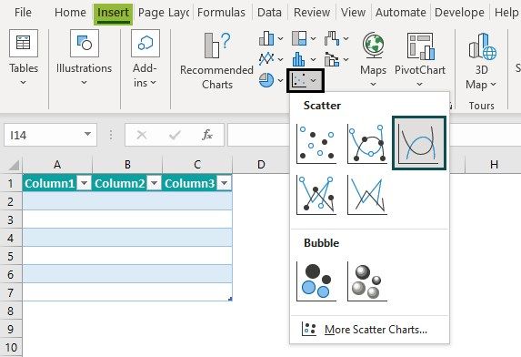
First, choose a cell range – select the “Insert” tab – go to the “Charts” group – select the “Insert Scatter (X, Y) or Bubble Chart” option drop-down – select the “Scatter”, “Scatter with Smooth Lines and Markers”, “Scatter with Smooth Lines”, “Scatter with Straight Lines and Markers”, or “Scatter with Straight Lines” chart types from the “Scatter” category, as shown below.
Can we generate a 3D Scatter plot in Excel?
A 3D Scatter Plot in Excel visually represents three-dimensional data points on a coordinate system. And, yes, we can generate a 3D Scatter plot in Excel as follows:
• First, follow the steps to generate a Scatter Plot.
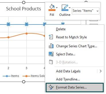
• Next, click the generated Scatter Chart – right-click, and select the “Format Data Series…” option, as shown below.
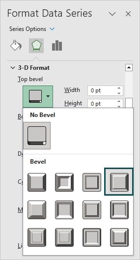
• Now, in the “Format Data Series” section that appears on the right, select the “Slant” option under the 3-D Format.
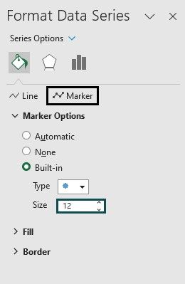
• Then, select the “Built-in” radio button from the Marker options.
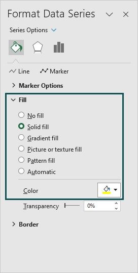
• Finally, change the color of the plots from the “Fill” option, as shown below.
We will now have a 3D Scatter plot.
Recommended Articles
This article is a guide to Scatter Plot in Excel. Here we create Scatter Chart, advantages/disadvantage, types of relationship, examples, downloadable template. You may also look at these useful functions in Excel: –