Table Of Contents
What is Lorenz Curve?
The Lorenz curve, named after American economist Max O. Lorenz, is a graphical representation of an economic inequality model. The curve takes the population percentile on the X-axis and cumulative wealth on the Y-axis. Complementing this graph would be a diagonal line at a 45⁰ angle from the origin (meeting point of the X and Y axis), indicating the population's perfect income or wealth distribution.
Below this straight diagonal line would be this actual distribution Lorenz curve. The area enclosed between the line and this curve is the precise measurement of inequality. The area between the two lines expressed as a ratio to the area under the straight line represents the inequality. It is called the Gini coefficient.
Table of contents
- The Lorenz curve is a graphical representation of the economic inequality model. It is named after American economist Max O. Lorenz.
- The Lorenz curve considers the population percentile on the X-axis and the cumulative wealth on the Y-axis.
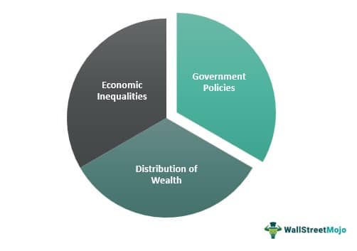
- The Lorenz curve and the Gini coefficient are the two indicators for determining economic inequality. It does not consider the income variation over an individual's lifecycle during measuring inequality.
- The Lorenz curve can display the government policy's effectiveness in serving redistributing income. One can also use it while considering particular measures to create economy weaker sections.
Lorenz Curve Explained
Lorenz curve is the graphical representation of the distribution of wealth within an economy. It is calculated by placing the total population of the country on one axis and the total wealth of the economy on the other.
In a perfect economy, there is no concept of a rich or poor individual. Everyone has an equal amount of wealth as it has been distributed evenly not just in terms of money, but also in terms of opportunities and support.
It was introduced more than 100 years ago, the Lorenz curve calculation provides an innate and complete understanding of income distribution. Moreover, it provides the basis for inequality measurements through the Gini index.
The curve defines the relationship between the cumulative portions of income as received by the cumulative population when the income-earning population is arranged in ascending order.
The extent to which the curve bulges downward below the straight diagonal line called the line of equality indicates the degree of inequality of distribution. It implies the curve will always be bowed downwards until there exists inequality in the economy.
Though considered the simplest among other disparities measures, the graph can be misleading and might not always produce accurate results.
Formula
Let us understand how Lorenz curve economics work by first understanding its formula.
Lorenz Curve = L − X = 1 − L X (1 − F)
Examples
To understand the Lorenz curve economics in detail, let us take the help of a couple of examples with calculation.
Example #1
Let us consider an economy with the following population and income statistics: -
| Population | Income Portion % |
|---|---|
| 0 | 0 |
| 20 | 10 |
| 40 | 20 |
| 60 | 35 |
| 80 | 60 |
| 100 | 100 |
And for the line of perfect equality, let us consider this table: -
| Population | Income Portion % |
|---|---|
| 0 | 0 |
| 20 | 20 |
| 40 | 40 |
| 80 | 80 |
| 100 | 100 |
Let us now see how a graph for this data looks: -
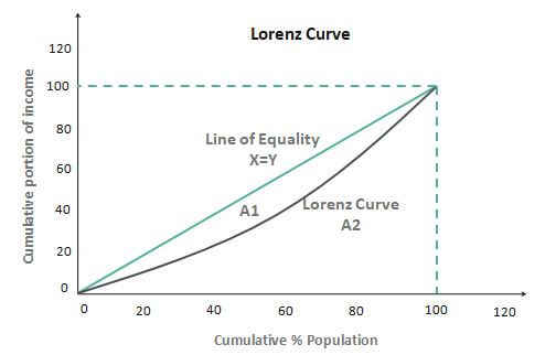
As we can see, there are two lines in the graph of the Lorenz curve, the curved red line, and the straight black line. The black line represents the imaginary line of equality, i.e., the ideal graph when income or wealth is equally distributed amongst the population. But on the other hand, the red curve, the Lorenz curve, which we have been discussing, represents the distribution of wealth among the people.
Hence, we can say that the Lorenz curve is the graphical method of studying dispersion. Gini coefficient, also known as the Gini index, can be computed as follows. Let us assume in the graph area that A1 represents the Lorenz curve and the line, and A2 is the line below the curve. So,
Gini coefficient = A1/ (A1+ A2)
The Gini coefficient lies between 0 and 1, 0 being the instance where there is perfect equality and 1 being the instance where there is perfect inequality. Therefore, the higher the area enclosed between the two lines represents higher economic inequality.
We can say that there are two indicators for measuring income inequality:
- The Lorenz curve is the visual indicator
- The Gini coefficient is a mathematical indicator
Income inequality is a pressing issue across the world. So, what are the reasons for inequality in an economy?
- Corruption
- Education
- Tax
- Gender differences
- Culture
- Race and caste discrimination
- The difference in preferences of leisure and risks.
Reasons for income inequality
- The distribution of economic characteristics across the population should be considered.
- Analyzing how the differences give rise to different outcomes in terms of income.
- A country may have a high degree of inequality because of: -
- A great disparity in these characteristics across the population.
- These characteristics generate huge effects on the amount of income a person earns.
Example #2
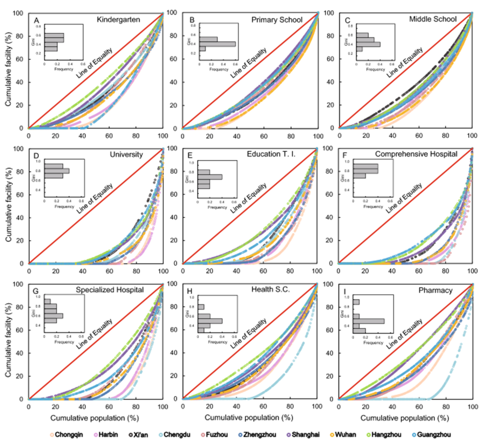
It is important to understand that the Lorenz curve economics is not restricted to just find the lopsided distribution of wealth but also to other factors, such as education, healthcare, public facilities, and so on.
In China, a study was conducted to determine the lack of equal distribution between the facilities in urban and rural areas within the country. The results were crystal clear in terms of how disproportionately facilities were distributed among the citizens based on their geographical placement. To paint a clearer picture, the graphs below would give us a clearer idea of the distribution.
Uses
Finding data points based on the Lorenz curve can be used in a variety of ways based on the requirement of the analyst or the user. Let us discuss them through the points below.
- One can use it to show the effectiveness of a government policy in helping redistribute income. The impact of a particular policy introduced can be demonstrated with the help of the Lorenz curve, how the curve has moved closer to the perfect equality line post-implementation of that policy.
- It is one of the simplest representations of inequality.
- It is most useful in comparing the variability of two or more distributions.
- It shows the distribution of wealth in a country among different percentages of the population with the help of a graph that helps many businesses establish their target bases.
- It helps in business modeling.
- One can use it majorly while taking specific measures to develop the weaker sections of the economy.
Disadvantages
Let us understand the disadvantages of using a Lorenz curve calculation through the discussion below.
- It might not always be rigorously true for a finite population level.
- The equality measure shown may be misleading.
- When two Lorenz curves are being compared and intersected, it is impossible to ascertain which distribution represented by the curves displays more inequality.
- The Lorenz curve ignores income variation over an individual's lifecycle while determining inequality.
Frequently Asked Questions (FAQs)
The difference between the Lorenz curve and the Gini coefficient is that the Lorenz curve assists in understanding income or wealth distribution. At the same time, the Gini coefficient estimates income inequality.
A Lorenz curve graphically represents income or wealth inequality. The population percentiles are displayed on the horizontal axis as per income or wealth.
The Lorenz curve is essential as it is helpful to understand economic inequality. The unequal distribution level increases as the Lorenz curve moves from the baseline.
The Gini coefficient is equal to the area of perfect equality below the line minus the area below the Lorenz curve, which is divided by the area the perfect equality below the line. So the coefficient means double the area between the perfect equality line and the Lorenz curve.
Recommended Articles
This article guide to what is Lorenz Curve. Here, we explain Loren Curve's examples, formula, uses, and disadvantages in detail. You can learn more about economics from the following articles: -
