Table Of Contents
What Are Quick Analysis Tools In Excel?
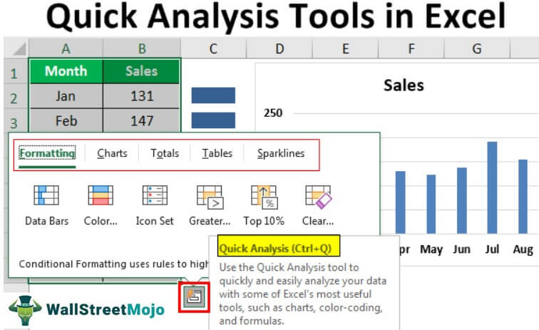
Quick analysis tools in Excel are provided to quickly analyze any data rather than the older method of inserting a chart or tables etc. There are two ways to see these quick analysis tools: select the cell range data, which contains values, and a yellow box on the bottom right-hand side which is the quick analysis tools, or we can press the "CTRL + Q" for quick analysis tools.
Note: This feature is available from Excel 2013 onwards.
When analyzing the data, instead of going through various tabs, we can use the quick analysis tool to insert charts, visualizations, different formatting techniques, formulas, tables, PivotTables, and sparklines.
These can be created in a few seconds.
Key Takeaways
- Quick analysis tools in Excel promptly analyze any data instead of the traditional method of inserting charts or tables.
- There are two ways to access these tools: select the cell range data that contains values, and a yellow box will appear on the bottom right-hand side, which is the quick analysis tool, or press "CTRL + Q" for quick analysis tools.
- When analyzing the data, instead of going through various tabs, we can use the quick analysis tool to insert charts, visualizations, different formatting techniques, formulas, tables, PivotTables, and sparklines.
Where To Find Quick Analysis Tools In Excel?
Now, the important question is where this tool is. This tool appears when we select the data range in Excel. For example, look at the below data.

Once we select the data, we can see a small icon to the bottom right of the selection.
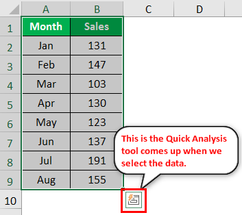
We know you have seen this icon before, but you have not worried about this. Unfortunately, not many Excel users make use of this wonderful tool. We will show the various kinds of analysis tools it has.
How To Use Quick Analysis Tools In Excel?
There are five tips to use quick analysis tools in Excel. They are:
- Quickly Insert Formatting into the data
- Quickly Analysis inserting chart to the data
- Quickly Analysis through totals
- Quickly Analysis through tables
- Quickly Analysis through sparklines
In this article, let us learn all the five methods using the following examples.
Examples
Example #1 - Quickly Insert Formatting Into The Data
Once you select the data, we can see the "Quick Analysis Tools" icon at the bottom of the selection.
- Click on this icon to explore all the possible options.
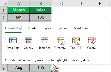
- We have "Formatting," "Charts," "Totals," "Tables," and "Sparklines." Let us look at "Formatting" now. Placing a cursor on the required formatting option can see the immediate impact on our data.
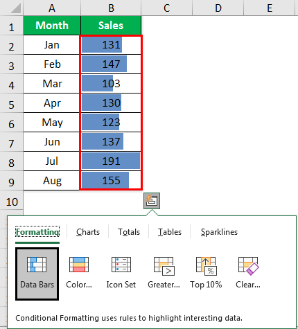
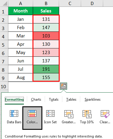
We have placed a cursor on "Data Bars" and inserted data bars according to the size of the numbers. Similarly, we can use "Color Set," "Icon Set" in Excel, "Greater Than," and "Top Value," and more importantly, we can clear the Excel formatting with the "Clear" option. - Click on the "Color Set" to insert different colors.
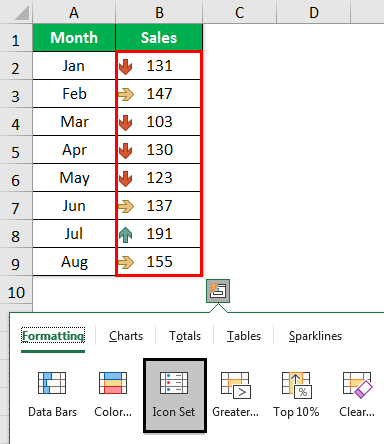
- Click on "Icon Set" to get icons for your numbers.
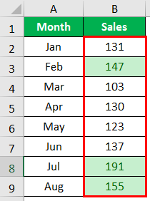
- If you want to highlight values greater than 140, click on the "Greater Than" option below the window.

- Mention the value as "140" and choose the formatting color.

- Click on "OK." We will have mentioned formatting for all the values which are >140.
Example #2 - Quickly Analysis Inserting Chart To The Data
We can also insert a chart to the selected data using the quick analysis tools. Once the data is selected, click on "Charts."
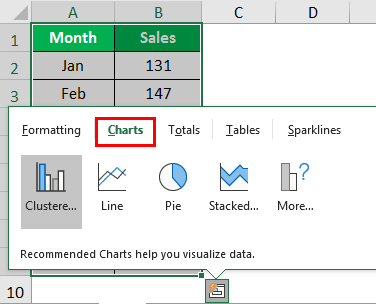
Then, select the required chart here. We have chosen a clustered column chart. Then, the quick analysis tools are ready to use.
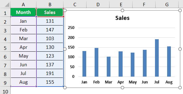
Like this, we can use various charts that suit our data structure.
Example #3 - Quickly Analysis Through Totals
We can also insert totals into the data by choosing "TOTALS" under "Quick Analysis." Under this, we have a variety of formulas.
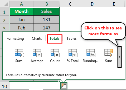
We can insert the SUM, AVERAGE, COUNT, % Total, Running Total, SUM to the Right, Average to the Right, count to the right, and running total to the right.
Based on the requirement, we can make use of these formulas. Now, we have applied "RUNNING TOTAL" in Excel.

We got the result for the running total, as shown below:
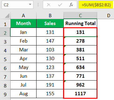
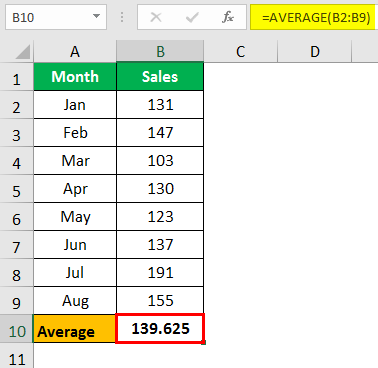
Similarly, we can use SUM, AVERAGE, etc.
Example #4 - Quickly Analysis Through Tables
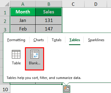
We can also insert the table format in excel and PivotTable to the data under "Tables." Then, click on "TABLES" and choose the option you want to use.

A table will convert the range of data to table format data.

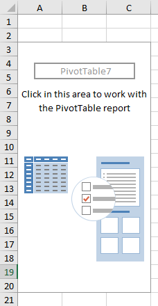
If you click "Blank," it will insert a PivotTable in the new sheet in Excel.
Example #5 - Quickly Analysis Through Sparklines
We can insert sparklines to the right of the data under the "SPARKLINES" option.
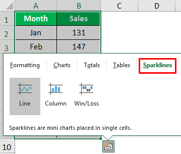
Based on our selection, it will display the sparklines to the left of the data.
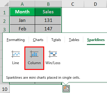
We have selected "Column" sparkling, as shown below.

By making use of the "Quick Analysis Tools" in Excel, we can make a quick analysis of our data without breaking any sweat.
Important Things To Note
- Quick Analysis is a powerful tool that helps you choose the best chart for your data with just a few clicks.
- To get started, select a range of cells that you want to analyze.
- Then, look for the Quick Analysis button that appears at the bottom right corner of the selected data, or press Ctrl + Q.
- This feature will help you save time and effort by automating the process of finding the perfect chart for your data.

