Area Chart in Excel
Selecting charts to show the graphical representations is too difficult if many choices exist. Choosing the correct chart type is very important to achieve the results or the aim. It requires lots of experience and effort to select the right chart.
An Area Chart is a chart like a line chart with one difference. For example, the area below the line is filled with color, making it different. An Area Chart in Excel showcases the data, which depicts the time-series relationship.
Uses of Area Chart
- It is useful when we have different time-series data and need to showcase the relation of each set to the complete data.
- There are two axis – X and Y, where information is plotted in an Area Chart. It is primarily used when the trend needs to be shown with magnitude rather than individual data values.
- The series with fewer values generally hides behind the series with high values. This chart in Excel is of 3 types in both 2-D and 3-D format: Area Chart, Stacked Chart, and 100% Stacked Chart. If we want to display a series of different data, 3-D is advisable.
How to Create an Area Chart in Excel?
The Area Chart is very simple and easy to use. Let us understand the working of the Excel area chart with some examples.
Video Explanations of Area Chart in Excel

Example #1
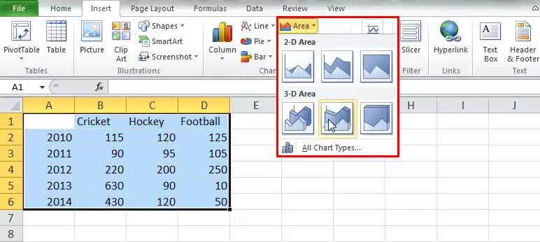
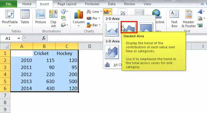
We have to select one of the graphs shown in the drop-down list. Refer to the below image:
Below are steps for creating an Area Chart in Excel: –
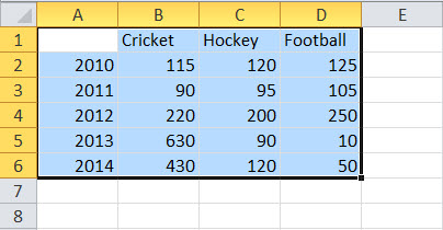
- Select the whole data or range for which we have to make the chart:
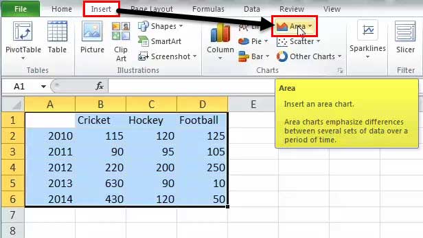
- Then, go to the “Insert” tab and select “Area Chart” like below:

- We have to select one of the graphs shown in the drop-down list. Refer to the below image:

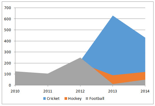
- The excel chart will get populated as shown below:
So, these are the necessary steps that we have to follow to create an Area Chart in Excel.

Example #2 – Stacked Area
It is the same as the above one; we have to click on the 2-D stacked area like below:
The above selection creates the below chart:
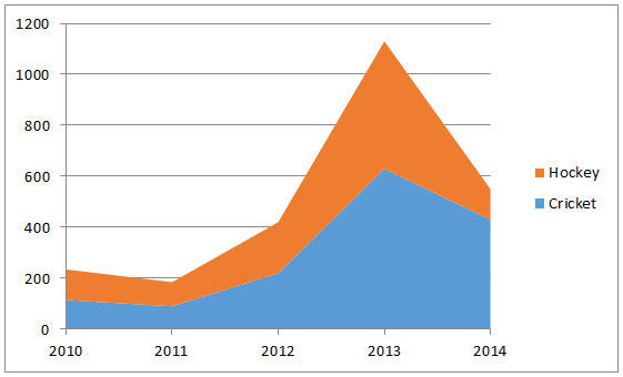
Here, we can see the relation between the data and the year, the time relationship. The overall trend of the games concerning the year.
Example #3 – 100% Stacked Area
There is the only difference is that all the values show 100% on Y-axis like below:
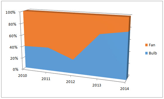
It helps in establishing a better representation of Product lines.
The only change in the creating a 100% stacked area is to select the last option in 2-D or 3-D like below:
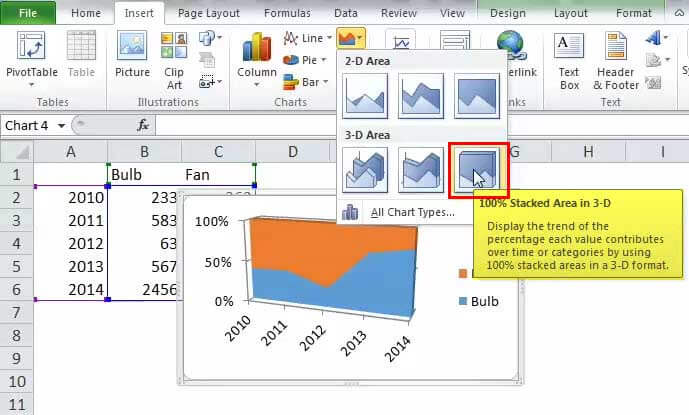
Below is the result:
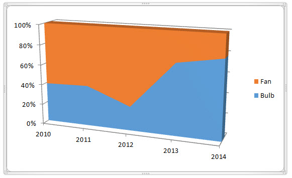
We can analyze the trends of changes in product bulbs and fan consumption over the years.
Hence, we have seen the above example of the three types of area charts in Excel, which helps us understand more clearly.
It does not show the value-wise in the representation. It shows the trends.
Variants of the Excel Area Chart
One can illustrate this chart in two ways:
- Data plots that overlap each other
- Data plots stacked on top of each other
Pros
- Comparison of the trend: After looking Area Chart in Excel, it gives us a clear understanding of the trend followed by each product.
- Comparison between small no. of the category: The stacked area is easier to understand than the overlapped. Though it surely takes more effort to read than it takes for a chart with two classes.
- Comparison between trends and not the values: The overlapped data is also readable and helpful by giving the colors and the appropriate values.
Cons
- Understanding: For deducing the values or data of the plot, one should read it concerning the previous plot from which we have to compare. Everyone is not used to it.
- Difficult to analyze: Sometimes, it is challenging to read the data and study to achieve the desired results.
Points to Remember
- The user must have the basic knowledge of the chart to understand the area chart.
- One should compare the data with each other concerning time.
- Basic understanding of the analyzing chart.
Recommended Articles
This article is a guide to Area Chart in Excel. Here, we discuss its uses and how to create Area Chart in Excel, Excel examples, and downloadable Excel templates. You may also look at these useful functions in Excel: –