What Are Legends In Excel Chart?
Legends in excel chart are a representation of data itself. It is used to avoid confusion when the data has the same values in all the categories. In addition, it is used to differentiate the classes, which helps the user or viewer to understand the data more properly. It is located on the right-hand side of the given Excel chart.
For example, consider the below image showing population of people in a place under 25, divided by directions.
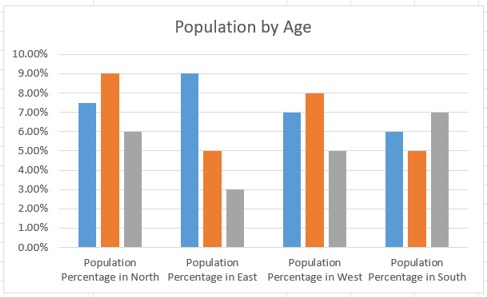
Though this chart type is neat and clean, we need to have legends to make it more presentable and understandable.
To insert, simply click on the chart and click on the ‘+’ symbol. Now, select the Legend option.
We can see from the below image that the legends are added in Excel.
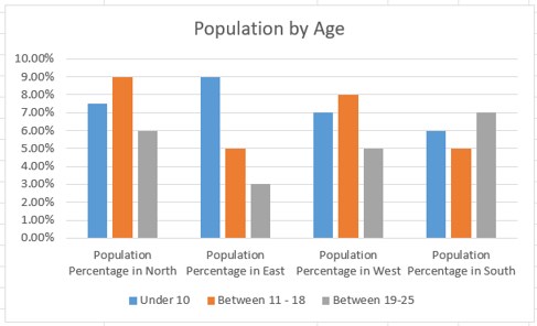
Likewise, we can use legends in Excel.
Let’s understand more about legends in Excel in this article with detailed examples.
Key Takeaways
- Legends in Excel chart are a small visual representation of the chart’s data series to understand each without confusion.
- Legends are directly linked to the chart data range and change accordingly.
- In simple terms, if the data includes many colored visuals, legends show what each visual label means.
- To insert legends in Excel chart, simply click on the chart which we have created and then, click on ‘+’ option.
- Now, select the Legend option. We can immediately see the legends in Excel chart.
Explanation And Uses
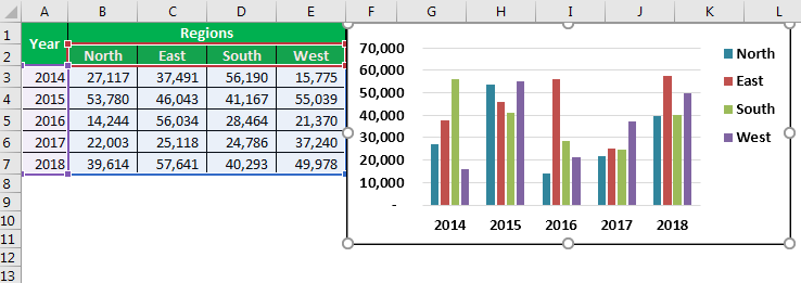
If you look at the below image of the graph, the graph represents each year’s region-wise sales summary. So in a year, we have four zones: each year, the red color represents the North zone, the orange color represents the East zone, the green color represents the South zone, and light blue represents the West zone.
In this way, legends are useful in identifying the same set of data series in different categories.
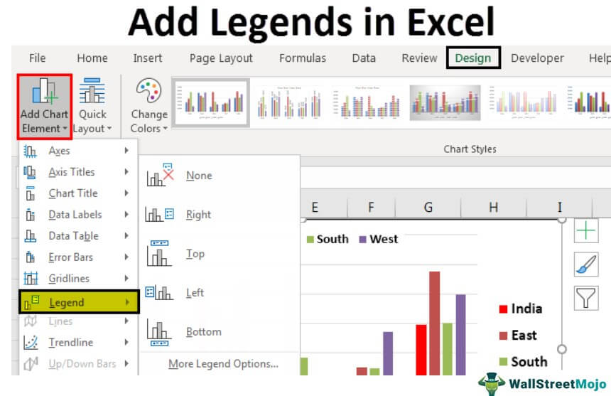
How To Add Legends To A Chart In Excel?
Below are a few examples of adding legends in Excel.
Examples
Example #1 – Work with Default Legends In Excel Charts
When you create a chart in excel, we see legends at the bottom of the chart below the X-axis.

The above chart is a single legend, i.e., in each category, we have only one set of data, so there is no need for legends here. But, in the case of multiple items in each category, we have to display legends to understand the scheme of things.
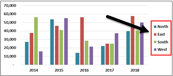
For example, look at the below image.
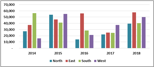
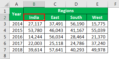
Here 2014, 2015, 2016, 2017, and 2018 are the main categories. Under these categories, we have sub-categories that are common for all the years, i.e., North, East, South, and West.
Example #2 – Positioning Of Legends In Excel Charts
As we have seen, by default, we get legends at the bottom of every chart. But that is not the end; we can adjust it to the left, right, top, right, and bottom.
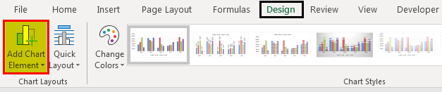
For changing the positioning of the legends in Excel 2013 and later versions, there is a small PLUS button on the right-hand side of the chart.
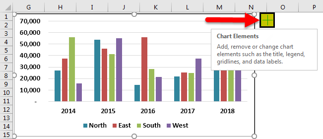
If we click on that PLUS icon, we will see all the chart elements.
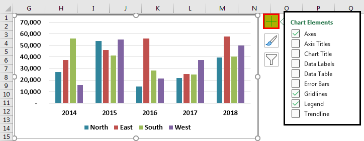
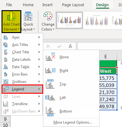
Here we can change, enable, and disable all the chart elements. Now, go to Legend and place a cursor on the legend; we will see Legend options.
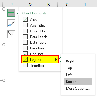
It is showing as Bottom, i.e., legends are showing at the bottom of the chart. You can change the position of the legend as per your wish.
The below images will display the different positioning of the legend.
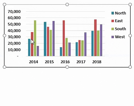
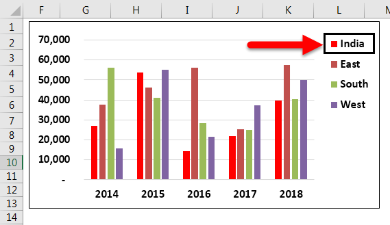
Legend at Right Side
Click on the “Right” option in “Legend.”
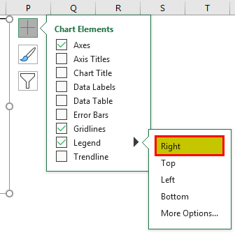
We will see the legends on the right-hand side of the graph.
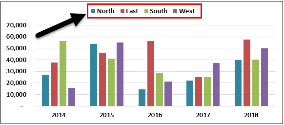
Legends at the top of the chart
Select the “Top” option from the “Legend,” and we may see the legends at the chart’s top.
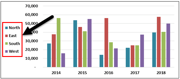
Legends at the Left Side of the chart
Select the “Left” option from the “Legend,’ and we may see the legends on the left side of the chart.
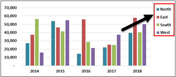
Legends at the Top Right Side of the Chart
Go to “More Options,” select the “Top Right” option, and see the following result.
If you are using Excel 2007 and 2010, the positioning of the legend will not be available, as shown in the above image. Instead, select the chart and go to “Design.”
Under Design, we have the Add Chart Element.
Click on the drop-down list of Add Chart Element > Legends > Legend Options.
In the above tool, we need to change the legend positioning.
Example #3 – Excel Legends Are Dynamic
Legends are dynamic in Excel as formulas. Since the legends are directly related to the data series, any changes made to the data range will affect legends directly.
For example, look at the chart and legends.
We will change the “North” zone’s color to “red” and see the impact on legends.
Legends’ indication color has also changed to red color automatically.
We will change the North zone to India in the Excel cell for experiment purposes.
Now see what the legend name is.
It automatically updated the legend name from North to INDIA. These legends are dynamic if directly referred to as the data series range.
Important Things To Note
- Legends are representation of data, found in the chart created in Excel.
- By default, we get legends at the bottom.
- Legends are dynamic and change as per the change in color and text.
Frequently Asked Questions (FAQs)
What is legends in Excel?
Legends are representation of data. Users use them to make the data more presentable and to avoid confusion. Based on the chart types, we can choose whether or not to include legends in Excel.
Explain overlapping of legends in Excel chart with an example.
By default, legends will not overlap other chart elements, but if space is too constrained, they will overlap on other chart elements. Below is an example of the same.
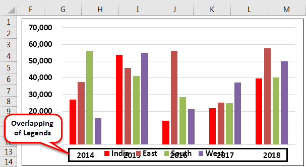
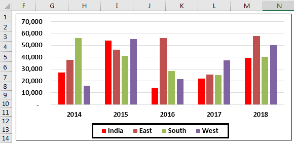
In the above image, legends are overlapped on the X-axis. To make it proper, go to legends and check the option “Show the legend without overlapping the chart.”
It will separate the legends from other chart elements and show them differently.
What are some important points to remember while using legends in Excel?
Legends are available by default and we can choose whether or not to include legends in Excel chart.
Also, we can change the positioning of the legend as per our wish but cannot place it outside the chart area.
Recommended Articles
This article is a guide to Legends in Excel Chart. We discuss adding legends in Excel with examples and downloadable Excel templates. You may also look at these useful functions in Excel: –