What Do You Mean By Plots In Excel?
Plots in Excel are defined as graphs that correlate with the data presented in the two columns. Plots are nothing but Excel’s scatter diagram or scatter charts to tally the data sets in two columns. Two-dimensional XY charts show the relationship between the two variables and analyze the data in multiple views. It is easy to select the right scatter plot to perform data analysis.
Key Takeaways
- Plots in Excel, also known as scatter diagrams or scatter charts, represent the correlation between data presented in two columns.
- XY charts depict two-variable relationships and support multi-perspective data analysis. Choosing the right scatter plot is straightforward and significantly enhances analysis.
- It can be challenging to create a chart if the data for a variable is presented in a non-numeric format. To perform better data analysis with scatter plots, a small amount of data is valid.
- To perform accurate data analysis, avoid errors, and interpret data carefully. Enhance the visual appearance by adding colors and changing the chart format.
How To Make Plots In Excel?
Plots in Excel helps users convert data into plot charts. Let us learn how to create plots in Excel with detailed examples.
Examples
Example#1 – Simple Scatter Plot
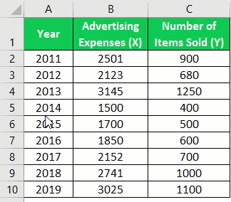
To create the simple scatter plot, place the data into two columns, as shown in the screenshot.

Follow the steps to create a scatter plot in Excel:
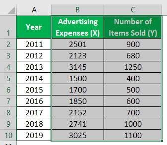
First, select the data, including the two columns, such as the advertising expenses, the number of items sold, and column headers.
In this situation, the range of data is B1:C10.
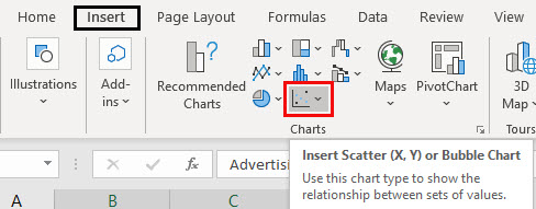
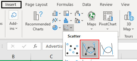
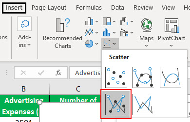
Go to the “Insert” tab, move to a “Scatter” plot, and place the cursor, as shown in the figure.

Choose the “Scatter” plot to represent the relationship between the data sets.

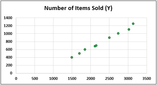
The scatter plot is developed, as shown in the below mentioned figure.
We can change the format and design of the chart area using the “Design” and “Format” tabs.
Example #2 – Scatter Plot With Smooth Lines And Markers
To create the simple scatter plot with lines and markers, place the data into two columns, as shown in the screenshot.

Step 1: Select the data, including the two columns, such as the advertising expenses, the number of items sold, and their column headers. In this situation, the range of data is B1:C10.
Step 2: Go to the “Insert” tab and choose the scatter plot with markers and lines to represent the relationship between the data sets.
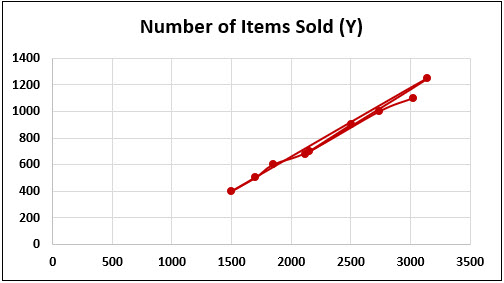
The scatter plot with lines and markers is shown in the below-mentioned figure.
Example #3 – Scatter Plot With Smooth Lines
Place the data into two columns to create a simple scatter plot with smooth lines.

Select the data, including the two columns, such as the advertising expenses, the number of items sold, and column headers. For example, in this situation, the range of data is B1:C10.

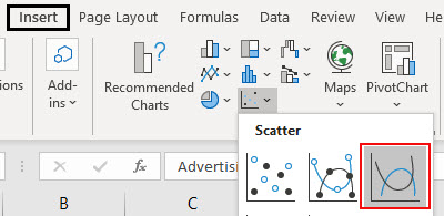
Go to the “Insert” tab, move to a scatter plot, and choose the scatter plot with lines representing the relationship between the data sets.
The scatter plot is developed, as shown in the below mentioned figure.
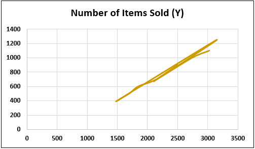
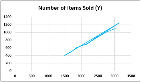
Example#4 – Scatter Plot With Straight Lines And Markers
To create the simple scatter plot with straight lines and markers, place the data into two columns, as shown in the screenshot.
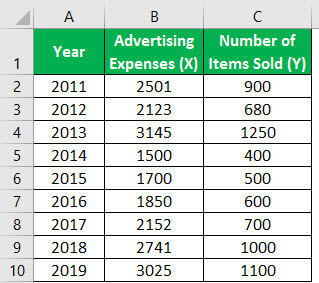
Select the data, including the two columns, such as the advertising expenses, the number of items sold, and column headers. For example, in this situation, the range of data is B1:C10.

Go to the “Insert” tab, move to a scatter plot, and choose the scatter plot representing the relationship between the data sets.
The scatter plot is developed, as shown in the below mentioned figure.

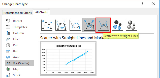
Change the chart type to scatter with straight lines, as shown in the figure.
The scatter with straight lines is developed, as shown in the figure below.
Example#5 – Bubble Chart
To create the simple bubble plot, place the data into two columns, as shown in the screenshot.

Select the data, including the two columns, such as the advertising expenses, the number of items sold, and column headers. For example, in this situation, the range of data is B1:C10.

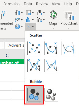
Go to the “insert” tab, move to the bubble plot, and choose the bubble plot to represent the relationship between the data sets.
The bubble plot is developed, as shown in the below mentioned figure.

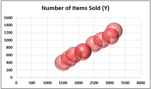
Change the chart type to a 3-D bubble plot, as shown in the figure.
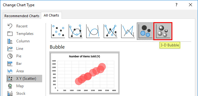
The 3-D bubble plot is developed, as shown in the figure below.
Applications
Scatter plots have different applications. These are used in:
- Resolve a problem through data analysis
- Determining the correlation between the independent and dependent variables.
- It is used as a quality tool in determining the causes of an issue.
- It tests the autocorrelation before building the control charts in quality analysis.
- It helps to show the non-linear pattern.
- A user can easily identify the minimum and maximum values in the range of data flow.
- Three relationships between variables: no relation, positive, and negative relationships, are analyzed effectively using the scatter plot. It helps to understand how changes in one factor will affect another factor.
Important Things To Note
- It is hard to create a chart if the data of a variable is presented in a non-numeric format.
- A small amount of data is useful in performing better data analysis with the scatter plot.
- It must be taken care of while performing proper data analysis without errors.
- The user must understand how to utilize and interpret data carefully and properly.
- We must always add colors and change the chart format to enhance users’ visual appearance.
Frequently Asked Questions (FAQs)
What do you use to create a plot in Excel?
To create a plot in Excel, one must choose the data they want to plot in the chart. Then, click the ‘Insert’ tab, and then click ‘Line,’ and pick an option from the available line chart styles. With the chart selected, click the ‘Chart Design’ tab to do any of the following: Click ‘Add Chart Element’ to modify details like the title, labels, and legend.
How do I add labels to a scatter plot in Excel?
To label the points in your scatter graph, follow these steps: 1. Select the plot and click on ‘Chart Elements’. 2. Check ‘Data Labels’ and click ‘More Options’. 3. Go to the ‘Label Options’ tab and select ‘Value From Cells’. 4. Choose the range to extract data labels. 5. Clear the X Value and/or Y Value box to show only names. 6. Set the position of the labels as ‘Above data points.’ After completing these steps, your Excel scatter plot data points will be labeled with names for easy comprehension.
How do I create a map plot in Excel?
To create a map chart, select any cell within the data range, then go to the ‘Insert’ tab, click on ‘Charts,’ choose ‘Maps,’ and select ‘Filled Map.’ If the preview looks good, click ‘OK.’ Depending on your data, Excel will insert either a value or a category map.
Recommended Articles
This article is a guide to Plots in Excel. Here, we learn to make scatter plots using a scatter plot with smooth lines; a scatter plot with straight lines and markers, and a bubble chart with examples and downloadable templates. You may learn more about Excel from the following articles: –