What is the Clustered Column Chart in Excel?
Before going straight into the “Clustered Column Chart in Excel,” we must look at the simple column chart. The column chart represents the data in vertical bars, looking horizontally across the chart. Like other charts, the column chart has X-axis and Y-axis. Usually, the X-axis represents the year, periods, names, etc. The Y-axis represents numerical values. The column charts display a wide variety of data to exhibit the report to the company’s top management or end-user.
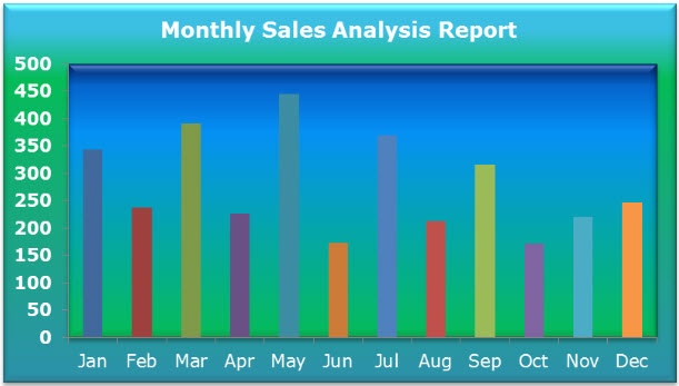
Below is a simple example of a column chart.
Clustered Column vs Column Chart
The simple difference between the column and clustered charts is the number of variables used. If the number of variables is more than one, we can call it a “clustered column chart.” If the number of variables is limited to one, we can call it a “column chart.”
One more significant difference is in the column chart. Again, we can compare one variable with the same set of other variables. However, in the clustered column Excel chart, we can compare one set of a variable with another set of variables within the same variable.
Therefore, this chart tells the story of many variables, while the column chart shows the story of only one variable.
How to Create a Clustered Column Chart in Excel?
The clustered column Excel chart is straightforward and easy to use. Let us understand the work with some examples.
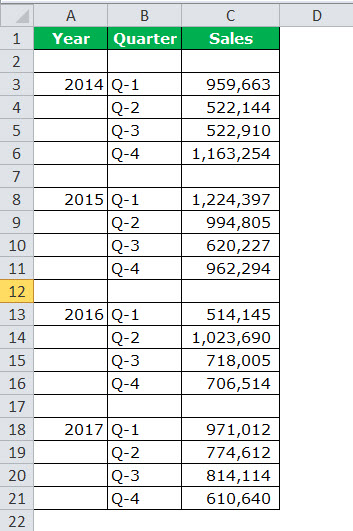
Example #1 Yearly & Quarterly Sales Analysis
Now, we need to do the formatting to arrange the chart neatly.
Below are the steps to find yearly and quarterly sales analysis:
- Firstly, we must prepare the dataset as shown below.

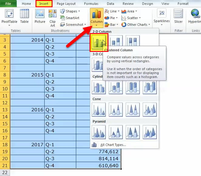
- Then, we must select the data, go to “Insert” “Column Chart,” and choose “Clustered Column Chart.”
As soon as we insert the chart, it will look like this.

- Now, we need to do the formatting to arrange the chart neatly.
First, we must select the bars and click “Ctrl + 1” (do not forget Ctrl +1 is the shortcut to format).Then, we must click on “Fill” and select the below option.After varying each bar with a different color chart, it will look as shown below.


Formatting Chart:
- After this, we must make the gap width of the column bars 0%.
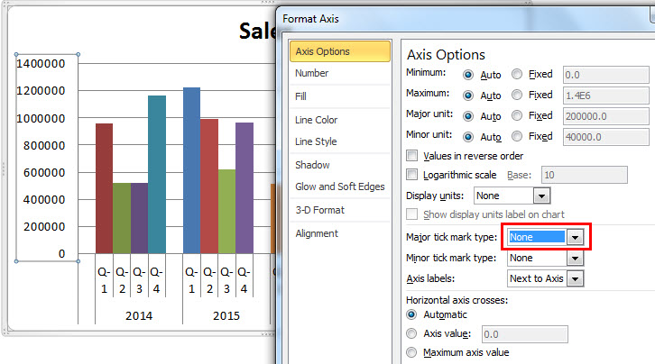
- Next, we must click on “Axis Options” and choose “Major tick mark type” to “None.”
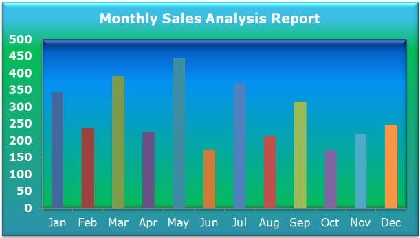
Therefore, our clustered chart may look like the one shown below.

Interpretation of the Chart:
- Q1 of 2015 was the highest sales period, where it generated revenue of more than 12 lakhs.
- Q1 of 2016 is the lowest point in revenue generation. That particular quarter generated only 5.14 lakhs.
- In 2014, there was a steep rise in revenue after a dismal show in Q2 and Q3. Currently, this quarter’s revenue is the second-highest revenue period.
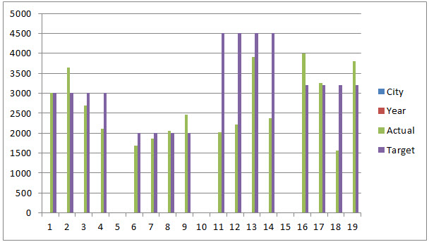
Example #2 Target vs Actual Sales Analysis across Different Cities
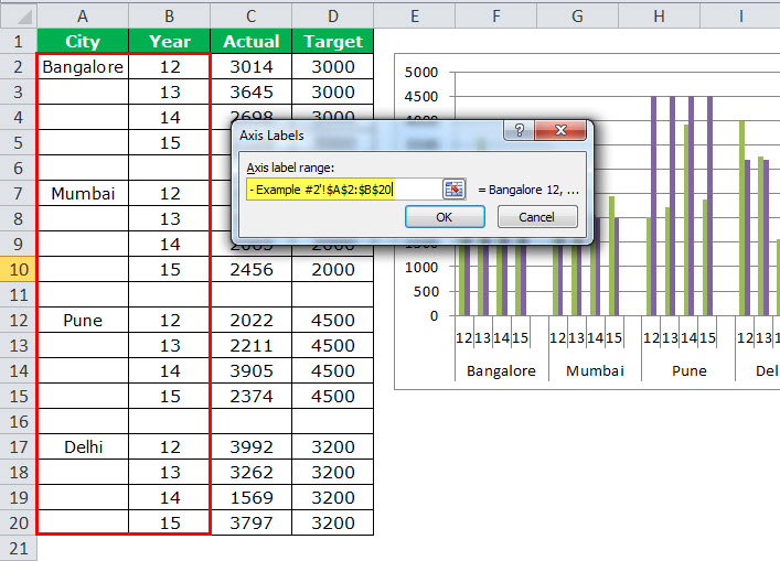
Step 1: We must arrange the data in the below format.

Step 2: We must insert the chart from the insert section. Then, follow the steps of the previous example to insert the chart. Initially, the chart will look like this.
Then, we need to do the formatting by following the below steps.
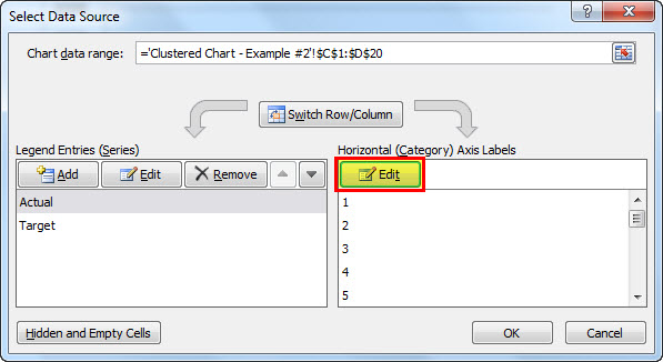
- Right-click on the chart and choose “Select Data.”
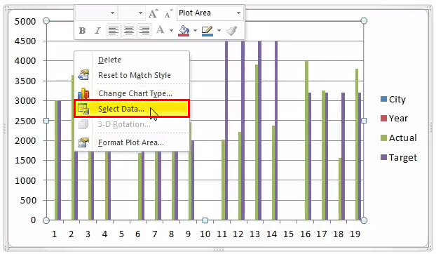
- And remove “CITY & YEAR” from the list.
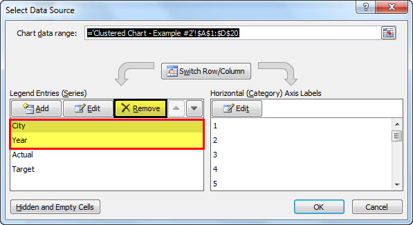
- Then, we must click on the “EDIT” option and select “CITY & YEAR” for this series.
- So now, the chart will look like this.

- Apply to format as we did in the previous one, and your chart looks like this.
- Now, we must change the “TARGET” bars chart from the “Column” chart to the “Line” chart.
- Select Target Bar chart and go to Design > Change Chart Type > Select Line Chart.

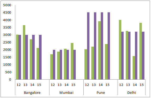
- Finally, our chart will look as shown below.

Interpretation of the Chart:
- The blue line indicates the target level for each city, and the green bars indicate the actual sales values.
- Pune is the city where it has achieved its target for the year.
- Delhi has exceeded the target besides Pune, Bangalore, and Mumbai cities.
- Delhi has achieved the target 3 years out of 4 years.
Example #3 Region-wise Quarterly Performance of Employees
Note: Let us do it independently, and the chart should look like the one below.
- Initially, we must create the data in the below format.

- And our chart must look like this as shown below.

Pros of Clustered Column Excel Chart
- The clustered chart allows us to directly compare multiple data series of each category.
- It shows the variance across different parameters.
Cons of Clustered Column Excel Chart
- Difficult to compare a single series across categories.
- It could be visually complex to view as the data of the series keeps adding.
- As the dataset keeps increasing, it gets confusing and makes it difficult to compare more than one data at a time.
Things to Consider Before Creating Clustered Column Chart
- We must avoid using a large data set, as it is tough to understand for the user.
- We must not use 3-D effects in the clustered chart.
- Always play smartly with data to arrange the chart beautifully, like how we inserted one extra row between cities to give extra spacing between each bar.
Recommended Articles
This article is a guide to Clustered Column Chart. We discussed creating clustered column chart in Excel, examples, and downloadable Excel templates. You may also look at these useful functions in Excel: –