What Are Graphs And Charts In Excel?
Graphs and Charts in Excel are the pictorial representation of datasets for easy presentation and understanding. Graphs represent the numeric data and show the relation and variation of how one number affects or changes another. However, charts represent data that may or may not be related.
For example, when we plot a graph or a chart using the numeric values, we get the following pictorial representation.
Let us consider how to arrive at this chart in the article.
Key Takeaways
- The Graphs and Charts in Excel are the graphical representation of any selected dataset. It represents the data in a user understandable way.
- In a presentation, when we represent the data as a chart or graph, we can comprehend the trend with just a glimpse.
- Unlike the numeric value datasets, we cannot immediately identify the maximum and minimum values, the increase or decrease in profit, etc.
- To generate an accurate chart or graph, we must sort the data in the required order, ensure to have all the data filled, i.e., no empty or blank cells, and the cell values must always be numeric. i.e., not special characters or alpha-numeric values.
How To Make Charts And Graphs In Excel?
We can create Excel Charts and Graphs as follows:
- First, choose the dataset or the cell range required to plot the graph, ensure we have valid numeric data, and no blank or empty cells.
- Next, select the “Insert” tab → go to the “Charts” group → click the “Insert Column or Bar Chart” option drop-down → select the “Clustered Column” chart type from the “2-D Column” category, as shown below.
- Finally, the chart automatically generates in the worksheet. Then, we can format it accordingly.
Types To Create Graphs And Charts In Excel
We can create Excel Graphs and Charts in 2 types, namely,
- Auto Selection of Data Range → Here, we select the dataset first, insert a chart type, and then the chart is generated. Later, we use the “Format Data Series” to format it further.
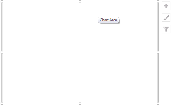
- Manual Data Selection → Here, we first insert a chart using the “Insert” tab. A blank chart generates in the background, as shown below. Then, click the “Select Data…”, and format it to get the required chart.
Examples
Let us consider a couple of examples to show how to create Graphs and Charts automatically and manually.
Example #1
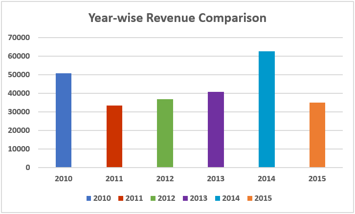
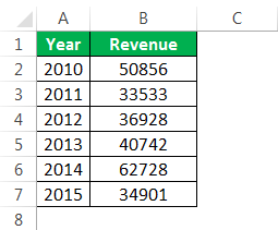
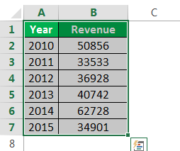
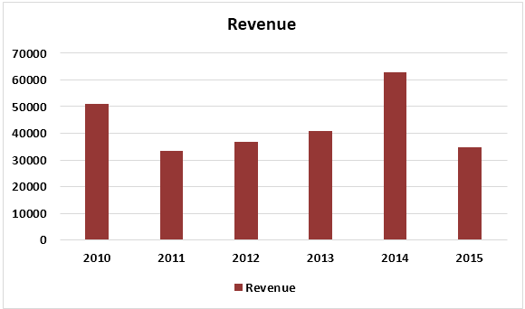
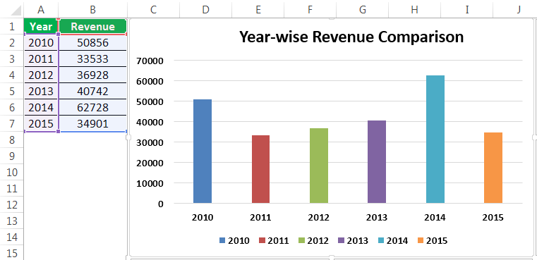
Assume we have passed six years of sales data. We want to show them in visuals or graphs.
The steps to create a Graph or Chart using automatic data selection type are,
First, we must select the date range we are using for a graph.

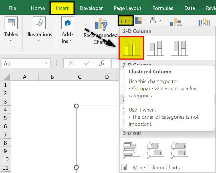
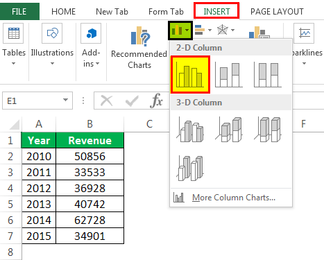
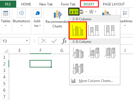
Then, go to the “INSERT” tab → under the “Charts” section, and select the “COLUMN” chart. We can see many other types under the “Column” chart, but prefer the first one.

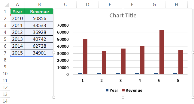
As soon as we have selected the chart, we can see the below chart in Excel.

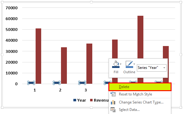
It is not the final chart. We need to make some changes here. So, we must select the blue-colored bars and press the “Delete” button. Else, right-click on the bars & choose “Delete.”

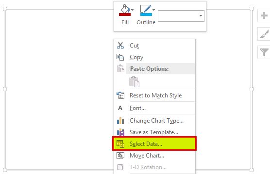
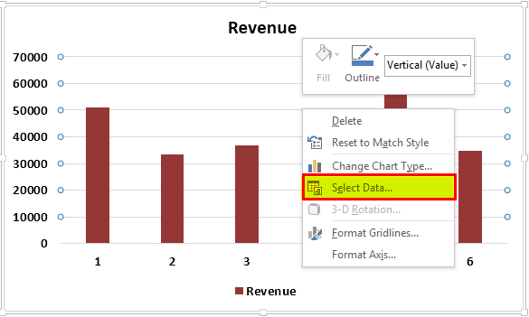
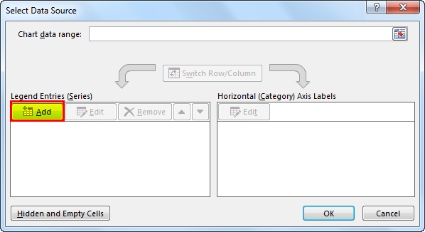
Now, we do not know which bar represents which year. So, right-click on the chart and select “Select Data…”

In the below window, we must click “EDIT,” which is on the right-hand side.

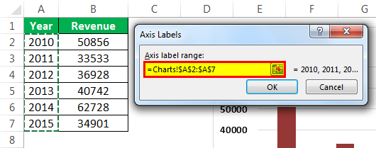
After we click the “EDIT option,” we will see a small dialog box below. It will ask to select the “Horizontal Axis Labels.” So, choose the “Year” column.

Now, we have the “Year” name below each bar.

After that, change the heading or title of the chart as per the requirement by double-clicking on the existing header.
Add “Data Labels” for each bar. The “Data Labels” are each bar’s numbers to convey the message perfectly. Right-click on the column bars and select “Add Data Labels.”

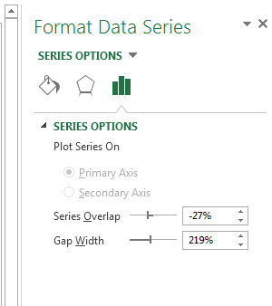
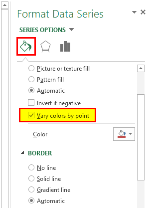
Change the color of the column bars to different colors. Next, select the bars and press “Ctrl + 1.” We may see the format chart dialog box on the right-hand side.

Now, go to the “FILL” option, and select the option “Vary colors by point.”

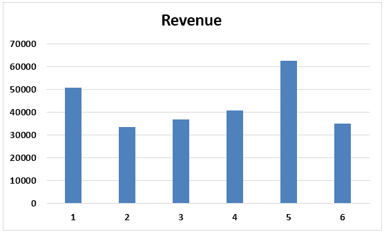
Now, we have a neatly arranged chart, as shown below.


Example #2
We have seen how to create a graph with auto-selection of the data range. Next, we will show you how to build an Excel chart with a manual data selection.
The steps to create a Graph or Chart using manual data selection type are,
- Step 1: First, we must place the cursor in the empty cell, and click the “Insert Chart.”
- Step 2: After we click on the “Insert Chart,” we can see a blank chart.
- Step 3: Right-click on the chart, and choose the “Select Data” option.

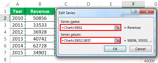
- Step 4: In the below window, click “Add.”
- Step 5: In the below window, under “Series name,” select the heading of the data series, and under the “Series values,” select data series values.
- Step 6: Now, the default chart is ready.
Now, we must apply the steps shown in the previous example to modify the chart. i.e., refer to steps 5 to 12 to format the chart.
Important Things To Note
- For the same data, we can insert all types of charts. It is important to identify a suitable chart.
- If the data is smaller, it is easy to plot a graph without any hurdles.
- In the case of percentage data, we must select the PIE chart.
- We must try using different charts for the same data to identify the best fit chart for the data set.
Frequently Asked Questions (FAQs)
What are some tips to follow when plotting a Graph and Chart in Excel?
A few tips to follow while creating a Graph and Chart in Excel are as follows:
- Numerical Data: The first thing required in your Excel is numerical data. Charts or graphs can only be built using numerical data sets.
- Data Headings: These are often called data labels. The headings of each column should be understandable and readable.
- Data in Proper Order: It is important how the data looks in Excel. If the information to build a chart is in bits and pieces, it is difficult to construct a chart. So, arrange the data properly.
Name the different types of charts available in Excel.
The different types of charts available in Excel are as follows:
- A Pie Graph displays the data as a pie or a circular form.
- The Column or Bar Graph displays statistical data relation or variation in the form of Bars or Columns, i.e., horizontally or vertically, respectively.
- A Line Graph displays the selected dataset as a line, which is easy to understand and not cluttered.
- The Area Graph is like a line graph to represent data comparison and to keep track of data trends.
- The Scatter Graph is mostly used for a smaller dataset as the graph will look like scattered dots for data points.
Why is the Graph or Chart in Excel not working?
A few reasons why a Graph or Chart in Excel may not work are as follows:
- The dataset linked to the generated chart is modified, and the chart did not update automatically. In such scenarios, we can refresh the chart once to display the updated data.
- The dataset is not selected, or it is deleted. So, there is no data range to display or generate the chart
Recommended Articles
This article is a guide to Making Charts in Excel. Here, we discuss how to make charts or graphs in Excel, practical examples, and a downloadable Excel template. You may learn more about Excel from the following articles: –