Part of our Excel Charts guide
What Is Chart Legend In Excel?
A legend is a description of major elements of an Excel chart. It helps in easy access to any chart. Legends may occupy a very small cornered area in any chart of an Excel sheet. However, it is one of the most important areas.
For example, consider the below table.

Using chart legend in Excel, we can create something user friendly as shown in the below screenshot.

In this article, let us learn how to create chart legends in Excel.
Key Takeaways
- Excel chart legend is a feature in an Excel chart that describes the different elements of the chart, such as colors or symbols, making it easier to understand the data.
- Legends are crucial for Excel charts. They provide necessary details about the units of the chart clearly and concisely for viewers.
- Customizing them to fit our specific needs makes our presentations more effective and easier to understand.
- Legends are critical for analyzing data in charts. They help in better understanding and comparison of multiple data sets and are present in all charts.
How To Add A Legend To Excel Chart?
We can easily add legend in Excel with a few steps.
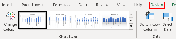
First, we have to select the data and insert a chart, such as 2D column chart. Then, click on Chart Styles to select the chart style as required.
Next, click on Add Element – Legend – Top to create chart legend in Excel.
Let us learn how to create chart legend in Excel with detailed following examples.
Examples
Example #1 – Change Order Of Legend
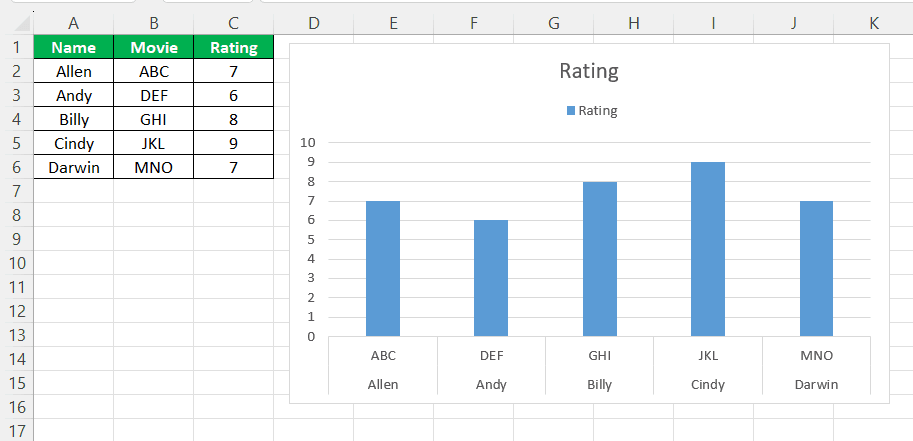
ABC Co. sells a range of products. After a few days of selling the product, the company seeks reviews from its customers by asking them to rate the product on 10.
Since the company deals with multiple products and tries to make a place in the market, it keeps track of each customer and their ratings.
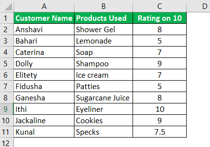
In the above example, we have taken only ten customers for ease of understanding. However, a company may have multiple customers for a single product.
With the use of Excel legends, we can understand the products and their ratings in a better way.
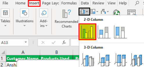
- In an Excel file, we have the option “Insert.” On the right side, outlined in black, it would give the following options for the charts. We can choose from a range of charts, from “Recommended Charts” to “Scatter Charts” or a simple one.
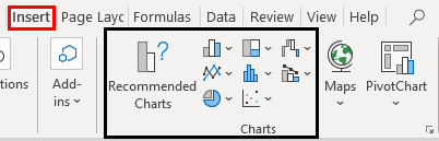
- For the convenience of explanation and understanding, we have selected one of the basic charts.
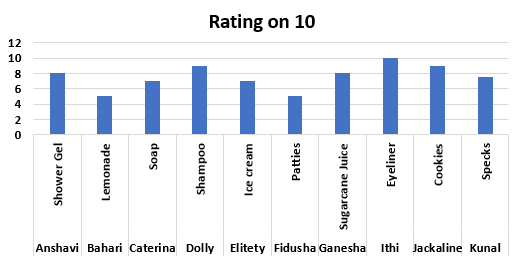
- We will have a chart like the one below.
- As soon as the chart is selected, we will be navigated automatically to the design option for formatting. Here in the example, we have chosen the first design. And we can edit the design any number of times, even after the final chart and legend adjustments are made.
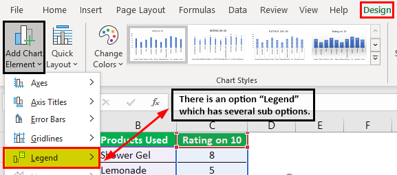
In the “Design” option, we have an icon of “Add Chart Element” on the left side of the sheet, as highlighted below. We get a pop-down menu when we click on that, as you can see below. The pop-down menu has an option – “Legend,” as shown below.
- To bring the “Legend” on the chart, we must go to the Chart Tools – Design – Add chart element – Legend – Top.
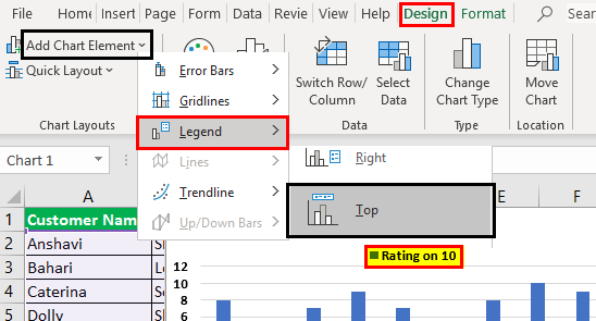
- An extra element appears on the chart below as soon as we do this.
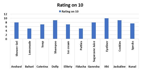
That is called a “Legend.” A legend gives us a direction as to what is marked in the chart in blue. In our example, it is the “Ratings” from customers.
The above process looks simple. Let me guess what you are thinking!
Why this?
It may look simple. However, as we mentioned earlier, a company may have several customers for a single product, or there may be several products in an organization with a different class of customers.
In the above example, you might have observed that we have taken just one simple rating!
Example #2 – Change Format Of Legend
However, to explain it better, let us take another example of multiple data elements to make a chart of three different products, as mentioned on the next page.
The following is a list of customers and their sales values for each product.

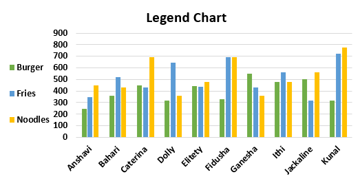
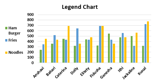
When we make a chart for this following the above procedures, our graph may look like this. And the “Legend” will be represented by different colors as defined by the arrow blue for “Burger,” orange for “Fries,” and green for “Noodles.”
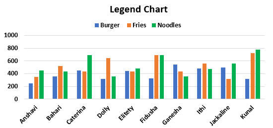
We can customize the legends as per the explanation above and select from options to make any alterations. As you can see, the legend is at the top of the chart. We can edit it to bring it to the top, bottom, right, or left as needed and convenient.
- Moving ahead with the legends, when we double click on the legends part of the chart as shown with an arrow, we get the “Format Legend” option.
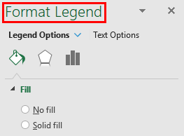
- The “Format Legend” option area has three icons, shown below.
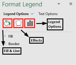
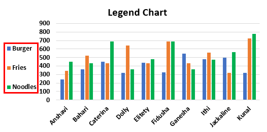
- From the icon “Legend Options,” as mentioned in the above screenshot, we can select various options to adjust the top, bottom, left, right, and top right chart. For instance, here, we have changed the option to left. So now my chart looks as follows. The legend appears on the left side now.
- Meanwhile, we also can change the color of the legends. We must go to “Design” – click on “Change Colors” in the drop-down menu. We have the option of changing the colors of our legends.

- The new chart looks like the following:
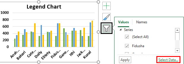
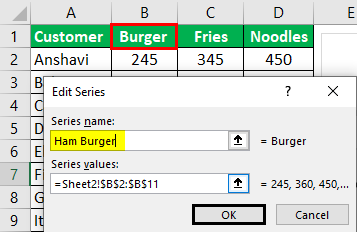
- We also have the option of changing the names of the legend. First, we need to go to the option “Chart Filters.” It helps to edit and modify the names and areas of the chart elements. Then click on “Select Data,” as highlighted below in red.
- When we select the above option, a pop-up menu called the “Select Data Source” screen appears. In addition, there is an option of “Edit.”
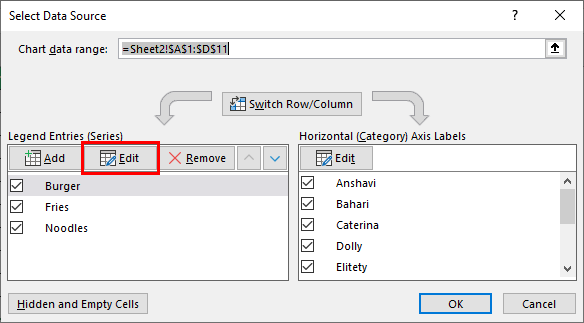
- The below-mentioned screenshot is the next step where the “Edit Series with “Burger” comes under the “Series name.” Here, we have the option of editing the name of the legend.
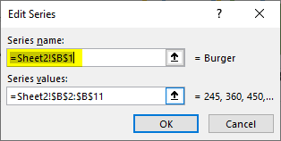
- We have replaced “Burger” with another name, “Ham Burger,” and then click “OK.”
- The chart may look like the one below.
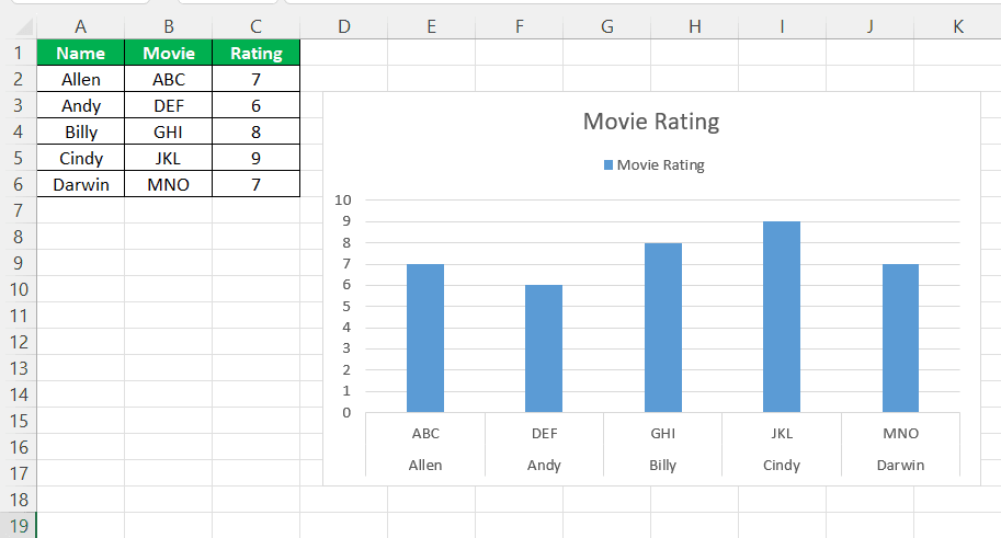
- In the same way, we can edit and replace the names of the legends as per the needs.
Important Things To Note
- It characterizes the units of any chart in the best possible way with the required details for the viewers. Therefore, we can customize it as per the needs.
- It makes the presentation easier and better.
- The legends are used for analyzing the data in a better way compared to normal tabular contents.
- It helps in comparison to multiple data and assists in a better understanding of the data.
- It is one of the most important parts of any chart and is present in all of them.
Frequently Asked Questions (FAQs)
How to edit text in Excel chart legend?
To edit legend entries in a chart, follow these steps: click the chart. Then go to the ‘Design’ tab and click ‘Select Data.’ Select the legend entry to change and click ‘Edit.’
How to change legend name in Excel chart?
For example, consider the below chart legend in Excel.
To change the series name, select the chart and click on Select Data option. Next, click on the entry from Legend Entries (Series) list and click Edit. Then, type the new name in the Series Name field.
We can easily change the legend name in Excel as shown in the below screenshot.
How do I get rid of value data labels and legend in Excel?
To delete data labels from a chart in Excel, go to the ‘Layout’ tab, click ‘Data Labels’ in the ‘Labels’ group, and select ‘None.’ Then, click on the data label and press ‘DELETE’ or right-click and select ‘Delete.’
Recommended Articles
Continue with these closely related articles from the same guide.