Part of our Excel Charts guide
What Is Tally Chart In Excel?
Tally chart in Excel is one of the techniques for collecting valuable data through tally marks from the data set. MS Excel has many pre-installed charts. All these charts speak a lot about the data in an eye-catching manner; a tally chart is one of the features. Tally marks are numbers, occurrences, or total frequencies measured for a category from the grouped observations. Unfortunately, there is no such chart type called “tally chart” in Excel, but there are a few ways to draw it.
It reflects quantitative and qualitative information from the tally information in a visually appealing manner. The best way to create a tally chart is using a column chart in Excel. We can convert tabular data into a tally chart with the help of a column chart where tally information is converted to columns in which each row has a distinct record.
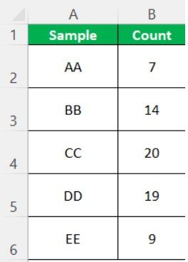
For example, consider the below table showing sample and count values.
Now, we can create Tally chart in Excel with ease, as shown in the below image.
Likewise, we can create tally chart in Excel. In this article, let us learn how to create tally chart in Excel with detailed examples.
Key Takeaways
- The tally chart in Excel shows the quantitative and qualitative details attractively. It can be created through a column chart in Excel and can also convert tabular data into a tally chart.
- This chart in Excel is simpler than MS Word and consists of five lines.
- It has two types of marks: 5 marks, which are shown as 4 vertical lines with one diagonal line, and 1 mark that refers to the remainder of the number.
- The column chart is a must for the tally chart to make a clear and understandable chart.
Explanation And Uses
- We can easily collect and organize data. Visualizing any number is faster than writing in words or numbers. The numbers represent frequencies or occurrences from each category. Then, we can see the tally marks in the unary number system.
- They are written in a group of five lines. It can be plotted in Excel and simpler and constructive in MS Word. The chart has two types of marks: 5 marks and 1 mark. 5 marks are represented in 4 vertical lines, with 1 line diagonally on the 4 lines. 1 mark represents the remainder of the number, which is stacked and scaled with the unit as
Below are the tally chart representation of numbers from 1 to 7 to make it more clear:
- | = 1
- || = 2
- ||| = 3
- |||| = 4
- |||| = 5
- |||| | = 6
- |||| || = 7
Similarly, we can represent any number in this.
How To Create Tally Chart In Excel?
This article must be helpful to understand Tally Chart in Excel, with its formula and examples.
Example #1
- For creating a tally chart, we need tabular data. We have the data for the same.
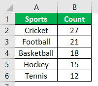
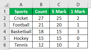
The table above has sports as a category that has the count in the next column along with the count. We need a tally chart for the same.
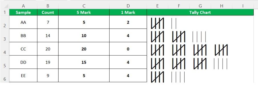
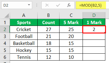
- Now, we need to find 5 marks and 1 mark for the count. There are two formulas. First, let us calculate 5 mark.
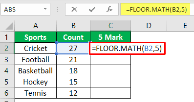
- Here, B2 is the cell of the count, and 5 is the divisor. We can see the result as shown below.
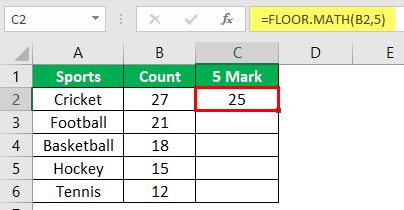
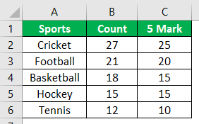
- Similarly, we can find the 5 marks for all the count values or drag the cursor until the last cell to automatically get the result.
- We can calculate 1 mark with the formula, as shown below.
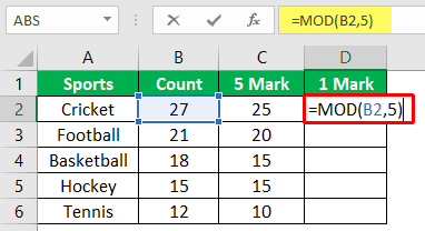
- The result is 2, as shown below.
- Similarly, we can calculate the rest of the counts.
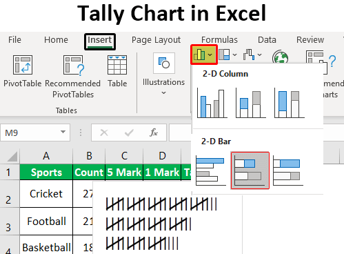
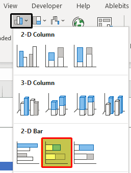
- It requires a column chart first. So, we will select the 5 marks and 1 mark columns to plot a column chart. To create a column chart, click Insert > Column Chart – 2-D Chart – Stacked Chart in Excel, as shown below.
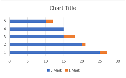
- Now, the column chart is ready. The blue color in the chart shows 5 marks, and the orange color shows 1 mark. The chart is horizontal in shape, as shown below.
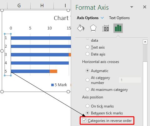
- Now, we can select the Y-axis, go to Format Axis – Axis Options, and select “Categories in reverse order,” as shown below.

Now, we can see the chart in descending order.
- In the next step, we will have to click on the data points and then change the gap width to 0%, as shown below.
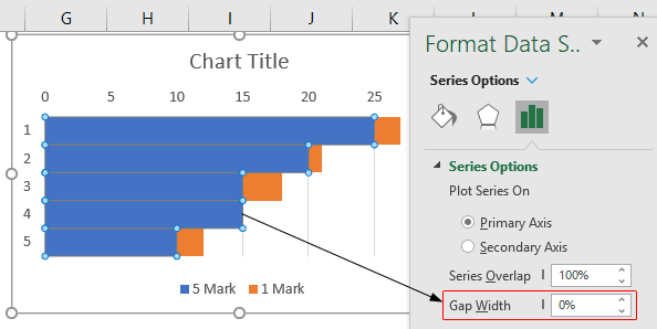
- Now, we can delete all the axis titles and numbers from the graph to clarify the chart. Next, we will resize the chart and paste it close to the table, as shown below.
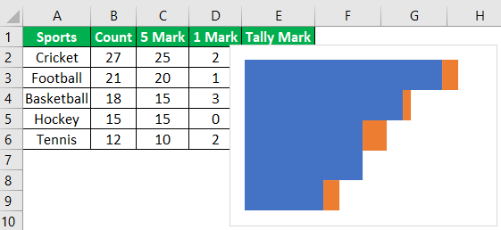
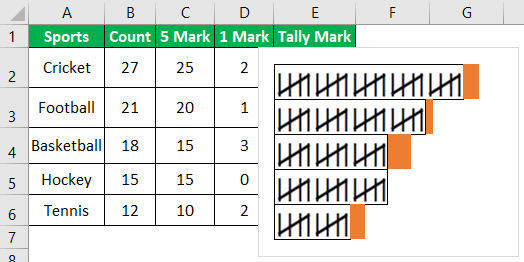
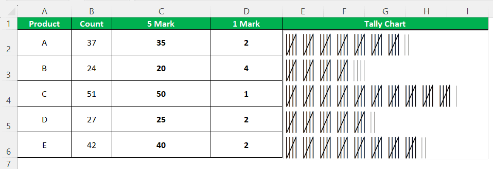
- We can see each category count in the column chart above. The next step is to create a tally chart in Excel. We will manually enter numbers from 1 to 6 and draw vertical lines below the numbers. For example, a diagonal line can show 5 marks on the 4 vertical lines, and 1 mark can be seen as a single vertical line.

- Now, we can copy the 5 marks and paste them on the right of the first bar of the column chart and 1 mark just below it for convenience.
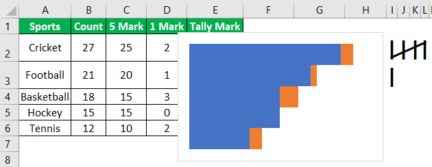
- Next, we must copy the 5 marks and click on the column chart. And select the options from the “Format Data Series.”
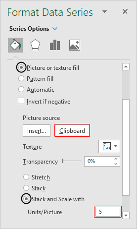
- Next, we can see tally marks. For example, when we set the stack and scale unit to 5, we can draw the 5 marks tally chart, as shown below.
- Similarly, we can draw the 1 mark tally chart with scale and stack unit set as 1.
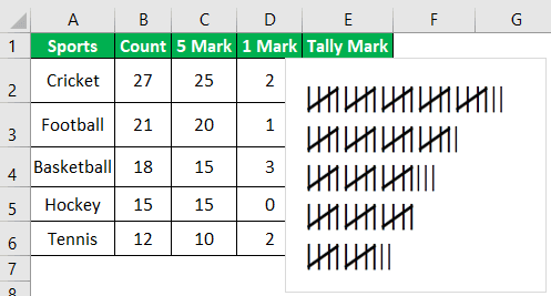
In the tally chart, 27 is represented as four 5 marks and one 1 mark.
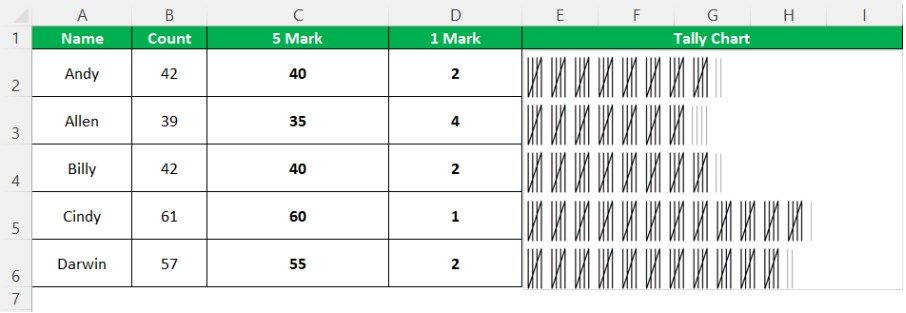
We can see the tally information as a tally chart in Excel.
Grasping these principles is essential for anyone looking to excel in this area. For those who want to take their learning to the next level, this Excel power query course is designed to build on this foundation and enhance their expertise.
Example #2
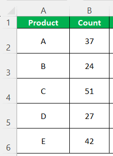
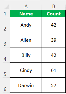
Consider the below table showing products and availability.
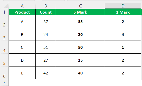
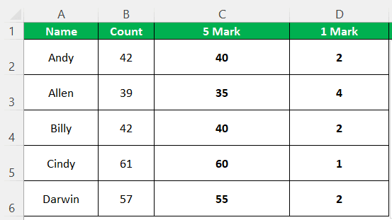
Now, we need to find 5 marks and 1 mark for the count.
Here, B2 is the cell of the count, and 5 is the divisor.
Similarly, we can find the 5 marks for all the count values or drag the cursor until the last cell to automatically get the result.
We can calculate 1 mark with the formula.
We can see the result as shown below.
It requires a column chart first. So, we will select the 5 marks and 1 mark columns to plot a column chart. To create column chart, click on Insert – Column Chart – 2-D Chart – Stacked Chart in Excel, as shown below.

Now, the column chart is ready. The blue color in the chart shows 5 marks, and the orange color shows 1 mark.
Now, we can select the Y-axis, go to Format Axis > Axis Options, and select “Categories in reverse order,” as shown below.
We can see the counts in descending order.
In the next step, we will have to click on the data points and then change the gap width to 0%, as shown below.
Now, we can delete all the axis titles and numbers from the graph to clarify the chart. Next, we will resize the chart and paste it close to the table.
Now, we can count each category in the column chart. The next step is to create a tally chart in Excel. We will manually enter numbers from 1 to 6 and draw vertical lines below the numbers. For example, a diagonal line can show 5 marks on the 4 vertical lines, and 1 mark can be seen as a single vertical line.

Now, we can copy the 5 marks and paste them on the right of the first bar of the column chart and 1 mark just below it for convenience.
Next, we must copy the 5 marks and click on the column chart. And select the options from the “Format Data Series.”

Now, we can see the tally marks.
Similarly, we can draw the 1 mark tally chart with scale and stack unit set as 1.
Likewise, we can create Tally chart in Excel.
Example #3
Consider the below table showing products and availability.
Now, we need to find 5 marks and 1 mark for the count.
Here, B2 is the cell of the count, and 5 is the divisor.
Similarly, we can find the 5 marks for all the count values or drag the cursor until the last cell to automatically get the result.
We can calculate 1 mark with the formula.
We can see the result as shown below.
It requires a column chart first. So, we will select the 5 marks and 1 mark columns to plot a column chart. To create a column chart, click Insert – Column Chart – 2-D Chart – Stacked Chart in Excel, as shown below.

Now, the column chart is ready. The blue color in the chart shows 5 marks, and the orange color shows 1 mark.
Now, we can select the Y-axis, go to Format Axis – Axis Options, and select “Categories in reverse order,” as shown below.

Now, we can see the counts in descending order.
In the next step, we will have to click on the data points and then change the gap width to 0%, as shown below.
Now, we can delete all the axis titles and numbers from the graph to clarify the chart. Next, we will resize the chart and paste it close to the table.
We can see each category in the column chart. The next step is to create a tally chart in Excel. We will manually enter numbers from 1 to 6 and draw vertical lines below the numbers. For example, a diagonal line can show 5 marks on the 4 vertical lines, and 1 mark as a single vertical line.

Now, we can copy the 5 marks and paste them on the right of the first bar of the column chart and 1 mark just below it for convenience.
Next, we must copy the 5 marks and click on the column chart. And select the options from the “Format Data Series.”

Now, we can see tally marks.
Similarly, we can draw the 1 mark tally chart with scale and stack unit set as 1.
Likewise, we can create Tally chart in Excel.
Important Things To Note
- Tally information must be calculated using the two formulas before creating a column chart.
- A column chart is drawn from the table’s 5 marks and 1 mark values.
- It relies on the column chart. Without a column chart, we cannot draw a tally chart.
- Knowledge of the tally chart is before constructing it in excel.
- It makes the data clear and easier to understand from a layman’s point of view. Even students use this at school in Mathematics.
Frequently Asked Questions (FAQs)
What are the parts of a tally chart?
The tally chart in Excel includes three primary elements: different categories, data or information, and titles.
Is a tally chart a diagram?
The tally chart is an innovative and quick technique to record data or any information. It can be done through vertical lines that show any item observations instead of repeatedly typing data, figures, and words.
Is a tally chart a table?
The tally charts are utilized to note values for a variable and are denoted as a tally mark on the value’s frequency. They are grouped in five sets to help the counting frequency for every value presented in the given data.
Recommended Articles
This article has been a guide to Tally Chart in Excel. Here, we learn how to create a tally chart in Excel, examples, and a downloadable Excel template. You may learn more about Excel from the following articles:-
Recommended Articles
Continue with these closely related articles from the same guide.