Part of our Excel Charts guide
Histogram in Excel
A histogram Excel chart is a data analysis chart used to represent histogram data. In Excel 2016 and older versions, this chart is built-in in Excel. While for previous versions, we used to make this chart manually by using the cumulative frequency method. In the histogram chart, the data comparison is classified into ranges.
In layman’s terms, it is a graphical representation of data using bars of different heights. For example, a histogram chart in Excel is like a bar chart except that it groups numbers into ranges, unlike individual values in a bar chart.
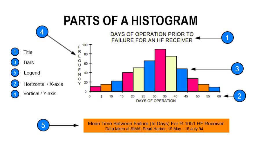
A histogram in Excel comprises five parts: “Title,” “Horizontal,” “Bars” (height and width), “Vertical,” and “Legend.”
- The title describes the information about the histogram.
- (Horizontal) X-axis grouped intervals (and not the individual points).
- Bars have a height and width. The height represents the number of times the set of values within an interval occurred. The width represents the length of the interval covered by the bar.
- (Vertical) Y-axis is the scale that shows you the frequency of the values within an interval.
- Legend describes additional information about the measurements.
Refer to the image given below to understand better. It shows a sample histogram with each component highlighted.

Purpose of a Histogram in Excel
The purpose of the histogram chart in Excel is to roughly assess the probability distribution of a given variable by showing the frequencies of observations occurring in a certain range of values.
How to Make a Histogram Chart in Excel?
- Divide the entire range of values into a series of intervals.
- Count how many values fall into each interval.
- The buckets are generally specified as consecutive, non-overlapping intervals of a variable. They must be adjacent and may be of equal size.
- As the adjacent bins are continuous without gaps, the rectangles of a histogram touch each other to indicate that the original variable is continuous.
Video Explanations of Histogram
Different shapes of Histogram Chart in Excel
- Bell-shaped
- Bimodal
- Skewed right
- Skewed left
- Uniform
- Random
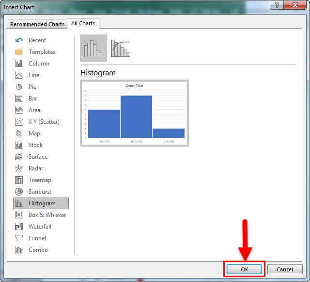
Steps to Create a Histogram in Excel
Following are the steps to create a histogram in Excel:
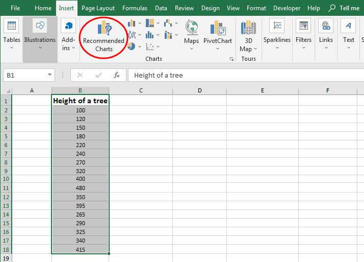
- The first step to building a histogram in Excel is to select the range of cells containing the data to be presented using the histogram. Then, it would be the input for the histogram.

- Click on “Recommended Charts,” as shown in the below figure.

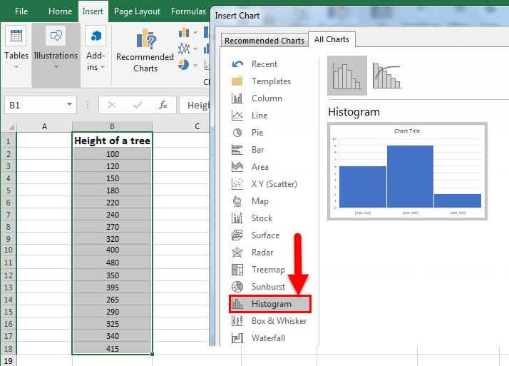
- Select “Histogram” from the presented list.
- Click “OK.”

Examples
A histogram chart in Excel is simple and easy to use. Let us understand working with some examples.
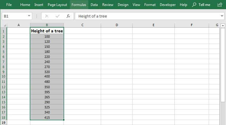
Example #1 – Height of Apple Trees
As shown in the above figure screenshot, the data is about the height of apple trees. The total number of trees is 17. The X-axis of the histogram in Excel shows the height range in cm. The Y-axis indicates trees. The chart shows three bars. One for the range 100-250 cm, the second for the range of 250-400, and the third for the range 400 – 550. So, the width of a bar is 150. So, the readings are in cm. The vertical axis (Y) shows the number of trees under a given range. E.g6 trees are in the range 100-250, 9 trees are in the range 250-400, and 2 trees are in the range 400-550. The legend is the height of the tree represented by green color. So, the bars indicate different heights in cm for the recorded trees.
Example #2 – Set of Negative and Positive Values
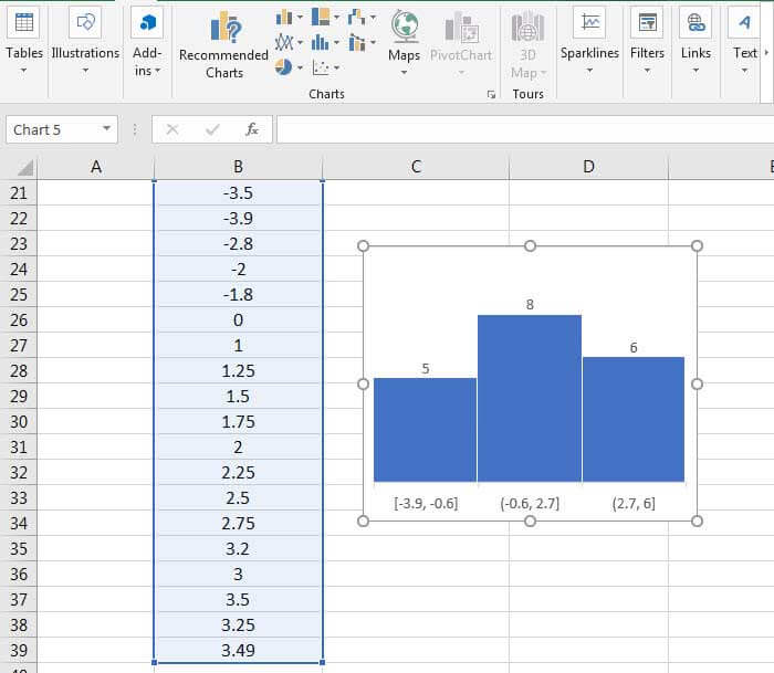
As shown in the above example, the dataset contains positive and negative values. Here also, Excel auto-calculated the range, which is 3.3. The total number of values in the dataset is 19. The 3 bars indicate three different ranges and the total number of input values falling under each range. 5 values are [-3.9, -0.6], 8 values range from -0.6 to 2.7, and 6 values range from 2.7 to 6.
Pros
- The histogram chart in Excel is useful where the entities to be measured can be presented in ranges such as height, weight, scales, frequencies, etc.
- They give a rough idea of the density of the underlying data distribution and often for density estimation.
- They are also used to estimate the underlying variable’s probability density function.
- Different intervals can expose various features of the input data in the histogram in Excel.
Cons
- A histogram chart in Excel can present data that is misleading.
- Too many blocks can make your analysis tough, while a few can miss out on important data.
- A histogram in Excel is not useful for showcasing discrete/categorized entities.
Things to Remember
- The histograms are based on the area and not the height of bars.
- It is a column-based chart that shows frequency data and is useful for depicting continuous data.
- While working on the histograms, one must ensure that the bins are not too small or too large. However, doing so might lead to incorrect observations.
- There is no “ideal” number of bins, and different bin sizes reveal various data features.
- The number of bins k can be assigned directly or can be calculated from a suggested bin width that has:
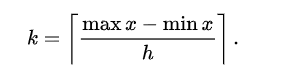
The braces indicate the Ceiling Function in Excel.
![]() which takes the square root of the number of data points in the sample.
which takes the square root of the number of data points in the sample.
Recommended Articles
This article is a guide to Histogram Chart in Excel. Here, we discuss its uses and how to create a histogram in Excel, along with Excel examples and downloadable Excel templates. You may also look at these useful functions in Excel: –