Part of our Excel Charts guide
Difference Between Graphs Vs Charts
Graphs vs Charts in Excel helps us understand the similarities and differences between the plotted Graphs and the generated Charts of the variables in a dataset. They display data values pictorially, allowing users to easily understand and analyze the data.
Graphs mostly represent numerical data by showing the relation between numeric variables and how one number affects or changes another. However, charts are the graphical representation of data that may or may not be related.
“All graphs are a type of chart, but not all charts are graphs”. The statement sums up the two very well and outlays which one is broader and a subset of the other.
For example, the graph and the charts are shown in the images below.

We can plot a graph or a chart for any given dataset.
- Graphs vs Charts helps us understand the difference between data representations using the inbuilt charts in Excel and plotting graphs on the generated charts to display the trend.
- They are frequently used to present raw and exact data, and deliver it to make it visually appealing and easy to understand for the intended users.
- It is possible to misunderstand Graphs and Charts due to minor differences between them. However, these powerful visual representation tools, display large data sets graphically and are understandable.
What Is A Graph?
Graphs mainly focus on raw data and depict the trend overtime-related to such data. A two-dimensional graph shows the relationship between the data through a line, curve, etc., using the horizontal line along the bottom (called X-axis) and the vertical line up the side (called Y-axis). One dictionary defines a Graph as, “A Graph is a mathematical diagram that shows the relationship between two or more sets of numbers or measurements”. A graph allows the user to easily represent the values in the data through a visual representation.
Graph Example
An example of a basic graph is shown below:
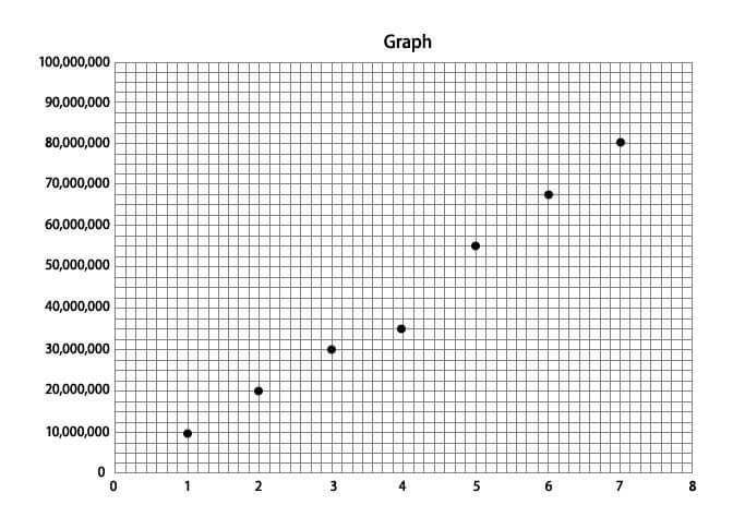
The above graph is a basic graph that allows the user to visualize that the data plotted on its Y-axis are on an increasing trend, shown in years on the X-axis. There are two types of graphs: bar graphs and line graphs.

What Is A Chart?
A chart is a type of representation of large sets of data, which makes the user understand the same better. Using the same helps predict existing data and forecast future data based on the present data pattern. A chart can be a diagram, a picture, or a graph. We can transform data variables into a visual, graphical, or pictorial, representation using charts.
Chart Example
An example of a simple chart is shown below:
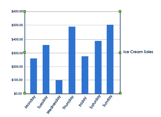
- The above chart is a simple Column Chart depicting the company’s sales of ice cream products on different days of the week. With just a glance of the same, the user can identify the week’s highest and lowest sales day.
- Charts can simplify data, categorize them into easy-to-understand and analyze formats, and find its excessive usage in a business where data is presented using different charts.
- A few types of charts are,
- Vertical bar charts
- Historical bar charts
- Stacked bar charts
- Histograms
- The Pie Chart in excel
- Line chart
- Area Charts in Excel
There are many more chart types. However, based on the user requirement, the type of charts can be applied and generated to display the data graphically.
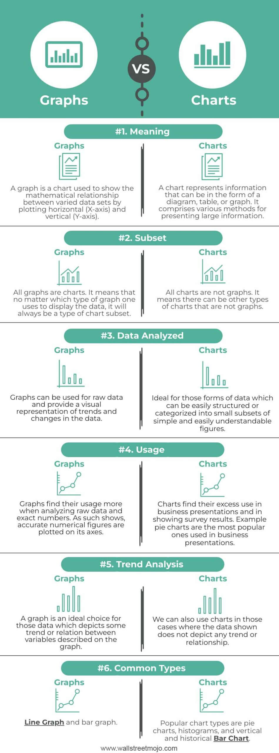
Graphs Vs Charts Infographics
Here, we provide the top 6 differences between Graphs and Charts.
Graphs Vs Charts – Key Differences
- Charts represent a large set of information in graphs, diagrams, or in the form of tables. At the same time, the graph shows the mathematical relationship between varied groups of data. It is a type of chart but not all of it. A graph is a type of subgroup of a chart. On the contrary, a chart can take a graph, diagram, or picture form.
- Charts projects any data in a visually engaging pattern. However, in the case of a graph, it is ideal to have data that depicts any relationship between the plotted variables on the axes for better understanding.
- Charts are handy to use in cases where the data to be presented well categorized (such as by region, age bucket, etc.) or averaged, which will further enable simple display. On the contrary, graphs are more intended for identifying trends or patterns in the data sets. A graphing calculator can be a useful tool for plotting complex equations and visualizing mathematical relationships in graph form. Similarly, just as well-categorized data improves clarity in charts, selecting the right decor elements can enhance the visual appeal of a space. For example, Living Room Wall Art Canvas Photos Prints can add structure and aesthetic value to home interiors.
Graphs Vs Charts Comparative Table
| Basis | Graphs | Charts |
|---|---|---|
| Meaning | A graph is a chart that shows the mathematical relationship between varied data sets by plotting horizontal (X-axis) and vertical (Y-axis). | A chart represents information as a diagram, table, or graph. It comprises various methods for presenting large information. |
| Subset | All graphs are charts. It means that no matter which type of graph one uses to display the data, it will always be a type of chart subset. | All charts are not graphs. It means there can be other types of charts that are not graphs. |
| Data Analyzed | Graphs can be used for raw data and visually represent trends and changes in the data. | Ideal for those forms of data which can be easily structured or categorized into small subsets of simple and easily understandable figures. |
| Usage | Graphs find their usage more when analyzing raw data and exact numbers. As such shows, accurate numerical figures are plotted on its axes. | Charts find their excess use in business presentations and in showing survey results. For example, pie charts are most popularly used in business presentations. |
| Trend Analysis | A graph is an ideal choice for those data which depict some trend or relation between variables described on the graph. | We can also use charts in those cases where the data shown does not depict any trend or relationship. |
| Common Types | Line Graph and bar graph. | Popular chart types are pie charts, histograms, and vertical and historical Bar Chart. |
Recommended Articles
This article is a guide to Graphs vs Charts. Here we discuss the differences between Charts & Graphs, infographics & comparison table, & downloadable template. You may also have a look at the following articles: –