What Is Line Graphs / Chart In Excel?
Line graphs/ chart in Excel are created to display trend graphs from time to time. In simple words, a line graph is used to show changes over time to time. By creating a line chart in Excel, we can represent the most typical data. Among the many types of charts in Excel, line chart is most commonly used.
For example, consider the below table showing the products, along with expected and actual sales in columns B and C. Now, let us learn how to insert line chart in Excel.
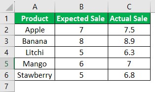
Step 1: First, select the data for which we want to create a line chart. So, in this example, let us choose the cell range A1:C6.
Step 2: Next, go to Insert – Insert Line or Area Chart under the Charts group and click on the required chart type. In this example, let us select 2-D Line chart.
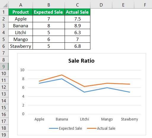
We can see the data is converted into a line chart.
Likewise, we can create line chart in Excel.
Key Takeaways
- Line graph or chart in Excel is one of the many chart types in Excel, used to represent data.
- There are two main types of line chart in Excel. They are, 2-D Line chart 3-D Line chart
- 2-D line chart is sub-categorized into line, stacked line, 100% stacked line, line with markers, stacked line with markers, 100% stacked line with markers.
- To insert line chart in Excel, simply select the data which we want to represent in line chart.
- And then, click on Insert – Insert Line or Area Chart under the Charts group in Excel.
Types Of Line Charts / Graphs In Excel
There are different categories of line charts that we can create in Excel.
- 2D Line Charts
- 3D Line Charts
Also, remember that there are sub-categories of both 2D and 3D Line graphs in Excel.
#1 – 2D Line Graph in Excel
The 2D line graph in Excel is basic. We can take this graph for a single data set. Below is the image for that.
Now, let us have a look at the sub-categories with examples.
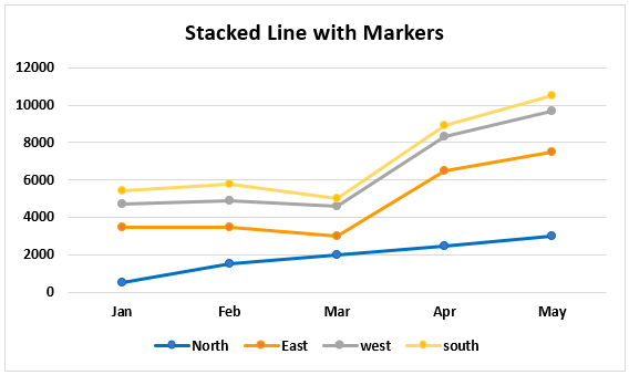
Stacked Line Graph in Excel
This stacked line chart in Excel shows how it will change the data over time.
We can show this in the below diagram.
The graph shows that all 4 data sets use 4 line charts. They are represented in one graph using two axes.
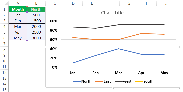
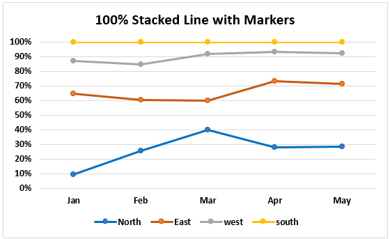
100% Stacked Line Graph in Excel
This graph is similar to the stacked line graph in Excel. The only difference is that this Y-axis shows % values rather than normal values. Also, this graph contains a top line. It is the 100% line. It will run across the top of the chart.
We can show this in the below figure.
Line With Markers In Excel
This type of line graph in Excel will contain pointers at each data point. So, we can use this to represent data for every important point.
The point marks represent the data points where they are present. We can know the values corresponding to that data point when we hover the mouse on the point.
Stacked Line with Markers
100% Stacked Line with Markers
Excel Line Chart Video Explanation

Excel Line Chart Explanation
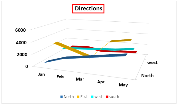
#2 – 3D Line Graph in Excel
This line graph in Excel is in 3D format.
The below line graph is the 3D line graph. All the lines are in 3D format.
All these graphs are types of line charts in Excel. The representation is different from chart to chart. As per the requirement, you can create the line chart in Excel.
How To Make A Line Graph In Excel?
Below are examples to create a Line chart in Excel.
Example #1
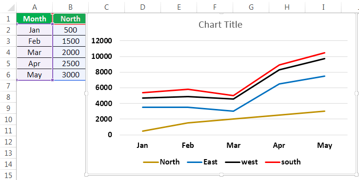
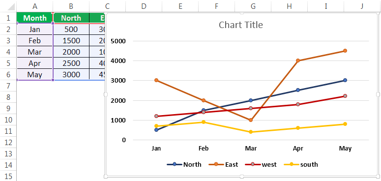
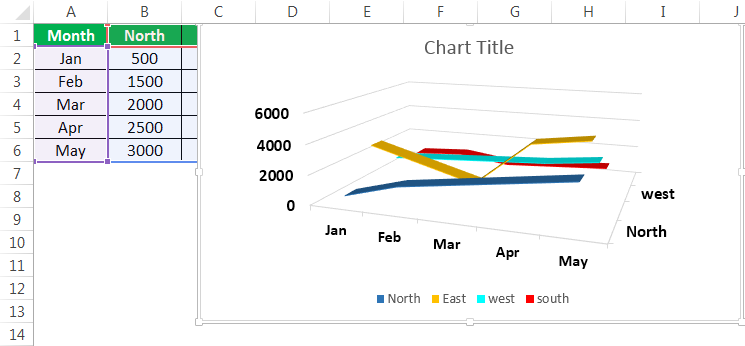
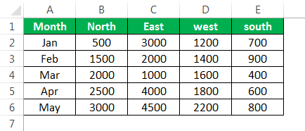
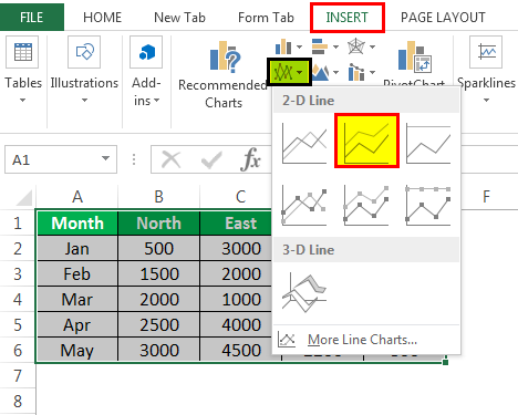
We can use the line graph in multiple data sets also. Here is an example of creating a line chart in Excel.
In the above graph, we have multiple datasets to represent that data. Also, we have used a line graph.
Select all the data and go to the “Insert” tab. Next, select the “Line” graph from “Charts.” It will display the required chart.
Then, the line chart in Excel created looks like as given below:
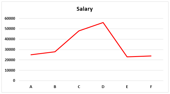
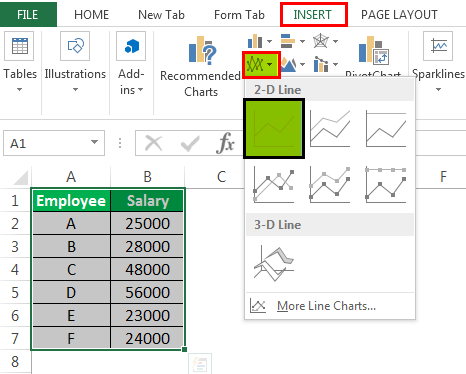
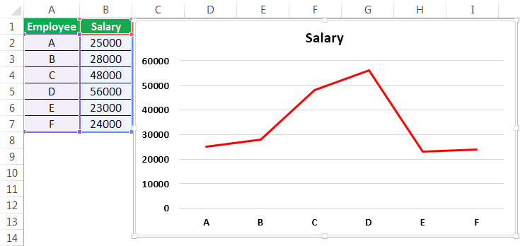
Example #2
There are two columns in the table: Employee and Salary. The employee names and salary are on X-axis and Y-axis. From these columns, that data is in Pictorial form using a line graph.
- Go to the “Insert” menu – “Charts” Tab – Select “Line” charts symbol. We can select the customized line chart as per the requirement.

- Then, the chart may look like as given below.

It is the basic process of using a line graph in our representation.
To represent a line graph in Excel, we need two necessary components. They are the horizontal axis and vertical axis.
The horizontal axis is X-axis, and the vertical axis is Y-axis.
There is one more component called “legend.” It is the line in which the graph is represented.
One more component is “plot area.” It is the area where it will plot the graph; thus, it is called the plot area.
We can represent the above explanation in the below diagram.
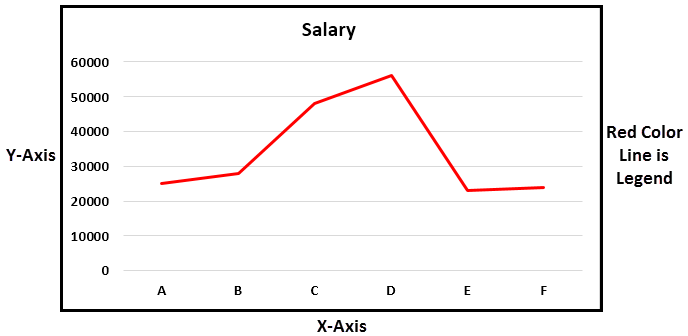
The X-axis and Y-axis are used to represent the scale of the graph. Next, the legend is the blue line in which the graph is represented. It is more useful when the graph contains more than one line to define. Next is the plot area. It is the area where we can plot the graph.
In the line graph, if there are multiple datasets to represent the data, and if the axes are different for all the columns, we can change the scale of the axes and represent the data.
From this line graph, we can easily represent timeline graphs. If the data contains years of data related to time, it can be presented better than other graphs. We can also represent a line graph with points for easy understanding.
Relevance And Uses Of Line Graph In Excel
We can use the line graph for:
- Single dataset.
The data having a single data set can be represented in Excel using a line graph over a period. It can be illustrated with an example.
- Multiple Datasets
We can also represent the line graph for multiple datasets.

The different data set is represented using another color legend. In the above example, revenue is represented by a blue line. We can represent customer purchase % by using an orange color line, Sales by grey line, and the last one profit% by using a yellow line.
We can customize the graph after inserting the line graph, such as formatting grid lines, changing the chart title to a user-defined name, and changing the axis’s scales. It can be done by right click on the chart.
Formatting the grid lines: Gridlines can be removed or changed as per our requirement by using an option called formatting grid lines.
Right-click on Chart – Format Gridlines.

We can select the types of gridlines as per the requirement or remove the grid lines completely.
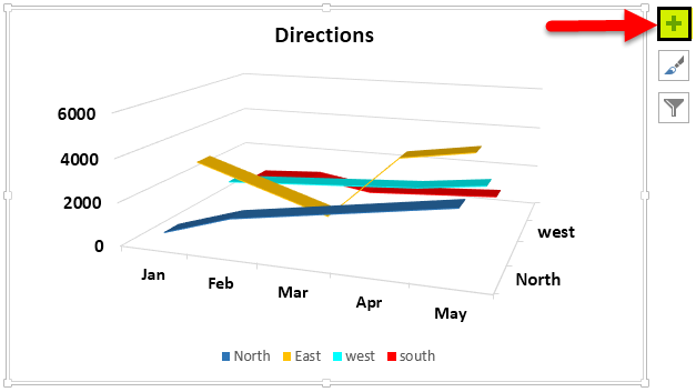
The three options on the top right side of the graph are the graph options to customize them.
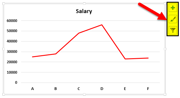
The “+” symbol will have the checkboxes of what options to select in the graph to exist.
The “paint” symbol is used to select the style of the chart to be used and the color of the line.
The “filter” symbol indicates what we should represent as part of the data on the graph.
Customize Line Chart In Excel
These are some default customizations made to a line chart in Excel.
#1 – Changing the Line Chart Title:
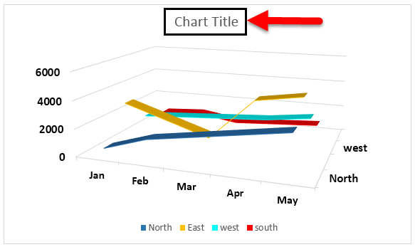
We can change the chart title as per the user requirement for better understanding or the same as the table’s name for a better experience. For example, we can show that as below.
We should place the cursor in the “Chart Title” area, and we can write a user-defined name in place of the chart title.
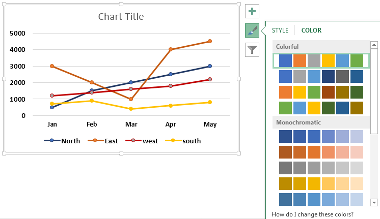
#2 – Changing the Color of Legend
We can also change the color of the legend, as shown in the below screenshot.
#3 – Changing the Scale of the Axis
We can change the scale of the axis if there is a requirement. For example, If there are more datasets with different scales, we can change the scale of the axis.
A given process can do this.
Right-click on any of the lines. Now, select “Format Data Series.” It will show a window on the right side and select the secondary axis. Now, click “OK,” as shown in the below figure.

#4 – Formatting the Gridlines
We can format Gridline in excel. In addition, we can change or remove it completely. We can do this as per the requirement. We can show this in the below figure.
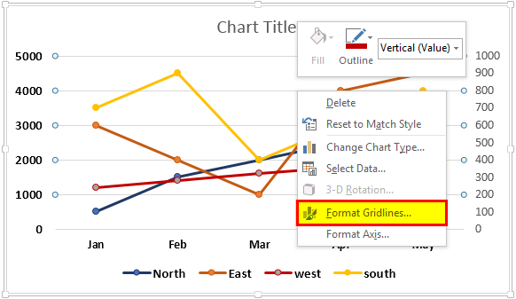
After right-clicking on the gridlines, select “Format Gridlines” from the options, and then it will open a dialog box. In that, we can choose the type of gridlines as per choice.

#5 – Changing the Chart Styles and Color
We can change the chart’s color and style by using the “+” button on the top right corner. For example, we can show this in the below figure.
Important Things To Note
- With data points, we can format a line graph with points in the graph. We can also format it as per the user’s requirement.
- Similarly, we can also change the color of the line as per the requirement.
- While creating a line chart in Excel, the very important point is that we cannot use these line graphs for categorical data.
Frequently Asked Questions (FAQs)
1. What is line chart in Excel?
In Excel, we can convert the data into charts and graphs. In simple terms, we can represent data in graphical format. There are so many types of charts in excel. The line chart in Excel is the most popular and used.
2. Explain the use of line chart in Excel with an example?
Consider the below table showing the marks obtained by John in semester 1 and semester 2, in various subjects. Now, let us learn how to insert line chart in Excel.

- Step 1: First, select the data for which we want to create a line chart. So, in this example, let us choose the cell range A1:C8.
- Step 2: Next, go to Insert – Insert Line or Area Chart under the Charts group and click on the required chart type. In this example, let us select 2-D Line chart.
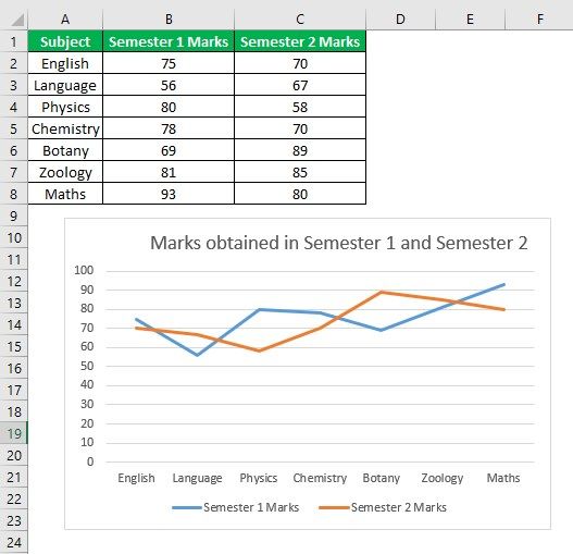
Likewise, we can use line chart in Excel.
3. What are the components of a line chart in Excel?
There are 4 main components that we have to be familiar with while using line chart in Excel.
They are:
• Horizontal Axis
• Vertical Axis
• Legend
• Plot Area
Recommended Articles
This article is a guide to Line Graphs and Charts in Excel. We discuss creating a line chart/graph in Excel, practical examples, and a downloadable Excel template. You may also learn more about Excel from the following articles: –