Stacked Chart in Excel (Column, Bar & 100% Stacked)
The stacked chart in Excel is of three types: stacked column charts, stacked bar charts, and 100% stacked column charts. In a 100% stacked bar chart, in stacked charts, data series are stacked over one another for particular axes. In a stacked column chart, the series are stacked vertically, while in the bar, the series are stacked horizontally.
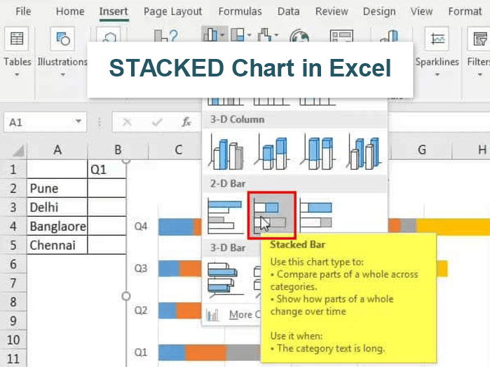
There are four stacked chart options:
- Stacked Bar
- Stacked Column
- 100% Stacked Bar
- 100% Column.
There is an option for 2-D and 3-D, which we should select per the presentation style’s needs and requirements.
Let us see each of them in detail with an example –
How to Create a Stack Chart in Excel? (with Examples)
Example #1 – Stacked Column Chart
Below are the steps for creating stacked chart in excel –
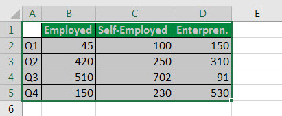
- Select all the data for which we have to create the Stacked Chart, like below:
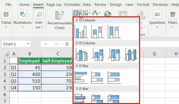
- Click on “Insert”and then click on “Insert Column or Bar Chart”like below:

- After clicking the above one, one box will appear to select:

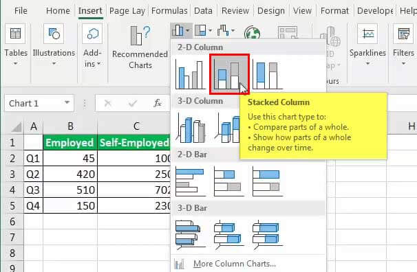
- Make sure to select “Stacked Column” only from “2-D” column or below box:

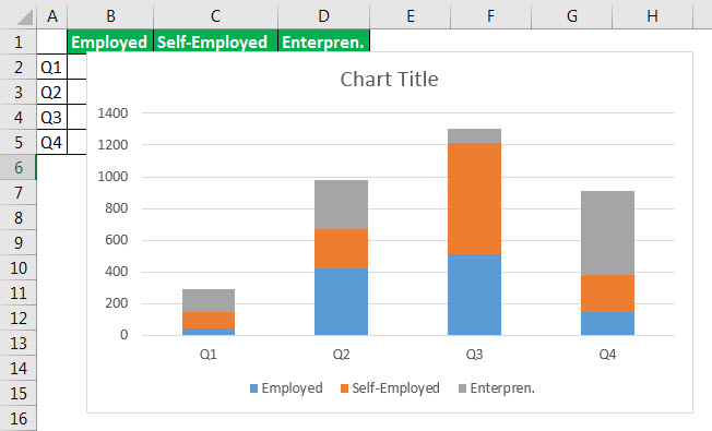
- After selecting, we have got below Stacked Area Chart in the result:
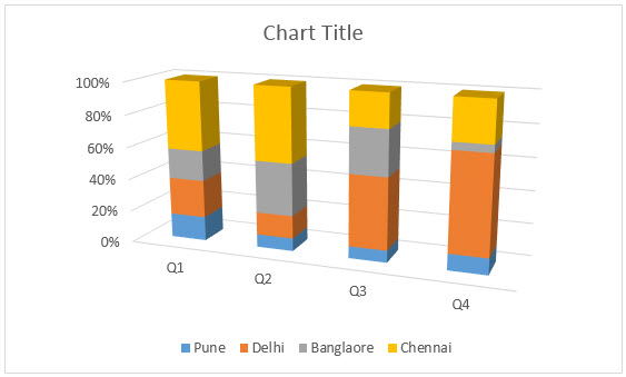
Likewise, if we have to create in 3- D format, then we have to select the below one from the “3-D Column”:After clicking the circled one, below would be the result, which is nothing but a 3-D column format:


Example #2 – Stacked Bar Chart
Above are the examples of 2-D and 3-D columns. Now, we will see the same in the stacked bar chart format.
Below are the steps which are different from the above one:
- So, instead of selecting the option from the “2-D Column” and “3-D Column”, we have to choose the 2-D and 3-D stacked bar chart like below:
Below is the result for the data:
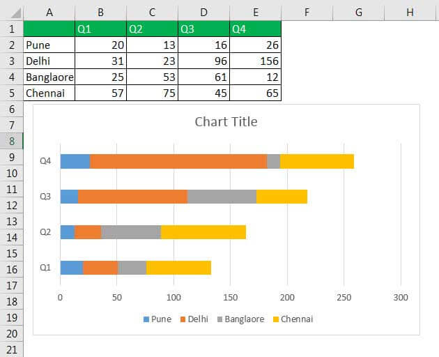
Here, we can see the difference. The no. is horizontal here, and the Q1, Q2… are vertically shown. So, it is the vice-versa of the 2-D column. If we select a 3-D stacked bar chart, it would be the same but in 3-D format. So, we can analyze from above and conclude the different results if we have to look out the maximum no. of Pune in which quarter. First, see the color of Pune, blue, given in the chart. Now, we have to see in which quarter the blue bar is the largest, so it is the Q4, and no. is 26 if we look at the data. Hence, it helps in making a decision quickly.
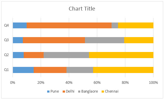
Example 3 – 100% Stacked Chart
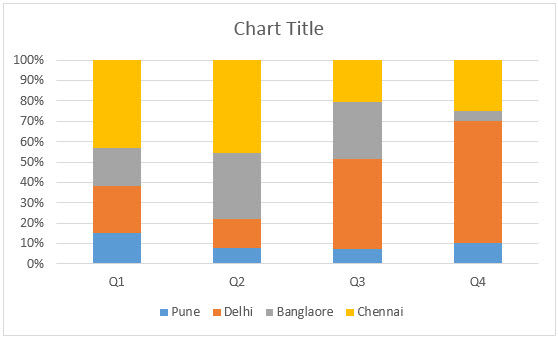
Another type of stacked chart is a 100% stacked chart. In which the bar would be 100% means in the above examples, the length of the bar or column is the only data total. But here, the bar or column would be 100%, and the colored part is as per data, like below:
So, we have to select the below one for the result:
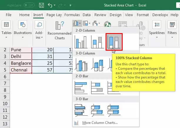
Like above, we can create a 3-D column,2-D bar, and 3-D bar by selecting the third from above.
- 3-D Column (100% Stacked Column):
- 2-D bar(100% Stacked Chart):
- 3-D Bar (100% Stacked Chart) :

Stacked Chart in Excel – Video Explanation

When to use a Stacked Chart?
- A Part-to-Whole: With the help of the stacked bar chart, we can clarify the difference from part to whole. We can see what the chart is pointing out.
- Comparisons: The stacked chart compares the given data like values, productions, or many others.
- Survey Results: The stacked chart identifies the differences and highlights them to showcase the survey results.
- Rankings: The stacked chart is also used to show the rankings over time. The column and graph show the data’s length and differentiate it by different colors.
When Not to use Stacked Chart?
In the following situations, we have to avoid using the stacked chart:
- Deeper Analysis: It should be avoided when one has to make a deep analysis from the chart because it is preferable for quick decision-making.
- Lots of Data: One must avoid using the stacked chart when there is a lot of data because it is very difficult to analyze after seeing many variants.
Things to Remember
- One can change the bar’s color or column by right-clicking and choosing the correct option per needs and requirements.
- We can also add the chart’s title to understand better or differentiate the data.
- The variants should be properly selected while creating a stacked chart so that we should do the result and analysis.
Recommended Articles
This article is a guide to Stacked Chart in Excel. Here, we discuss its uses and how to create a stacked chart in Excel (column, bar, and 100% stacked) along with Excel examples and downloadable Excel templates. You may also look at these useful functions in Excel: –