Part of our Excel Charts guide
Clustered Bar Charts – Explanation
A clustered bar chart is a chart where bars of different graphs are placed next to each other.
It is a primary type of Excel chart. It compares values across categories by using vertical or horizontal bars. A clustered bar chart in Excel displays more than one data series in clustered horizontal or vertical columns. A clustered bar chart typically shows the categories along the vertical (category) axis and values along the horizontal (value) axis.
Key Takeaways
- The data for each series is stored in a separate row or column.
- It consists of one or more data series.
- A clustered column Excel chart creates a separate bar for each value in a row.
- Column charts are useful for showing data changes over some time.
- Charts depict data visually, so you can quickly spot an overall trend.
- Useful for summarizing a series of numbers and their interrelationships.
- A chart is linked to the data in your worksheet. The chart will automatically update if we change or update the data.
- We can customize every aspect of chart elements (axis titles, data label, data table, error bars in Excel, gridlines in Excel, legend, trendlines) and chart’s appearance (including style and colors).
- Clustered bar chart data looks better when limited data points (i.e., 12 months, 4 quarters, etc.)
How To Create A Clustered Bar Chart In Excel?
Clustered bar charts in Excel is one of the easiest available bar chart types. Let us learn how to use clustered bar chart with detailed examples.
Examples
Example #1
Below are the steps to create clustered bar chart in Excel:
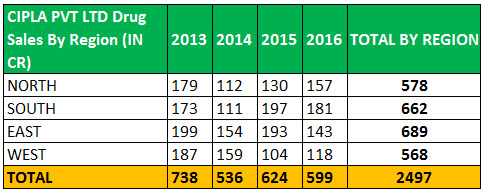
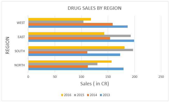
- First, we must create data in the below format. The below data shows yearly drug sales performance over 4 years in a specific region. So now, let us present this in a bar chart with clustered columns.
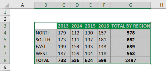
- Then, we must select the data.
The selection should include row and column headings (complete data range). It is important to have the row headings to use those values as axis labels on our finished chart.

- We must now select the “Insert” tab in the toolbar at the top of the screen. Then, click on the “Column Chart” button in the “Charts” group and select a chart from the drop-down menu. Select the third column chart (called clustered bar) in the “2-D Bar” column section.

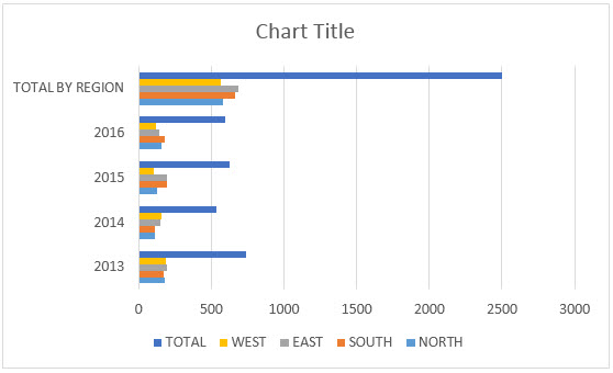
- Once we select a chart type, Excel will automatically create the chart and insert it into our worksheet. The bar chart will appear in our spreadsheet with horizontal bars representing sales data across the different regions.

- It has unnecessary data that does not belong in the graph, i.e., totals by year and region. So, we can remove this data to analyze the sales trend across the different regions correctly. We will select the graph or click on the center of the graph or plot area to choose the data.

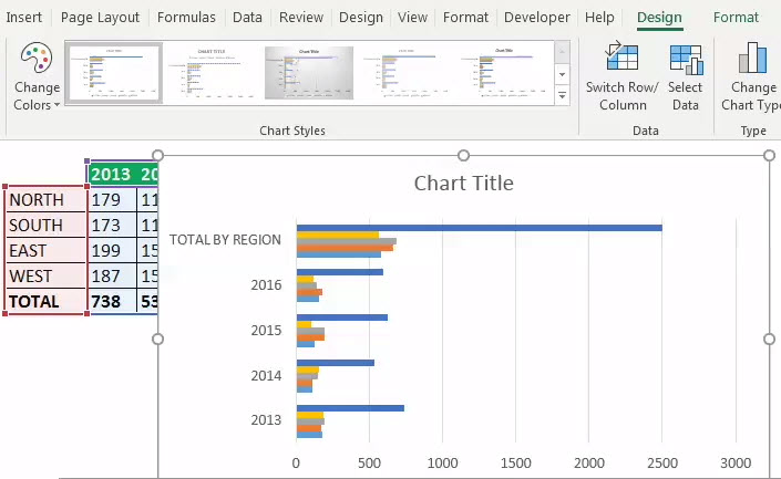
- Under the “Design” toolbar, click on select data. As a result, a pop-up will appear containing column row headings. Now, select “Total By Year” on the left-hand side and click on remove; the same will disappear in the graph.
We must click on “Switch Row/Column” now. The “Total By Region” will appear on the left-hand side. Click on it and select remove. The same will disappear in the graph. Again, click on the “Switch Row/Column” to return to the original configuration.

- We can interchange row columns by clicking on Switch row/column.
We must click on the chart titleand update it to “Drug Sales by Region.”The “Region” labels are along the Y-axis. The “Sales” data are along the X-axis.

- Visual Appearance of the Chart
We can update the visual appearance of the chart by selecting the below-mentioned chart elements (axis titles, data label, data table, error bars, gridlines, legend, trendlines).


Example #2
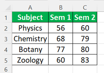
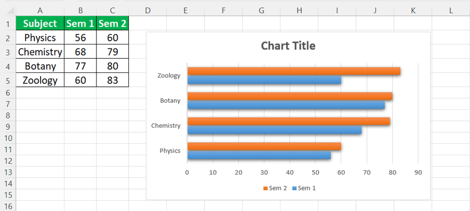
The below table shows marks obtained by various students in 3 subjects. Let us create a clustered bar chart for the below table.

- First, select the data.
- Next, select Insert tab – Column Chart – 2-D Bar column section.
- Excel will automatically create the chart as shown in the below image.

Likewise, we can create clustered charts in Excel.
Example #3
The below table shows marketing campaign’s study conducted in various places. Let us create a clustered bar chart for the below table.

- First, select the data.
- Next, select Insert tab – Column Chart – 2-D Bar column section.
- Excel will automatically create the chart as shown in the below image.

Likewise, we can create clustered charts in Excel.
PROS
- It is simple and versatile.
- The category labels are easier to read.
- Easy to add data labels at the ends of bars.
- Like a column chart, it can include any data series, and the bars can be “stacked” from left to right.
- Useful in showing data changes over some time.
CONS
- Sometimes it becomes cluttered with too many categories or becomes visually complex as categories or series are added.
- The clustered column charts can be difficult to interpret.
Important Things To Note
- Before plotting information on a chart, we should ensure our data is laid out correctly. Here are some tips:
- Structure your data in a simple grid of rows and columns.
- Never include blank cells between rows or columns.
- It can include titles if we like them to appear in the chart. We can use category titles for each column of data (placed in the first row, atop each column) and an overall chart title (positioned just above the category-title row).
Frequently Asked Questions (FAQs)
How to reorder clustered bar chart in Excel?
Click ‘Select Data’ in the ‘Data’ group under ‘Chart Tools’ on the ‘Design’ tab. Click the data series that you want to change the order of in the ‘Legend Entries’ (Series) box in the ‘Select Data Source’ dialog box. To move the data series to the desired location, use the Move Up or Move Down arrows.
What is clustered column bar chart also known as?
A clustered column chart is also known as a bar graph. It displays data in solid shapes such as pillars.
For example, consider the below table showing marks obtained by Andy in various subjects in two different semesters.
Now, if we apply clustered bar charts in Excel, then, the result will appear as shown in the below image.
Now, let us learn how to create clustered charts in Excel.
What is simple vs clustered bar chart?
The simple bar chart represents a single piece of data per bar or category (total sales), whereas the clustered bar chart represents a series of data clustered together (one for each product sold).
Recommended Articles
This article is a guide to Clustered Bar Chart in Excel. We discussed creating the clustered bar chart in Excel, examples, and downloadable templates. You may also look at these useful functions in Excel: –