What Is Gauge Chart In Excel?
A Gauge Chart in Excel helps users measure the dataset values and to show the comparison between them. It is also known as a Speedometer Chart because it resembles a speedometer, which uses dials to visualize the information on the data.
We can create an Excel Gauge Chart using the combo chart option in Excel, mostly two different types of charts: a doughnut and pie charts.
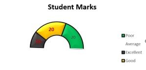
For example, we can find the scores of an entire classroom using their exam results. When we use the Guage chart to measure their performance and place them in the “Poor Average, Good, and Excellent” categories, we get the following chart.

The output is shown above, which indicates 20% of the students fall under the “Excellent” score category, the next 20% in the “Good” category, and 10% of them in the “Poor Average” category..
Key Takeaways
- The Guage Chart in Excel help us measure various objects with different size, shape, thickness, etc., and to measure how the parameters vary with each other.
- This chart has a variety of applications from educational to corporal domains.
- We can project the performance of a corporate project, we can display the performance of the students w.r.t the scored marks, we can display the weather temperature variations, etc.
- It is also often called a Dial Chart; the final representation will be a semi-circle doughnut chart. We can apply colors using the format option in the chart to represent different dimensions
Attributes Of Gauge Chart In Excel (Speedometer Chart)
- Maximum value: It shows the value of the maximum range of the gauge chart, e.g., the maximum value is 180 in a motorbike.
- Minimum Value: It shows the value of the minimum range of the gauge chart, e.g., the minimum value is 0 in a motorbike.
- Speed: We use the speedometer/Gauge chart to check the exact information to check the vehicle’s speed because it is not stable.
- A gauge chart is used in business to check how much revenue has been achieved versus the goal.
How To Create A Gauge Chart In Excel?
Excel does not provide an inbuilt Gauge Chart or a Speedometer Chart. However, we can create the chart using the Combo Chart Option in Excel, or a Doughnut Chart.
Examples
We will consider some examples to create Gauge Chart in Excel.
Example #1 – Create a Gauge Chart in Excel with Single Value
The steps to create a Guage Chart are as follows:
We must first choose the data with a single value, as shown below:

Then, select the information data, and incorporate the headers from the information.

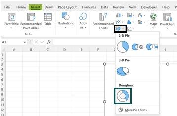
Tap on the “Insert” tab. Then, in the “Charts,” tap the insert “Pie” or “Doughnut” diagram, and select the chart which suits the information:

Consequently, the chart may look like the one below.

Right-click on the speedometer chart and select the “Format Data Series” option.

Select “Series Options” and set the “Angle of first slice” to “90 degrees” to make data in a semi-circular form.

Then, the chart looks like this.
Now, right-click on the bottom slice of the pie. Next, click on “Format Data Point.”

Select “No fill.” As a result, it will make the bottom slice invisible.

Here is a Gauge chart, which looks like a speedometer in Excel. Add a chart title to it.
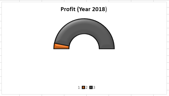
The right-hand side slice of grey color shows the profit we had selected while preparing the Gauge chart.
Example #2 – Create a Gauge Chart in Excel with Multiple Values
- We are taking the data on the quality of the product like “Average,” “Good,” “Excellent,” etc. Below is the information:

The steps to create a Guage Chart are as follows:
- Step 1: We must first select the data and select the excel doughnut chart, as shown above, while creating the Gauge chart with a single value. Once it is completed, we will get the Gauge chart (speedometer).

- Step 2: Select a “Format Data Series” option.

- Step 3: Set an “Angle of first slice” (which one is large) to 90 degrees.

- Step 4: It rotates the chart on the right side.

- Step 5: Right-click on a large slice of pie. Click on “Format Data Point.”

- Step 6: Click “Fill” and select “No fill.” As a result, it will make the slice invisible.

- Step 7: Finally, we have prepared the Gauge chart quality-wise, as shown below.

Pros And Cons Of The Excel Gauge Chart
Pros
- It is easy to use and understand for everyone.
- A Gauge chart can be prepared from a single value or multiple values.
Cons
- It is not the best method to present a single measure.
- The Gauge chart cannot portray the context of the sample.
- People who are color blind would not be able to get the information through a Gauge chart.
- It requires a lot of space to display different information on a single chart.
Important Things To Note
- We must always take the values which have no dimensions.
- If we want to communicate the data through a Gauge, it is mandatory to understand the audition and whether they know the data.
- We must always make the chart more attractive to show clear information using different colors.
- We must always select the appropriate data to get the chart in a better way.
- Remember to make the slice of pie, which is larger, invisible.
- If the data is small, we can better understand the data and make a better Gauge chart.
Frequently Asked Questions (FAQs)
How to insert a Doughnut Chart to create a Guage chart in Excel?
We can insert a Doughnut Chart as follows:
First, choose the cell range or the dataset – select the “Insert” tab – go to the “Charts” group – click the “Insert Pie or Doughnut Chart” option drop-down – select the “Doughnut” chart type from the “Doughnut” category, as shown below.
What are the uses of the Guage Chart in Excel?
A few uses of the Guage Chart in Excel are,
- It helps to find out the difference between the variables or parameters with each other, to see whether, varies w.r.t the other dimension in comparison.
- Since it is dynamic, as and when the dataset or the dimensions are modified, the chart automatically updates, displaying the current data.
Why is the Guage Chart in Excel not working?
A few reasons the Guage Chart in Excel may not work are as follows:
- Once the data is modified in the dataset, due to network issues, the chart might not get updated. In such scenarios, we must refresh the chart to reflect the current data modifications.
- The dataset linking the Guage Chart is deleted. So, there is no data available to display.
- In some scenarios, the cell values are saved as text. So, the chart is not plotted precisely. Therefore, ensure to format the dataset values to numbers.
Recommended Articles
This article is a guide to Gauge Chart in Excel. Here we create chart using Doughnut or combo charts, measure dimensions, examples, downloadable excel template. You may also learn more about Excel from the following articles: –