Table Of Contents
What is Box Plot in Excel?
A Box Plot in Excel is a graphical representation of the numerical values of a dataset. It shows a five-number summary of the data, which consists of the minimum, maximum, first quartile, second quartile (median), and third quartile. From these, the median is a measure of the center while the remaining are measures of dispersion. So, a box plot shows the center (or middle) and the extent of spread (dispersion or variability) from the center of a dataset.
For example, the sales managers of a bank have to sell current accounts to start-ups across the country. In an Excel worksheet, the number of current accounts (column B) opened by the five managers (column A) is given. Ignore the double quotation marks of the following entries:
Column A
- Cell A1 contains “manager A.”
- Cell A2 contains “manager B.”
- Cell A3 contains “manager C.”
- Cell A4 contains “manager D.”
- Cell A5 contains “manager E.”
Column B
- Cell B1 contains 20.
- Cell B2 contains 5.
- Cell B3 contains 10.
- Cell B4 contains 35.
- Cell B5 contains 15.
Further, in column D, we apply some formulas to this data. The formulas and the output are stated as follows:
- In cell D1, “=MIN(B1:B5)” returns 5.
- In cell D2, “=QUARTILE(B1:B5,1)” returns 10.
- In cell D3, “=MEDIAN(B1:B5)” returns 15.
- In cell D4, “=QUARTILE(B1:B5,3)” returns 20.
- In cell D5, “=MAX(B1:B5)” returns 35.
Thereafter, we calculate the cell differences, D2-D1, D3-D2, D4-D3, and D5-D4. Next, we plot the outputs obtained and the minimum value (of cell D1) on a stacked column chart. This is followed by the creation of a box plot in Excel. This box plot provides an overview of the performance of the five sales managers. Consequently, one can make decisions based on this performance.
An excel box plot is also known as a box and whisker plot. It is an efficient tool that helps determine the way numbers are distributed in a dataset. Box plots indicate the shape, the central value, and the variability of a distribution. The variability suggests how spread out the data points are from the center of the distribution.
The purpose of creating multiple box plots is to compare the different samples and analyze the results obtained.
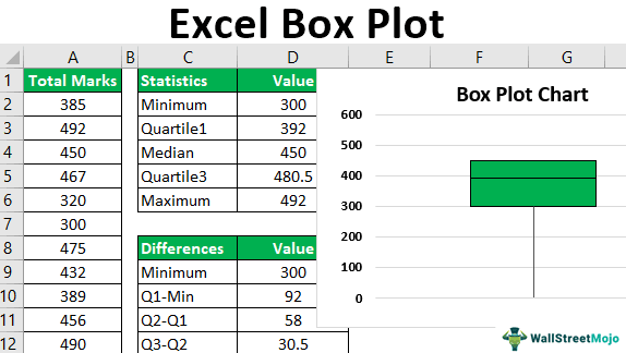
Box plots can be drawn horizontally or vertically. This article focuses on creating and interpreting vertical box plots of Excel. Further, a vertical box plot with a lower whisker (explained under the next heading) is shown on the right side of the following image.
Box Plot's Five-Number Explained
A box plot in excel (horizontal and vertical) shows the five values (minimum, first quartile, median, third quartile, and maximum) as a pictorial representation. The box of the vertical box plot begins from the third quartile (at the top) and extends to the first quartile (at the bottom).
Likewise, the box of the horizontal box plot begins from the first quartile (at the left) and extends to the third quartile (at the right). So, the length of the box (horizontal and vertical) is the third quartile minus the first quartile, which is known as the interquartile range (IQR) of the dataset.
Further, the horizontal or vertical line within the vertical or horizontal box, respectively, is the second quartile.
In a vertical box plot, vertical lines are drawn from the upper and lower boundaries of the box. In a horizontal box plot, horizontal lines are drawn from the left and right boundaries of the box. Such extended lines (horizontal and vertical) are known as whiskers. The two whiskers of a box plot may be of the same or varying lengths.
The values depicted by a vertical box plot in Excel are explained as follows:
- Minimum: This is the smallest or the least value of the dataset. It is shown by the bottom-most point of the lower whisker.
- First quartile: This is represented by the boundary at the bottom of the box. It is also known as the lower quartile or the 25th percentile. The first quartile is the middle of the minimum value and the median of the dataset.
- Second quartile: The second quartile is also called the median or the 50th percentile. It is the middle value of a dataset, which is calculated after arranging the data points in an ascending or descending order. The median divides the entire dataset into two equal parts. In other words, half (50%) of the data points lie below the median and the other half (50%) lie above the median. In a vertical box plot, the median is the horizontal line drawn within the box. In a horizontal box plot, the median is shown by a vertical line within the box.
- Third quartile: This is represented by the boundary at the top of the box. It is also known as the upper quartile or the 75th percentile. The third quartile is the middle of the median and the maximum value of the dataset.
- Maximum: This is the largest or the maximum value of the dataset. It is shown by the topmost point of the upper whisker.
How to Create a Box Plot in Excel? (With an Example)
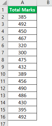
The following image shows the total marks obtained in five subjects by 15 students of a school. For each subject, the maximum marks are 100.
We want to create a box plot in excel for the given dataset.
The steps to create a box plot in Excel are listed as follows:
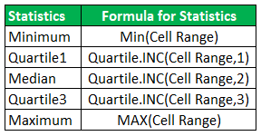
Step 1: Calculate the minimum, first quartile, median, third quartile, and the maximum for the given dataset. The formulas for all these measures are given in the following image.
In the following pointers (step 1a to step 1b), the calculations of the minimum value and the first quartile are discussed.
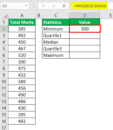
Step 1a: To calculate the minimum value, use the following formula:
“=MIN($A$2:$A$16)”
Press the “Enter” key. The output is shown in cell D2 of the following image.
Note: Alternatively, the formula “=QUARTILE.INC($A$2:$A$16,0)” could have been used to calculate the minimum value in Excel 2013. For more details about the QUARTILE.INC function, refer to the note of the next step (step 1b).
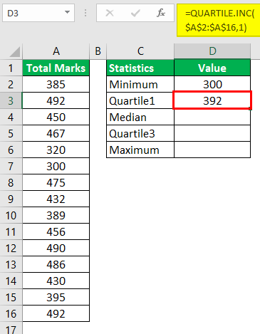
Step 1b: To calculate the first quartile, use the following formula:
“=QUARTILE.INC($A$2:$A$16,1)”
Press the “Enter” key. The output is shown in cell D3 of the succeeding image.
Note: The QUARTILE.INC function was introduced in Excel 2010. It replaced the QUARTILE function of the earlier versions of Excel. The QUARTILE.INC function accepts the following mandatory arguments:
- Array: This is the range on which quartiles are to be calculated.
- Quart: This tells the function the kind of quartile to be calculated. For “quart” equal to 0, 1, 2, 3 or 4, the minimum, first quartile, median, third quartile, or maximum, respectively, is calculated.
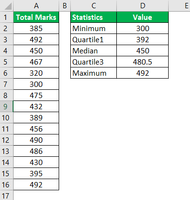
Step 2: The five outputs are shown in the following image.
Step 3: Based on the five measures calculated, compute the following differences:
- Q1 (first quartile)-Min (minimum)
- Q2 (second quartile or median)-Q1
- Q3 (third quartile)-Q2
- Max (maximum)-Q3
The outputs are shown in the range D10:D13 of the following image. The output in cell D9 is the minimum, which has been simply copied from cell D2.
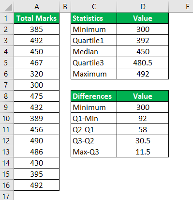
Step 4: Create a stacked column chart for the outputs obtained in the preceding step (step 3). For this, select the range D8:D13.
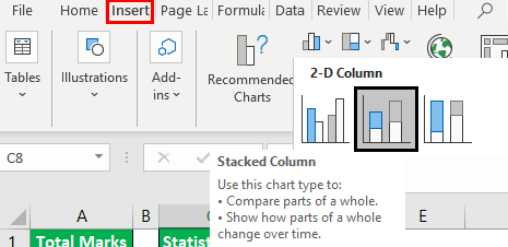
From the Insert tab, click “insert column chart.” Next, select the “stacked column chart,” as shown in the following image.
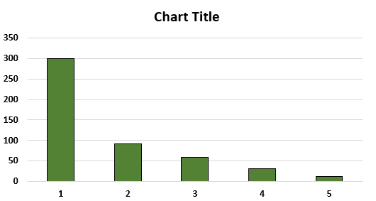
Step 5: A stacked column chart appears, as shown in the following image. This chart is different from a box plot.
By default, Excel has plotted the numbers of the range D9:D13 horizontally. Moreover, though the bars are vertical, they are not stacked over each other. For creating a box plot, it is essential for the bars to be one on top of the other.
In the following pointers (step 5a to step 5b), the stacking of bars (one on top of the other) has been discussed.
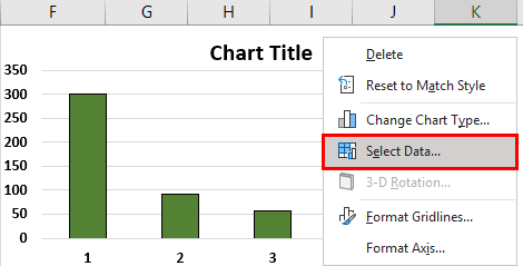
Step 5a: To stack the bars over each other, we need to reverse the axes of the chart. For this, right-click the chart and choose “select data.” The same is shown in the following image.
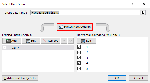
Step 5b: The “select data source” window opens, as shown in the following image. At present, the “legend entries (series)” is showing “value” and the “horizontal (category) axis labels” is showing the numbers 1 to 5. Click the button “switch row/column.”
Once the “switch row/column” button is clicked, the entries under “legend entries (series)” will interchange with the entries under “horizontal (category) axis labels.”
Next, click “Ok” to accept the changes.
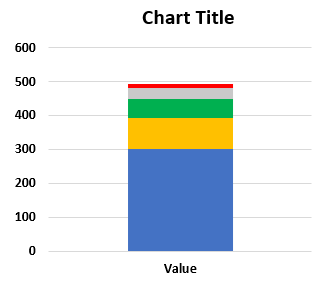
Step 6: The stacked column chart appears the way it is shown in the following image. The bars are now stacked one on top of the other.
Note: The legend of the chart (shown on the right side, by default) has been deleted. For deleting the legend, select it and press the “delete” key from the keyboard.
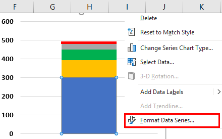
Step 7: Convert the stacked column chart to a box plot. For this, select the bottom-most segment (blue bar) of the chart. Right-click this selection and choose “format data series.”
The same is shown in the following image.
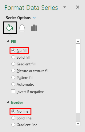
Step 8: The “format data series” panel opens. Expand the “fill” option and select “no fill.” Likewise, expand the “border” option and select “no line.” This is shown in the following image.
Close the “format data series” panel.
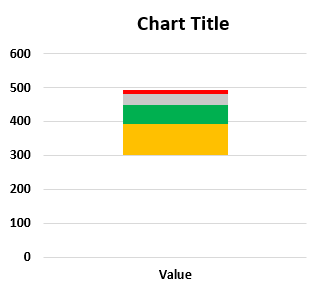
Step 9: The box plot chart appears, as shown in the following image. The bottom-most segment (shown in the image of step 7), which was blue in color, has been hidden.
Moreover, the text “value” that is currently shown on the x-axis, has been deleted for all the future images. For deleting, select the box containing “value” and press the “delete” key from the keyboard.
Step 10: Create whiskers for the box plot. The whiskers are simply the error bars of Excel. So, adding an error bar adds whiskers to the box plot chart.
For creating whiskers, replace the current topmost (red) and the bottom-most (orange) segments with the top and the bottom whiskers respectively. These segments have been shown in the image of the preceding step (step 9).
Note: An error bar shows the variability of a data point. In other words, an error bar indicates the variation between the reported and the actual values of a dataset.
In the following pointers (step 10a to step 10e), the creation of the top whisker has been discussed.
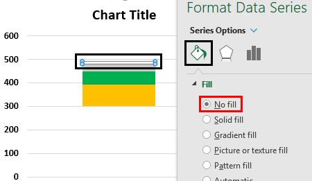
Step 10a: For creating the top whisker, it is important to hide the topmost segment. To hide, select the topmost segment shown in red in the following image. Right-click the selection and choose “format data series.” The “format data series” panel opens.
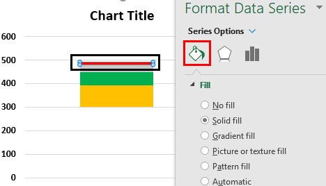
Step 10b: Expand the “fill” option and select “no fill.” This will hide the selected segment.
Note: One can hide a segment (or bar) either before creating the error bar or after it has been created. In the former case (segment is hidden before creating the error bar), keep the hidden segment selected to add an error bar or whisker.
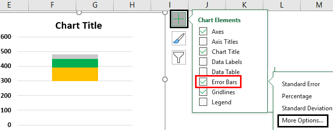
Step 10c: Keep the topmost segment selected and click the plus (+) icon displayed at the upper-right side of the box plot chart. Select “error bars” and click “more options,” as shown in the following image.
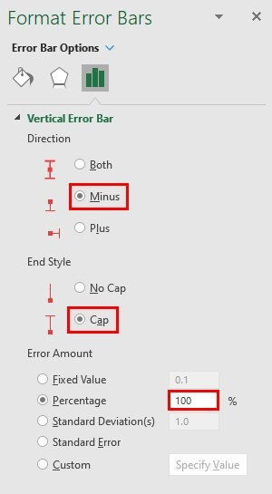
Step 10d: The “format error bars” panel opens, as shown in the following image. Next, perform the following tasks:
- Under “direction,” select the option “minus.”
- Under “end style,” choose the option “cap.”
- Under “error amount,” set the percentage at “100.”
Close the “format error bars” panel.
Step 10e: The top whisker appears, as shown in the following image. The bottom of the top whisker touches the grey segment with a small horizontal line (cap). This cap is displayed because it was selected as the “end style” in the preceding step (step 10d).
Note: The color of the bottom-most segment in the subsequent images may appear to be slightly different from that of the preceding images. It may be due to the different versions of Excel being used while creating the images.

In the following pointers (step 10f to step 10h), the creation of the lower whisker has been discussed.
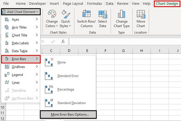
Step 10f: For creating the lower whisker, perform the following tasks:
- Select the current bottom-most segment, which is shown in orange.
- Click the drop-down of “add chart element” from the Chart Design tab.
- From the option “error bars,” select “more error bars options.”
The “more error bars options” is shown in the following image.
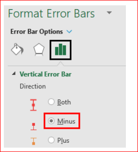
Step 10g: The “format error bars” panel opens. Further, make the following selections in the “vertical error bar” tab of this panel:
- Select the option “minus” under “direction.”
- Select “cap” under “end style.”
- Set the percentage under “error amount” to 100.
Close the “format error bars” panel. The selection of the “minus” option in the “format error bars” panel is shown in the following image.
Step 10h: The lower whisker appears, as shown in the following image. The bottom of the lower whisker touches the base of the orange segment with a small horizontal line (cap).
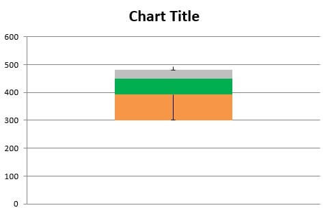
Step 11: Hide the bottom-most segment (refer to steps 10a and 10b) shown in orange in the preceding image. Next, color the entire box of the box plot in the same color. This is because box plots usually have the same color throughout the box.
For coloring the box, perform the following tasks:
- Select the two individual segments one by one.
- Right-click the selection and choose “format data series.” The “format data series” panel opens.
- From the “fill” option, select “solid fill.” Select the desired color.
- Close the “format data series” panel.
One can also add borders by selecting “solid line” from the “border” option (of the “format data series” panel).
The single-colored excel box plot with the upper and lower whiskers is shown in the following image. It must be observed that the cap of the upper whisker has been hidden by the topmost, horizontal border of the box plot.
Note: The preceding steps (step 1 to step 11) can also be applied to multiple data series. Multiple series are represented by multiple box plots which are parallel to each other.
While creating vertical box plots for multiple series, one must ensure that the entire dataset (consisting of all series) is selected prior to creating the stacked column chart. Moreover, the upper and lower whiskers have to be created for each series one by one.
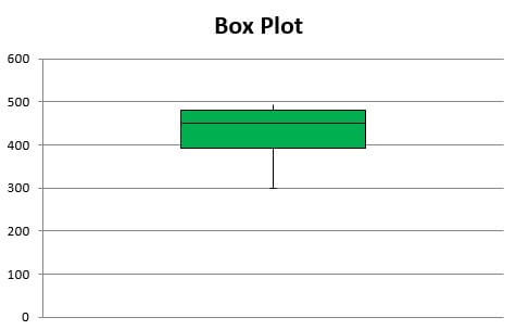
Interpretation of the box plot: The excel box plot shown in the preceding image is interpreted as follows:
- The topmost point of the upper whisker is somewhere below 500. This point corresponds with the maximum value of the dataset, which is 492. So, the topmost point of the whisker shows the value 492.
- The bottom-most point (shown by the center of the cap) of the lower whisker depicts the minimum value, which is 300.
- The topmost horizontal line of the box plot represents the third quartile of the dataset. The value of the third quartile is 480.5.
- The horizontal line shown within the box depicts the median (second quartile) of the dataset. This value is 450. It can be observed that the median is not in the center of the green box. This implies that the distribution is skewed.
- The bottom-most horizontal line of the box plot represents the first quartile of the dataset. So, this line shows the value 392.
Hence, since the five-number summary is correctly displayed by the box plot (in the preceding image), one can say that the box plot created is accurate.
Further, it can be said that 25% of the students have scored below 392 (first quartile), while 75% have scored below 480.5 (third quartile). Moreover, 50% of the students have scored between 392 and 480.5.
Since the median lies closer to the third quartile, one can say that the distribution is negatively skewed. In addition, one can notice that the upper whisker is shorter than the lower whisker. Besides, the mean (430.6) is less than the median (450).
How to Interpret Box Plot in Excel?
From a box plot in excel, one can interpret whether a distribution is symmetric or skewed. This is inferred as follows:
- If the distribution is symmetric, the median lies exactly in the center of the box. In such a case, the distance between the first and second quartiles and the second and third quartiles is the same. Further, for a symmetric distribution, the upper and the lower (or left and right) whiskers are of the same length.
- If the distribution is skewed, the median is not in the center of the box. Rather, the median is on one side (up or down) of the vertical box or one side (left or right) of the horizontal box. The distribution can be either positively or negatively skewed.
- If the distribution is positively skewed (or skewed right), the median lies closer to the first quartile. Moreover, in such a case, the lower whisker is shorter than the upper whisker. For a positively skewed distribution, the mean (average) is greater than the median.
- If the distribution is negatively skewed (or skewed left), the median lies closer to the third quartile. Moreover, in such a case, the upper whisker is shorter than the lower whisker. For a negatively skewed distribution, the mean (average) is less than the median.
Note 1: Quartiles divide a dataset, arranged in an ascending order, into four groups. These groups are separated from each other by certain points, which are known as the first quartile (Q1), the second quartile (Q2), and the third quartile (Q3). Given that the dataset is arranged in an ascending order, the groups are explained as follows:
- The first group begins from the minimum value and extends till the first quartile. 25% of the data points are less than the first quartile.
- The second group begins from the first quartile and extends till the median. 25% of the data points lie between the first and the second quartile (median).
- The third group begins from the median and extends till the third quartile. 25% of the data points lie between the second and the third quartile.
- The fourth group begins from the third quartile and extends till the maximum value of the dataset. 25% of the data points are greater than the third quartile.
In other words, 25% of data points are present under the first quartile, while 75% of data points are present under the third quartile.
Note 2: Any point outside the whiskers is known as an outlier. Outliers are extreme values (very high or very low) that lie far from the other values of a dataset. The outliers are shown by small dots placed beyond the whiskers.

