Tornado Chart in Excel
Excel Tornado chart helps in analyzing the data and decision-making process. It is very helpful for sensitivity analysis, which shows the behavior of the dependent variables, i.e., how one variable is impacted by the other. In other words, it shows how the input will affect the output.
This chart is useful in showing the comparison of data between two variables.
It is a bar chart having the bars represented horizontally. This chart has the bars of two variables facing opposite directions with the base for both in the middle of the chart, making it look like a Tornado. So, it is named the Tornado chart. It is also called a Butterfly chart or Funnel Chart in Excel.
Examples of Tornado chart in excel
Now let us learn how to make a Tornado chart in excel. The example below shows the comparison of data for the products in two locations.
Example #1 – Comparison of Two Variables
Let us start.
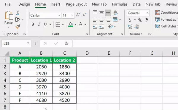
- Enter the data set in an Excel worksheet with the variable’s name and values.
Arrange the data set of the first variable in ascending order by sorting it from “Smallest to Largest.”

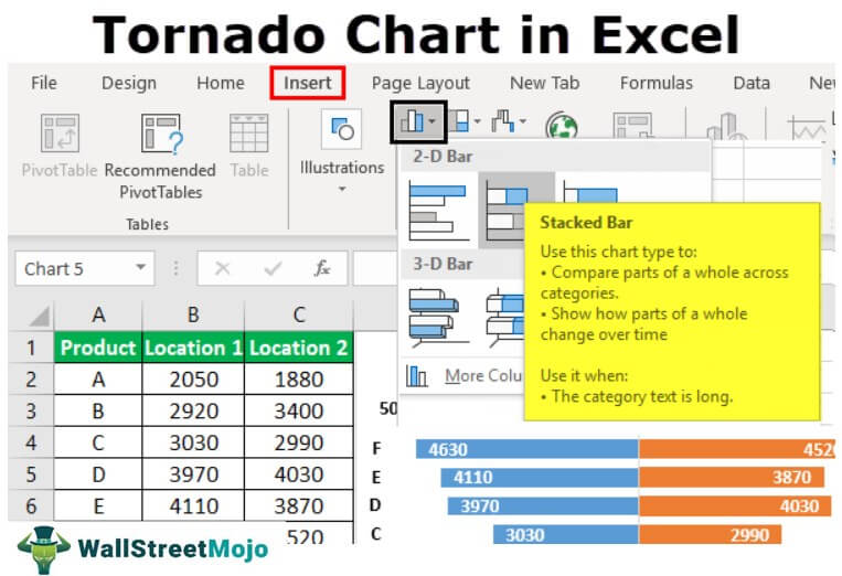
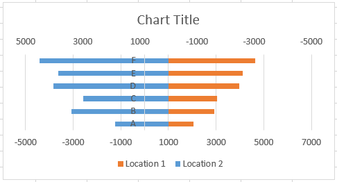
- Select the data to insert a chart (A1:C7)

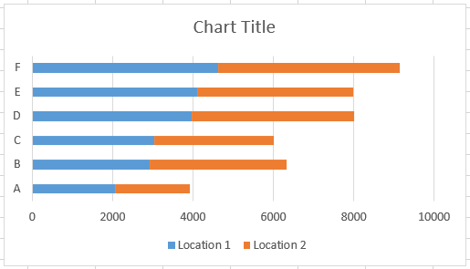
- Select the “2-D Stacked” bar graph from the “Charts” section in the “Insert” tab.

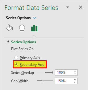
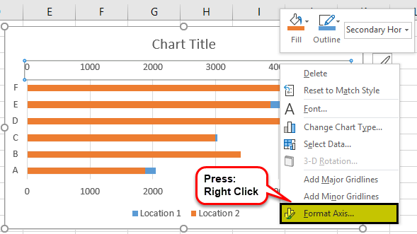
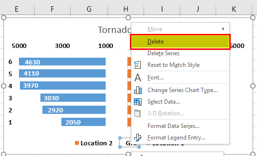
- Select the first variable and right-click to select the “Format Data Series” option. Next, select the “Secondary Axis” option in the “Format Data Series” panel.

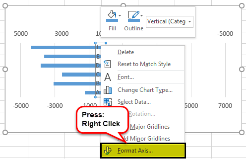
- Select the “Secondary Axis” in the Excel chart and right-click to select the “Format Axis” option.

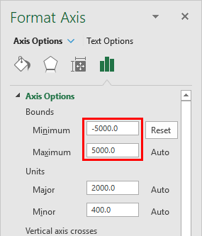
- Set the axis “Bounds” minimum value under “Axis Options” with the negative value of the maximum number (Both maximum and minimum bounds should be the same, but the minimum value should be negative, and the maximum value should be positive).

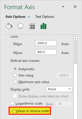
- Also, check the “Values in reverse order” box under the “Axis Options” in the “Format Axis” panel.

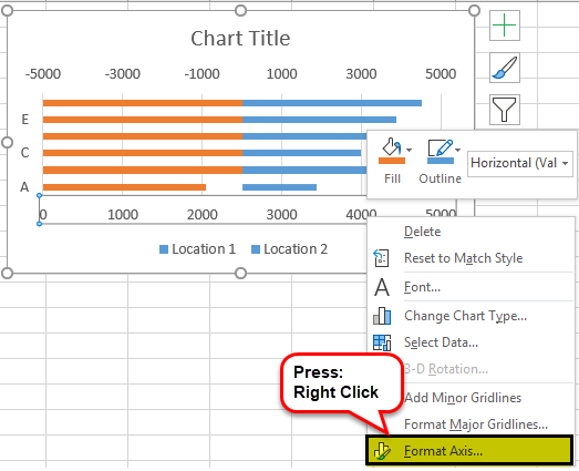
- Now, select the “Primary Axis” and right-click to choose the “Format Axis” option.

- Set the “Axis” bounds minimum with negative and maximum with positive values (same as above).

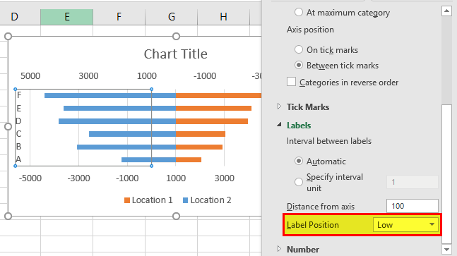
- . Click the axis showing the product name (A, B, C,…). Next, select and right-click to choose the “Format Axis” option.

- Select the “Label Position” as “Low” from the dropdown option in the “Labels” section under the “Axis” options.
That is how your chart looks now. Next, right-click the bars to add value labels by selecting the “Add data labels” option. Next, select the “Inside Base” option to make the labels appear at the end of the bars and delete the gridlines of the chart by selecting the lines.

- Select the “Primary Axis” and delete it. Change the chart title as you like.


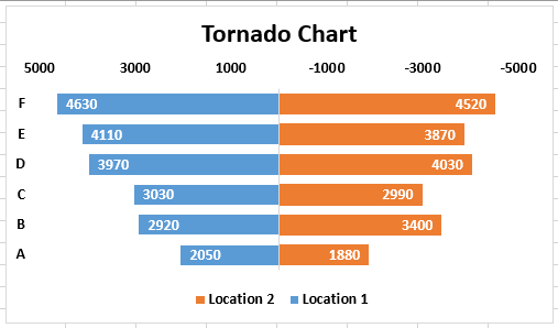
Now, your Excel Tornado chart is ready.
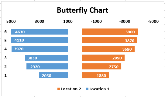
Example #2 – Excel Tornado Chart (Butterfly Chart)
The Excel Tornado chart is also known as the Butterfly chart. This example shows how to make the chart look like a butterfly.
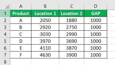
- Create a data set in the Excel sheet with the product name and the values
- Add another column in the data set with the column name “GAP” after the variables column.
- In the “GAP” column, add 1,000 for all the products.
- Create a graph in excel with this data by including the GAP column.
- Follow all the above steps to create a graph.
- Make sure the GAP bars are on the “Primary Axis.”

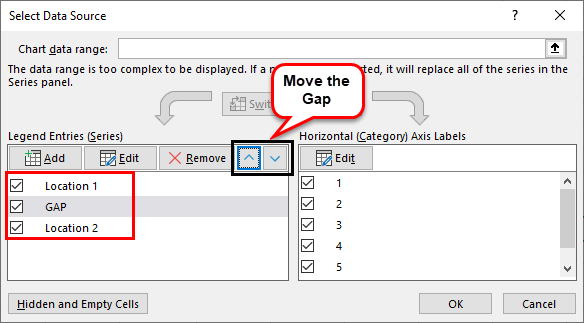
- Right-click on the chart and select the “Select Data Source” option.
- Under “Legend Entries (Series),” move the “GAP” column to the middle.
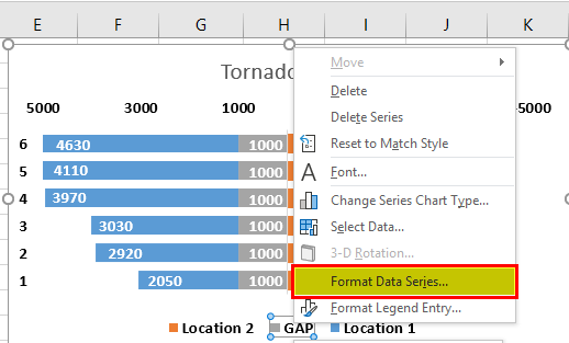
- Right-click on the bars and select the “Format Data Series” option.
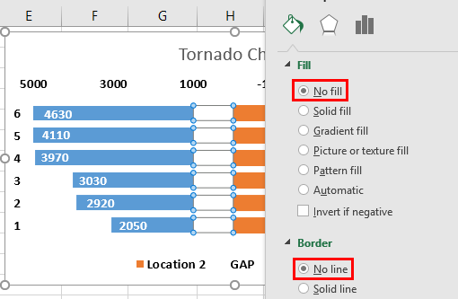
- Select “No fill” and “No line” options under the “Fill” and “Border” sections
- Double click on the legend “GAP” and press the “Delete” to remove the column name from the chart.
Now, the chart looks like a butterfly. So, you can rename it a Butterfly chart.
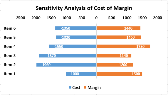
Example #3 – Sensitivity Analysis
Sensitivity analysis shows how the variation in the input will impact an output. We need to set data for two variables to build a Tornado chart in excel for sensitivity analysis. One variable with a negative value and another one with a positive value.
The example below shows how the increase or decrease in the cost impacts the margin.
Follow the same steps shown in the previous examples to build the chart.
In this example, we have shown the cost of a negative value and the margin in a positive value.

In the above chart, you can see the impact of cost on margin. The Excel Tornado chart shows that the increase in the cost is decreasing the margin, and a decrease in cost is increasing the margin.
Things to Remember
- To build a Tornado chart in Excel, we need data for two variables to show the comparison.
- We should sort the data to make a chart look like a Tornado to create the highest value on the top.
- The Excel Tornado chart is dynamic as it gets updated with the changes made in the values of variables in the data set.
- A Tornado chart in Excel is not useful in showing the values of the independent variables.
Recommended Articles
This article has been a guide to Tornado Chart in Excel. Here, we learn how to create an Excel Tornado chart, practical examples, and a downloadable Excel template. You may learn more about Excel from the following articles: –