What Is Control Chart In Excel?
Control chart in Excel is the visual graph to analyze the process change over time. It is also known as a behavioral chart or Shewhart chart in Excel. We need to arrange the data in chronological order with current data sets to plot this Excel graph. To create a control chart in Excel, we need to have the average of the data, the upper control limit of the data, and the lower control limit of the data.
All these lines are drawn by using historical data sets. We compare the current data set with average, upper limit, and lower limit lines in the graph to determine whether the process variation is consistent or inconsistent and whether the data is unpredictable. If all the data points come within the control limit lines (average, upper, lower), then variations may be due to general cause and process said to be in control. Similarly, if the data points are plotting above or below the limit line, variations may be due to special cases and processes “out of control.”
For example, packing boxes with a certain number of products. In such cases, this chart can help analyze whether our process is performing within our calculated parameters.
Key Takeaways
- Control chart, also known as a behavioral chart or Shewhart chart in Excel is a tool used to analyze how data changes over time.
- When analyzing a process’s changes over time in business statistics, a process control chart is used.
- It consists of three components: the control line, the upper control limit, and the lower control limit.
- It is created by calculating the average and standard deviation of the data. It helps users and viewers better understand data and make informed decisions.
How To Create Control Chart In Excel?
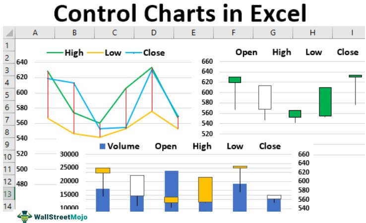
We have four kinds of control charts with Excel. Below are the types of control charts with Excel.
- High – Low – Close
- Open – High – Low – Close
- Volume – High – Low – Close
- Volume – Open – High – Low – Close
Each chart requires a specific set of data.
Now, we should remember the following rules while using control charts in Excel.
- If one point exceeds the 3 control limit, it may be worth investigating to identify the root cause of the deviation.
- If eight or more consecutive points fall on one side of the centerline without crossing, this may indicate a shift in the process that should be addressed.
- Four out of five points falling in zone B or beyond may suggest that the process is not stable and requires further analysis.
- Six or more points in a row steadily increasing or decreasing may indicate that the process is trending in a particular direction, and corrective action may be necessary.
- If two out of three points fall in zone A, the process is likely stable and operating within acceptable limits.
- 14 points in a row alternating up and down may indicate that the process is stable and operating within acceptable limits, but additional analysis may be necessary to confirm this.
- Any noticeable or predictable pattern, cycle, or trend should be investigated to determine the root cause and appropriate corrective action.
Let us learn how to create control chart with apt examples.
Examples
Example #1 – High – Low – Close Control Chart
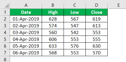
To create this type of control chart, we need to have three sets of data, i.e., what is the high price in the day or high-value point, what is the low-value point, and the actual closing number.
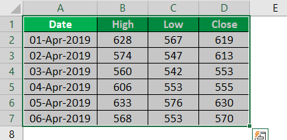
- First, we must copy and paste the below data sets to our worksheet.

- We must select the data and go to the “Insert” tab once we have copied the data to the worksheet.

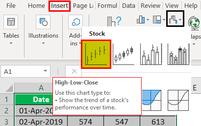
- In the ” Insert ” tab, we must go to the charts area → Stock Chart → High-Low-Close Chart.

- We will have a chart as shown below.

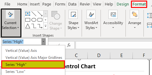
- We cannot identify anything with this chart, so we need to color each line in our way. By selecting the chart, we must go to “Format”→ Current Selection → and from the drop-down, select “Series High.”

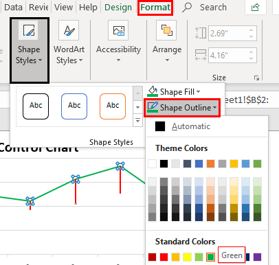
- As a result, it would select the high line from the chart. So, now again, under “FORMAT,” we must choose “Shape Outline” and choose the color as per choice.

- Now, we can see the “High line” is in green color.

- Now we need to repeat the same task for the other two lines, i.e., “Low” and “Close.”

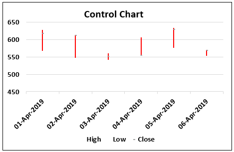
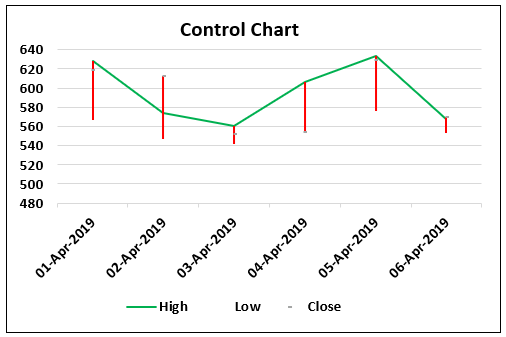
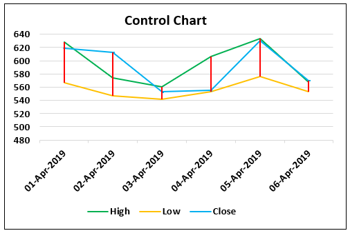
So, this shows how “High, Low, and Close” points fared on each day.
Example #2 – Open – High – Low – Close Control Chart
To create this, we need a copy table to the worksheet.
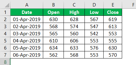
We will insert the Open – High – Low – Close chart this time.

Now we will have the below chart.
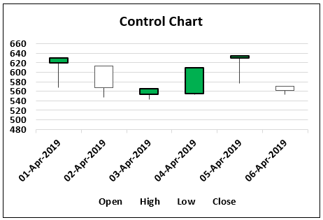
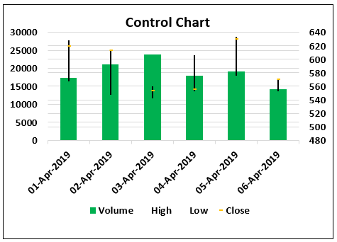
Example #3 – Volume – High – Low – Close Control Chart
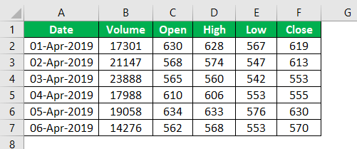
To create this, we need to have one additional data point, i.e., “Volume” data.
We must copy the above table to the worksheet; insert the Volume – High – Low – Close chart.
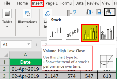
Now we will have the below chart.
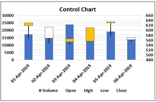
Example #4 – Volume – Open – High – Low – Close
It is the final type of control chart. For this, we need one more additional data, i.e., the opening value of the data point.
Then, we must copy the above table to the worksheet. This time, insert the Volume-Open-High-Low-Close chart.
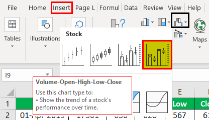
So, now we will have the designed chart below.
We can do all the settings, formatting, and many other things as per our choice.
Uses Of Control Chart In Excel
- The control chart is a type of chart used to analyze how the data changes from time to time.
- It is used in statistics and business. It helps the users or the viewers analyze how any process changes.
- Its components are the control line and upper and lower control line, and the means of making it is with the help of calculations of average and standard deviation of the data.
Important Things To Note
- Control charts in Excel helps us analyze the changes visually.
- We can use Excel to create four different types of control charts.
- They are:
- High-Low-Close
- Open-High-Low-Close
- Volume-High-Low-Close
- Volume-Open-High-Low-Close
Frequently Asked Questions (FAQs)
Are control charts always normal?
Although many control charts that are intended for variable data are based on the assumption of normality, it is still possible to obtain accurate results even when analyzing non-normal data. A viable method to achieve this is to collect data in subgroups. The robustness of the results to non-normality depends on the sample size, which is supported by the central limit theorem.
What are the common control charts in Excel?
The most commonly used control charts are:
- X-Charts: These charts present variable data.
- P-Charts: They are used for counted data.
- NP-Charts: These charts present the number of non-conforming or conforming items.
- C-Charts
- U-Charts
- MR-Charts
- Individual MR-Charts
- Custom Data Control Chart
Explain how to create control chart in Excel with an example.
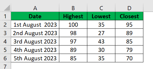
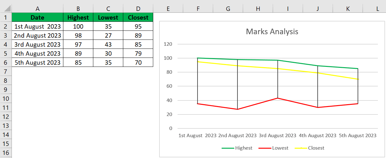
Consider the below example showing the marks obtained by students in Maths in 5 different exams. Now, with the data, let us create control chart in Excel.
The steps are:
- Step 1: First, select Insert > Insert Waterfall, Funnel, Stock, Surface or Radar Chart under Charts group.
- Step 2: Select High-Low-Close Chart under Stock Chart.
- Step 3: Next, click on Format → Current Selection → and Series High.
- Step 4: Next, choose Shape Outline. In this example we have selected green color.
- Step 5: Similarly, click on Format > Current Selection > and Series Low; choose shape outline color. In this example we have selected red color.
- Step 6: Finally, click on Format > Current Selection > and Series Closest; choose shape outline color. In this example we have selected yellow color.
Recommended Articles
This article is a guide to Control Charts in Excel. Here, we discuss the top 4 types of control charts in Excel and how they are created with practical examples and a downloadable Excel template. You can learn more about Excel functions from the following articles: –