
Table Of Contents
What is a Dashboard in Excel?
The dashboard in excel is an enhanced visualization tool that provides an overview of the crucial metrics and data points of a business. By converting raw data into meaningful information, a dashboard eases the process of decision-making and data analysis.
For example, a department dashboard consists of the following information:
- Financial coverage includes revenues, expenses, profits, operating expenses, and so on.
- Non-financial coverage includes staff turnover, recruitment procedure, quality of new hires, training mechanisms, and so on.
The key metrics incorporated in an excel dashboard can relate to finance, marketing, operations, human resources, banking, and other areas of an organization. With a dashboard catering to such varied fields, the end-users also vary accordingly.
The excel dashboards assist the organization in setting new goals and revising the existing ones based on past performance and the current market trends. Since the negative trends can be identified, quick corrective measures can be implemented.
In addition, the efficiency of employees, teams, and departments can also be assessed with dashboards.
The data source for creating an Excel dashboard can be a spreadsheet, text file, business report, web page, and so on. A dashboard can be static or dynamic depending on the requirement.
Types of DashBoards in Excel
The excel dashboards are categorized as follows:
- Strategic Dashboards in Excel–They track the relevant KPIs and forecast performance. They also help in attaining the targeted growth numbers. For instance, a strategic dashboard displays the monthly, quarterly, and annual sales figures of an organization.
- Analytical Dashboards–They help in identifying the current and future market trends. Based on these projections, it becomes easier to make decisions.
- Operational Dashboards–They monitor the operations, activities, and events taking place within an organization.
- Informational Dashboards–They are based on facts, figures, and statistics. For instance, an informational dashboard displays an overview of a player’s profile and performance, the details of a flight’s arrival and departure etc.
How to Create a Dashboard in Excel?
Let us go through a few examples to understand the creation of a dashboard in Excel.
Example #1–Comparative Dashboard
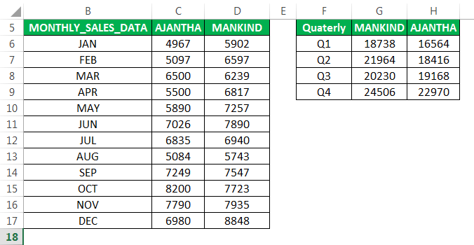
The following tables show the monthly and quarterly sales (in $) of two pharmaceutical companies–“Ajantha” and “Mankind.”
We want to compare the performance of the two companies with the help of a comparative excel dashboard. The purpose is to examine the progress made by both the companies on the revenue front.
The steps to create a dashboard in excel are listed as follows:
- In column A, enter the sales of "Mankind", followed by the corresponding month in column B and the sales of "Ajantha" in column C.

- Select the whole data and create colored data bars. For this, increase the row height from 15 to 25, as shown in the following image.
To open the "row height" box, press the excel shortcut key "Alt+HOH" one by one.
- Select the sales data range of "Mankind". In the Home tab, click the conditional formatting drop-down. Select "data bars" and click "more rules".

- The "new formatting rule" window appears. In "edit the rule description", select the "type" as "number" under both "minimum" and "maximum".
In "value", enter 0 and 9000 under "minimum" and "maximum" respectively.
- In "bar appearance", select the required color in the "color" option. In "bar direction", select "right-to-left", as shown in the following image.

- Click "Ok". In case you do not want numbers to appear with the colored data bars, select "how bar only" under "edit the rule description".
The colored data bars appear in each row of column A, as shown in the following image.
- Likewise, create the same colored bars for the company "Ajantha". In "bar direction", select "left-to-right".
The colored bars appear in each row of column C, as shown in the following image.
- Similarly, create colored bars for the quarterly sales data of the two companies as well. In "edit the rule description", enter 25000 under "maximum". Select a different color in the "color" option under "bar appearance".
The colored bars appear in each row of columns F and H, as shown in the following image.
Hence, with the help of the colored bars, the user can glance through the monthly and quarterly sales figures of both the companies.
In addition to the colored bars, the following comparison indicators can also be used in a dashboard depending on user requirements.
Example #2–Performance Analyzer Excel Dashboard
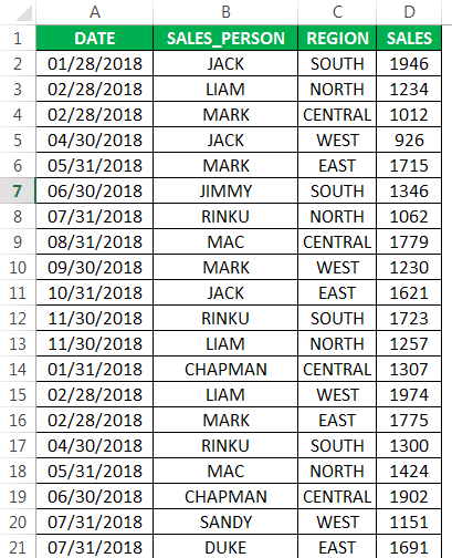
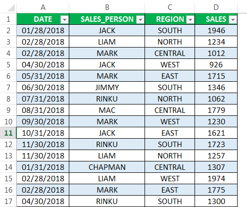
The following table shows the region-wise sales revenue (in $) generated by the different sales representatives of an organization. It also displays the corresponding dates of making these sales.
We want to create an Excel dashboard with the help of a PivotChart and slicer. The purpose is to glance through a summary of the progress made by each salesperson.
The steps to create a performance analyzer dashboard in excel are listed as follows:
Step 1: Create a table object
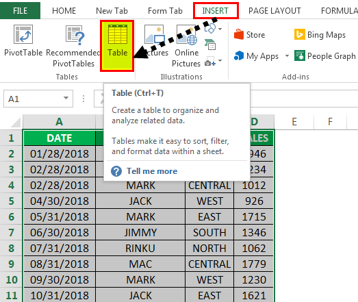
a. Convert the existing data set into a table object. For this, perform the following actions in the mentioned sequence:
- Click anywhere within the data set.
- In the Insert tab, select “table.”
The same is shown in the following image.
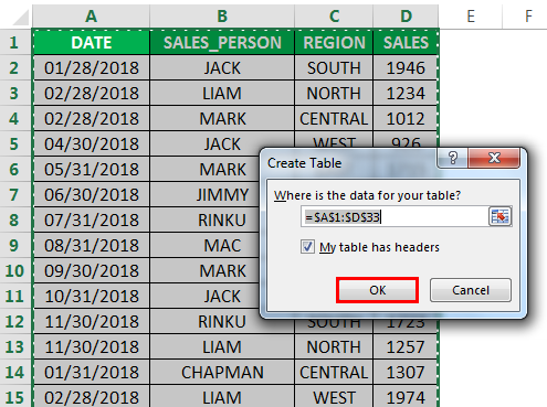
b. The create table popup appears. It shows the table range and the checkbox for headers, as shown in the following image. Click “Ok.”
c. The table appears, as shown in the following image.
Step 2: Create a Pivot Table
To summarize the progress made by each representative, we want to organize the sales data by region and quarter. For this, we need to create two PivotTables.
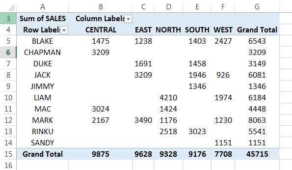
a. Create a region-wise PivotTable for the different sales representatives
Perform the following actions in the mentioned sequence:
- Click anywhere within the table.
- In the Insert tab, select “PivotTable.”
- In the “create PivotTable” window, click “Ok.”
The PivotTable fields pane appears in another sheet.

Perform the following actions in the PivotTable fields pane:
- Drag the “salesperson” tab to the “rows” section.
- Drag the “region” tab to the “columns” section.
- Drag the “sales” tab to the “values” section.

b. The region-wise PivotTable for the different sales representatives appears, as shown in the following image.
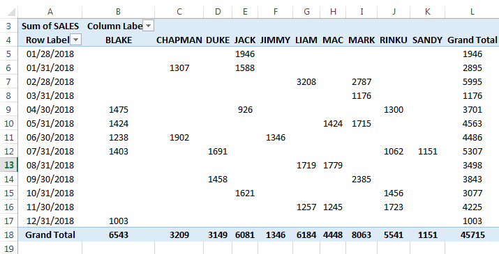
c. Create a date-wise PivotTable for the different sales representatives
Likewise, create the second PivotTable. Perform the following actions in the PivotTable fields pane:
- Drag the “date” tab to the “rows” section.
- Drag the “salesperson” tab to the “columns” section.
- Drag the “sales” tab to the “values” section.

d. The date-wise PivotTable for the different sales representatives appears, as shown in the following image.
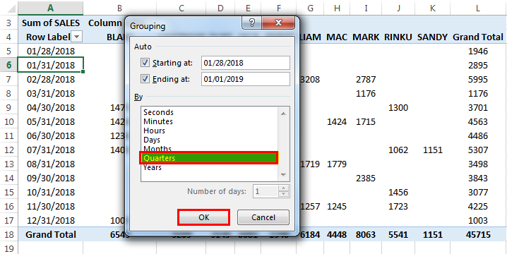
e. Group the dates on a quarterly basis. For this, right-click any cell in the column “row label” (column A) and select “group.”
This is done to view the revenue generated by every representative for all the quarters.
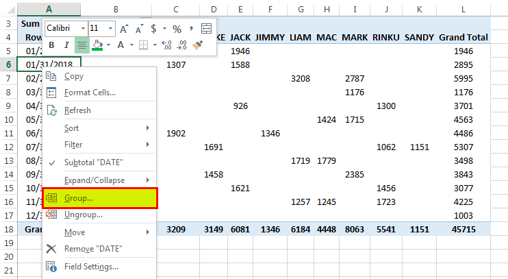
f. The “grouping” window appears with the start date and the end date. Under “by,” deselect “months” (default value) and select “quarters.” Click “Ok.”
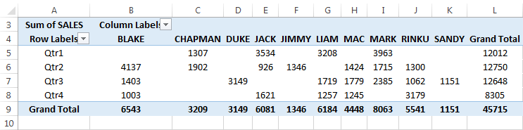
g. The quarterly sales data for each representative appears, as shown in the following image.
Step 3: Create a PivotChart
The PivotChart should be based on the PivotTables created in the preceding step (step 2).
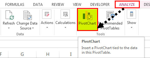
a. Create a PivotChart for the first PivotTable (created in step 2a), which shows the sales data by region. Click inside this PivotTable. In the Analyze tab, click “PivotChart.”
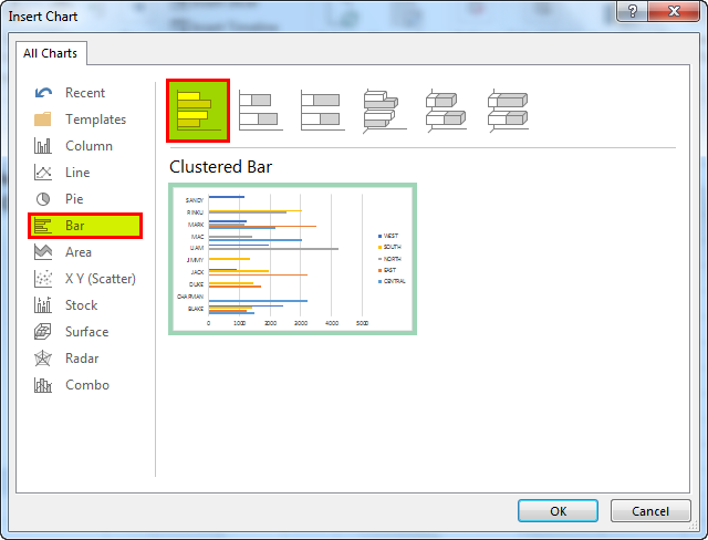
b. The “insert chart” popup window appears, as shown in the following image. From the “bar” option, select “clustered bar chart.”
c. The PivotChart showing the region-wise sales for the different representatives appears.
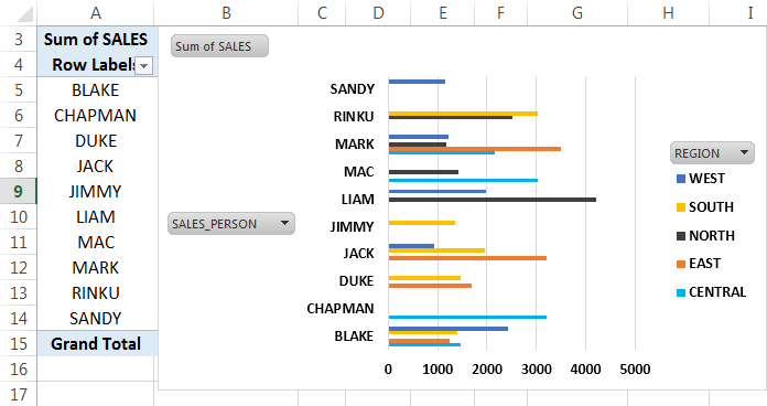
d. To hide the label “region” of the legend, right-click on it and select “hide legend field buttons on chart.”
To hide the labels “sum of sales” and “sales_person,” right-click on either of these and select “hide all field buttons on chart.”
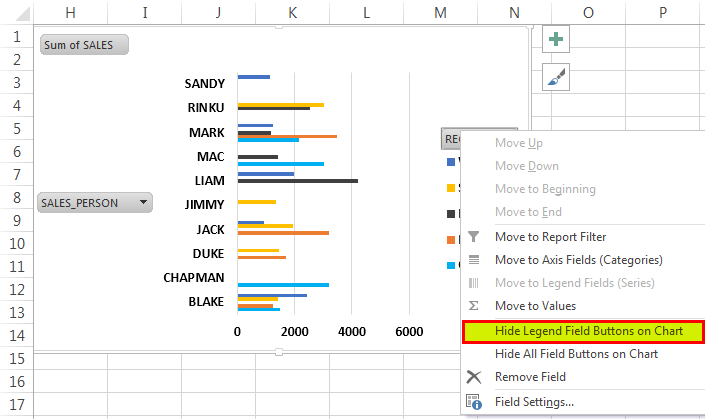
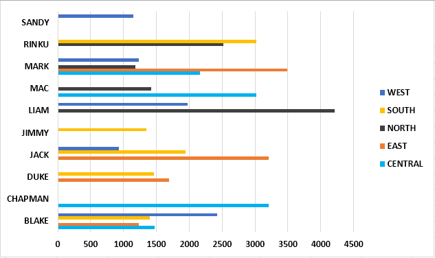
e. All the labels of the chart disappear, as shown in the following image.
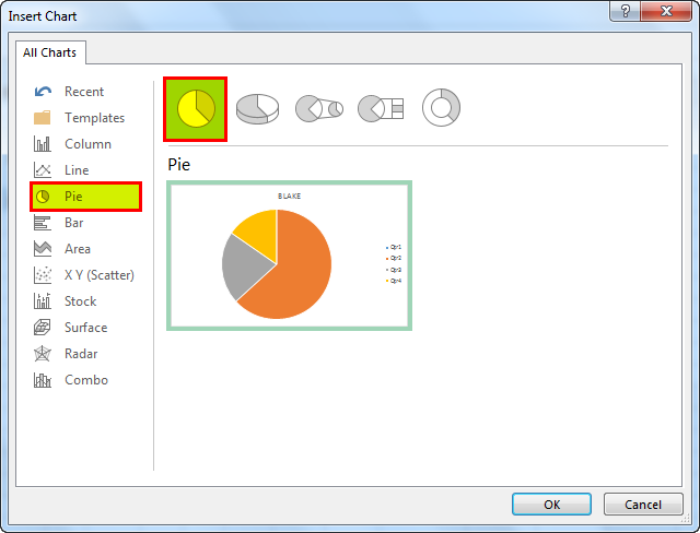
f. Likewise, create a PivotChart for the second PivotTable (created in step 2c), which shows the sales data by quarters. In the “insert chart” window, select a pie chart. Click “Ok.”
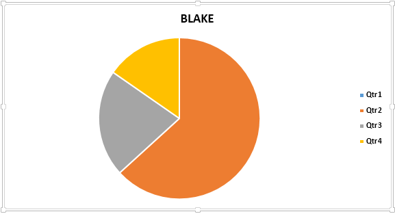
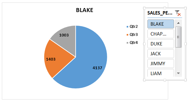
g. The https://www.wallstreetmojo.com/make-pie-chart-in-excel/"]Excel Pie Chart showing the quarterly sales data for the representative Blake appears, as shown in the following image. We have hidden the labels.
Step 4: Add slicers
Slicers can be created for the different regions and the various sales representatives. This helps sort the sales by region. It also allows viewing the quarterly performance of the individual salesperson.
a. In the first PivotChart (created in step 3a), click “insert slicer” from the “filter” group of the Analyze tab.
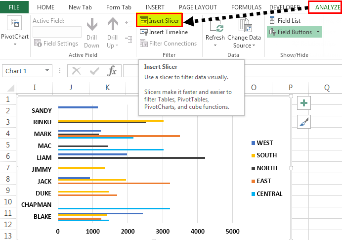
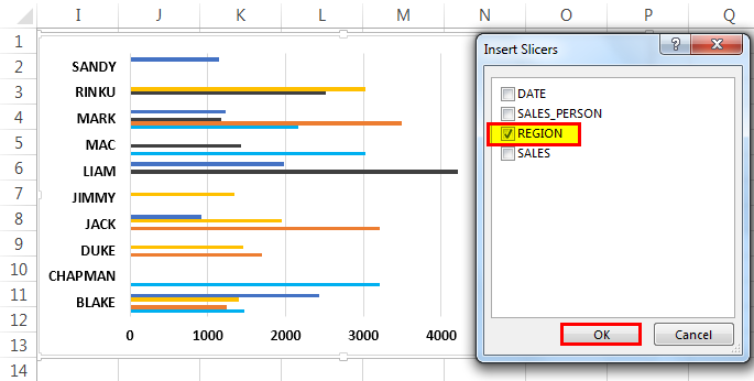
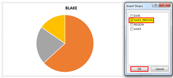
b. The “insert slicers” window appears, as shown in the following image. Select the option “region” and click “Ok.”
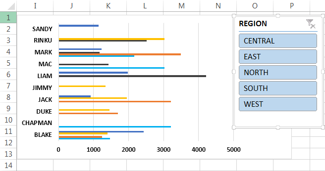
c. The slicer appears, displaying the names of the five regions. Hence, the performance of every salesperson for a particular region can be analyzed.
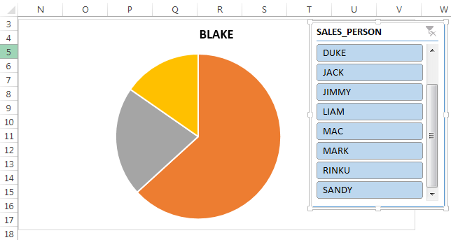
d. Similarly, add slicers to the second PivotChart (created in step 3f). In the “insert slicers” window, select the option “salesperson” and click “Ok.”
e. The slicer appears, displaying the names of the different sales representatives. Hence, the performance of every salesperson for the four quarters can be examined.
Step 5: Create a Dashboard
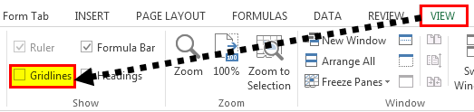
a. Create a new sheet with the name “sales_dashboard.” In this sheet, remove the gridlines by deselecting “gridlines” under the View tab. This enhances the appearance of the dashboard.
b. Copy the PivotCharts (created in step 3) and the slicers (created in step 4) to the “sales_dashboard” sheet.
The user can glance through the region-wise sales data. Moreover, the quarterly progress made by every sales representative can also be analyzed.
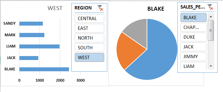
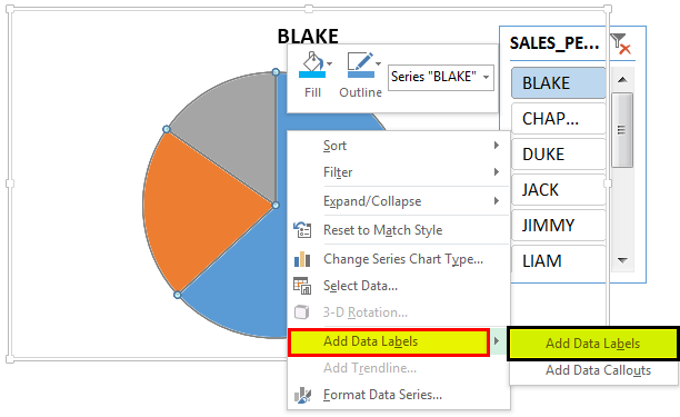
c. For viewing the sales figures on the data bar or the pie chart, right-click the same and select “add data labels.”
d. The sales figures appear on the pie chart, as shown in the following image. The chart shows the quarterly sales numbers of the representative Blake.
The Tools Used to Create an Excel Dashboard
The tools used in the creation of an Excel dashboard are listed as follows:
- Visualization elements–This includes tables, charts, PivotTables, PivotCharts, slicers, timelines, conditional formatting (data bars, color scale, icon sets), sparklines, auto-shapes, and widgets.
- Interactive controls–This includes a scroll bar, radio button, checkbox, and drop-down list.
- Excel formulas–This includes SUMIF, COUNT, VLOOKUP, INDEX MATCH, etc.
- Other tools–This includes named ranges, data validation, and macros.
Purpose of Creating a Dashboard
Dashboards are used by several industries for varied purposes. The objectives of creating a dashboard are listed as follows:
- To structure business information and create a consolidated data summary
- To plan the future course of action of a business
- To measure the key performance indicators (KPIs) that help evaluate the overall performance of an organization
- To study the effectiveness of various business processes and analyze the forecasted results against actual figures
- To improve business productivity
The Considerations While Creating a Dashboard
An excel dashboard should be created keeping in mind the following aspects:
- The purpose of creating a dashboard
- The intended audience for whom the dashboard is being created
- The relevant metrics to be included based on which decisions will be taken
- The data source to be populated in a dashboard
- The task of renewing dashboard information that can be periodic or as and when required
The Cautions While Creating an Excel Dashboard
The cautions to be observed while creating an excel dashboard are listed as follows:
- Ensure that the data file is appropriately structured by removing duplicates, blanks, leading and trailing spaces, and errors.
- Insert only the relevant information in a dashboard so that it is easy to interpret and not overcrowded.
- Simplify a complicated dashboard by creating a user guide or an instruction manual that assists in navigation.
