Table Of Contents
What is Radar Chart in Excel (Spider Chart)
A radar chart in Excel is also known as the spider chart, web, or polar chart. It is used to demonstrate data in two-dimensional for two or more data series. The axes start on the same point in a radar chart. This chart is used to compare more than one or two variables. There are three different types of radar charts available to use in Excel.
The radar chart in Excel visualizes the performance and makes concentrations of strengths and weaknesses visible.
Different Types of Radar Chart in Excel
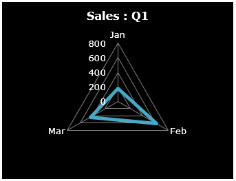
#1 Radar Chart
Display values relative to a center point. It is best used when the categories are not directly comparable. Given below is an example of this type of chart.
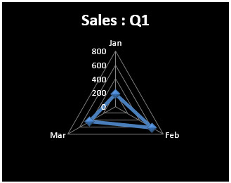
#2 Radar Chart with Markers
It is similar to the earlier type, but the only difference is that it has markers in each data point. Given below is an example of this type of chart.
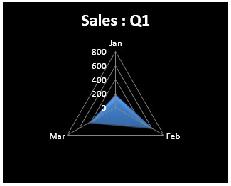
#3 Radar Chart with fills (Filled Spider Chart)
Everything remains the same as shown in the previous two types, but it fills the color to the entire radar. Given below is an example of this type of chart.
How to Understand the Radar Chart?
Like in the column chart in the spider chart in excel, also we have the X-axis and Y-axis. The X-axis is each end of the spider, and each step is considered the Y-axis. For example, in the below-given image, circles that are marked in orange are X-axis, and circles, which are marked in blue, are Y-axis. The zero-point of the radar chart in Excel starts from the center of the wheel. A point reaches the edge of the spike, the higher the value.

How to Create a Radar Chart in Excel?
The radar chart in Excel is very simple and easy to use. Let us understand the working of some radar chart examples.
Radar Chart Example #1 - Sales Analysis in 4 different quarters
Below are the steps for creating a radar chart in Excel: -
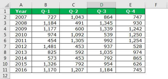
- Create data in the below format. The below data shows quarterly sales performance over 10 years. So now, let us present this in a spider chart.
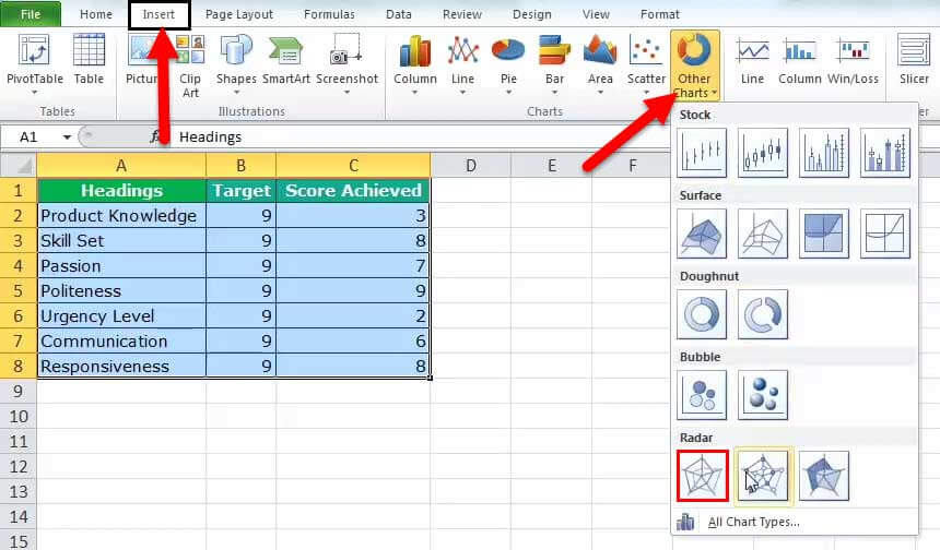
- Go to the "Insert" tab in Excel. Then, in "Other Charts," select the "Radar with Markers" chart. It will insert a blank radar chart in Excel.
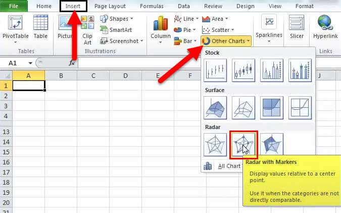
- Right-click on the chart and select “Select Data” below.

Click on the “Add” button.
Select "Series name" as "Q-1" and "Series values" as values. Then, click "OK.".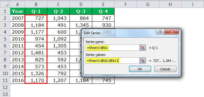
Again, repeat this procedure for all the quarters. After that, your screen should look like this.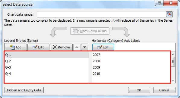
After this, click on "OK." It will insert the chart. Below is the illustration of how the radar chart in Excel looks before formatting.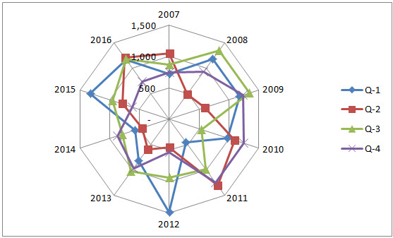
- Format the Chart as per our wish.
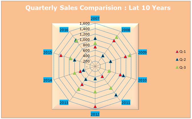
Right-click on each line and, change the line color, change the marker style option as per your needs. Next, add chart titles to tell the user what it is. And finally, your chart will look like this.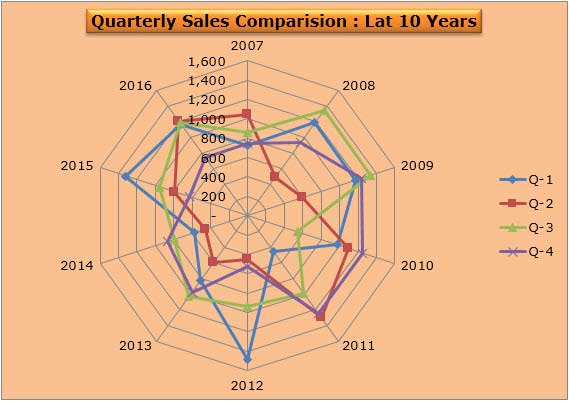
Interpretation of the data:
- Looking at the spider's outset, we can see that in 2012, Q1 revenue was the highest among all the 10 years of revenue. And in 2011, Q1 revenue was the lowest.
- In Q2, the highest revenue was in 2011, and the lowest point was in 2014.
- In Q3, the highest revenue was in 2009, and the lowest was in 2010.
- In Q4, the highest revenue was in 2011, and the lowest revenue occurred in 2012.
- In none of the years, there has been a consistent growth of revenue over 4 quarters. There is always volatility in revenue generation across quarters.
Additionally, you can remove the chart's lines but highlight only the markers. The advanced formatting is always a treat to watch.
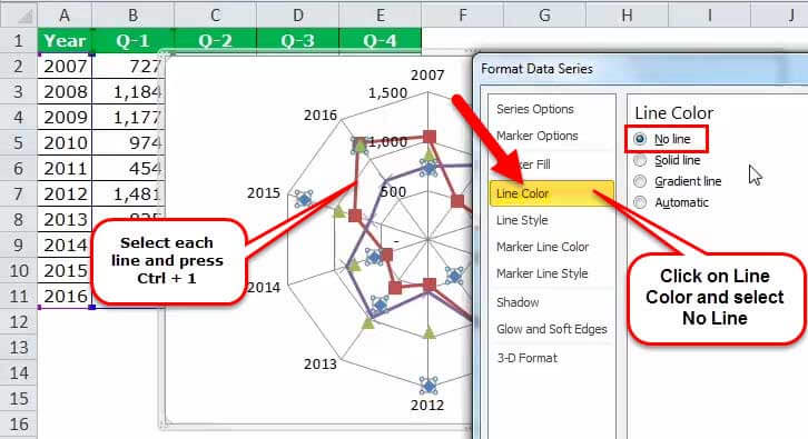
- Select each line and press Ctrl + 1 > Line Colour > Select no line.
- Select marker options > select built-in > choose the color per your wish.
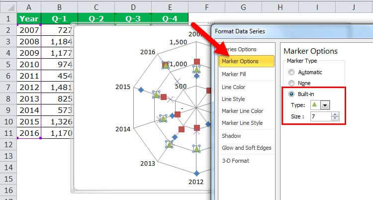
- Repeat this for all the lines. Ensure you select different marker colors but the same markers.
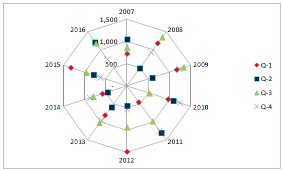
- Click on spider lines and press Ctrl + 1 > Line Colour > Solid Line > Select the colour.

- Select Line Style > Dash Type > Select dotted lines.
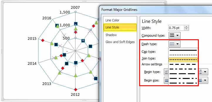
- Select the background color from the "Format" tab.

- So, the chart looks beautifully like the one below.
Radar Chart Example #2 - Target vs. Customer Satisfaction Level
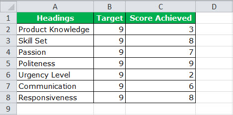
Step 1: Create the data in the below format and apply chart type 1 (ref types of the chart).
Step 2: Select the data to apply chart type 1. Insert > Other Charts > Select Radar Chart.
Initially, your chart looks like the one below.

Step 3: Do the formatting as per your ideas (to do the formatting, refer to the last example and play with it).
- Change the target line color to red and the achieved line color to green.
- Change spider line color to light blue and the line style to dotted lines.
- Change X-axis values to word art styles.
- Insert the header for the chart and format it nicely.
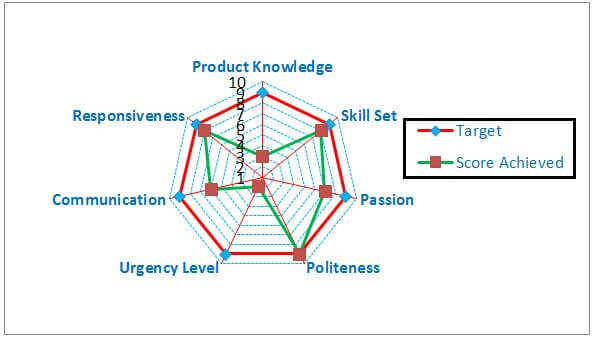
After all the formatting, your chart should look like the one below.

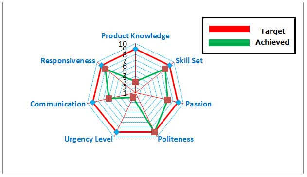
Step 4: Get rid of the legends and use manual legends to adjust the chart neatly. To insert manually, go to the "Insert" tab and "Insert Shapes."
Before removing and inserting manual legends
After removing and inserting manual legends.
Interpretation of the Spider Chart in Excel
- The red line shows the target level of each category, and similarly, the green line indicates the achieved level of each category.
- The politeness category achieved a 100% score by reaching 9 out of 9.
- Next, the closest categories are responsiveness and skill set, scoring 8 out of 9.
- The least anchored category is urgency level. It achieved only 2 out of 9.
- There is conclusive evidence that customer care executives need to work on the urgency level and gain more knowledge on the product.
- Maybe they require training to know more about the product.
- They need to create an urgency level to close more deals often.
Advantages of using Spider chart in Excel
- When presenting a two-dimensional dataset, it is very useful to tell the story of the data set just by creating the radar chart in Excel.
- The radar chart in Excel is more suitable when the exact values are not critical for a reader, but the overall chart tells some story.
- We can easily compare each category along with its axis, and overall differences are apparent by the size of each radar.
- Spider charts in Excel are more effective when comparing target and achieved performance.
Disadvantages of using Spider chart in Excel
- Comparing observations on a radar chart in Excel could be confusing once more than a couple of webs are on the chart.
- When there are too many variables, it creates too many axes. The crowd is too much.
- Though multiple axes have gridlines connecting them for reference, issues arise when you try to compare values across different axes.
Things to consider while creating a radar chart in excel to visualize your report.
- Make sure you are not using more than two variables. Otherwise, it will be tedious for a user to understand and conclude.
- We must try to cover the background with light colors to tell the story colorfully.
- We must use different line styles to attract users’ attention.
- We must arrange the data schematically.
- Enlarge the spider web to give clear visualization
- Work on-axis values to avoid too many intervening axis values.
- Get rid of legends to enlarge the spider web, but insert the legends by adding shapes.
- To make the chart easier to read, one of the simplest things to alter is the size of the text. Do all these in the "Formatting" section.

