
Table Of Contents
How to Create a Bubble Chart in Excel?
We can create a bubble where we want to use multiple bar charts to share results. For example, use an Excel bubble chart to show three types of quantitative data sets.
This chart is straightforward to use. Let us understand the work with some examples.
Video Explanation Of Bubble Chart in Excel
Example 1
Below are the steps to create a bubble chart in excel:-
- Initially, we must create a dataset and select the data range.

- Then, we must go to "Insert" and "Recommended Charts" and select the bubble chart, as shown below.

- Next, we must create an Excel Bubble Chart with the below formatting.
- Format X-axis

- Format Y-axis

- Format bubble colors.

- Now, we need to add data labels manually. Right-click on bubbles and select add data labels. Select one by one data label and enter the region names manually.
(In Excel 2013 or more, we can select the range, no need to enter it manually).
So finally, our chart should look like the one below.
The additional point is that when we move the cursor on the bubble. It must show the complete information related to that particular bubble.
Interpretation
- The USA is the highest-selling region. But since we are showing profitability in the bubble. But, on the other hand, the USA's bubble looks small due to a 21.45% profitability level. So, it shows profitability in this region is very low even though the sales volume is very high compared to the others.
- The lowest-sold region is Asia, but the bubble size is huge due to the superior profitability level compared to others. So, this will help to concentrate more on the Asia region next time due to the higher profit margin.
Example 2
Step 1: Arrange the data and insert a bubble chart from the insert section.
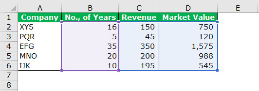
Step 2: We need to follow the steps shown in example 1. The chart should look like the one shown below. (For formatting, we can do our numbers).
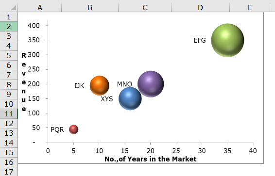
Interpretation
- The chart shows that EFG Co. has been in the market for 35 years, its market value is 1575, and its revenue is 350.
- MNO Co. has been in the market for 20 years. Its last year's revenue was 200, and the market value was 988. But IJK has been in the market for ten years and achieved 195 in revenue. But in the graph company, the MNO Co.'s bubble size is immense compared to the company. So since we are showing the market value in bubble size, we see a massive change in the size of the bubble even though the revenue difference is only 5%.
Advantages
- The Excel bubble chart was better when applied to more than 3-dimension data sets.
- Eye-catching bubble sizes will attract the reader's attention.
- It visually appears better than the table format.
Disadvantages
- It may be difficult for a first-time user to understand very quickly.
- Sometimes, we may get confused with the bubble size.
- If one is a first-time user of this chart, one may need someone's assistance to understand the visualization.
- In Excel 2010 and earlier versions adding data labels for large bubble graphs is tedious. (In 2013 and later versions, this limitation is not there).
- The overlapping of bubbles is the biggest problem if two or more data points have similar X and Y values. The bubble may overlap, or we may hide one behind another.
Things to Consider When Creating a Bubble Chart in Excel
- We must instantly arrange the data to apply the bubble chart in Excel.
- Always decide which data set to show as a bubble. First, one must identify the targeted audience for this to happen.
- Always format the dataset's X and Y-axis to a minimum extent.
- We must avoid fancy colors that may look ugly at times.
- We must play with the chart's background color to make it look nice and professional.
