What Is Dot Plots In Excel?
Dot plots in Excel is one of the methods to plot data using dots in Excel. It is not an inbuilt chart type but we can achieve it using simple steps.
Dot plots are commonly set up with one axis representing the range of values or categories along which the data points are categorized and a second axis representing the number of data points in each category. For easy visual comparison, dots can be stacked vertically or horizontally to display how many are in each group.
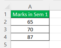
For example, consider the below table showing marks obtained by Allen in semester 1.

The same data can be converted into dot plots in Excel as shown in the below image.

Likewise, we can use dot plots in Excel.
Key Takeaways
- The Dot Plot chart is not included in the Excel.
- To make a dot plot chart, we need to combine the scattered chart. Under the format data series section, we may increase the size of the dots if necessary.
- If we require a horizontal dot plot chart, we must use a bar chart rather than a column chart in Excel.
How To Make Dot Plots In Excel?
Creating data plots in Excel is all about using Select Data Source window effectively. We use it to carefully select the cell range required for.

Let us learn how to use and apply dot plots in Excel with detailed examples.
Examples
Example #1
We have created one of the sample data item-wise sales numbers for five months; below is the same sample data. Next, we will create a dot plot for this Excel data.
Follow the below steps:
- We must first enter numbers 1, 2, and 3 in the next columns of the data. For example, refer to the below image.

- Now, select the first two rows of the data and insert the column chart in Excel.

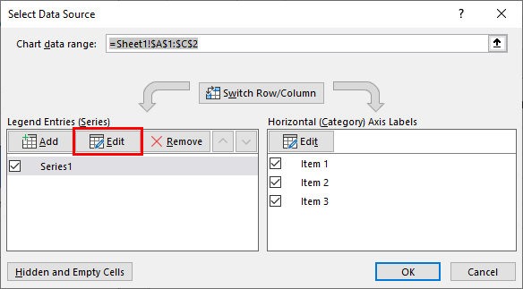
- After that, right-click on the chart and choose “Select Data.”

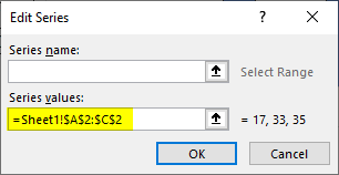
- We need to choose the “Edit” option in the below dialog box.

- We can see the existing values as our selected range.

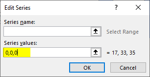
- Next, delete these existing values and enter 0, 0, 0 for all three items.
- Click on the “OK.” We will have a blank chart like the below one.

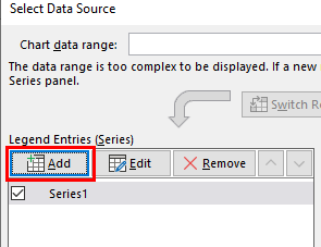
- Again, right-click on the chart and choose “Select Data Source.” Then, click on the “Add” button in the below window.

- Select cell A1 for “Series name” and “Series values,” and enter “1” as the value in the below window.

- Click on the “OK.” We will have a chart like the one below.

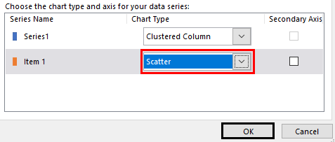
- Now, right-click on the chart and choose “Change Chart Type.”

- In the below window, we must select “Combo.”

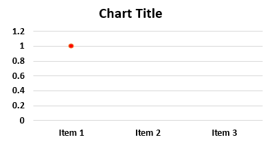
- For “Item 1”, choose “Scattered Chart” and click on the “OK.”

- We will have a chart like the one below with just a dot, a column bar replaced with just a dot.

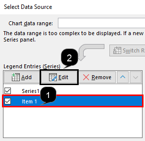
- Next, right-click on the chart and choose “Select Data” again. Finally, select “Item 1” and click on “Edit” in the next window.

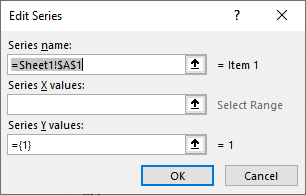
- Now, we can see below the options window.

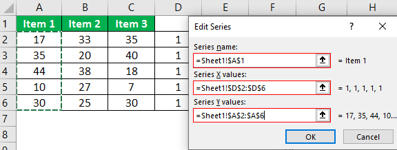
- For “Series Name,” choose cell A1. For “Series X Values,” select the column which has number 1 (the one we have entered manually in step 1), and for “Series Y Values,” choose “Item 1” numbers.

- Click on the “OK.” Now we will have a dot plot chart for “Item 1”.

- We need to repeat the same process for the other two items, “Item 2” and “Item 3.”
Below is “Item 2”.


Below is “Item 3.”

We will have a “Dot Plot” chart ready like the below one.
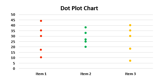
As we can see, instead of the traditional “Column Bar Chart,” we have a “Dot Plot Chart.”
Example #2
Consider the below table showing marks obtained by Billy in subjects, Physics, Chemistry and Biology in 3 different exams.
Now, let us use and apply dot plots for the data in Excel.
First, to start with, enter numbers 1, 2, and 3 in the next columns of the data as shown in the below image.

Now, select the first two rows of the data, i.e., rows A and B and insert the column chart in Excel.

Next, right-click on the chart. In the tab of options, click on “Select Data.” Now, we need to choose the “Edit” option.
The Edit Series window appears.
Here, we can see the existing values as our selected range. Now, we need to delete the Series values: and enter 0,0,0. Next, click on OK.
We can see a blank chart as shown in the below image.

Now, we have to right-click on the chart and choose “Select Data Source.” Next, click on the “Add” button. In the appearing window, we need to select cell A1 for “Series name” and “Series values,” and enter “1” as the value in the window.
Next, click on “OK.” We will be able to see a chart as shown in the below image.

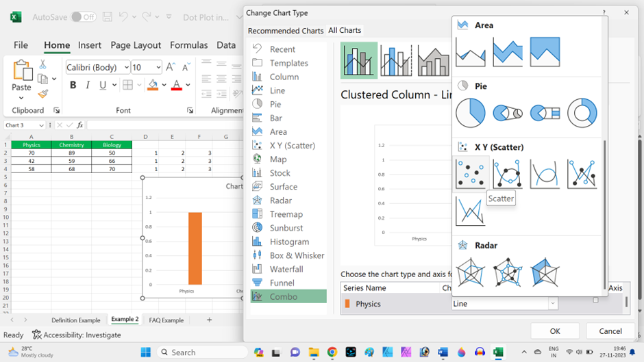
Next, we need to right-click on the chart and choose “Change Chart Type.”
The window, Change Chart Type appears. In the window, we must select “Combo.” Next, choose Scatter type chart next to option, Physics under the category – Choose the chart type and axis for your data series:
We will be able to see a chart as shown in the below image with just a dot. In simple terms, the column bar replaced with just a dot.

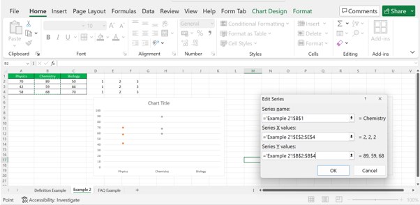
Finally, right-click on the chart and choose “Select Data” again. Here, select “Physics” and click on “Edit” in the next window.
The Edit Series window appears.
Now, we have to select Series name:, Series X values:, Series Y values: as shown in the below image.

Now, click “OK.” We will have a dot plot chart for Physics.
We need to repeat the same process for data, “Chemistry.”
Now, click “OK.” We will have a dot plot chart for Physics.
We need to repeat the same process for data, “Biology.”

Now, we can see dot plots in Excel for the given data.

Likewise, we can use dot plots in Excel.
Important Things To Note
- There is no built-in dot plot chart in Excel.
- We need a combination of the scattered chart to create a dot plot chart.
- We can increase the size of the dots in case required under the format data series section.
- If we need a horizontal dot plot chart, we need to insert a bar chart in excel instead of the column chart.
Frequently Asked Questions (FAQs)
Explain the use of dot plots in Excel with an example.
Dot plots are commonly used to present data in a plotted chart using dots in Excel.
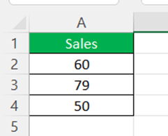
For example, consider the below table showing sales in column A.
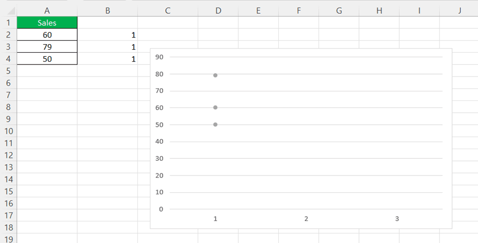
Using simple steps, we can create a dotted plot in Excel which appears as shown in the below image.
Why do we need a dot plot?
By plotting dots for each observation, a dot plot depicts data distribution. Dot plots are suitable for both categorical and quantitative data. Dot plots can also be used to compare multiple distributions or to investigate the relationships between variables.
When not to use a dot plot?
Dot plots are ideal for data with a limited number of values. They would not work well for huge data sets because each value would require a dot to be plotted. For huge data sets, histograms or box graphs are more useful.
Recommended Articles
This article has been a guide to Dot Plots in Excel. Here, we discuss how to make dot plots in Excel, examples, and a downloadable Excel template. You may learn more about Excel charts from the following articles: –