What Is S Curve In Excel?
The S curve in Excel is used to visualize a relation of two variables: how one variable impacts another and how the value of both variables changes due to this impact. It is called an S curve because the curve is in an S shape. It is used in two types of charts: line charts and scatter charts.
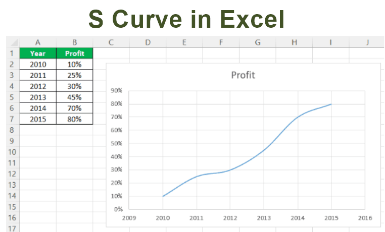
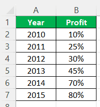
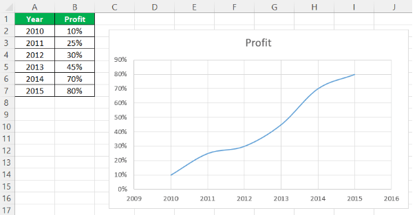
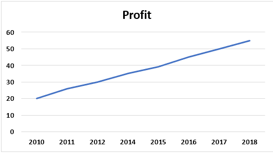
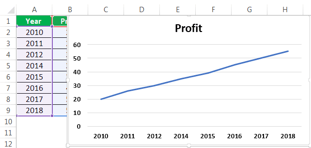
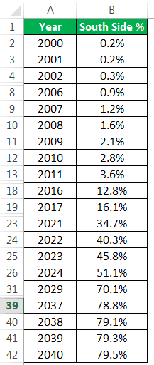
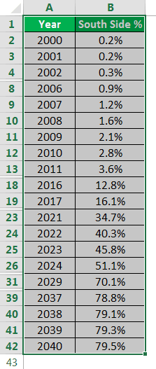
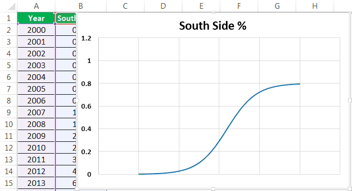
For example, consider the below table showing year and profit percentage of a retail store.
Now, we can convert this data into S Curve in Excel in simple steps. The S Curve for this data will appear as shown in the below image.
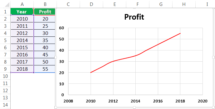
Likewise, we can convert long data into S Curve in Excel.
In this article, let us learn how to create S Curve in Excel with apt examples.
Key Takeaways
- The S curve in Excel visualizes how two variables affect and change each other. It is called S curve due to its S shape and is used in line and scatter charts.
- It is a free project management tool that is valuable for analyzing financial data and cash flow, constructing projects, and making predictions.
- The S curve must be drawn in Excel, a period in one axis so that it can be used for comparison over a period very quickly.
Explanation And Usage Of S Curve In Excel
The S curve is available in two different charts in Excel. They are:
If we use this type of chart, there should be data. Remember, we have to match the two variables with the same period. This curve can plot the changes in one variable related to another.
By seeing the curve, we can make complete inferences such as,
- What is the profit or sales recorded (over a period)?
- What is the starting point for the first time?
- What is the progress from year to year by comparing with other years. The main thing is we can also draw future inferences from these charts.
The Excel S curve is in the below screenshot.
How To Make S Curve In Excel?
The S curve is a very important curve or tool in Excel. We can use it in projects to know the daily progress and track the previous records of other days. Let us learn how to create or make S Curve in Excel with the following examples.
Below are examples of the S curve in Excel.
Examples
Below are examples of the S curve in Excel.
Example #1
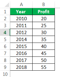
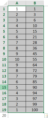
Consider the below data. Let us learn how to make S Curve in Excel with step-by-step instructions.
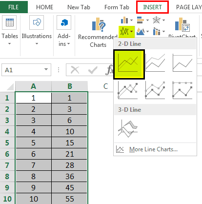
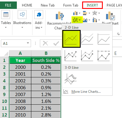
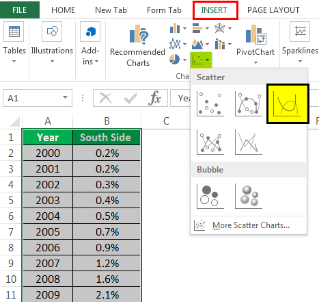
1. Select the data.
2. Now, go to the “Insert” tab and select a “Line” graph or “Scatter” graph per the requirement.
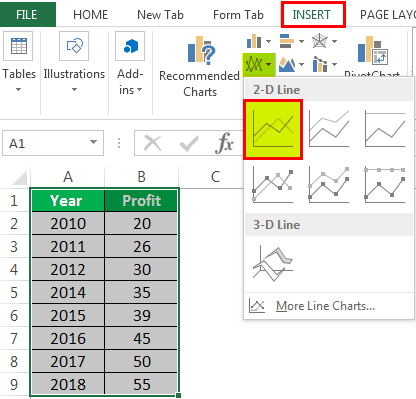
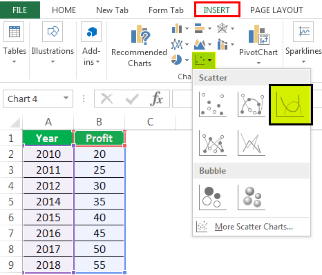
The first one is for a line graph and the second screenshot is to select the scatter plot. There are again 2D and 3D charts present.
When we select the chart type, it will display the chart on the sheet. So now, we can choose the graph per our requirement by looking at the graph.
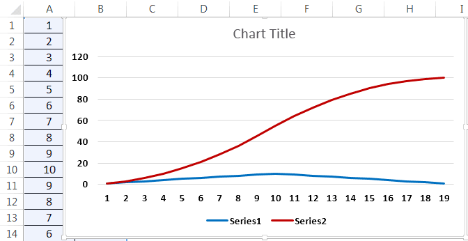
3. We can see the final graph on the sheet.
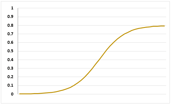
In this graph, a slight S curve is present. As the name indicates an S curve, there is no compulsion that the graph should be completely looking in an S shape. There can be a slight curve present in the graph. The shape of the curve will depend on the data we take.
Example #2
We are taking a dual-axis graph with an S curve in this example.
Step 1: Select the data.
Step 2: Go to the “Insert” tab and select a “Line” graph or 3d scatter plot in excel or 2D, based on the requirement and the interest. Now, click “OK.”
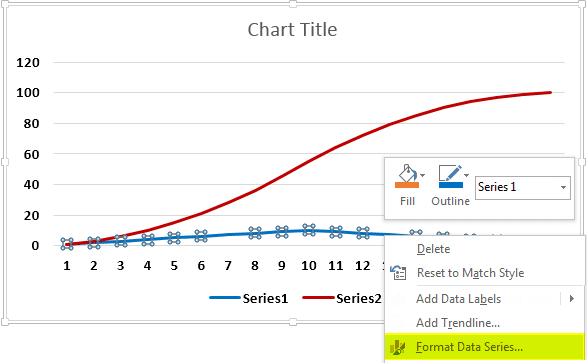
Step 3: In this step, the graph will be ready. Also, we can use a dual chart if two data columns are on one chart.
Step 4: After the chart is prepared, click on the point of the graph where you want to move to the secondary axis. Right-click, now select the “Format Data Series” option.
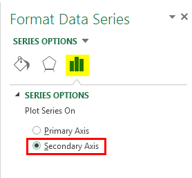
Step 5: On the “Axis” tab, the default option will be the “Primary Axis.” Now, please change it to the “Secondary Axis.” Now, we can set the selected data for the secondary axis.
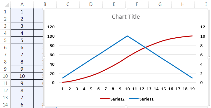
The final step is the dual-axis graph. We can show this in the below screenshot.
Example #3
Step 1: Fill the data correctly in the sheet with all the columns, as shown in the below screenshot.
Step 2: Select the data for which you want to draw the S curve, as shown in the below screenshot.
Step 3:
- Go to the “Insert” tab.
- Select the “Line” graph.
- Choose the model of the line graph which we want to use.
Select the “Scatter” plot from the “Insert” tab in the same way, as shown below.
The curve will be shown automatically, as shown in the below screenshot, after selecting the type of charts we want to use.
Usage Of S Curve In Excel
- The S curve is a very important project management tool that anyone can use in projects as it is available free of cost.
- It is mainly used in the data where we have data related to time. For analyzing the data, this curve can be used.
- This curve can also be extensively used in financial data modeling and cash flow.
- We can use them in constructing a project and forecasting the model.
- We can use the S curve in Excel to calculate cumulative values.
- Similarly, we can use the S curve as a dual-axis curve. This curve can be used with the combination of any other chart.
- We can make budget comparisons by using this Excel S curve.
- As we can draw this Excel S curve from the scatter plot and line graph, it is more useful for many purposes, as mentioned above.
There are some formulas also to calculate the S curve manually, but Excel has made that very easy so that we can do it in no time. We can do the manual method by taking the X-axis and Y-axis points from the plot.
Important Things To Note
- The main point to be remembered in time is to draw this S curve in Excel.
- There should be a period in one axis so that something can be compared over some time very easily with this curve.
- We can also make future predictions from these curves.
Frequently Asked Questions (FAQs)
What is the S curve approach to change?
The S-curve model assumes all modifications are well plotted and result in positive experiences for the people. The initial curve represents a slow adoption of the change in the beginning, followed by a faster adoption process and eventually tapering off towards the end.
How do you smooth an S curve in Excel?
If you want to view your data as a smooth curve, you must opt for a scatter chart. To create them, one may click on the icon, which looks like several blue and black dots scattered over a right angle, and then choose the ‘Scatter with Smooth Lines’ option.
What is the S curve stages?
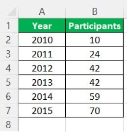
Consider the below table showing the number of participants of an annual event in different years.
Now, we can convert this data into S Curve in Excel in simple steps.
The S Curve for this data will appear as shown in the below image.
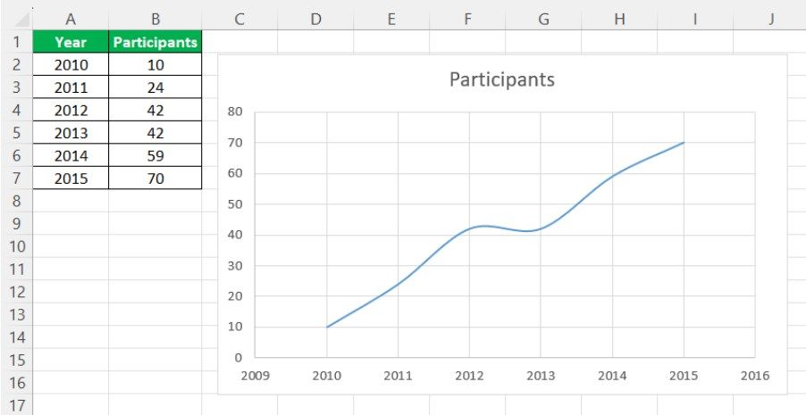
Likewise, we can convert long data into S Curve in Excel.
Recommended Articles
This article is a guide to S Curve in Excel. Here, we discuss making an S curve pattern in Excel using two charts, 1) Line chart and 2) Scatter chart, along with practical examples and a downloadable Excel template. You may learn more about Excel from the following articles: –