What Is Excel Marimekko Chart?
Marimekko chart is also known as a Mekko chart in Excel. This chart is a two-dimensional combination of Excel’s 100% stacked column and 100% stacked bar chart. The creativity of this chart is that it has variable column width and height. It is not a built-in chart template in Excel.
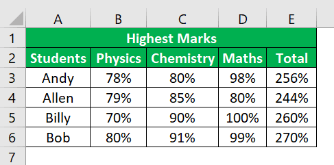
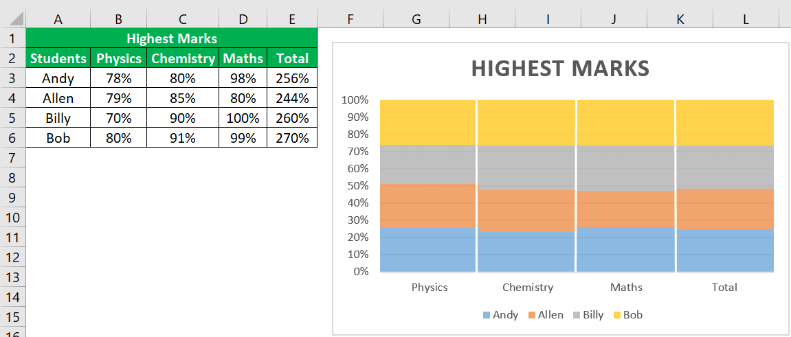
In the below section of the example, we will show you how to build a Mekko chart in Excel. Consider the table showing highest marks obtained by 4 students in Physics, Chemistry and Maths. Now, with the data, let us create a marimekko chart in Excel.
The steps are:
- Step 1: To start with, click on the Insert tab and click on 100% Stacked Column Chart under Charts group.
- Step 2: Now, we have to eliminate the gap between data series. So, right-click and select Format Data Series.
- Step 3: Now, to delineate the boundaries, we can insert lines under Illustration tab. Next, copy and paste the lines.
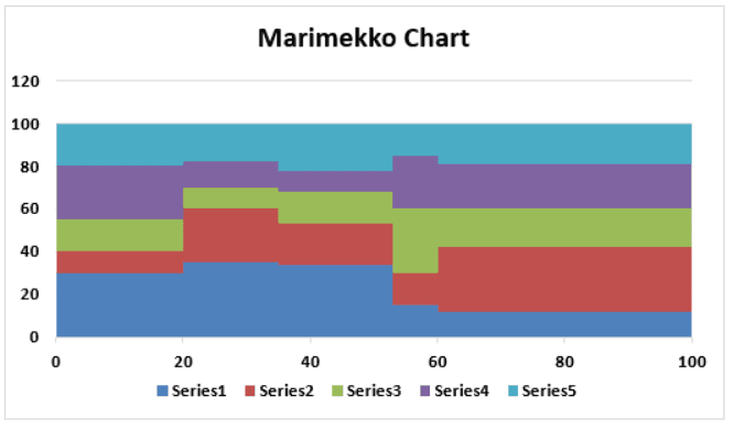
We can see the Marimekko chart in Excel as shown in the below image.
Likewise, we can use marimekko chart in Excel.
However, there are other ways to make this chart in Excel.
- Marimekko chart, also known as a Mekko chart in Excel, is a creative two-dimensional chart that combines Excel’s 100% stacked column and 100% stacked bar chart.
- What sets it apart is that it has variable column width and height.
- It should be noted that this chart is not a built-in template in Excel.
- However, there are other ways to create this chart using Excel.
- When comparing the performance of various companies within a market sector, the Marimekko chart is an excellent and constructive way to do so.
How To Create A Marimekko Chart In Excel Spreadsheet?
Below is an example of a Marimekko chart in Excel.
Examples
Example #1
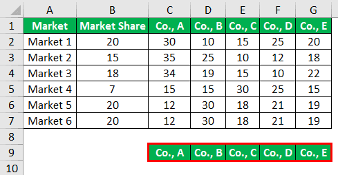
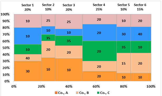
As we told you initially, the Marimekko chart is very useful for showing the performance of different companies competing in the same market sector. Therefore, for this example, we have created a simple data sample as below.
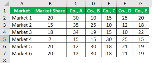
It is the companies’ market share data, column 2. In each market, each company shares a percentage that sums up to 100 in each market.
For example, in Market 1 Co., A has a market share of 30, but in Market 5, it has only 12. So like this data is.
To create the Marimekko chart, we need to rearrange the data, including many complex excel formulas.
First, create a company list below.
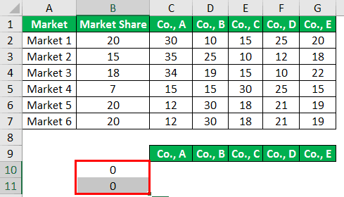
In B10 and B11, we must enter values as zero.
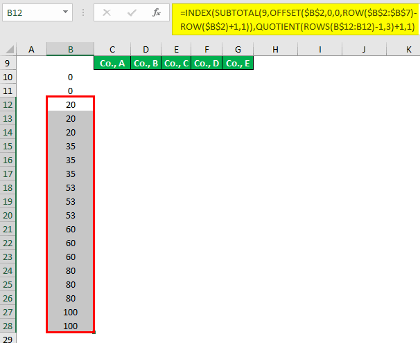
Now in B12, we must apply the below formula.
=INDEX(SUBTOTAL(9,OFFSET($B$2,0,0,ROW($B$2:$B$7)ROW($B$2)+1,1)),QUOTIENT(ROWS(B$12:B12)-1,3)+1,1)
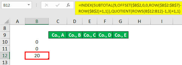
It is used to create a running total of market share. Once the formula is applied, copy down the formula to the below cells until the B28 cell.
Now in cell C10, apply the below formula.
=IF(MOD(ROWS(C10:C$10)-1,3)=0,0,INDEX(C$2:C$7,QUOTIENT(ROWS(C10:C$10)-1,3)+1))
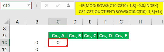
It is used to create a three values stack where the initial value is always zero, 2nd and 3rd values are the repetitive value of the company A share in Market 1 and Market 2. Like this going forward, it will create three values for each market sequence.
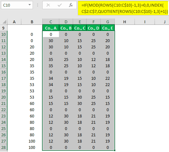
Copy down and to the right once the above formula is applied to cell C10.
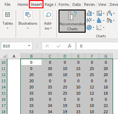
Now that the calculation is over. The next step is to insert the chart. Select the data from B10 to G28 and click on the “Recommended Charts.”
Now, we must go to the area chart and choose the below chart.
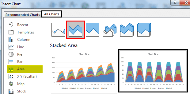
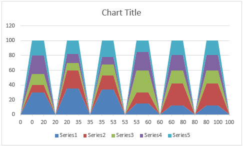
Click on “OK.” We will have a chart like the one below.
Select the horizontal-vertical axis and press “Ctrl + 1” to open the “Format Data Series” to the right.
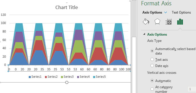
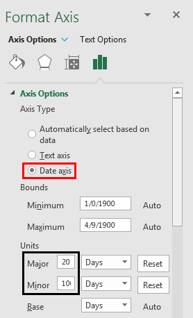
Change the “Axis Type” to “Date axis,” major is 20, and minor is 100.
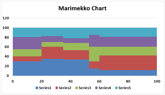
Now, we have a nice-looking chart like the one below.
Now, we need to insert data labels to this Marimekko chart. So, we need to create one more table to the right of our first table.
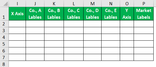
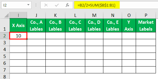
In a cell, I2 applies the below formula.
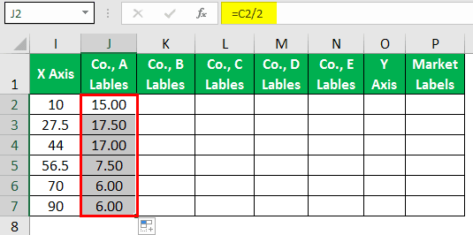
Cell J2 applies the below formula in a cell and pastes it to other cells to the down.
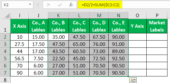
Now in the K2 cell, apply the below formula.
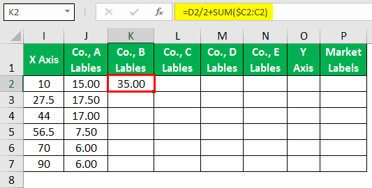
Copy the formula to down cells and paste it to other companies’ columns to the right.
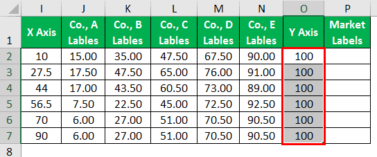
In the Y-Axis column, we must enter 100 for all the cells.
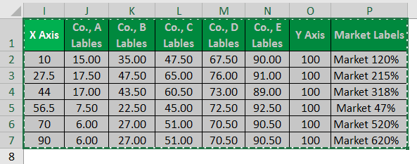
The “Market Labels” column enters the below formula and copies it to other cells in the market.
Once this table is set up, we must copy the data I1 to N7.
Once the data is copied, select the chart and open the paste special dialog box.
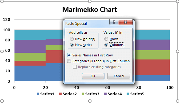
Choose “Categories (X Labels) in First Column.”
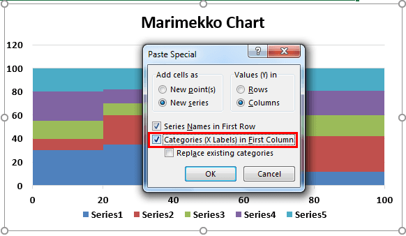
If we do not get the chart correctly, download the workbook and change the legends to your cells.
Now finally, our Marimekko chart looks like this.
Note: We have changed colors.
Example #2
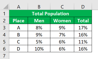
Consider the table showing total population in places, A, B, C, and D. Now, with the data, let us create a marimekko chart in Excel.
The steps are:
- Step 1: To start with, click on the Insert tab and click on 100% Stacked Column Chart under Charts group.
- Step 2: Now, we have to eliminate the gap between data series. So, right-click and select Format Data Series.
- Step 3: Now, to delineate the boundaries, we can insert lines under Illustration tab. Next, copy and paste the lines.
We can see the Marimekko chart in Excel as shown in the below image.
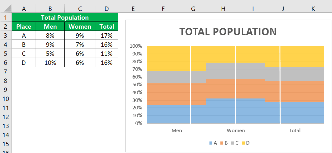
Likewise, we can use marimekko chart in Excel.
Example #3
Consider the table showing sales of electronic gadgets, such as mobile, tablet and laptop in different places. Now, with the data, let us create a marimekko chart in Excel.
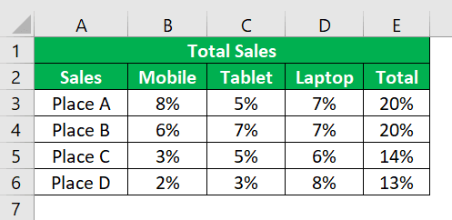
The steps are:
- Step 1: To start with, click on the Insert tab and click on 100% Stacked Column Chart under Charts group.
- Step 2: Now, we have to eliminate the gap between data series. So, right-click and select Format Data Series.
- Step 3: Now, to delineate the boundaries, we can insert lines under Illustration tab. Next, copy and paste the lines.
We can see the Marimekko chart in Excel as shown in the below image.
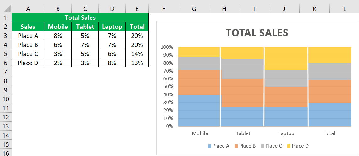
Likewise, we can use marimekko chart in Excel.
Important Things To Note
- Mekko chart, (Marimekko chart) is not a built-in chart.
- We need to recreate or restructure our data to create a Marimekko chart.
- With the data first, we will create a stacked area chart. Then by making some tweaks to the chart, we will be able to create a Marimekko chart.
Frequently Asked Questions (FAQs)
1. What is the alternative to the Marimekko chart?
Stacked bar charts are a better option for representing category data with the same aspect ratio than Marimekko charts, especially when comparing two categories of equal value.
2. What is the difference between a Marimekko chart and a stacked bar graph?
Marimekko, also known as the Mekko chart or Mosaic plot, is a type of chart that differs from the full stacked bar chart in terms of column width. In Marimekko charts, the column widths are scaled to fit the desired chart height, resulting in columns of varying widths. This chart makes it easier to compare the relative sizes of each category, making it a valuable tool for data visualisation.
3. How do you read a Marimekko chart?
The Marimekko chart is a valuable tool to help you compare and identify the popularity of different product categories within each customer segment. By visually representing the proportion of each product category’s sales with rectangular segments, you can quickly identify which categories are more prevalent within different customer segments. This chart can help you make strategic decisions and improve your overall marketing approach.
Consider the table showing sales of 4 products in Q1, Q2 and Q3. Now, with the data, let us create a marimekko chart in Excel.
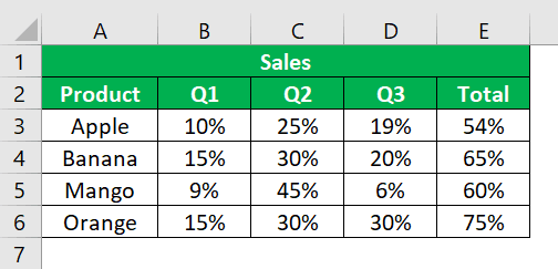
The steps are:
- Step 1: To start with, click on the Insert tab and click on 100% Stacked Column Chart under Charts group.
- Step 2: Now, we have to eliminate the gap between data series. So, right-click and select Format Data Series.
- Step 3: Now, to delineate the boundaries, we can insert lines under Illustration tab. Next, copy and paste the lines.
We can see the Marimekko chart in Excel as shown in the below image.
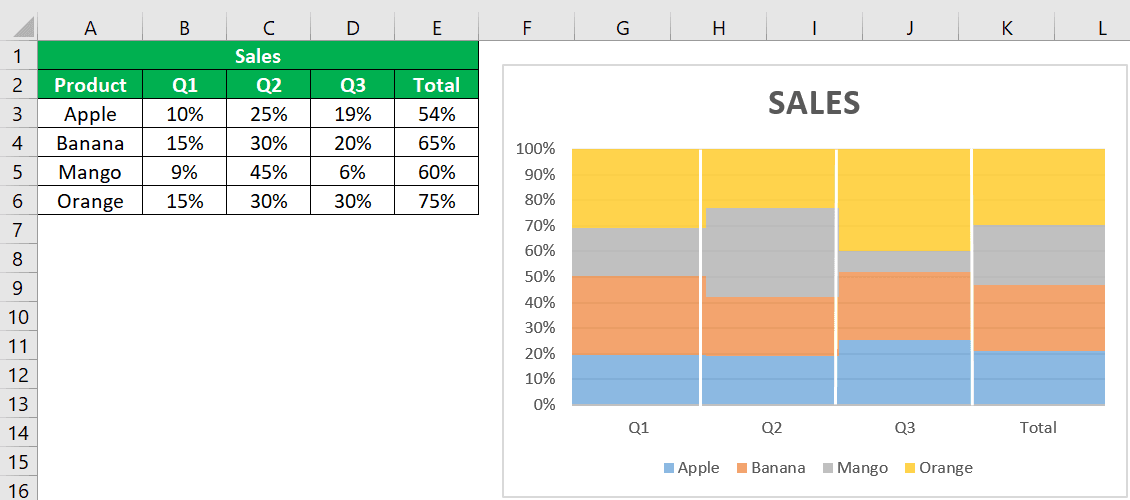 Likewise, we can use marimekko chart in Excel.
Recommended Articles
This article is a guide to the Marimekko Chart. We discuss creating the Mekko chart in Excel, practical examples, and a downloadable Excel template. You may learn more about Excel from the following articles: –