Create A KPI Dashboard In Excel
In any organization, analyzing performance based on Key Performance Indicators (KPIs) is essential. Typically, a dedicated team is assigned to evaluate these metrics and present the results through visual tools. This article will guide you through the process of creating a KPI dashboard to track the performance of individual sales employees using Excel. Download the workbook and follow along to build your own KPI dashboard in Excel.
Different companies have different KPI dashboards. For this article, we are taking into consideration a sales-driven organization. Its core revenue generation department is its sales team. To just how the company is performing, it is important to look at the performance of each individual in the department.
Step-by-Step Guide to Creating a KPI Dashboard in Excel
- Identify Key Performance Indicators (KPIs)
You must define the particular metrics you require to keep track of your business goals like sales, growth rate, etc. - Collect and Organize Data
Collect all relevant data and transform them into tables. \ - Create Calculated Metrics
Use Excel formulas like VLOOKUP and XLOOKUP to compute KPIs such as target achievement, rate of growth, etc. - Build Pivot Tables : Summarize large data sets using PivotTables.
- Design the Dashboard Layout
The next step involves allocating space for charts, metrics, and filters. - Insert Charts and Visual Elements
Next, you have to create dynamic charts, line graphs, etc. and use conditional formatting for getting information at a glance. - Add Slicers
Include slicers or drop-downs and protect the dashboard before sharing.
Key Takeaways
- KPI dashboards are very beneficial for any organization.
- Your KPI dashboards should have a well defined set of KPIs to ensure that the most important metrics required for your business are present.
- Add visual elements such as charts and conditional formatting so that it is easier to interpret data at a glance.
- Adding interactive slicers and drop-downs enhances user experience and it also ensures you can explore data dynamically.
How To Create A KPI Dashboard In Excel?
The above steps are generic. Below is an actual example of creating a KPI Dashboard in excel.
The steps to create a KPI dashboard in Excel are as follows:
1. First, we need to create a “Target_Table” for each employee across 12 months.
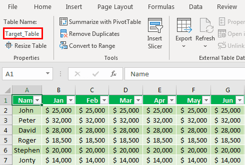
In the above table for each individual, we have created a target for each month. We have applied table format in excel and named it Target_Table.
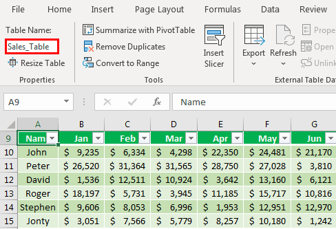
2. Similarly, we must create one more table called Sales_Table, which shows actual sales.
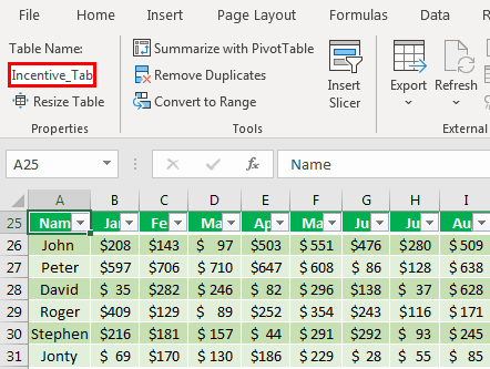
3. Similarly, we must create two more tables to arrive at the salary and incentive numbers.

Above is the table of individual salaries. So now, create a table for Incentives.
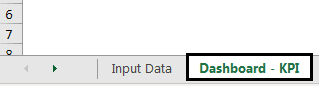
We are done with all the data inputs required to show in the dashboard. Next, we must create one more sheet and name it Dashboard – KPI.
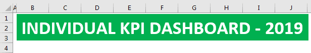
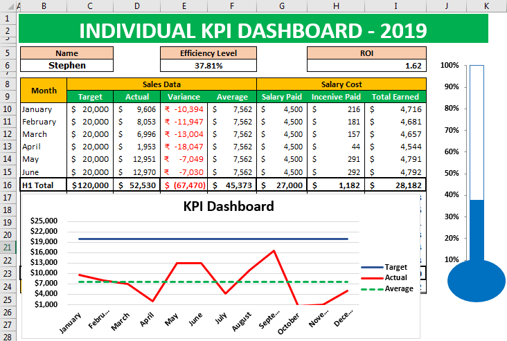
4. Create the heading “Individual KPI Dashboard- 2019” in Excel.
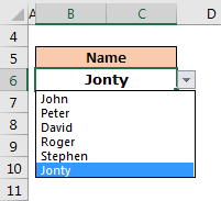
5. Now, create employee names and build a drop-down list in Excel of employees.
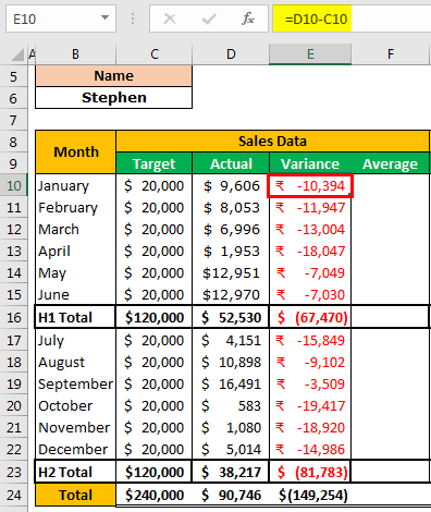
6. Create a month-wise table to show Target, Actual, Variance, and Average Sale. And also to display Salary and Incentive Paid.
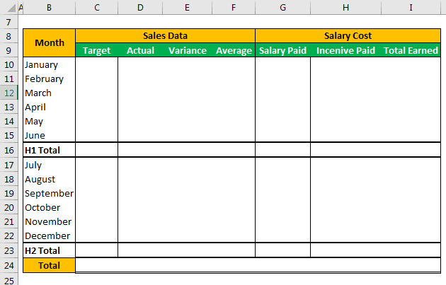
We have divided the data to be shown for the first six months and the later six months. So that is why we have added H1 total and H2 total rows.
H1 consists of the first six months total, and H2 consists of the second six months total. So, the whole is a combination of H1 + H2.
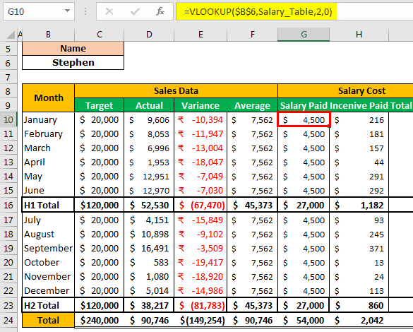
7. For Target and Actual, we must apply VLOOKUP from the Input Data sheet and arrive at numbers based on the name selection from the drop-down list.
To find Actual sales data, select Sales_Table in place of Target_Table in the VLOOKUP formula.
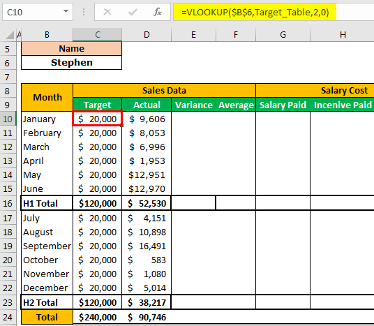
To find the variance, subtract actual sales data from target sales data.
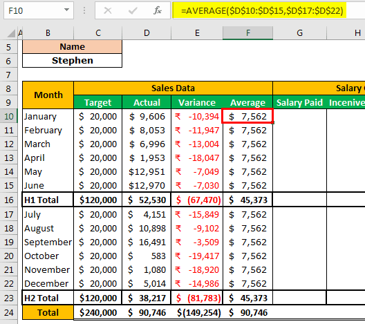
To get an average of sales data, apply the below formula.
Similarly, we must do the same for the Salary Paid and Incentive Paid columns.
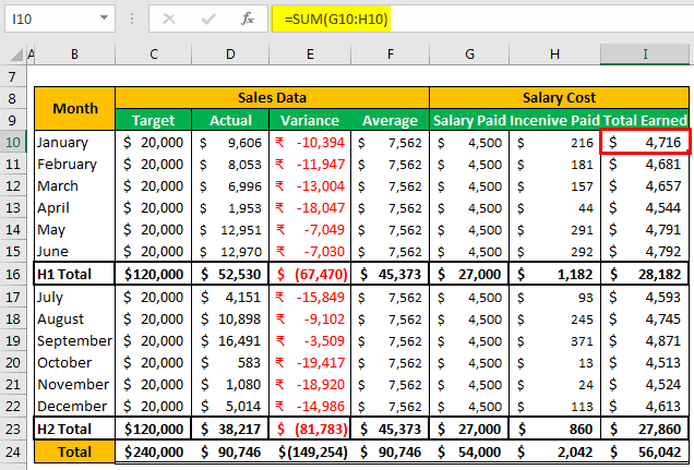
Then, find the Total Earned by adding Salary Paid and Incentive Paid.
Now, based on the selection we make from the drop-down list of the name, VLOOKUP fetches the Target, Actual, Salary Paid, and Incentive Paid data from the respective table which we have earlier in the article.
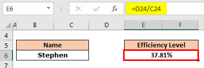
8. We need to create a cell for the Efficiency Level. Then, we need to divide the achieved amount by the target amount to arrive at the efficiency level.
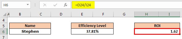
9. Now, arrive at the return on investment result. But, first, we must divide the Actual amount by the Total Earned amount.
10. Now, a graphical representation of the data we have comes at. Below is the graph we have applied. We can create a chart based on the liking.
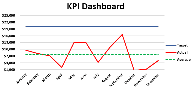
We have applied a line graph for “Target,” “Actual,” and “Average” numbers in the above chart. Therefore, this graph will represent the “Average” achieved and “Target” achieved against the “Target” numbers.
We have applied a Clustered Column chart in excel.
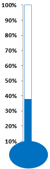
After all this, we need to insert a simple efficiency chart. Finally, we have applied the efficiency chart, and we can start using this KPI dashboard by downloading the Excel workbook from the link provided.
Based on the selection we make from the drop-down list, numbers will turn up accordingly, and graphs will show the differences.
Based on the requirement, we can increase the number of employees and fill the target data, actual data, and salary and incentive data accordingly.
Need an overall idea of creating dashboards in Excel? You can check out this article here.
Frequently Asked Questions (FAQs)
What are the Excel tools commonly used in dashboards?
Common tools used in KPI dashboards include PivotTables, charts, slicers, and formulas like IF, VLOOKUP, and SUMIFS.
Charts, like bar or pie charts, can be used to visualize trends and comparisons. PivotTables are used to summarize and analyze data. Slicers enable users to filter out the data, and formulas like VLOOKUP and SUMIFS are used for calculations.
How to make a KPI dashboard interactive?
To make a KPI dashboard more interactive, slicers, drop-down menus, and PivotTable filters can be used, which allow users to change views or filter data as needed.
What are some best practices to remember when creating a KPI dashboard in Excel?
The following are some of the best practices to be followed.
- Choose the right KPIs that align with your business goals and provide useful insights to take necessary action.
- Understand the end user, as different stakeholders may require different aspects of performance. The KPIs should match the expectations of your audience.
- Use a comparison point, such as past performance, to measure against.
- Choosing too many KPIs makes it difficult for you to monitor and manipulate the data. Usually, between 5 to 20 is considered ideal.
Recommended Articles
This article is a guide to KPI Dashboard in Excel. We discuss creating a KPI dashboard in Excel, practical examples, and a downloadable Excel template. You may also learn more about Excel from the following articles: –